relative colors in #CSS looks pretty cool! ishadeed.com/article/css-...
11.03.2025 08:27 — 👍 6 🔁 1 💬 0 📌 0
@xocasgv.bsky.social
Co-founder of the Visualization for Transparency Foundation @fndvit.bsky.social Ex- @theguardian.com @nytimes.com and NatGeo. Dad, husband, Galician. He / him.
relative colors in #CSS looks pretty cool! ishadeed.com/article/css-...
11.03.2025 08:27 — 👍 6 🔁 1 💬 0 📌 0I can’t see it as anything but a matter of phonetic spelling, hence the reluctance of Europeans and Canadians to use #dataviz. Just like business is shortened as biz, Americans shorten visualization as viz.
To me … as silly a debate as data is v. data are.
⚠️⚠️⚠️Gone from #GoogleCalendar are:
Holocaust Remembrance Day,
Indigenous Peoples Day,
Black History Month,
Hispanic Heritage Month,
Pride Month,
Native American History Month.
Please give a shout out to this change many of us helping users in the Calendar Help Community are displeased with.

A GenXer attempts a Gen Z selfie of the group in the classroom, after a long hackathon.
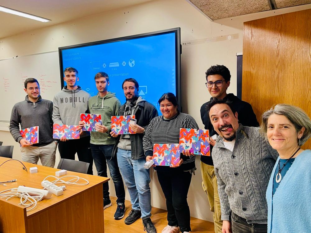
Six students posing with their awards (a book and a card collection). To the right, two of their professors, and sponsors of the hackathon via the ViT Foundation, happy and proud of their work.

The winning team, selected by the professional jury, receives a commemorative diploma from the award sponsors, Eurecat. The six students pose with their awards next to the sponsor’s representatives.

The winning team explains their results and methods to the rest of the class at the end of the hackathon.
All students were awe inspiring.
In the end, “Donicelas” —professional jury— and “Raposos” —popular vote— won.
(Yah, we took our team names from the Galician forest 🌳 🦊 🐗 )
Next week, we’ll merge all the PRs and publish the results.

Two instructors seating on the desk working. In the foreground, the classroom door with a poster of the hackathon.

To the right, in the background, a student explains his reasoning for a data science project on a blackboard. To the left, in the foreground, a classmate is focusing on a computer task.

Two students smile while working on their laptops. In the foreground, some sandwiches they stole from the common area, to fuel their overworked brains.

A very serious group of students around a table, working with their laptops. Flowing …
Yesterday, we held the fourth edition of our Data Science Hackathon.
1 dataset, 4 DS scenarios. ½ a week to prep. And 12 hours of madness 🤪, coffee ☕️ , sandwiches and pizza 🍕. (And 🗺️ and 📊 and 🐛)
Thanks to @univgirona.bsky.social @eurecat.bsky.social @fndvit.bsky.social for sponsoring.

Everything’s ready for tomorrow’s hackathon!! @univgirona.bsky.social @fndvit.bsky.social @eurecat.bsky.social
This year’s theme is energy efficiency certifications.
mds-hackathon-25-fndvit.vercel.app
you know what most research money goes to? PEOPLE
to pay peoples' salaries
so they can pay the rent
and buy groceries
and medicine
and maybe some nice, fun things, too
this will be devastating for people in every state and territory across the country.
This is insane. There are lots of scientists in the US who are on “soft money”, which means that without government grants, they’re out of jobs. This is how you destroy the best research and development in the world.
28.01.2025 04:50 — 👍 812 🔁 198 💬 30 📌 12
I think some people hear “grants” and think that without them, scientists and government workers just have less stuff to play with at work. But grants fund salaries for students, academics, researchers, and people who work in all areas of public service.
“Pausing” grants means people don’t eat.
Genuinely horrifying.
20 million people receive HIV antiviral treatment from the program annually.
Mothers with HIV would transmit it to their infants at birth if not for perinatal antiviral treatment.
This should be resumed as soon as possible. Every day of delay means more lives lost.

The way @nytimes.com continues to normalize fascist parties with candid interviews with their voters www.nytimes.com/2025/01/27/o... is irresponsible and wholly misguided. Portraying anti-immigrant, anti-LGTBQIA+ rhetoric as acceptable opinion legitimizes discrimination.
27.01.2025 13:27 — 👍 0 🔁 0 💬 0 📌 0
Study finds extensive AI use may impair critical thinking among 666 participants, with younger users showing higher dependency. While higher education could counteract negative effects, researchers emphasize the need to balance AI usage with cognitive development.
www.mdpi.com/2075-4698/15...
Take a great tools like Flourish or Datawrapper. Nothing prevents you from making terrible, absurd interactives or data visualizations with it. If your data reporting is bad or you misuse visual encodings, it will show. Tools by themselves won’t save you. Learn why, then how.
13.01.2025 09:32 — 👍 0 🔁 0 💬 0 📌 0But that doesn’t mean tools are a panacea. They ain’t what will rescue digital journalism. Just like a great camera don’t make a photographer great, digital tools for journos don’t make visual journalism great. Tools give access; understanding gives mastery. They don’t replace critical thinking.
13.01.2025 09:32 — 👍 0 🔁 0 💬 1 📌 0Yes, tools help remove barriers and make fields more accessible. Yes, developing tools is fundamental to a field’s progress. And yes, I can even indulge and assume McLuhan’s point of view —I’m an integrati: I can’t help but see the positive in mass access to otherwise esoteric fields of knowledge.
13.01.2025 09:32 — 👍 0 🔁 0 💬 1 📌 0Tools are tools. They’re devices to help you perform a task that’s an expression of your ability and expertise. And expertise on a particular field comes from understanding the systems and techniques that govern it —and know then rules and how to break them.
A very short rant 🧵

Xaquín draws a gorgeous world map in a whiteboard.
Every class, I ask a team of students to take notes of our conversations —as in the debates and critique sessions we have. They are the “annotation team.”
I just read this in last session’s.
“Xaquín attempted to draw a world map”
The audacity!!!
Replies encouraged.
I'd love to know what other instructors do or other practitioners would expect to learn:
- Is the syllabus too broad or too narrow?
- Traditional, flipped, or a mix of both teaching methods?
- What other activities do you do to engage folks in thinking critically about dataviz?
The part we do in @observablehq.com is public here: observablehq.com/collection/@... We just started, so our second session is next week.
I still need to find a way to open the rest of the materials, especially the conversations. They're currently on the University's Moodle.

Cover of the second lesson: A (visual) language, the background is a close up of a woman's eye looking at you.
It's 6 classes and a hackathon —shared with the Project Management subject. The 6th session is reserved for the final project presentations.
The syllabus is:
- Why Visualize
- A Visual Language
- Let's Talk Color
- The Age of (Data) Exploration
- Data-driven visual storytelling
To keep a record of these convos, every week, we have an annotation team in charge of taking notes of the discussions in the '𝗟𝗲𝘁'𝘀 𝗱𝗿𝗮𝘄', '𝗦𝗽𝗲𝗮𝗸𝗶𝗻𝗴 𝗼𝗳 𝗰𝗵𝗮𝗿𝘁𝘀', the '𝗥𝗲𝘃𝗶𝗲𝘄 𝗼𝗳 𝗹𝗮𝘀𝘁 𝘄𝗲𝗲𝗸'𝘀 𝗲𝘅𝗲𝗿𝗰𝗶𝘀𝗲', and '𝗙𝗶𝗻𝗱 𝗮 𝗚𝗼𝗼𝗱 𝗧𝗵𝗶𝗻𝗴' segments —and the notes are graded as part of their participation grade.
05.12.2024 11:09 — 👍 0 🔁 0 💬 0 📌 0
A misleading chart showing average female height. The baseline starts at around 4'10", so the 5'0" Indian women look as if they only measured a couple of inches, and were scared by the gigantic Latvian women.
𝗙𝗶𝗻𝗱 𝗮 𝗴𝗼𝗼𝗱 𝘁𝗵𝗶𝗻𝗴 is a way to stay positive when faced with horrific charts. Every week, a few students bring bad charts they've seen out there, and we all have to find something good to say about it, any aspect where things didn't go completely wrong.
05.12.2024 11:09 — 👍 0 🔁 0 💬 0 📌 0We discuss:
- Battling Infectious Diseases in the 20th Century: The Impact of Vaccines graphics.wsj.com/infectious-d...
- How the Recession Reshaped the Economy, in 255 Charts www.nytimes.com/interactive/...
- Codex Atlanticus codex-atlanticus.ambrosiana.it/
Among others.
𝗦𝗽𝗲𝗮𝗸𝗶𝗻𝗴 𝗼𝗳 𝗰𝗵𝗮𝗿𝘁𝘀 are conversations about a data visualization example tied to the class topic. We'll attempt to reverse engineer how their authors went from data query to visualization, the strengths and opportunities of the charts, and what we can learn from them.
05.12.2024 11:09 — 👍 0 🔁 0 💬 0 📌 0The class is 3 and ½ hours long, so imagine if it were just me talking 😱 so I keep that in check.
My favorite bits are: '𝗟𝗲𝘁'𝘀 𝗱𝗿𝗮𝘄,' '𝗦𝗽𝗲𝗮𝗸𝗶𝗻𝗴 𝗼𝗳 𝗰𝗵𝗮𝗿𝘁𝘀,' and '𝗙𝗶𝗻𝗱 𝗮 𝗴𝗼𝗼𝗱 𝘁𝗵𝗶𝗻𝗴.'
𝗟𝗲𝘁'𝘀 𝗱𝗿𝗮𝘄 are warm-up, pen-and-paper exercises that set the topic for the class. I also use these in workshops.
Every October, I start reviewing and updating my #InformationVisualization class for @univgirona.bsky.social Master's in #DataScience. I usually massage the explanations and data in the @observablehq.com notebooks and refine the lessons with new examples and better explanations.
A 🧵
My first truly public lecture in Catalan —as in not just impressionable Uni students, open to a wider audience, and by myself.
We talked about why visualization is so relevant in today’s data age: I showed the Datasaurus dozen, historical examples, and how to make honest visuals at @casadeculturagi

L’art i la ciència de la Visualització de Dades de @xocasgv.bsky.social
Les dades poden explicar històries. Si tenim dades, tenim la capacitat de generar un impacte.