Bar chart showing the percentage decrease in foreign air passenger arrivals to America by flight origin from May-July 2025. All arrivals decreased by 4%, Canada by 14%, the Middle East by 6%, South America by 11%, Oceania by 8%, Asia by 8%, and Europe by 4%. The actual change in thousands is listed alongside. Data sources are the US International Trade Administration and The Economist.
Are foreign tourists really avoiding the USA?
03.02.2026 19:55 — 👍 29 🔁 11 💬 4 📌 3

A map titled "THE REAL SIZE OF IRAN" shows the outline of Iran, colored bright pink, overlaid onto the map of North America. The shape of Iran is positioned over the central United States and a part of Canada, with its borders stretching across multiple states and provinces, including North Dakota, South Dakota, Nebraska, Minnesota, and others, illustrating a scale comparison. The map also labels the United States, Canada, Mexico, Hudson Bay, and the Northwestern Passages for geographical context.
The real size of Iran
by @the.world.in.maps
made using thetruesize.com
03.02.2026 19:55 — 👍 5 🔁 0 💬 1 📌 0

This line chart titled “Can AI replace junior workers?” illustrates the change in U.S. employment for junior employees from 2015 to 2025, indexed to December 2022 = 100, comparing firms that adopted AI (red line) with those that did not (gray line), showing that while both groups experienced growth until early 2023, employment at AI-adopting firms peaked just before the release of GPT-3.5 and then declined steadily through 2025, falling below the baseline to approximately 92 by 2025, whereas non-adopting firms continued growing slightly after the AI milestone, reaching about 102 by 2025, suggesting a potential displacement effect of AI on junior roles in adopting firms; the vertical axis ranges from 70 to 110, and a black dot marks the inflection point labeled “Month after GPT 3.5 released,” while the source is cited as the 2025 SSRN working paper “Generative AI as seniority-biased technological change” by S.M. Hosseini & G. Lichtinger, with the Economist’s “E” logo visible in the corner.
Is AI replacing junior workers and entry level jobs?
via @theeconomist
03.02.2026 17:55 — 👍 5 🔁 0 💬 2 📌 2

A 24-hour clock illustration depicting Earth's history as a single day. The clock starts at midnight for Earth's formation, with major events like meteorite bombardment from 12:00 to 3:00 AM, origin of life at 4:00 AM, oldest fossils at 5:36 AM, sexual reproduction at 6:08 AM, emergence of seaweeds at 8:28 AM, and mammals at 11:39 PM. Humans appear at 11:58:43 PM, just before midnight.
If the whole history of the Earth was squeezed into one day... #dataviz
Source: flowingdata.com/2012/10/09/h...
03.02.2026 15:55 — 👍 18 🔁 3 💬 2 📌 2

A grid showing how different IT roles (Developers, Designers, Project Managers, QA, and Sysadmins) perceive each other. The matrix format uses humorous images for each intersection - like developers seeing designers as children with crayons, QA seeing everyone as problematic, and sysadmins being viewed as either chaotic or mysterious by others. The images range from professional photos to memes, creating a satirical take on tech workplace stereotypes and interdepartmental relationships
Think there might be some truth in this matrix...
(creator: unknown)
02.02.2026 17:55 — 👍 28 🔁 10 💬 0 📌 2

A humorous map of Europe divided into four quadrants labeled "Northwest," "Northeast," "Southwest," and "Southeast." This unconventional division is presented as the "only correct" way to divide the continent. Note: This ALT tag reflects the humorous nature of the image and its intended message.
The only correct way to divide Europe, apparently
(by Reddit user: garis53)
02.02.2026 12:55 — 👍 3 🔁 1 💬 0 📌 1

This image displays the visual evolution of the YouTube video player interface from 2005 through to a speculative design labeled “since 2025,” arranged chronologically in a vertical list. Each row pairs a date range on the left with a screenshot of the corresponding player design on the right. The 2005 version is minimalist with a simple progress bar and pause button. Early 2006 adds volume control and time display. From 2006–2008, the player gains more buttons including rewind and full screen, plus a red progress bar. An embedded version from the same period appears slightly simplified. In 2008–2010, the player becomes sleeker with rounded corners and a play button integrated into the timeline. The 2010–2011 version introduces a bold red top bar and larger controls. By 2011–2012, the interface turns black with red accents and adds a settings gear icon. In 2012–2013, YouTube branding appears alongside “More info” and social interaction icons like thumbs up/down and share. The 2013–2015 player retains the black theme but refines layout with clearer icons and a clock symbol. From 2015–2025, the design becomes flatter with minimal icons, a visible total duration (e.g., 4:12), and a fullscreen toggle. The final mockup labeled “since 2025” shows an even more compact dark interface with playback time (1:18 / 1:00), closed captions, settings, playlist, theater mode, and other modern features, suggesting continued streamlining and functional density. The progression illustrates YouTube’s shift from basic functionality to a rich, user-centric media experience with consistent color themes and evolving UI conventions over two decades.
The Strangely Memerising Evolution of the YouTube Progress Bar
by Wikipedia user: @Elominius
01.02.2026 06:35 — 👍 20 🔁 4 💬 0 📌 1
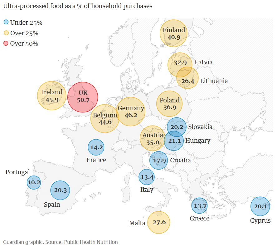
A map of Europe showing the percentage of ultra-processed foods in the diets of different countries. The colors represent different ranges: Blue: Under 25%, Yellow: Over 25%, Orange: Over 50%. The map highlights countries with high consumption of ultra-processed foods, such as the UK, Ireland, and Belgium, and those with lower consumption, such as Portugal and Greece.
Consumption of ultra-processed foods (UPFs). WTF UK?
(via @Guardian)
31.01.2026 12:55 — 👍 10 🔁 7 💬 1 📌 1

An infographic depicting an intricate family tree of Greek gods and goddesses. The chart includes primordial deities, titans, and Olympians, with lines denoting relationships such as parentage, marriage, and notable births. Key details: At the top, primordial deities Gaia (Earth) and Ouranos (Sky) give rise to the titans and other entities. Titans like Kronos and Rhea lead to the Olympians, including Zeus, Poseidon, and Hades. Iconic births, such as Athena springing from Zeus's forehead and Aphrodite arising from sea foam, are highlighted. The chart humorously admits that it's "not even close to complete" but provides a visually appealing overview of Greek mythology's complex lineage.
The Greek God Family Tree
by Korwin Briggs
veritablehokum.com
30.01.2026 15:55 — 👍 6 🔁 0 💬 1 📌 0
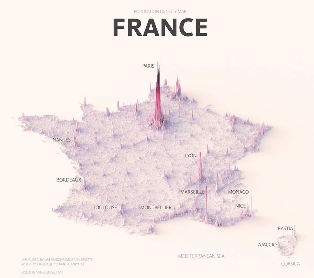
A population density spike map of France showing highest population as higher peaks across a 3D landscape.
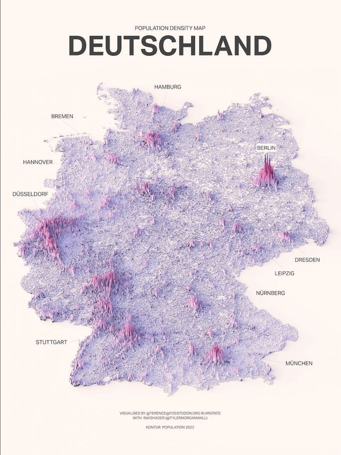
A population density spike map of Germany showing highest population as higher peaks across a 3D landscape.
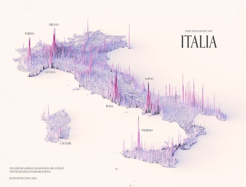
A population density spike map of Italy showing highest population as higher peaks across a 3D landscape.
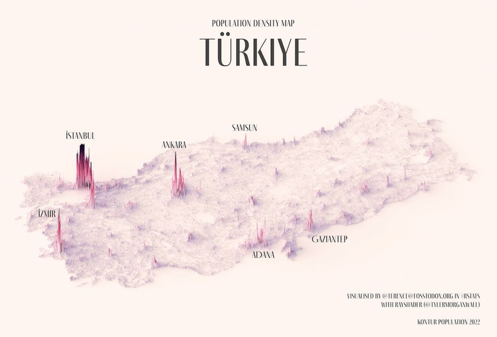
A population density spike map of Turkey showing highest population as higher peaks across a 3D landscape.
Love these population density spike maps
by www.instagram.com/researchremo...
30.01.2026 12:55 — 👍 20 🔁 4 💬 0 📌 0

A chart titled "90s Band Alignment Chart" presents a 2x2 matrix with axes labeled "HAPPY" to "SAD" on the horizontal and "ANGRY" to "HORNY" on the vertical. Bands from the 1990s are placed within the quadrants to reflect their musical or lyrical style. Rage Against the Machine is in the top-center for "ANGRY." Deftones is in the top-right for "ANGRY" and "SAD." Alice in Chains and The Cranberries are in the far right for "SAD." Nirvana and Portishead are positioned in the bottom-right of the "SAD" axis. Morphine and Sublime are in the bottom-left of the chart, near the "HORNY" axis. Blink-182 and No Doubt are on the far left, near the "HAPPY" axis. In the center, bands like Soundgarden, Smashing Pumpkins, and Oasis are clustered. A line labeled "sarcasm belt" runs diagonally through the center of the chart.
The 90s band Alignment Chart
(creator unknown)
30.01.2026 06:34 — 👍 37 🔁 8 💬 7 📌 8

Bar chart shows the % of global fossil fuel emissions occurring in a lifetime with bars of different length for ages from 5 to 100 years. More emissions happen over a longer lifetime. During the life of an 85 year old, 90% of all emissions happened. For someone age of 30 the rate is already 50%
If you're aged 30 or more, then 50% of all human fossil fuel emissions happened during your lifetime
29.01.2026 17:55 — 👍 20 🔁 17 💬 0 📌 0

An infographic flyer advertising an online seminar for learning how to create impactful infographics and data visuals with best-selling author and data-visualisation practitioner David McCandless of Information is Beautiful. Discounts are available.
Come learn the a different ‘concept-driven’ approach to creating impactful charts & visualisations
2 x virtual half days:
25th & 26th Mar 🇬🇧 UK/EU/AUS
29th & 30th Apr 🇺🇸 USA timezone
Mon 27th Apr 🇬🇧 LDN in-person
Deets: bit.ly/IIBWAB
Reviews: geni.us/WABreviews
29.01.2026 15:55 — 👍 0 🔁 0 💬 0 📌 0

Diagram shows how the perception of marriage in the West changed over the centuries and in relation to romance, love and sex. Pre-17th century marriage was an economic and political contract negotiated between families. Love happened outside of marriage. This changed over time. From the 17th to 19th century love was arranged but expected to be a starting point for romance and love. Later, romance lead to marriage and then love. And since the 1960s a progression from sex to romance, then love and only then marriage seems to be the prominent model.
How the concept of marriage has changed across centuries 💘
29.01.2026 12:55 — 👍 4 🔁 1 💬 0 📌 1

A diagram plots human experience of space & time in the physical world. It shows a rectangular area between two axis. One is time, the other space. Both range from very small to very large. Inside of that area is a much smaller rectangle. It is about 1/16 of the size and labelled “Human Experience"
Al-Barquq > Albercoc > Aubercot > Apricot
28.01.2026 17:55 — 👍 19 🔁 3 💬 2 📌 0

A playful scatterplot (using dog silhouettes instead of dots) depicts the best dog, according to data. On the vertical axis is a measure of public popularity. On the horizontal is an indexed score of several metrics to consider when owning a dog (cost, temperament, no. of genetic ailments etc). Each dog is coloured by category (sport, toy, hound etc) and sized (S, M, L). If a dog is facing left, it's kind of a dumb dog. If it's facing right, it's an intelligent dog.
It's fun to learn how to create impactful #infographics & data-visuals like this.
2 x virtual half days:
25th & 26th Mar 🇬🇧 UK/EU/AUS
29th & 30th Apr 🇺🇸 USA timezone
Mon 27th Apr 🇬🇧 LDN in-person
Details geni.us/WAB2024
Reviews geni.us/WABreviews
27.01.2026 17:55 — 👍 3 🔁 0 💬 0 📌 0

A simple diagram amusingly plots the typical denizens of a hotel bar.
Every Hotel Bar Ever (by Matt Surelee)
www.facebook.com/photo.php?fb...
27.01.2026 17:55 — 👍 12 🔁 1 💬 0 📌 1

The cover images of three infographic books by David McCandless: Beautiful News, Knowledge is Beautiful and The Visual Miscellaneum
Some good USA deals on our beautiful books out there
📘 20% off Beautiful News - geni.us/BNEWS
📕 10% off Knowledge is Beautiful (hardcover) - geni.us/KIB25
📗 11% off The Visual Miscellaneum - geni.us/VMisc25
bit.ly/IIB-Books
26.01.2026 23:55 — 👍 3 🔁 1 💬 0 📌 0

Line chart titled "Reported polio cases in the United States". The y-axis represents the number of reported cases, ranging from 0 to 60,000. The x-axis represents the years, from 1910 to 2022. The chart shows a significant spike in polio cases in the late 1940s and early 1950s, peaking around 1952 with nearly 60,000 reported cases. After the introduction of the first polio vaccine in 1955, the number of cases declined sharply. By 1961, with over 85% of children under ten vaccinated, the cases were significantly reduced. The chart indicates that by 1980, wild polio had been eliminated from the US, with reported cases remaining near zero from that point onwards. The data includes both wild- and vaccine-derived poliovirus infections.
In the first half of the 20th century, tens of thousands of people (mostly children) suffered paralysis from polio. The first vaccine was introduced in the USA in 1955. Notice the trend afterwards.
(by @ourworldindata)
26.01.2026 19:55 — 👍 20 🔁 5 💬 1 📌 0

A map of Europe showing Android vs iOS mobile operating system popularity by country. Android (green) dominates most of continental Europe, while iOS (blue) is more popular in the UK, Ireland, Norway, and Switzerland. Data source: Statcounter, October 2022
The true digital divide in Europe
(by reddit user theworldmaps)
Note: Oct 2022 data
25.01.2026 12:55 — 👍 11 🔁 1 💬 0 📌 1

Chart showing positivity ratings for various words and phrases on a scale from 0 to 10. Words range from "Very bad" (2.22) to "Perfect" (8.75), with color-coded distributions from red (negative) to green (positive). The title references "Make America 8.08 out of 10 again," with "Great" scoring 8.08.
Very bad? Terrible? Or perfect? American superlatives graded. Making American 8.8 again?
today.yougov.com/society/arti...
23.01.2026 23:55 — 👍 6 🔁 1 💬 1 📌 2

Infographic titled 'HOW COOL IT IS vs YOUR AGE' humorously mapping perceived coolness across ages 10–100. Items include 'Skateboarding' (younger years), 'Living alone' (early adulthood), 'Complaining about young people' (older age), 'Juuling' (young trend), 'Being good at patty cake' (childlike skill), 'Being told you look older' (subjective milestone), and 'Celebrating your birthday' (universal but less cool with age). A horizontal age axis runs below with no explicit coolness scale, relying on ironic cultural stereotypes.
How cool something is vs. your age
by Matt Surelee @mattsurelee
23.01.2026 06:34 — 👍 28 🔁 6 💬 0 📌 2

A table titled "Causes of Death in London 1632" which lists various diseases, casualties, and other causes of mortality along with the number of deaths attributed to each cause in that year. The data reveals that some of the leading causes of death in 1632 London were teeth (dental infections) at 470 deaths, flocks and smallpox at 531 deaths, fever at 1108 deaths, and chrisomes and infants at 2268 deaths.
Be glad you live now. Causes of death in London in 1632
(via Reddit bit.ly/4e4WazX)
interpretation of obscure terms by KimberelyG bit.ly/3KzIgYR
22.01.2026 17:55 — 👍 12 🔁 4 💬 3 📌 2
New dates for our 'Create Impactful Infographics' trainings. Learn to make memorable, useful, beautiful charts & graphics
2 x virtual half days:
25th & 26th Mar 🇬🇧 UK/EU/AUS
29th & 30th Apr 🇺🇸 USA timezone
Mon 27th Apr 🇬🇧 LDN in-person
Deets bit.ly/IIBWAB
22.01.2026 15:55 — 👍 1 🔁 0 💬 0 📌 0

Homepage of Information is Beautiful (IIB) store showing sample data visualization prints, including a left-right comparison chart, a colorful circular diagram, and a word cloud of books. The page includes store navigation, environmental notes about sustainable printing practices, and a welcome message introducing David McCandless's work
May we mention our new online store? Where you can buy high-quality art prints of our most popular infographics & visualisations
bit.ly/IIBStore
22.01.2026 01:55 — 👍 6 🔁 0 💬 0 📌 0

A heatmap titled "The U.S. Baby Boom was between 1946 and 1964" illustrates age-specific fertility rates in the United States from 1935 to 2020. The y-axis represents the age of mothers, from 15 to 45. The x-axis represents the year. The color intensity of the grid cells corresponds to the fertility rate, with a color scale below the chart ranging from light pink (0.00) to dark purple (0.25). A vertical black box with a horizontal arrow across the top highlights the period from 1946 to 1964, visually marking the "Baby Boom." The heatmap shows a significant area of dark color, indicating high fertility rates, concentrated in the age range of 20-30 during the Baby Boom years, with the highest concentration around age 25. The high-fertility area shrinks and shifts slightly to the right in subsequent years, showing a general decline in the overall fertility rate, but a slight increase in fertility rates for older age groups over time. The data source is the Human Fertility Database (2024), and the visualization is by Miguel HG.
The baby boom visualized
(by Reddit user: u/Serkan089)
21.01.2026 06:38 — 👍 17 🔁 5 💬 0 📌 2
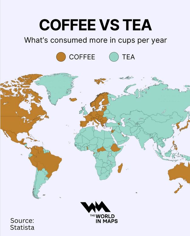
A world map infographic comparing annual per capita consumption of coffee versus tea, with countries shaded brown where coffee is consumed more and teal where tea is consumed more. Large swaths of the globe including most of Asia, the Middle East, Africa, and the UK are shown preferring tea, while North America, most of South America, much of Europe including Scandinavia, and Australia are shaded for coffee. The split shows clear regional trends: coffee dominates in the Americas, Northern and Central Europe, and Australia, while tea dominates in Asia, Africa, and the Middle East. The map is titled “COFFEE VS TEA What’s consumed more in cups per year,” with a key identifying coffee in brown and tea in teal, and cites Statista as the source. At the bottom is the logo for The World in Maps.
A true world divide
21.01.2026 06:36 — 👍 21 🔁 4 💬 2 📌 5

The Witcher series poster with three characters and episode ratings table for four seasons. Episode ratings range from 4.0 to 8.8 displayed in colored blocks. Episodehive logo and tagline 'View episode details at episodehive.com' at the bottom
Hard agree
20.01.2026 19:55 — 👍 2 🔁 1 💬 2 📌 0

Map highlighting control over the North Pole, divided into regions: Russia, Norway, Greenland (Denmark), Canada, U.S. (Alaska), and international waters.
For reference...
20.01.2026 15:55 — 👍 11 🔁 5 💬 0 📌 1

This satellite map titled "Total Solar Eclipse Over Spain on August 12, 2026" displays the path of totality and partial eclipse visibility across the Iberian Peninsula and surrounding regions, showing Spain, Portugal, France, Andorra, Morocco, and Algeria with political boundaries marked in red and pink lines, overlaid with yellow diagonal lines indicating the eclipse path and timing information showing durations like "1 min 50 sec" and "1 min 48 sec" at various points along the centerline of totality which crosses northern Spain from the Atlantic coast near A Coruña through cities like Oviedo, Santander, Bilbao, Pamplona, and Zaragoza before exiting near Barcelona, while black circles with percentage values ranging from 52% to 99% are positioned around the coastlines indicating the degree of partial eclipse visibility at those locations, with the ocean areas shown in dark blue and the landmasses displayed in realistic terrain coloring showing topographical features, and the map includes major cities labeled in white text including Madrid, Lisbon, Valencia, Seville, Cordoba, Granada, and Algiers, created by EclipseAtlas.com as indicated by their logo in the bottom left corner featuring a stylized sun and earth design.
www.eclipseatlas.com/2026-august-12
by Instagram user: @eclipseatlas
20.01.2026 06:37 — 👍 6 🔁 4 💬 0 📌 0
Explaining the world one sketch at a time, i.e. very slowly, but steadily. By Jono Hey
All the things: sketchplanations.com
Artist, author of New Dark Age (2018) and Ways of Being (2022). Free Palestine, Protect Trans Kids, for ever and ever. https://mastodon.social/@jamesbridle / jamesbridle.com
K-8 Math Specialist, #EduSky (pronounced Lai-eeb)
📝jennalaib.com
📈slowrevealgraphs.com
dataviz and information graphics at ELTE MMI
portfolio: https://attilabatorfy.com/
head of visual journalism project: https://atlo.team/
book order: https://eltebook.hu/batorfy-attila-adatvizualizacio
blog: https://attilabatorfy.substack.com/
📗 public data cultures https://jonathangray.org/publicdatacultures
🌱 codirector @digitalculturekcl.bsky.social reader @kingsdh.bsky.social king's college london cofounder @publicdatalab.bsky.social
🫧 feminist STS, internet studies, poetic computation
Or just “Li” |
Assist. Prof. @ Plant Bio Michigan State U. |
Also post data visualization |
Lab: https://cxli233.github.io/cxLi_lab/ |
GitHub: https://github.com/cxli233
For more AI&Tech content, check here www.luok.ai
🍎Apple Die Hard Fan| 苹果骨灰粉
🤖GenAI Observer | GenAI观察者
👨🏻🎤Cutting Edge Tech Enthusiast | 科技爱好者
Professor, Santa Fe Institute. Research on AI, cognitive science, and complex systems.
Website: https://melaniemitchell.me
Substack: https://aiguide.substack.com/
Create and share social media content anywhere, consistently.
Built with 💙 by a global, remote team.
⬇️ Learn more about Buffer & Bluesky
https://buffer.com/bluesky
L'agence Dataviz 🇫🇷 / nous vous aidons à raconter vos données
// #data #viz & #dataviz
// Newsletter 💌 Buena Vista Data Club 💌 http://wedodata.fr/newsletter
// S'inpirer 🤩 et se former 📚 en dataviz : https://dataviz-index.fr/
Solitary, poor, nasty, brutish and short.
Demography nerd at Pew Research Center
Global religious change, sociology
Crafting data experiences at http://truth-and-beauty.net
Datavisualization and data-art, one woman studio: illustrating data on social issues, mental health, science, culture.
Born in the 70s, NL (Brabo), 🏳️🌈 mother of 2 teens, macro photographer
Award winning Datavizioneer @ TULP interactive
https://tulpinteractive.com https://timebender.io
JasonForrestAgency.com, Data Vandals, Editor-in-chief of Nightingale, Electronic Musician, Ex-McKinsey. Contact & more: http://jasonforrestftw.com
Data Journalist @ Zeit Online, before: Frankfurter Allgemeine Zeitung
Alumna 2020 @ City, London University
Into creative ML/AI, NLP, data science and digital humanities, narrative, infovis, games, sf & f. Consultant, ds in Residence at Google Arts & Culture. (Lyon, FR) Newsletter arnicas.substack.com.
Team Lead / Data Journalist / News Dev at Handelsblatt
😍 for stories, 🧶 code and 😵💫 sketches
Previously @ rbb, NZZ, FT, Zeit Online
Director Arena for Journalism in Europe https://journalismarena.eu/,
Journalist http://www.alfter.dk/
Posting on journalism, Europe, collaborative journalism