Global Gossip
"I used flashtext, a high-performance keyword search algorithm, to scan articles and count these mentions. Then I map, for example, how often French newspapers mention Allemagne (Germany) or how often Chinese outlets mention 美国 (USA)", says Matt. Play with the map on mfranchi.net/global-gossip!
10.12.2025 14:47 — 👍 0 🔁 0 💬 0 📌 0
This visualization uses randomly sampled news articles from digital news providers in 55 'ego' countries since 2015, courtesy of Nokia Bell Labs Cambridge's Responsible AI Group. Country mentions are qualified by CLDR, which compiled names of 257 countries as expressed differently in 186 languages.
10.12.2025 14:47 — 👍 0 🔁 0 💬 1 📌 0

#30DayMapChallenge day 24: Places and their names
How often do places name other places?
@mfranchi.bsky.social mapped global media attention patterns using 415K news articles from 55 countries. The analysis tracks how often outlets mention other nations. Explore at mfranchi.net/global-gossip!
10.12.2025 14:47 — 👍 4 🔁 0 💬 1 📌 1
Dates come from two sources: the record of changes from 1964-2025 maintained by Jonathan Belcher (roster.transithistory.org/MBTARouteHis...) and Thomas Humphrey's book on the development of the MBTA's bus network (roster.transithistory.org/MBTABUSDEV.pdf). Shapefiles are sourced from MassGIS.
09.12.2025 17:01 — 👍 1 🔁 0 💬 0 📌 0
"These bus routes have been inherited from various older private and public bus companies, converted from street cars or trackless trollies, and created whole cloth based on arising needs. Together they represent the complex and evolving history of bus transportation in Greater Boston," he writes
09.12.2025 17:01 — 👍 1 🔁 0 💬 1 📌 0

November is over, but we still have some #30DayMapChallenge entries to share! And for our transport-themed day 26 map, MBTA data analyst Joe Hilleary takes us on a ride back in time: he shows current bus routes in Greater Boston by the earliest known year in which a direct percursor route ran a bus.
09.12.2025 17:01 — 👍 7 🔁 1 💬 1 📌 0

#30DayMapChallenge day 22: Natural Earth
@lgreenstreet.bsky.social worked on a visualization of invasive species in New York State. Invasive species presence correlates with the presence of road, rail, and urban areas due to a combination of human activity introducing them and observation density.
25.11.2025 18:09 — 👍 8 🔁 0 💬 0 📌 0
Map by @jessiefin.bsky.social, in collaboration with Francisco Marmolejo-Cossío, Jacqueline Caulderon, and Lizet Jarquin. Data from INEGI.
This map (+ Day 11) is part of their ongoing collaboration continuing some of the work from the 2024 EAAMO social hackathon in San Luis Potosí, Mexico.
24.11.2025 18:53 — 👍 2 🔁 1 💬 0 📌 0

#30DayMapChallenge day 20: water
This map of Arsenic and Cadmium levels in Mexico's water show non-trace concentrations of Total and Soluble Arsenic and Cadium. Points are colored by the presence of high amounts of contaminants, and sized by their relative concentration.
tinyurl.com/map20wtr
24.11.2025 18:53 — 👍 8 🔁 2 💬 1 📌 0
#30DayMapChallenge day 19: projections
@jennahgosciak.bsky.social created a gif that visualizes NYC neighborhoods under different map projections. While most atrocities are clear only at national or global levels, her maps show interesting local deformities!
24.11.2025 14:42 — 👍 11 🔁 2 💬 0 📌 1
"Grains are scattered in clustered patterns, merged as a landmass, converted into a smooth density field using KDE, and blended with edge-fading to mimic coastal shelves. Gaussian filtering adds coherence. Elevation bands and lighting produce naturalistic terrain with sand, grass, rock, and snow."
22.11.2025 16:27 — 👍 0 🔁 0 💬 0 📌 0
Elijah says: "In this project I created a generative terrain builder that transforms virtual scatterings of rice-shaped polygons into coastlines, heightmaps, and fully shaded 3D landscapes"
22.11.2025 16:27 — 👍 0 🔁 0 💬 1 📌 0

Out of this world!
@eappelson.bsky.social explored fantasy map-making using rice digital to form tactile terrains for #30DayMapChallenge day 18. He was inspired by handmade maps created by outlining real piles of rice and simulated rice scattering. Grain density becomes elevation.
22.11.2025 16:27 — 👍 9 🔁 0 💬 1 📌 0
"Day 15 immediately caught my interest because it prompted reflection on energy consumption. I was also curious to experiment with kepler.gl to explore Uganda’s Census findings. When I connected fire with cooking and energy with the electricity grid, the theme felt like a perfect match," says Sylvia
21.11.2025 18:35 — 👍 2 🔁 0 💬 0 📌 0

#30DayMapChallenge 15: Fire
@sylviaimani.bsky.social visualized how Uganda’s transition toward electric cooking aligns with the reach of the national grid. Regions with denser grid networks show a strong correlation with higher household adoption of electric cooking technologies.
21.11.2025 18:35 — 👍 12 🔁 2 💬 1 📌 0

Are you running from your responsibilities? On our #30DayMapChallenge day 14 entry, we tell you where!
Atmika Pai maps running clubs with OpenStreetMap, which includes amenities such as water and restrooms. Running club data comes from @shaylaruns (Instagram).
atmikapai13.github.io/iconic-runcl...
21.11.2025 14:33 — 👍 12 🔁 1 💬 0 📌 0

#30DayMapChallenge day 13: 10-min map
Atmika Pai set the clock. "I used Marauders, an AI-powered spatial intelligence tool, to create a heatmap of 311 indoor air quality complaints in NYC" she says. "All it took was downloading the dataset from Open Data and uploading!"
tinyurl.com/13-map-311
21.11.2025 00:16 — 👍 7 🔁 0 💬 0 📌 0
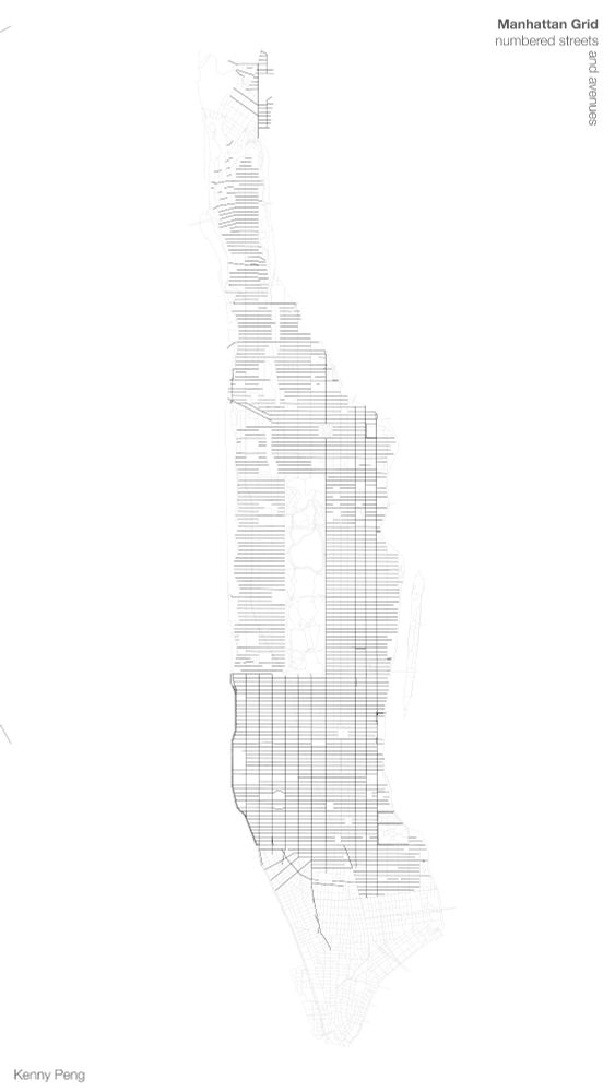
For #30DayMapChallenge day 11, a minimal map from @kennypeng.bsky.social.
Kenny extracts minimal elements from a not-as-minimal-as-it-seems object: the Manhattan street grid. "I show how Manhattan’s numbered grid of streets and avenues is more complicated than you might realize," he says.
17.11.2025 14:43 — 👍 11 🔁 3 💬 0 📌 2
They say: "We softly overlap point locations of these ladrilleras across Mexico (downloaded from DENUE) and scores for proximity to these kilns across the country, computed as the total inverse distance each ladrillera. This score is presented for each 50km point across the country, on a log-scale."
15.11.2025 17:19 — 👍 1 🔁 0 💬 0 📌 0

#30DayMapChallenge day 10: Air
@jessiefin.bsky.social + Francisco Marmolejo-Cossío visualize the presence of ladrilleras, or brick kilns, which emit pollution across the state. Data cleaned by Jacqueline Calderón and Lizet Jarquin at UASLP.
Full interactive map: tinyurl.com/map10-air
15.11.2025 17:19 — 👍 8 🔁 2 💬 1 📌 0

#30DayMapChallenge day 9 asked us to get off our screens. @annaloganmc.bsky.social's "analog" map is a hand-painted postcard! 📫
"I chose to paint a postcard of a map of Ann Arbor where I currently live showing the Huron River!" she says
14.11.2025 20:42 — 👍 13 🔁 5 💬 0 📌 0
NYC Coffee Shop Density — World Urbanism Day (D3)
You can play with the map, visualizing individual points rather than cells or hiding chain coffee shops, at the link: gsagostini.github.io/documents/ma...
14.11.2025 17:09 — 👍 3 🔁 0 💬 0 📌 0

#30DayMapChallenge day 8: Urban
Chae Won Lee uses the Overpass API to visualize current coffee shop density in New York with an interactive map. Here's a snippet.
14.11.2025 17:09 — 👍 10 🔁 1 💬 1 📌 0
Gabriel writes: "Many accessibility works do a great job at quantifying disparate access to a single type of service. But urban access implies a relative ordering of things close and far to you. This is a cheeky title that proposes a spatial relationship between transit and food deserts."
13.11.2025 14:27 — 👍 2 🔁 0 💬 0 📌 0

Day 7 of #30DayMapChallenge asked us to think about accessibility. @gsagostini.bsky.social considers two metrics of access simultaneously: distance to a Subway and distance to the subway.
13.11.2025 14:27 — 👍 101 🔁 18 💬 4 📌 3
YouTube video by Atmika Pai
ArcGIS Maps SDK in Unity (Testing Samples)
You can find her full exploration on YouTube!
www.youtube.com/watch?v=ALzn...
12.11.2025 18:40 — 👍 0 🔁 0 💬 0 📌 0
"I wanted to step into a designer's shoes and see what tools are available to them, so I chose to set up ArcGIS Maps SDK for Unity and explore their sample project. The 3rd-person controller lets you navigate cities as a character, while the viewshed analysis calculates sight lines from any point."
12.11.2025 18:40 — 👍 1 🔁 0 💬 1 📌 0
#30DayMapChallenge day 6: dimensions
Atmika Pai dove into the ArcGIS Unity SDK to see how architects & designers plan in 3D. She explored 15 features from geocoding to viewshed analysis, all in an immersive game engine! Here's a video teaser of her map.
12.11.2025 18:40 — 👍 5 🔁 2 💬 1 📌 0

The Welikia Project
Explore the landscape before New York.
Jennah says "I was interested in examining how historical wetlands in the city correspond to modern-day flooding risk. I was inspired by articles that came out shortly after Hurricane Ida, and my own experience with flooding in Hurricane Sandy."
Data comes from the Welikia Project
www.welikia.org
11.11.2025 17:01 — 👍 6 🔁 0 💬 0 📌 1

We might be a few days delayed on the #30DayMapChallenge, but our day 5 submission spans almost 250 years of history! Our "Earth" map comes from @jennahgosciak.bsky.social, who compared the original ecology of New York City to present day variables.
11.11.2025 17:01 — 👍 12 🔁 1 💬 1 📌 2
Spatial inequality, housing, education, and quantitative social science | Sociology and Social Policy PhD @ Princeton + Office of Population Research
Covering housing and homelessness in NYC for @citylimitsnews.bsky.social. urban planner and NY Liberty diehard 🏀🗽
patrickspauster.com
Professor of Transport Data Science
NLP, ML & society, healthcare.
PhD student at Berkeley, previously CS at MIT.
https://rajivmovva.com/
Assistant professor of CS at UC Berkeley, core faculty in Computational Precision Health. Developing ML methods to study health and inequality. "On the whole, though, I take the side of amazement."
https://people.eecs.berkeley.edu/~emmapierson/
CS PhD student at Cornell :)
CMU CS ‘23
https://erica-chiang.github.io
🌎 Master’s student at UofM SEAS
🗺️ Geospatial Data Science
🎨 Watercolor Artist
Data Scientist in Berlin
Former Bard College prof
For my after-work alter-ego, see @elstersen.bsky.social
Support Ukraine! 🇺🇦
A nonprofit newsroom committed to in-depth reporting & commentary on New York City housing, homelessness, and other pressing issues. www.citylimits.org
Get involved: https://bit.ly/42jAa0b
City Hall reporter / New York Playbook co-author @politico.com. From 🇸🇪. Have a tip? DMs are open or reach me at csommerfeldt@politico.com
https://www.tandfonline.com/journals/cres20/about-this-journal#aims-and-scope
We empower urban planners, developers, and municipalities with intuitive data tools that streamline site analysis and planning. By bridging the gap between policy and development, our platform helps create sustainable, efficient, and resilient cities.
Demographics | Geospatial | Data Science | Open Source
PhD in InfoSci @Cornell working on ethics & statistical privacy. Census nerd @NCoC and fmr Gtown. Brooklyn-based Capetonian
PhD candidate in Information Science at Cornell University.
PhD student @ Cornell info sci | Sociotechnical fairness & algorithm auditing | Previously Stanford RegLab, MSR FATE, Penn | https://emmaharv.github.io/
Mostly making maps about the United States.
#Cartography | #GIS | #Maps
https://antonioantoine.com/
Assistant Prof at Boston College. Somewhere between ML theory and EconCS
www.jessiefin.com
The National Bureau of Economic Research is dedicated to conducting and disseminating nonpartisan economic research.
nber.org
Bartlett Centre for Advanced Spatial Analysis | @thebartlettucl.bsky.social | Website: ucl.ac.uk/bartlett/casa