This is pretty cool. I am near the middle of the Geospatial Professionals.
11.02.2026 01:55 — 👍 11 🔁 1 💬 0 📌 0
I love a custom north arrow.
09.02.2026 02:54 — 👍 0 🔁 0 💬 0 📌 0
Our paper “Inferring fine-grained migration patterns across the United States” is now out in @natcomms.nature.com! We released a new, highly granular migration dataset. 1/9
05.02.2026 17:30 — 👍 69 🔁 27 💬 2 📌 5

Map identifying the approximate regions where various Indigenous groups lived in North America in 1776.
The Utah Historical Society just produced a new, excellent map of "The Peoples of North America in 1776." Great resource for anyone teaching, writing, presenting about Native peoples as part of their 250th work. america250.utah.gov/power-of-pla...
03.02.2026 13:48 — 👍 1286 🔁 498 💬 34 📌 45
Five classes I took in college.
- Intro to Art (I still think about this class)
- United States History in the 1970s
- Climatology
- German Fairly Tales
- Microeconomics (yuck)
Honorable mention for statistics. Also, taking an econ class dropped my opinion of econ into the toilet. Lol
31.01.2026 23:03 — 👍 2 🔁 1 💬 0 📌 0
I was surprised to see so many Gen X locations, but then I remembered they are between two massive generations. If there is a decent size Boomer population in the tract, it will probably pull the median into Gen X territory.
31.01.2026 18:55 — 👍 1 🔁 0 💬 0 📌 0

A map showing the spatial distribution of median generations across the contiguous US. The four main generations are: Boomers (1946-64), Gen X (1965-80), Millennials (1981-96), and Gen Z (1997-2012).
I made a Median Generations map of the US for a contest, but I missed the deadline. 😅 The generations are based on the median age of census tracts in 2023. The urban areas are tract centroids, and the rural areas were dasymetrically binned to a 10km grid.
#gis #cartography #gischat
31.01.2026 18:55 — 👍 6 🔁 0 💬 1 📌 0
Just an incredible and unusual landslide at Niscemi, Sicily, Italy, as captured by @planet.com SuperDove satellites 🧪⚒️🛰️
29.01.2026 23:24 — 👍 136 🔁 58 💬 7 📌 8
Gotcha! There are a few map contests going on, I wasn't sure. lol
28.01.2026 00:52 — 👍 1 🔁 0 💬 0 📌 0
Which map gallery are you referring to?
27.01.2026 23:54 — 👍 1 🔁 0 💬 1 📌 0
Somehow I had three art classes in high school in the middle of nowhere AL! Maybe four, now that I think about it.
27.01.2026 23:53 — 👍 1 🔁 0 💬 1 📌 0
Dang, I wish I had the option of a printmaking class!
27.01.2026 21:36 — 👍 3 🔁 0 💬 1 📌 0
Animation showing the plunge of cold Arctic air which is causing disruption to flights and has left almost a million people without power
Read
Martha Muir and Ilya Gridneff's report
www.ft.com/content/8757...
26.01.2026 16:53 — 👍 28 🔁 11 💬 2 📌 0
For context, before 1980, #Nashville temperatures hit 0°F an average of once per winter. Because of #GlobalWarming, what used to be an annual event has only happened 4 times in the last 30 years.
Similarly, before 1980 we got 12" of snow in an average winter. Since 2000, it's around 4".
24.01.2026 16:27 — 👍 11 🔁 7 💬 1 📌 1
Very cool! Did you make the web map with AGOL or FOSS?
25.01.2026 18:41 — 👍 0 🔁 0 💬 1 📌 0

Increasing hazard situational awareness is always worthwhile, and disaster maps are never excessive. I made this US #WinterStorm map with a dark background (save battery during outages), a vertical layout (mobile viewing/sharing), colorblind friendliness, and county/city references. Source: #NOAA
24.01.2026 12:45 — 👍 2 🔁 2 💬 0 📌 1
That is wild! An orographic lift and lake effect combo.
23.01.2026 20:42 — 👍 1 🔁 0 💬 0 📌 0
This is something I want to incorporate into my river workflows.
22.01.2026 23:03 — 👍 2 🔁 0 💬 0 📌 0
Do you appreciate @nws.noaa.gov's posts on Bluesky?
Did you know that this account is a pilot program that may or may not be continued and even expanded to NWS field offices?
NWS is soliciting comments here! www.surveymonkey.com/r/PrototypeN...
Press release:
www.weather.gov/media/notifi...
22.01.2026 19:53 — 👍 1257 🔁 664 💬 25 📌 47
#gischat
21.01.2026 15:02 — 👍 4 🔁 0 💬 0 📌 0
GIS After Dark presents "Mapping and Cartography at Esri"
GIS After Dark presents "Mapping and Cartography at Esri"
The first JHU GIS After Dark in 2026 is on February 5th from 7-8pm featuring Lauren Teirney from ESRI. The event is free and open to the public, however, you need register to attend.
#gis #gischat
www.eventbrite.com/e/gis-after-...
16.01.2026 20:55 — 👍 4 🔁 0 💬 0 📌 0

A screenshot of QGIS showing the labeling of Great Smoky Mountain National Park feature. The label shows the name of the park, the field name and value of the largest forest type.
![Screenshot of QGIS showing the expression to find the highest value from a range of fields. The code reads as:
concat( "PARKNAME", '/',map_akeys(attributes())[array_find(map_avals(attributes()), array_max(array_slice(map_avals(attributes()), 10, 148)))], '/' , array_max(array_slice(map_avals(attributes()), 10, 148)))](https://cdn.bsky.app/img/feed_thumbnail/plain/did:plc:vxgrriczkvh2dojfuogcju2n/bafkreibba47gbphqr5oufxcsf7mw23rpzgdgnx2oowf3g5pvyeh5ue2ueu@jpeg)
Screenshot of QGIS showing the expression to find the highest value from a range of fields. The code reads as:
concat( "PARKNAME", '/',map_akeys(attributes())[array_find(map_avals(attributes()), array_max(array_slice(map_avals(attributes()), 10, 148)))], '/' , array_max(array_slice(map_avals(attributes()), 10, 148)))
This simple label took me over day to make. I am still learning expression builder in #QGIS. I needed the highest value for each feature from over one hundred attribute columns AND the name of the field name. The worst part is I don't know if I will use this info. lol
15.01.2026 20:54 — 👍 8 🔁 0 💬 0 📌 1

Multivariate map of Canada showing environmental vulnerabilities – biodiversity loss, water stress, soil degradation, and deforestation – alongside accumulated climate events from the past several years – including floods, wildfires, long-term sea level rise, and droughts. The map combines these eight impacts via small pie charts, that when combined represent the intensity of climate-change risks.

Eight small maps of Canada arranged in a grid showing climate change vulnerabilities – biodiversity loss, water stress, soil degradation, and deforestation – alongside accumulated climate events from the past several years – including floods, wildfires, long-term sea level rise, and droughts
couple interesting maps of climate change vulnerability across Canada by Isabeaux Graham on our team
check out more here: schoolofcities.utoronto.ca/layers-of-cl...
#maps #gis #canada #climateChange
14.01.2026 21:23 — 👍 15 🔁 3 💬 0 📌 0
This is a very cool idea.
15.01.2026 04:42 — 👍 6 🔁 0 💬 0 📌 0
Very interesting read. About halfway through, I realised it was published in 1908!
14.01.2026 20:10 — 👍 2 🔁 0 💬 0 📌 0

A map where only the text labels and point symbols are visible
Labeling maps is a peaceful practice, and often is half the job of a cartographer. I'm sure seas will be drained and skies will be blackened so that AI can do it in our stead in a year or two, but for now, I always enjoy looking at a "map minus map" version of completed work.
10.01.2026 02:36 — 👍 32 🔁 3 💬 1 📌 0

A map showing the forest types and elevation in the lower 48 United States. The forests are shown in various shades of green, yellow, and red.
A work-in-progress map of the Forests in the lower US. I haven't decided if I am going to display and label the National Parks and/or Forests yet. Things get pretty busy on the West Coast.
The legend is going to be a nightmare and I am not looking forward to it. 😂
#gis #gischat #cartography #map
09.01.2026 18:32 — 👍 22 🔁 3 💬 2 📌 0
Congrats Raechel! 🎉
09.01.2026 17:32 — 👍 1 🔁 0 💬 1 📌 0
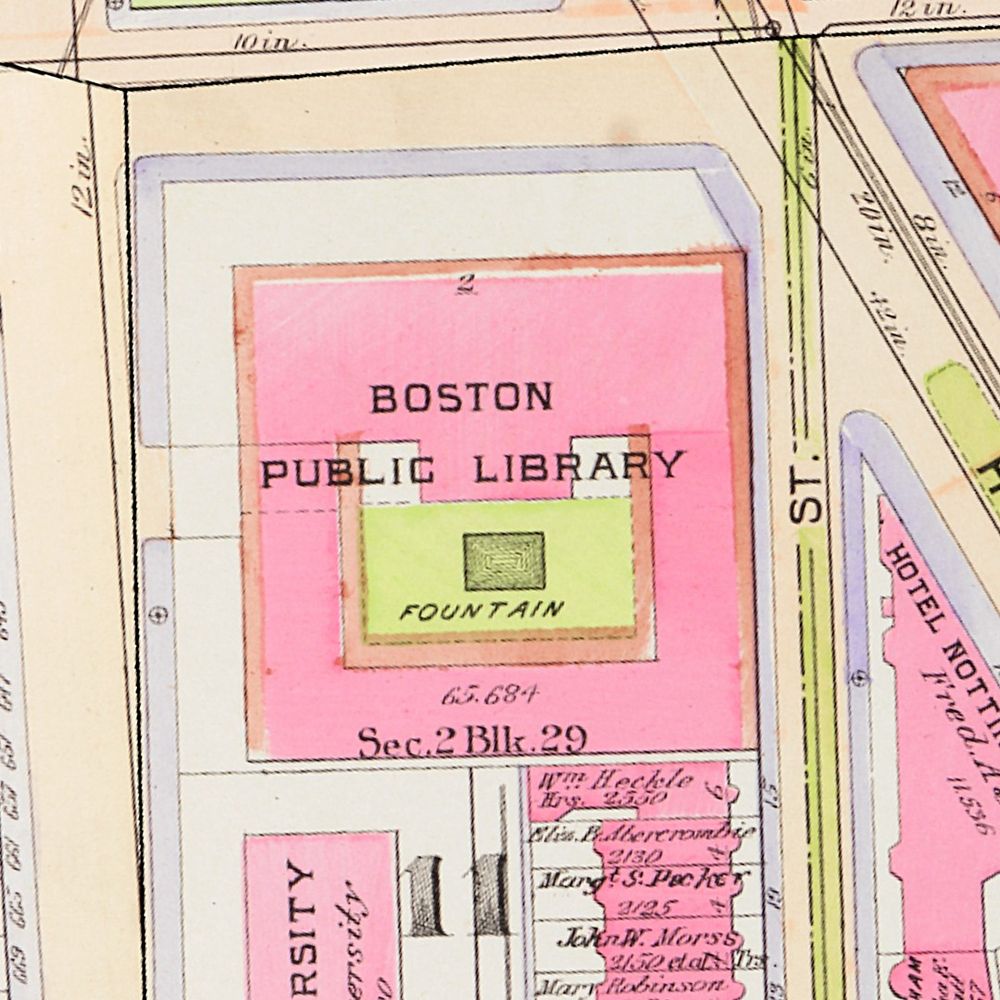
We use maps, geography, and history to understand the connection between people and places in Boston, New England, and beyond.
linktr.ee/bplmaps
British Cartographer & Artist living in Huntsville, Alabama.
Map maker & GIS consultant.
Including hand-drawn plausible fictitious maps
https://artimaps.com/
Data analyst/scientist making data analysis software, #datavis, #datascience , etc, nature photography, some creativity and hobbyist personal complex medical research . ( Did I miss anything?... well, #mecfs ;)
miskaknapek.eu
New & vintage stationery from around the world, since 2009. Our shop is at 12 Bury Place, London WC1A 2JL. https://www.presentandcorrect.com
The home of terrible maps with a pinch of humour
terriblemaps@gmail.com
GIS specialist at Geo-IT bv. I usually post about #geospatial related subjects // I can also be found on Mastodon: https://fosstodon.org/@michelstuyts // OSGeo Charter Member
=> maintainer of GeoNe.ws @geone-ws.bsky.social
maps, graphics, cities, etc.
website: https://jamaps.github.io/
github: https://github.com/jamaps
~9-5 M-F: https://schoolofcities.utoronto.ca/research-type/data-visualization/
Self employed Design & Interaction developer at Elastiq Ltd.
PhD Geog Teaching and researching #climatechange #GIS #remotesensing with a focus on treeline
Geologist, working on safer communities.
⚠️ #ClimateRisks, #NaturalHazards & #DRR
🌊 #FloodRisk Management
🛰️ #EarthObservation & #GIS
🚨 #RiskComm
Also in 🏀, ⛵️, 🏃 and 👨🌾.
👉 niklasjordan.com
Data guru @Esri. All things environmental.
Data viz enthusiast. Bookworm.
Github: https://github.com/DevJupyHUB/
TW | Cartography, GIS, Transportation, Urban planning, Dataviz | In ㄎㄧㄤ we trust | DM open | Wanderlust |
Twitter => https://twitter.com/yanchen00
Mastodon => http://mastodon.social/@yanchen00
@cartonaut elswhere
Map-o-phile / GIS wrangler / M.S. GIS / GISP / mischief / 🗺️ / solvitur ambulando
R, data science, dataviz, maps, experimental design, raytracing. Developer of rayshader, rayrender, and the rayverse | PhD in Physics from Johns Hopkins | Penn
Graphics Editor at The New York Times 🇺🇸| former Reuters 🇸🇬 | South China Morning Post 🇭🇰 | La Nacion 🇨🇷
Health Data Science | 📊 DataViz | 📖✨️ | 🐾
LinkedIn: linkedin.com/in/darakhshannehal
GitHub: github.com/darakhshannehal
PhD student at Cornell Tech | he/him | cities + equity + spatial everything | fan of cats and Taylor Swift | gsagostini.github.io
Official social media for the Urban Data working group. Researchers at the intersection of data, cities, people, and space. Read more and join us at https://urban-data-science-eaamo.github.io