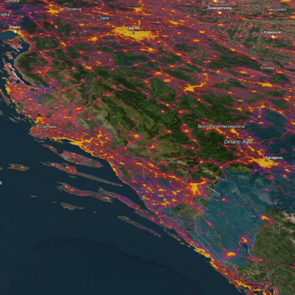
❄️🚢 Using 6 years of AIS data & NOAA sea-ice records, I tracked vessels completing the Northern Sea Route during seasonal ice retreat. Despite global shocks (sanctions, etc), 2021 saw 92 ships vs just 10 in 2010. Visuals show daily sea-ice + tracks. Data: Kpler & MarineTraffic
30.07.2025 08:27 — 👍 3 🔁 1 💬 0 📌 0
Yes correct, the arrow is normalised by speed and tanker size to an extent. With increased spoofing some of the tracks ping in strange directions so my workflow culls some of these leaps leading to the vessel looking like it disappears. I have an infographic I’ll share on spoofing in the region 👍
20.06.2025 05:02 — 👍 1 🔁 0 💬 0 📌 0
🗺️ I've spent a lot of time the past week looking at data in the Strait of Hormuz so here is a quick animation showcasing the sheer volume of activity in the Persian Gulf last Friday. The data highlights "Tanker" only vessels (AIS code 80-89) so everything from Crude Oil Tankers to LNG Tankers.
19.06.2025 12:54 — 👍 67 🔁 31 💬 3 📌 3
blobs haha! We really wanted to use our MarineTraffic arrows but the problem with fishing is there are long periods of static activity so the directions swing so much the vessels look like helicopters! Hence the blobs - no problem with direction 😅
03.04.2025 09:40 — 👍 1 🔁 0 💬 0 📌 0
#DataVizThursday 🐟 Here is a new #dataviz exploring fishing activity off Peru in 2024 using Kpler data. 38% of vessels near the EEZ were Chinese flagged. The heatmap reveals growing DWF patterns since 2017. Maritime data tells powerful stories—more to come! #dataviz #maritime #AIS #3d #map
03.04.2025 09:27 — 👍 16 🔁 4 💬 1 📌 1
Hey - I have some basic tuts on my Mapzilla website for Houdini, off the top of my head, @julianhoffmann.bsky.social recently did a blender training session for 3d mapping and @peterincan.bsky.social has also produced guides for geoanimations in blender - both amazing 3d designers 👌
21.03.2025 07:42 — 👍 2 🔁 0 💬 2 📌 0
My first month at Kpler was all about bringing AIS data to life with 3D animation. 🚢
From design-led R&D to data processing workflows & render tests (Octane, Redshift, Cycles), it’s been a deep dive into geography, scale & motion. More experiments & data stories soon—watch this space!
#dataviz
18.03.2025 12:03 — 👍 22 🔁 2 💬 2 📌 0
I really enjoyed developing these clean concepts and motion effects to showcase various products/ideas present in TomTom's Orbis Maps. #3d #animation
16.12.2024 10:56 — 👍 19 🔁 2 💬 1 📌 0
This was made almost entirely in Houdini and rendered using Octane. 👍
22.11.2024 08:49 — 👍 1 🔁 0 💬 0 📌 0
A snippet of an animation I created for TomTom earlier this year as part of their Traffic Index campaign for NYC. That probe data is 🔥 #dataviz #map
21.11.2024 12:33 — 👍 51 🔁 11 💬 2 📌 0
Here's a little collaboration I made with infogr8 animating socioeconomic data in N America. It shows a segmented version of "Joblessness" and the change from 1990-2019. #dataviz
18.11.2024 09:35 — 👍 13 🔁 0 💬 0 📌 0
YouTube video by Craig Taylor
Ito World - DataViz Greatest Hits
Hi Everyone!
As I end an era at Ito World I thought I'd start a new era here too. Great to see/hear so many of you again. 👋
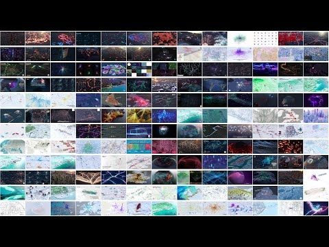
🗺️ YT of my 7 year Ito dataviz compilation below
youtu.be/_Hc4bL7LENY?...
16.11.2024 08:49 — 👍 17 🔁 4 💬 1 📌 0
A #DataViz challenge 📊 by @cedricscherer.com and @drxeo.eu
Supported by @wendyshijia.bsky.social and @ansgarw.bsky.social
More info on Github: https://github.com/30DayChartChallenge/Edition2024
Cartography, Data Vis, Animation
A @nacis.bsky.social publication dedicated to furthering the art and craft of cartography through inspirational examples.
https://atlasofdesign.org/ - Volume 7 available now!
It's all about astrophotography.
Graphics, visualizations, maps and more from The Washington Post.
We pioneer through data, design and technology to unravel the world’s complexity. We connect people to data to empower insights, reveal new perspectives, and inspire change.
cleverfranke.com
Part of ADC Consulting
📊📈
#dataviz
#datavisualization
Creative Technologist | Data Visualization Designer & Developer | Researcher.
Building websites at nussknagger.com
Always learning something new. (he/him)
https://sebastianlammers.com/
part beagle and part disaster
Exploring the overlap of science, art, data and randomness.
Building geospatial software · data narratives · creative coding
In my previous life I was an archaeologist · GZ
Information Management Officer at UNHCR specialized in #DataViz and #maps. Love #rstats stuff, especially making charts with #ggplot2.
Cartography and data-viz enthusiast. “Hobby-etymologist”. 🇪🇺 Europhile of multiple identities 🇷🇴/🇭🇺 |✸☽︎|. Immigrant 🇫🇷. Was an architect once.
Data Visualisation Manager at a health think tank 👩💻 Mostly talk about data, #dataviz, #opendata, #maps, #python and #data4good 📈 Into cycling, yoga, sourdough, puns and more. Views my own.
Also active on Mastodon + Linkedin
Front-end cartographer. Research Engineer in Geographic Information Science at CNRS & UAR RIATE. Author of Mad Maps (2019) and Practical Handbook of Thematic Cartography (2020). Observablehq ambassador.
See https://neocartocnrs.observablehq.cloud/cv/
I paint the world with #rstats and teach you how to unleash your inner #map artist. Join my map adventures and tutorials now:
https://youtube.com/@milos-makes-maps
Senior editor, data + viz @bloomberg /
formerly @nytclimate
✨✨✨✨✨
Data art since 2010, collecting data since I was 4yo. Poetic Web. Data and generative artist turning sound and music into visuals. Lecturer, TEDx speaker, tizianaalocci.com | London based | IG: tiz.alocci | Founder of dataviz studio https://necessity.ink/
Visualization, data, AI/ML. Professor at CMU (@dig.cmu.edu, @hcii.cmu.edu) and researcher at Apple. Also sailboats ⛵️ and chocolate 🍫.
www.domoritz.de