Thanks for the quick answer but I already did that. Maybe it's because I use github.com/eddelbuettel... to install my packages and arf doesn't seem to find them.
03.02.2026 09:35 — 👍 0 🔁 0 💬 2 📌 0
@cvidonne.bsky.social
Information Management Officer at UNHCR specialized in #DataViz and #maps. Love #rstats stuff, especially making charts with #ggplot2.
Thanks for the quick answer but I already did that. Maybe it's because I use github.com/eddelbuettel... to install my packages and arf doesn't seem to find them.
03.02.2026 09:35 — 👍 0 🔁 0 💬 2 📌 0Thanks for sharing! How do you manage to have it attached in vscode like radian or the native console? I can have it work without issue but can't have it attached to vscode like the others.
02.02.2026 20:14 — 👍 0 🔁 0 💬 1 📌 0It’s real. 📊
Source: www.cfr.org/expert-brief...

One year after the political transition began, more than one million Syrians have returned home.
📊 Explore @unhcr.org latest data story, “Coming Home”, to understand what’s driving these returns.
👉 Dive into the full story: dataviz.unhcr.org/product-gall...
#dataviz #UNHCR #refugees

a table about lemurs

a table about students and schools

a table about wines
{tinytable} 0.14.0 for #RStats makes it super easy to draw tables in html, tex, docx, typ, md & png.
There are only a few functions to learn, but don't be fooled! Small 📦s can still be powerful.
Check out the new gallery page for fun case studies.
vincentarelbundock.github.io/tinytable/vi...

A ggplot2 chart that showcases adding personal branding thanks to the 'ggbranding' package
🚀 Just released **ggbranding** (v1) – a tiny R package that lets you brand `ggplot2` charts with Font Awesome 7 icons.
📝 Blog: gnoblet.github.io/blog/ggbrand...
💻 Code: github.com/gnoblet/ggbr...
#opensource #branding #package #rstats #dataviz #ggplot2

I am beyond excited to announce that ggplot2 4.0.0 has just landed on CRAN.
It's not every day we have a new major #ggplot2 release but it is a fitting 18 year birthday present for the package.
Get an overview of the release in this blog post and be on the lookout for more in-depth posts #rstats

Bump chart faceted by world regions showing the top countries of asylum for refugees, asylum-seekers, and others in need of international protection. Overall patterns are stable, with some short-term ups and downs across regions.
Couldn’t resist doing the same for countries of asylum.
Turns out the picture is way more stable, with a few ups and downs.

Bump chart faceted by world regions showing the top countries of origin of refugees, asylum-seekers, and others in need of international protection. Asia and Africa rank consistently high, driven by long-term crises such as Afghanistan and Sudan. The Americas and Europe also appear high due to more recent crises in Venezuela and Ukraine.
Inspired by @nrennie.bsky.social excellent #TidyTuesday plot on the power of passports, I adapted the idea to look at refugee origins.
This chart ranks countries of origin of refugees, asylum-seekers, and others in need of international protection, grouped by region.
#RStats #ggplot2 #Refugees


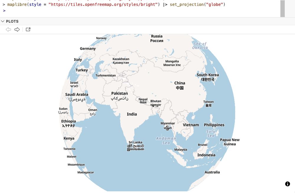
Learned today about @OpenFreeMapOrg - free, high-quality vector tiles for your maps and apps!
Use them in #rstats with mapgl by passing the URL to the style param, e.g.:
maplibre(style = "tiles.openfreemap.or...")
Styles include "positron", "bright", and "liberty" with 3D!
Feeling you on this — {unhcrthemes} is in the same dependencies nightmare right now.
26.08.2025 13:41 — 👍 0 🔁 0 💬 0 📌 0
Just published: our new data story on efforts to protect South Sudan’s most vulnerable — including children, women, and persons with disabilities.
Explore how protection monitoring and partnerships are making a difference: dataviz.unhcr.org/product-gall...
#refugees #unhcr #protection
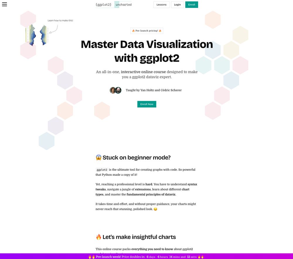
The landing page of the course "ggplot2 uncharted" with the title teasing it with "Master Data Visualizations with ggplot2".
Excited to launch "ggplot2 [un]charted" with @yan-holtz.bsky.social! 🎉
An online course to master #ggplot2 with exercises, quizzes, and modules—and hands-on code running in your browser!
Still WIP—sign up now for a limited discount:
👉 www.ggplot2-uncharted.com
#rstats #DataViz #DataVisualization
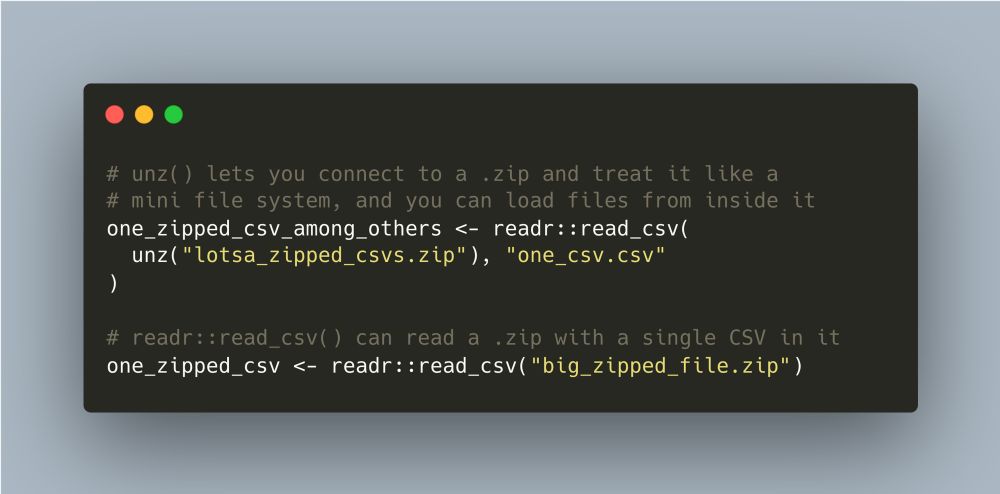
# unz() lets you connect to a .zip and treat it like a mini file system, # and you can load files from inside it one_zipped_csv_among_others <- readr::read_csv( unz("lotsa_zipped_csvs.zip"), "one_csv.csv" ) # readr::read_csv() can read a .zip with a single CSV in it one_zipped_csv <- readr::read_csv("big_zipped_file.zip")
Thing I just learned in #rstats: unz() lets you connect to a .zip and load files from inside it without actually unzipping it (great for a file I'm working with that's 30 MB zipped and 1+ GB unzipped, with multiple CSVs in it)
18.04.2025 18:19 — 👍 232 🔁 46 💬 10 📌 3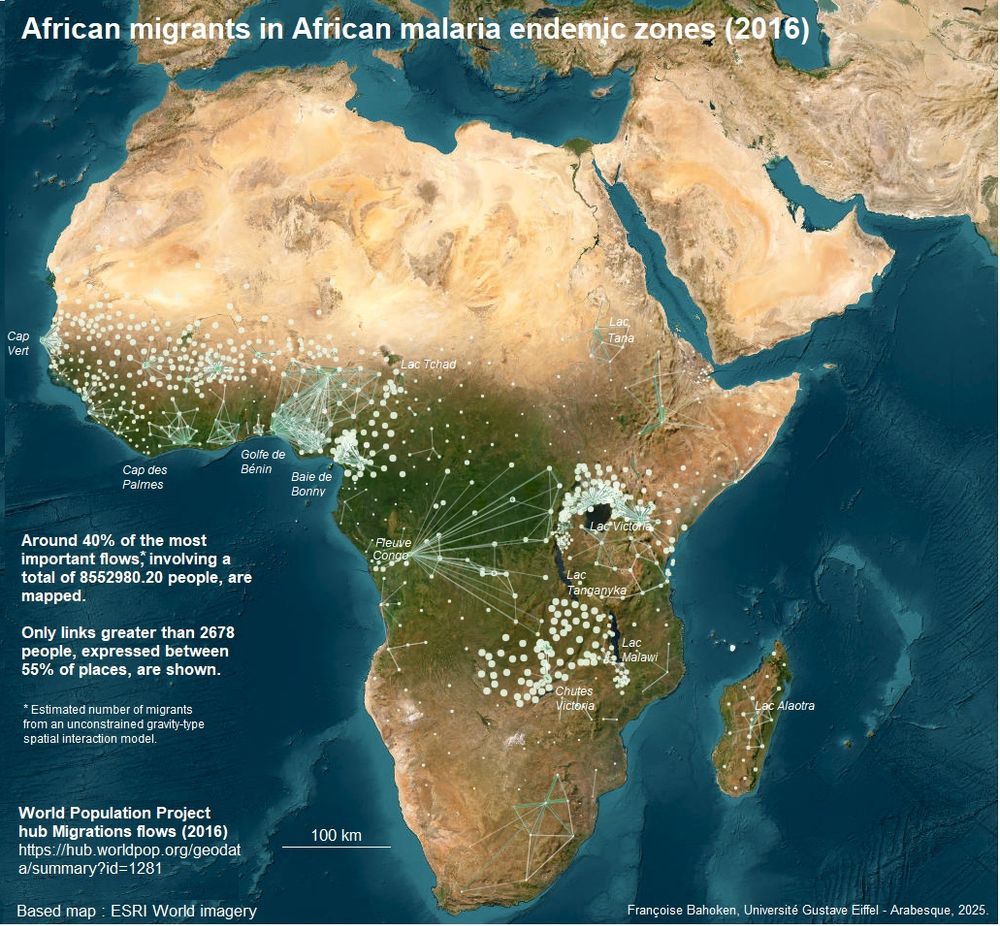
Géovisualisation de flux de migrants internes à la zone endémique paludéenne africaine, à partir des données du @worldpop-uos.bsky.social
Réalisée avec #Arabesque dans #Neocarto #flowmap
🔗 neocarto.hypotheses.org/21980

Sudan: Two years already.
Millions displaced. Needs rising. Attention fading.
📊 See the full data story: shorturl.at/wn8HU
#Refugees #dataviz #unhcr
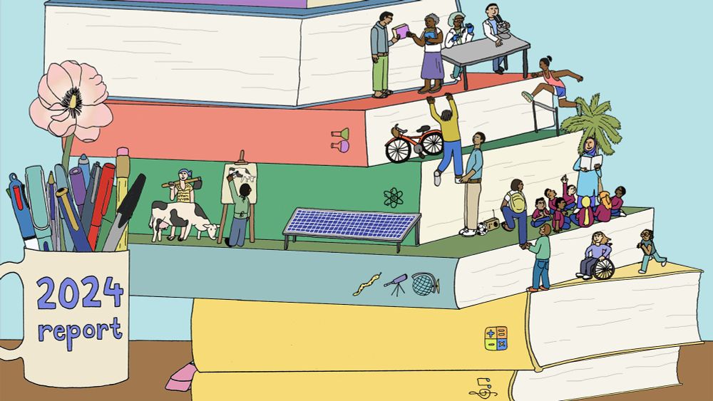
Mona Chalabi illustration for the UNHCR 2024 education report showing a pile of books that refugees children are climbing while learning and playing.
The Learning Divide
Our latest data story explores the stark educational challenges facing refugees in Mauritania and Mexico.
Explore the full story: dataviz.unhcr.org/product-gall...
#refugees #education #unhcr #dataviz

Map Migreurop 2022
One day, one map
Far from the reality of state control
#Migrations #Cartography #Walls #Deaths #Camps #Borders
Source: Migreurop, 2022

Behold #rstats:
My (draft) variable naming standard
😎
One more bonus update with two changes:
1. A diverging color palette centered at 4% lets us see which counties are doing great or doing poorly
2. That size legend was spaced funnily, but we can make it more compact with {legendry}
#rstats
www.andrewheiss.com/blog/2025/02...
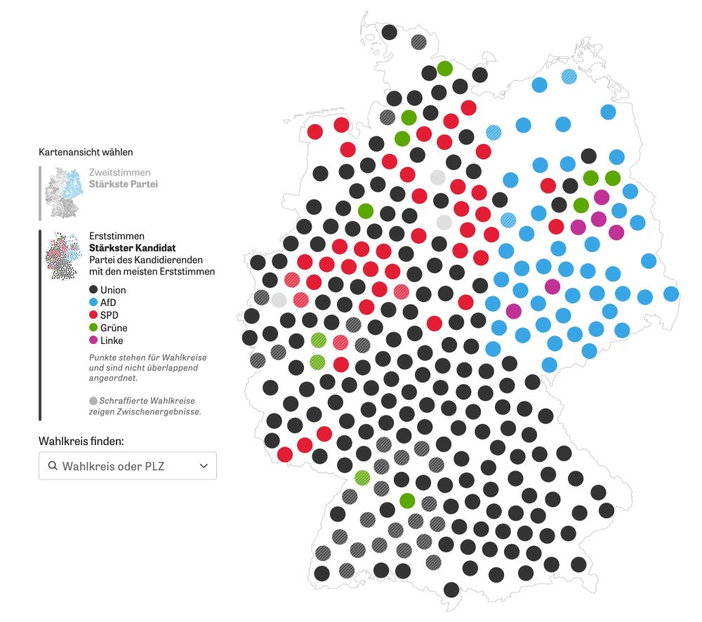
Cartogram of 299 German election districts
For the German election we wanted to use a cartogram of German election districts but didn't find anything good, so we created our own. Here's a little nerd thread how the final algorithm worked 🤓 🧵 #gis #cartogram #election #datavis #cartography
27.02.2025 16:48 — 👍 558 🔁 179 💬 18 📌 25Datawrapper (@datawrapper.de) has some cool new charts (def check them out)! One being these comparison bars.
Here's one way to do it in #RStats #ggplot2
blog.datawrapper.de/comparison-c...
ray.so/KDVci6B

Screenshot of an interactive world map using the Robinson projection showing 2023 aid commitments in each country

Western Europe mapped with a cropped Robinson projection with labels for each country

Egypt mapped with a cropped Robinson projection with labels for each country

Table of contents for the post: Working with map data Get map data Maps and projections with Observable Plot Built-in projections Other projections Filtering map data and adjusting projections Removing elements Quick and dirty cheating method: change the width or height Built-in projections and domain settings Other projections and .fitExtent() Arbitrary areas and .fitExtent() Working with USAID data Get USAID data Connect USAID data to the map data Improving the map Fixing labelling issues Some final tweaks The full game: Complete final code
New blog post! After archiving USAID data last week, I decided to play around with and recreate parts of the ForeignAssistance dot gov dashboard with #QuartoPub and #ObservableJS. I learned a ton about D3 projections and making pretty Javascript plots #dataskyence www.andrewheiss.com/blog/2025/02...
10.02.2025 22:55 — 👍 124 🔁 27 💬 6 📌 1
Selon “The New York Times”, le gouvernement de Donald Trump veut réduire les effectifs de l’Agence des États-Unis pour le développement international à moins de 300 personnes, contre plus de 10 000 actuellement.
Source : www.courrierinternational.com/article/etat...
If you have used #ggplot2 in the last couple of years you owe a great deal to @teunbrand.bsky.social who is behind most of the new features and fixes.
Read about his journey to become a part of the ggplot2 core team here:

📢 rredlist 📦 1.0.0 is now on #CRAN!!!
- upgrade to API v4 🤖
- handles API timeouts ⌚
- progress bar for multi-page queries 🚧
- IUCN color palette scales for ggplot2 🏳️🌈
- research pipeline and benchmarking vignettes 📄
- new logo 🦏
Docs 👉 docs.ropensci.org/rredlist/ind...
#rstats #iucn #redlist #api

Happy #Monday! Here’s something fun to get the week off to a good start!
🔮 What R package would you be based on your #zodiac sign?
Let me know if these resonate! 👀✨ #rstats #rladies
🧵👇 (1/13)
A tmap logo

A screenshot of the tmap CRAN webpage.
A map from tmap vignette
A map from tmap vignette
🚨 After years of development, the new version of #rstats tmap (4) is now available on CRAN! 🎉 Huge thanks to author Martijn Tennekes and all contributors.
🔧 Install: `install.packages("tmap")`
📚 Vignettes: https://buff.ly/4aAYNbq
📖 Book Chapter: https://buff.ly/43TokaF
#maps #tmap #rspatial
I wrote a bit about what it was like for me to join the tidyverse team to maintain ggplot2!
28.01.2025 09:21 — 👍 25 🔁 9 💬 2 📌 1
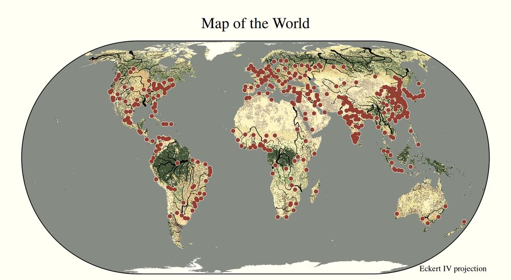
Map of missing migrants
By compiling multiple sources of data, we reach the astonishing figure of 71,000 migrants who have died or been missing at the European border since the early 90s. A hecatomb caused by the migration policies of European countries.
24.01.2025 06:12 — 👍 245 🔁 144 💬 14 📌 19