The image is a screenshot of a Github release page listing new features for the latest release of the @urbaninstitute/dataviz-component-library package. The changes list reads:
Fix: Typo; Theme size for h2 on smaller screens now renders at proper font size
Breaking: now accepts snippet props for custom background/foreground content and replaces getContext("scrolly") stores with the new useScrollyContext() helper; update slot markup and context access accordingly.
Breaking: SVGMap and its layer components now expose pointer interaction callbacks via props (onclick/onmousemove/onmouseout/onbgclick) instead of on:event listeners, and shared state is provided through useSVGMapContext()—replace any getContext("map") usage and update handler wiring.
Breaking: DatawrapperIframe emits interaction hooks through lowercase callback props such as
onvisrendered/onregionclick instead of Svelte on:event listeners; pass handler functions as props to receive chart events.
Breaking: The exported pymChildStore writable has been removed in favor of the rune-based
usePymChildContext() helper returned by ; import usePymChildContext() to interact with the active pym.js child instance.
Feat: All components use Svelte 5 runes syntax and move away from store-based state where possible.
Just landed a pretty big refactor of the Svelte-powered @urbaninstitute.bsky.social data viz component library that fully embraces runes syntax across all of our components. Svelte continues to be a flexible and powerful tool for our work.
Check out our code on Github github.com/UrbanInstitu...
30.10.2025 19:40 — 👍 21 🔁 5 💬 1 📌 0
between 60 and 80 percent of nonprofits in every state would be at risk of government funding were pulled.
21.02.2025 21:48 — 👍 2 🔁 0 💬 0 📌 0

What is the Financial Risk of Nonprofits Losing Government Grants?
check out how vulnerable your state's nonprofits might be if government funding is pulled.
my newest, short and sweet with a colorful tilemap and heat map indicators in the tables.
www.urban.org/research/pub...
21.02.2025 21:45 — 👍 1 🔁 1 💬 0 📌 1
Easter moves around!
28.11.2024 00:04 — 👍 2 🔁 0 💬 0 📌 0

🍎 School test scores released in PA: Statewide, scores were up in math and science and down in English.
Look up scores for Philadelphia-area schools + more from education reporter Maddie Hanna: www.inquirer.com/education/ps...
27.11.2024 19:45 — 👍 9 🔁 3 💬 1 📌 0
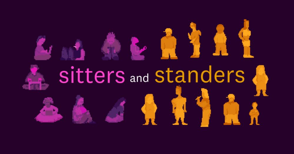
Sitters and Standers
The American worker divide: Those who sit, and those who stand
My latest: Sitters and Standers
Interactive: pudding.cool/2024/11/sitt...
Video: www.youtube.com/watch?v=sE_E...
21.11.2024 15:53 — 👍 13 🔁 7 💬 0 📌 3

A hex map of the United States shows the percent change in individuals who would have health insurance if enhanced PTCs are allowed to expire at the end of 2025 by state.
📊 A new data tool from @urbaninstitute.bsky.social shows that millions of Americans would lose their health insurance if the enhanced premium tax credits are allowed to expire at the end of 2025. Explore the tool to see who would be most impacted: www.urban.org/data-tools/h...
14.11.2024 16:33 — 👍 8 🔁 5 💬 0 📌 1
we on it 💪
18.11.2024 20:47 — 👍 2 🔁 0 💬 0 📌 0
🧵Okay let's do some BTS for Axios' elections #dataviz.
1/5: We used <canvas> for our big maps, which means we had to do some tricks with color hashes to get interactivity.
What the reader sees vs. what the computer sees.
Details on how it works:
observablehq.com/@camargo/can...
14.11.2024 17:28 — 👍 51 🔁 11 💬 3 📌 2

Poster with a small multiples grid of abstract shaded relief maps of the 48 four-thousand foot + peaks in New Hampshire’s White Mountains.
Poking around on The Map Center website and found this stunner from @awoodruff.bsky.social
www.mapcenter.com/store/p/4k-f...
cc @ecoandrewtrc.bsky.social
14.11.2024 00:59 — 👍 24 🔁 3 💬 0 📌 1

A map titled "The new continent of Arctica". It shows the world viewed from the North Pole extending about as far south as 55 degrees latitude. Sea is shown in pale green-blue, county outlines in brown. Canada is on the left of the map, Russia to the right and Northern Europe at the bottom. Overlaid in semi-transparent white is a mirror reflection of the Antarctic continental outline. It largely fits within the area of the Arctic Ocean overlapping northern hemisphere continents only in northern Canada and small parts of Alaska.
#30DayMapChallenge Day 11: Arctic
A bit short of time today, so had to rush this one, but quite pleased with an unexpected coincidence.
What would the continent of Arctica look like. How well could it fit in the Arctic Ocean?
Find out here observablehq.com/@jwolondon/t...
11.11.2024 19:19 — 👍 18 🔁 2 💬 2 📌 0

Is the Love Song Dying?
We categorized songs in the Billboard Top 10 to see if love songs are on the decline.
New project! Is love dead in pop music? 💕📉 We checked all 5,141 Top 10 hits since 1958 to see how much has *actually* changed. (Spoiler: it's not what most people think)
pudding.cool/2024/11/love...
11.11.2024 20:13 — 👍 28 🔁 9 💬 0 📌 7

Debt in America: An Interactive Map
This map shows the geography of debt in America at the national, state, and county levels. How does your community compare?
I brought this Debt in America tool data up to 2023. Check out credit card debt, medical debt, student debt, auto debt, and more, even subsetting by young adults 👀 apps.urban.org/features/deb...
11.11.2024 20:35 — 👍 4 🔁 1 💬 0 📌 0
I have a few more projects in my pipeline that are fairly D3 heavy, so watch out for those! my team is working on a good handful of innovative tools, charts, and explorers to take us through the end of the year, and we're so excited to show you soon.
17.07.2023 17:08 — 👍 1 🔁 0 💬 0 📌 0
This project is primarily built with Svelte and D3 and had a few more moving parts. if you want the full low-down, check out my git repo! https://github.com/UrbanInstitute/does-snap-cover-cost-meal-your-county-2022
17.07.2023 17:07 — 👍 2 🔁 0 💬 1 📌 0
this project was an awesome learning experience and I had a lot of support from our designer, Brittney Spinner, and my teammates, @aleszu.bsky.social, @mitchthorson.bsky.social, and @benkates.bsky.social. you'd better keep an eye out for this awesome crew, because big things are coming!!
11.07.2023 16:52 — 👍 0 🔁 0 💬 0 📌 0
👩💻 Creative developer; Data visualisation for Reuters Graphics
🖌️ Posting about data viz + art, creative coding 🌸
👩🎨 Organising c3s - community for co-creating with code in London
🦉 All views my own
🐈🐈⬛ are my joy
📍 London, sometimes Tokyo
Policy Researcher. Urban Institute, Family and Financial Well-Being Division. She/Her. Committed to intersectional race, class, and labor justice. Posts represent my own opinions.
City enthusiast and policy researcher. Studying real estate and community economic development.
The Urban Institute’s Housing Matters initiative provides data, research, and insights to advance solutions for affordable housing. https://housingmatters.urban.org/
K-12 ed lead at Urban Institute. Georgia Policy Labs founding senior director. RPPs, integrated data, veggie grower, and mama, too.
she/her | MPP | community development and transportation @UrbanInstitute.bsky.social | The Lab @ DC alum | 🎓 American University SPA & @MedillSchool.bsky.social | views my own
She/Her | Urban Institute, Housing Finance Policy Center | Ohio State University | views are my own
Housing finance + racial wealth equity research | public policy doctoral student at @priceschool.usc.edu | formerly at @urbaninstitute.bsky.social
Views (including WBB takes 🏀) my own.
Tax and budget analysis, data viz, #Rstats at Tax Policy Center, @urbaninstitute.bsky.social. Views my own.
https://taxpolicycenter.org/author/nikhita-airi
I love cities and graphs
Institute Fellow & Co-Director Disability Equity Policy Initiative @UrbanInstitute. Views my own.
Editor, garden obsessive, and queer about town. Editorial at American Insight, formerly Urban Institute, TalkPoverty, and Center for American Progress.
(Was) Disability+API+QT equity, foundation relations and DEI @UrbanInstitute. @UrbanInst_Union shill. BFA dramaturgy/directing @TheatreSchool. Views mine. FL+DC+CHI. they/them
All things climate change, adaptation, and affordable housing. Social policy researcher and co-lead of the Climate and Communities Program at Urban Institute.
📍DC with past lives in SF Bay Area, Santiago and Austin.
Providing training, resources and a community of support to journalists around the world. Join us at #IRE25 June 19-22 in New Orleans! 🔍 ire.org
I design digital products for people.
https://halftonecloud.com
Nature lover, science enthusiast & social justice advocate. ♻️ Passionate about human rights, feminism, racial equality, Indigenous reconciliation, immigrant rights, & LGBTQ+ inclusivity. 🌈🪶
Bookworm alert! 📚
Let's connect & inspire positive change! 🌱
Miami Herald | consumer team editor
💵Health | Shopping | Travel | Real estate
📝Story sculptor, Clarity clinician
🍊Florida man, Mr. 305, Family guy
I make charts at the NYT. Sometimes they're good...
https://www.nytimes.com/by/lazaro-gamio
https://lazarogamio.com/
Covering North Carolina politics for States Newsroom’s NC Newsline | dmv & maine & atx grown 🌸🦞🤘 | she/her