The real magic is ✨️regex✨️
15.10.2025 18:46 — 👍 6 🔁 1 💬 0 📌 0

A plot showing the "Prevalence of moderate or severe food insecurity in the total population of European areas (Northern, Eastern, Western, Southern)" as line charts from 2014 to 2024. Annual percentages (lines) and confidence intervals (ribbons) — Dotted lines show European average. Data: The Food and Agriculture Organization of the United Nations (FAO); Packages: {tidyverse, ggtext, patchwork, rnaturalearth, scales}; Visualization: C. Börstell. Next to each line chart is a map of Europe with the relevant countries (of the area) filled in with a color coding.
World Food Day #TidyTuesday
FAO's data on moderate/severe food insecurity across areas of Europe 🌍
Code: github.com/borstell/tid...
14.10.2025 12:27 — 👍 10 🔁 1 💬 0 📌 0

A scatter plot on a white background with blue dots clearly along a linear correlation line between x and y axes
In 2017, I collected a bunch of ratings for a project. The participants were a messy group and the survey tool and design were not ideal, so I always wanted to recollect better data with a better experimental design.
I just did. Seems like the old ratings were pretty solid after all.
12.10.2025 20:02 — 👍 8 🔁 0 💬 0 📌 0

A plot that says Euroleague Basketball teams by stadium capacity on a offwhite background and black/gray text. Each data point is plotted as a basketball (emoji) and text label with the name of the team(s) playing at the arena, along a parabola simulating the trajectory of a basketball shot towards a schematic basketball hoop located in the bottom right corner. A caption reads: "There are 20 teams in Euroleague Basketball, playing at 19 unique arenas with a median capacity of 12,700 spectators. The biggest arena by capacity is Belgrade Arena which hosts the teams Crvena zvezda Meridianbet and Partizan and seats up to 18,386 people. The smallest arena is Salle Gaston Médecin which hosts Monaco and has a capacity of 5,000. Data: EuroLeague & Wikipedia via {TidyTuesday}; Packages: {tidyverse, ggrepel, ggtext, glue, scales} ; Visualization: C. Börstell."
Euroleague Basketball #TidyTuesday
A mini dataset, so decided to find a way to plot stadium capacity in an interesting way: went with points along the trajectory of a basketball shot! Swoosh! 🏀
Code: github.com/borstell/tid...
#R4DS #DataViz
06.10.2025 13:06 — 👍 26 🔁 3 💬 3 📌 0
I did! Just one more reply down the thread! 🙂
bsky.app/profile/cbor...
05.10.2025 12:33 — 👍 1 🔁 0 💬 1 📌 0

Line chart showing a simulation of the Monty Hall problem. Two lines representing the strategies stay vs switch quickly converge around the ⅔ and ⅓ probabilities of winning the car, respectively
I just wanted to simulate the Monty Hall problem, but couldn't get why the host would sometimes pick the door that the contestant had already chosen
🚪🐐🚪🐐🚪🚗
04.10.2025 21:56 — 👍 0 🔁 0 💬 0 📌 0
Trying to debug for much longer than needed before realizing that
sample(3, 1)
is interpreted as
sample(1:3, 1)
Could not understand what the issue was, thinking it must be my own code, but finally looked at ?sample documentation... #RStats
04.10.2025 21:45 — 👍 7 🔁 0 💬 2 📌 0

A map of Sweden in 10 different panels, each showing the log odds frequency of different 3-letter place name endings in various shades of red (darker means higher prevalence; gray means no data).
Something like this!
Tweaked the calculation to something I had originally intended and included 3-letter endings only.
–arp is very Skåne
I like the distribution of the –red/–röd/–ryd endings, of the same origin
Code: github.com/borstell/maps
04.10.2025 21:28 — 👍 2 🔁 1 💬 0 📌 1
I haven't! But I should, I'll see if I can clean it up a bit, I was only trying to experiment with spatial data.
The method is definitely a bit weak as it's only looking among the just over 2000 "tätorter", which are already quite skewed in distribution and the number per municipality.
03.10.2025 21:28 — 👍 2 🔁 0 💬 2 📌 0

A graphic in the style of a yellowish page of sheet music. Title says "Taylor's Albums (melodized)". On the right, each album is represented by a line of sheet music. On the left, the text reads: "Each album as a single line of sheet music. The key of each track as a single note. Each note's duration as the relative track duration (z scored) across all albums."
It's super cool!
I used it for a bonus part TidyTuesday two years ago, making a tune out of Taylor Swift song data, saved as an mp3. Spoiler: the tune wasn't/isn't very good!
github.com/borstell/tid...
03.10.2025 21:24 — 👍 4 🔁 1 💬 0 📌 0
![library(lubridate)
yr <- 2025
# This doesn't work
ymd(yr)
#> Warning message:
#> All formats failed to parse. No formats found.
#> [1] NA
#-------
# TIRED
#-------
# I've done this for *yeeeeears*
ymd(paste0(yr, "-01-01"))
#> [1] "2025-01-01"
#-------
# WIRED
#-------
# The truncated argument tells {lubridate} that it can
# ignore up to 2 (in this case) formats to look for.
# Ordinarily `ymd()` looks for three formats: a year,
# a month, and a day. `truncated = 2` means it can skip
# the month and day parts
ymd(yr, truncated = 2)
#> [1] "2025-01-01"
ymd(c("2025", "2025-10", "2025-10-02"), truncated = 2)
#> [1] "2025-01-01" "2025-10-01" "2025-10-02"](https://cdn.bsky.app/img/feed_thumbnail/plain/did:plc:2zcfjzyocp6kapg6jc4eacok/bafkreihu4f54mnmgtyyl2u6azxu6iqdgjwrcte7hgdmv4cfyevyyexer3i@jpeg)
library(lubridate)
yr <- 2025
# This doesn't work
ymd(yr)
#> Warning message:
#> All formats failed to parse. No formats found.
#> [1] NA
#-------
# TIRED
#-------
# I've done this for *yeeeeears*
ymd(paste0(yr, "-01-01"))
#> [1] "2025-01-01"
#-------
# WIRED
#-------
# The truncated argument tells {lubridate} that it can
# ignore up to 2 (in this case) formats to look for.
# Ordinarily `ymd()` looks for three formats: a year,
# a month, and a day. `truncated = 2` means it can skip
# the month and day parts
ymd(yr, truncated = 2)
#> [1] "2025-01-01"
ymd(c("2025", "2025-10", "2025-10-02"), truncated = 2)
#> [1] "2025-01-01" "2025-10-01" "2025-10-02"
I just learned about the `truncate` argument in {lubridate} functions, which means NO MORE HACKY paste0(year, "-01-01") code to build dates when converting years to dates in #rstats
02.10.2025 17:43 — 👍 95 🔁 6 💬 6 📌 2
The meanings are more or less:
å = river
berg = mountain
kvarn = mill
mark = land
ö = island
ryd = open land
sta = place
torp = cottage
träsk = marsh
tuna = enclosed area, yard
Full disclosure I'm 100% not a historical linguist nor onomastician
01.10.2025 19:31 — 👍 5 🔁 2 💬 1 📌 0
Tun(a) comes from something like 'enclosed area, yard, plot of land' and is related to "town"!
01.10.2025 17:37 — 👍 3 🔁 1 💬 2 📌 0

A map of Sweden in 10 different panels, each showing the proportional frequency of different place name endings in various shades of blue
Distributions of endings in Swedish place names
#RStats #DataViz
01.10.2025 15:11 — 👍 44 🔁 10 💬 2 📌 1

ggplot2 styling
This post discusses one function in ggplot2: `theme()`. Find out about the glamour of graphics in this deep-dive article.
🎨 Theming got a huge overhaul with the latest #ggplot2 release. In honour of that @teunbrand.bsky.social has written a comprehensive deep-dive into styling your plots, covering both old and new functionality. Grab a coffee and dive in!
#rstats
01.10.2025 08:10 — 👍 139 🔁 42 💬 0 📌 3

A data visualization in the style of handwritten/-drawn notes on a piece of paper. Title reads "Cranes at Lake Hornborgasjön: Observations of cranes at the Swedish lake peak earlier over time". The graph shows ridgelines along dates from mid-March to end of April (x-axis) across the years 1994 to 2024 (y-axis). The first date each year where that year's maximum number of observations was reached is marked with a little handdrawn X on the year ridgelines. Across all years, there are lines showing the mean and median values for first max observations across years down the middle. X'es are generally farther to the right in early years (i.e. later in the spring) and farther to the left in more recent years (earlier in the spring). In the plot margins, there are embedded images of cranes in flight. Data: "Transtatistik", Naturum Hornborgasjön via TidyTuesday; Image: Gllawm, Wikimedia Commons curid=147233798; Packages: {tidyverse, magick}; Visualization: C. Börstell
I partially contributed to this week's #TidyTuesday dataset of crane observations at the lake Hornborgasjön, 🇸🇪
I made a minimalist plot of observation maxima – earlier over time – in the style of written notes.
{magick} magic for images!
Code: github.com/borstell/tid...
#R4DS #DataViz #ggplot2
29.09.2025 13:59 — 👍 32 🔁 4 💬 1 📌 0
Logo for the #TidyTuesday Project. The words TidyTuesday, A weekly data project from the Data Science Learning Community (dslc.io) overlaying a black paint splash.
TidyTuesday is a weekly social data project. All are welcome to participate! Please remember to share the code used to generate your results!
TidyTuesday is organized by the Data Science Learning Community. Join our Slack for free online help with R and other data-related topics, or to participate in a data-related book club!
How to Participate
Data is posted to social media every Monday morning. Follow the instructions in the new post for how to download the data.
Explore the data, watching out for interesting relationships. We would like to emphasize that you should not draw conclusions about causation in the data.
Create a visualization, a model, a shiny app, or some other piece of data-science-related output, using R or another programming language.
Share your output and the code used to generate it on social media with the #TidyTuesday hashtag.
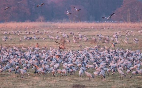
Large flock of cranes gathered in a grassy field during golden hour, with some birds in flight overhead and autumn-colored vegetation in the background.

Line chart showing the number of cranes per day at Lake Hornborga in Sweden during March and April from 2014-2021. Multiple gray lines represent different years, with the 2018 and 2021 seasons highlighted in blue. The chart shows crane migration patterns starting near zero in early March, building to peak numbers of 15,000-27,000 birds between March 30 and April 8 (highlighted in beige), then declining through late April. The highest recorded count was 27,300 cranes on April 3rd, 2019. Dashed lines indicate days when weather conditions made accurate counting difficult. A note explains that 2018 had unusually cold February temperatures causing later arrival. The chart is credited to Anna Thieme from Länsstyrelsen VG at https://transtat.lansstyrelsen.se/
@dslc.io welcomes you to week 39 of #TidyTuesday! We're exploring Crane Observations at Lake Hornborgasjön, Sweden (1994–2024)!
📁 https://tidytues.day/2025/2025-09-30
#RStats #PyData #JuliaLang #DataViz #tidyverse #r4ds
29.09.2025 13:38 — 👍 15 🔁 5 💬 0 📌 1
Since today is the #EuropeanDayOfLanguages, let's not forget that you are not required to keep your languages separate, pure, intact or in any way feel inadequate about your way of using your own language/s.
And don't let anyone take away your co-ownership of the languages you have.
26.09.2025 08:03 — 👍 60 🔁 22 💬 3 📌 5
Besides questionable variable names (test, testtest, test2, ...) and working in Untitled for hours, it's the 20+ lines of piping, including pipes inside join functions, all piped into ggplot with additional anonymous functions of subsetting and piping inside the geoms 🫣
24.09.2025 21:17 — 👍 5 🔁 0 💬 3 📌 0
Them in any other channel:
"We will organize an amazing thing, we will literally not tell you the date, location, contents or any other details here, please see our fb [link]" *logs off for the next 6 months*
24.09.2025 08:11 — 👍 5 🔁 0 💬 0 📌 0

And it's particularly sign languages in the Southern Hemisphere that have been added to the Glottolog database in the past 8 years.
23.09.2025 15:10 — 👍 18 🔁 3 💬 0 📌 0

A line chart with the title "Cumulative increase of documented languages by "family"/grouping across releases of Glottolog: only showing families with 10 or more languages". It shows the cumulative increase over time with releases of the Glottolog language database. "Sign languages" is highlighted in a turquoise line, steadily increasing, having increased by around 26% from version 3.1 to version 5.2.
Because sign language linguistics is a young field, many sign languages were undocumented for a long time, and still are.
In fact, in Glottolog, the "sign language" category is in the top with regard to the increase in number of documented languages across version releases.
23.09.2025 15:10 — 👍 8 🔁 5 💬 1 📌 0

A map showing the distribution of the 227 sign languages documented in Glottolog 5.2 (only 224 languages shown as 3 are missing coordinates). The languages are shown as turquoise dots, distributed across all continents.
In the Glottolog language database, there are currently 227 different sign languages documented, and they are found all around the globe!
23.09.2025 15:10 — 👍 21 🔁 6 💬 1 📌 1
It's the #InternationalDayOfSignLanguages!
The GIF below shows a commonly used international sign for 'sign language'. But is there only a single, universal sign language? Of course not, there are many!
#Linguistics
23.09.2025 15:10 — 👍 21 🔁 12 💬 1 📌 2

A plot titled "FIDE chess players by country & birth year: Ranking of the top International Chess Federation (FIDE) countries by the number of rated players (Elo rating ⩾1400) per age group (year of birth). Number of players shown under each flag (percentage of age group in brackets). Numbers under the flags show the number of players (with percentage of totals in brackets)". The plot resembles a chessboard, with a grayish purple background and the rankings being displayed as country flags on top of the chessboard's squares. In the oldest age brackets (left side), European countries are dominating with Germany, Spain and France having the most players. On the right side with the younger age groups, India is quickly rising to the top, in the youngest age group (2010—2021), Sri Lanka is also up-and-coming. Data: FIDE (September 2025) via TidyTuesday; Packages: {ggtext, tidyverse}; Visualization: C. Börstell
Which countries have must rated chess players per age group? ♟️
India rising to the top in the youngest age groups. #TidyTuesday
github.com/borstell/tid...
#R4DS #DataViz #ggplot2
22.09.2025 10:49 — 👍 13 🔁 1 💬 1 📌 0
library(tidyverse)
ggplot(mutate(uncount(tibble(x=LETTERS[1:7],y=rep(1:4,e=2)[-1],z=c(rep("#DDC",4),"#678","#643","#BCD")),y),g=row_number()))+geom_bar(aes(x,fill=I(z),group=g),col="#444")+theme_void()
👨🏻💻⛳️ #RStats
20.09.2025 21:32 — 👍 25 🔁 5 💬 1 📌 0

PhD student in Linguistics, sign language
The Department of Linguistics at Stockholm University conducts research and offers education in a number of areas such as child language development, computational linguistics, general linguistics, ph
Application for a PhD position at our department is now open! We are looking for applicants that are interested in areas of sign language linguistics, general sign language studies, or deaf bilingualism/multilingualism. Deadline is 15th Oct. Please share away! su.varbi.com/en/what:job/...
19.09.2025 05:05 — 👍 26 🔁 23 💬 1 📌 0
I agree! But I see people teach with the raw notebooks themselves, which to me makes things muddled and I'm not sure I get the benefits of. But for posting it like a report or tutorial, the rendered output with clear separation of comments, code and outputs is much nicer!
17.09.2025 11:00 — 👍 2 🔁 0 💬 0 📌 0
I've seen a few posts about notebooks vs plain scripts for teaching programming. I've always preferred using plain scripts for coding-in-class/exercises, and only used e.g. #Quarto when it's a tutorial/guide to be read rather than run.
Am I missing some benefit in notebook-type formats? #RStats
17.09.2025 10:13 — 👍 5 🔁 0 💬 3 📌 0
This is at Stockholm University, my alma mater & previous workplace. The dept is quite unique by having a fully deaf-led and deaf-majority sign language group, with deaf people in positions from department management, to professors, researchers and teachers and assistants in a signing environment!
17.09.2025 10:02 — 👍 7 🔁 0 💬 0 📌 0
Research and data to make progress against the world’s largest problems. Based out of Oxford University (@ox.ac.uk), founded by @maxroser.bsky.social.
PhD Candidate @Leiden University
Interested in: general & computational dialectology, dialectometry, mapping (QGIS), historical reconstruction
AI & Sign Language Researcher
METU Researcher
TRT Chief Engineer
MA Statistics & AI
MA TİD Interpretation
BA Mechanical Engineering
Computational geographer. Associate Professor at AMU, Poznan, Poland. Co-author of http://r.geocompx.org, http://py.geocompx.org, and http://tmap.geocompx.org books. #rstats #rspatial #geocompx
https://jakubnowosad.com/
Demographics | Geospatial | Data Science | Open Source
I teach people to use R @rfortherestofus.com
Computational biologist, data scientist, digital artist | he, him | http://clauswilke.com/ | Opinions are my own and do not represent UT Austin.
Unofficial CRAN updates bot maintained by @chriskenny.bsky.social using R package bskyr https://christophertkenny.com/bskyr/
Data analyst and data viz geek
Researcher at Lund University, working on radar aeroecology, flight behavior and animal migration 📡✨🐦🦋 She/her
http://cnilsson.science
Scribbler and data journalist. https://joshnicholas.com
Orator, Thinker, Networker, Tech & geopolitics commentator, 13th President of International Federation of Translators FIT (2014-17), Indigenous and minoritised spoken and Sign language advocate, Tanguero, Opera lover
Retired general linguist. Cognitive sciences (mainly linguistics & AI), linguistic theory, natural phonology, philosophy, science, history, liberal politics.
Centre for Language Evolution graduate in Edinburgh. Doctoral candidate at Max Planck School of Cognition. Interested in evolutionary genetics, aDNA and the neurobiological bases for linguistic cognition.
dataviz and statistics | https://jdonland.github.io | views are my own
Assistant professor of communication and computational methods @ Radboud University. I'm interested in why human languages are the way they are and how people from different cultures use them. Communicative efficiency, corpus-based typology, statistics, AI
Scientist, educator, audiologist, data viz enthusiast. AuD, PhD. Fan of transparent variable names.
Professor at the U of MN
Speech perception & brain nerd, University of Connecticut. Opinions my own, not my employer's.
Language tutor (primarily English & White Hmong), semi-professional conlanger, Hawaiian shirt collector, UTC−06:00, they/them for convenience's sake, very tired
https://linguifex.com/wiki/Category:Dillon
https://hugenerd.carrd.co
AuDHD & PhD. anthropology, language, power. he/him
New book: The Politics of Language Oppression in Tibet https://www.cornellpress.cornell.edu/book/9781501777783/the-politics-of-language-oppression-in-tibet/
ORCiD: 0000-0002-2410-351X