How much does Congress talk about democracy? How often do they worry that democracy is eroding? @alv9n.com's latest project analyzes every congressional speech in the last 145 years.
pudding.cool/2025/11/demo...
04.11.2025 15:20 — 👍 18 🔁 8 💬 0 📌 0

👏 Congrats to the winners and finalists of the Women in DataViz Awards 2025!
Powerful projects, creative minds, and a strong message: data can drive change.
#WomenInDataViz #VitFoundation #Dataviz #WomenInSTEM #Girona
29.10.2025 11:01 — 👍 5 🔁 1 💬 1 📌 0

5 anys de Fundació ViT! 🥂
Mitja dècada impulsant dades obertes, igualtat i visualitzacions amb sentit.
Gràcies per acompanyar-nos en aquest camí 🩵
27.10.2025 08:00 — 👍 2 🔁 1 💬 0 📌 1
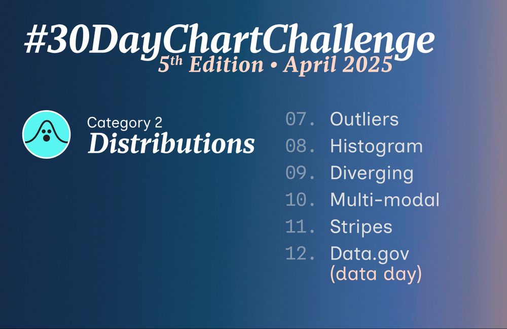
A banner with the prompts for the 2nd category: Distributions
07. Outliers
08. Histogram
09. Diverging
10. Multi-modal
11. Stripes
12. Data.gov (data day)
13 days left ⏳ until the #30DayChartChallenge kicks off. Are you really prepared? 😁📊📈📉
Here are the prompts for the 2nd category: Distributions
More info on Github: github.com/30DayChartCh...
Let us know if you have any further questions!
#dataviz
19.03.2025 19:25 — 👍 11 🔁 6 💬 1 📌 0

A banner with the prompts for the 1st category: Comparisons
01. Fractions
02. Slope
03. Circular
04. Big or Small
05. Ranking
06. Florence Nightingale (theme day)
14 days left ⏳ until the #30DayChartChallenge kicks off. Are you really prepared? 😁📊📈📉
Here are the prompts for the 1st category: Comparisons
More info on Github: github.com/30DayChartCh...
Let us know if you have any further questions!
#dataviz
18.03.2025 20:15 — 👍 31 🔁 18 💬 3 📌 1
✍️ This month I'm going to cover the Valencia floods to do an story for miraidata.es/en/.
🗺️ I've started with the #maps of the affected area and this is what we have now: an interactive map with 3D buildings🙌
Still have to add the critical points and info, but I'm already loving the results☺️
12.02.2025 18:08 — 👍 3 🔁 1 💬 0 📌 0
Trucos. Parte 1. Submodel trick – Muestrear no es pecado
February 9, 2025
Truquitos que va aprendiendo uno en tidymodels.
10.02.2025 16:50 — 👍 3 🔁 2 💬 1 📌 0
YouTube video by Restimando
ALEATORIEDAD | QUÉ es , POR QUÉ la necesitamos , CÓMO la "generamos" (RNG)
🎲¿Diríais que existe la #aleatoriedad? ¿El comportamiento de un gato es aleatorio y puede servir para generar contraseñas?🐈
▶️¡Nuevo vídeo de ReEstimando!:
ALEATORIEDAD | QUÉ es, POR QUÉ la necesitamos, CÓMO la "generamos" (RNG)
www.youtube.com/watch?v=D3Px...
31.01.2025 14:36 — 👍 2 🔁 1 💬 0 📌 0

Bivariate choropleth of population density and pesticide treatment intensity

Zoom on the brittany region

Surrounding of the school of Villeneuve, whose pupils were poisoned by pesticide applications

Map of schools most exposed to pesticides in France
A Journey Through France : a scrollytelling story about exposure of the French population to pesticides, with a focus on exposure of schoolchildren
bjnnowak.quarto.pub/journey_to_f...
18.12.2024 14:15 — 👍 49 🔁 18 💬 5 📌 4
Cool😍
18.12.2024 14:28 — 👍 1 🔁 0 💬 1 📌 0

a cartoon cat is sitting in a spotlight with a sad face .
ALT: a cartoon cat is sitting in a spotlight with a sad face .
My first semester as a professor just ended! (at least the lectures part🫢)
At the same time I have finished learning the names of almost all my students🥲😂
#tragedy
18.12.2024 12:02 — 👍 2 🔁 0 💬 0 📌 0
Thanks! I will take a look😍
18.12.2024 11:18 — 👍 1 🔁 0 💬 0 📌 0
I think it will take me a while to get used to it🥲 But thank you!
17.12.2024 14:19 — 👍 1 🔁 0 💬 0 📌 0
Hi @bsky.app! Lately I’ve been seeing awesome posts…could it be possible to bookmark them to revisit in the future?♥️
17.12.2024 07:53 — 👍 1 🔁 0 💬 2 📌 0
I love it!😍😍☃️
15.12.2024 13:32 — 👍 1 🔁 0 💬 1 📌 0

The Pudding Cup
The Pudding's annual picks for the best visual and data-driven stories
We’re excited to announce the winners of the 2024 Pudding Cup! Show them some love 🫶 on this thread 🧵, and check out all of the winners and honorable mentions here: pudding.cool/pudding-cup/
10.12.2024 20:14 — 👍 42 🔁 15 💬 3 📌 2
😍😍😍
09.12.2024 11:57 — 👍 1 🔁 0 💬 0 📌 0

New cuties at home🥰🪴
08.12.2024 14:50 — 👍 3 🔁 0 💬 0 📌 0
Hope it gets better from now on😅 Keep going💪
05.12.2024 14:54 — 👍 2 🔁 0 💬 0 📌 0
Are you ok?😕
05.12.2024 14:51 — 👍 1 🔁 0 💬 1 📌 0

One quirky post at a time😂😂
👉🏻Get yours at: blueskyroast.com
04.12.2024 13:26 — 👍 2 🔁 0 💬 0 📌 0
I’ve collected all the maps I created during the #30DayMapChallenge in a gallery. 🌏
bydata.github.io/30DayMapChal...
03.12.2024 18:33 — 👍 67 🔁 10 💬 4 📌 1

A hand-drawn map of North America on a ginkgo leaf using the Albers equal-area conic projection. Published by Atlas Guo on Bluesky.

Two world maps with blue lines showing approximate distances from Taiwan to various locations where navy warships can reload missiles. The left map focuses on the western Pacific region, showing 800 miles to Japan and 2,000 miles to Australia. The right map shows greater distances in the northern and southern Pacific, including 10,000 miles to Pago Pago in American Samoa. Published in The Wall Street Journal.

An isotype chart comparing sales of electric vehicles with conventional (internal combustion) engine cars. Each car icon represents 10,000 cars sold. The chart highlights that 2.7 million combustion engine cars were sold in 2023, compared to just 1.7 million electric, with notable sales in Latin America and the Middle East. The text notes that China's gasoline cars were popular in middle- and lower-income countries due to their cost-effectiveness. Published in Bloomberg.

A packed circle chart illustrating different foods and their respective weights in grams. The foods include mangosteen (38.5g), cocoa powder (13g), avocado (14g), and more. Each food item is represented by a circular icon with a cute illustration. The size of each circle proportional to the weight of the item. Published in Graphicacy.
It's the final week of the #30DayMapChallenge! 🗾🗺️📍 Explore the latest Data Vis Dispatch to discover our favorites, along with many more maps and other visualizations.
👉 https://blog.datawrapper.de/data-vis-dispatch-december-3-2024/
03.12.2024 16:50 — 👍 18 🔁 7 💬 3 📌 1

My last post for the #30DayMapChallenge!
⏳Day 12: Time and space
🔎 #Mataró: Buildings with history
This is some information from the history of my city. Hope you find it interesting!
🫶 Special thanks to @drxeo.eu
👉 Follow @mirai_data on Instagram for more maps!
#rstats #dataviz
02.12.2024 04:25 — 👍 24 🔁 7 💬 1 📌 0
Thankyouu🥰🥰 Hope to see your maps soon!🤭
02.12.2024 13:44 — 👍 1 🔁 0 💬 0 📌 0
My last post for the #30DayMapChallenge!
⏳Day 12: Time and space
🔎 #Mataró: Buildings with history
This is some information from the history of my city. Hope you find it interesting!
🫶 Special thanks to @drxeo.eu
👉 Follow @mirai_data on Instagram for more maps!
#rstats #dataviz
02.12.2024 04:25 — 👍 24 🔁 7 💬 1 📌 0

🗺️ #30DayMapChallenge Day 25: Heat
🏔️Topografia del #Maresme
#rstats #dataviz
29.11.2024 16:40 — 👍 4 🔁 1 💬 0 📌 0
Visualization can transform the reach of open data and revolutionize transparency and accountability.
🔗 https://www.fundaciovit.org/
Tropical geek & hobbit
🇧🇷 data journalist | #rstats #rspatial #ddj #data | 🎲 📊 🗺️
I cover democracy, corruption, environmental crime and inequality.
📍São Paulo / Brasília
🏆2023 SEJ & OPC |🥈Pulitzer finalist
https://linktr.ee/ceciliadolago
Faig el que puc. Em sento obligada a més.
Comunicació i cultura.
🐌 Bcn-Mataró
Vigilamos al poder, cuidamos lo público.
Con periodismo, herramientas y acción.
civio.es
Apúntate a nuestro boletín: https://civio.es/boletin/
Cuenta del Consejo Superior de Investigaciones Científicas, el mayor organismo público de investigación de España.
www.csic.es
Dataviz at @civio.es · Passionate about #dataviz #maps #creativeCoding alwaysLearning · 👩🏻💻🏳️🌈 she/her
https://observablehq.com/user/@carmen-tm
https://torrejonvalenzuela.net/
The official Bluesky account of the OpenStreetMap foundation
Kentuckian living in Alabama. Blue 🔵 in a red state.
💙nature,reading, dogs ,horses, trees, African violets,moss, lichen,birds,houseplants, gardening,knitting, yarn spinner,tea.Peace on earth 🌏. Equal rights for all.
Em barallo amb dades a la @diba, sobretot estadística territorial. Amb mili feta a R i novatillo a Python. Entre el Pallars i la cosa metropolitana. Opinions personals
📊 Information designer/data journalist, Koponen+Hildén
Co-author, “Data Visualization Handbook”
Teacher, data journalism & visualization at Haaga-Helia etc.
DJ
❤️ Maurizio, XCOM 2, GitS, Vernaccia di S. Gimignano
Output in 🇫🇮🇬🇧
Input also in 🇸🇪🇮🇹
Taking web-gis from 1990 -> 2024 🗺️ co-founder & cto @ atlas.co 🌍
Personatge alegre de Mataró: Molt personatge, molt alegre i molt de Mataró. M'agrada compartir i fer-la petar. Compromès amb @LaFosbury
🌐 Geographer & Urban Planner
💻 GIS Analyst & #Rstats
♻️ Desenvolupament Local i Comerç Urbà
🔗 https://urbanspacesproject.wordpress.com/
Demographics | Geospatial | Data Science | Open Source
i write R for fun & profit.
Demography | Data | Digital cartography | Dataviz
Post-doctoral researcher at Centre d'Estudis Demogràfics @CEDemografia
Insta: @juan_galeano
An arboreal, poly, gender non-participant mapmaker.
• Portfolio & tutorials: somethingaboutmaps.com.
• Prints: https://somethingaboutmaps.com/Storefront
• You can support my art & teaching at http://patreon.com/pinakographos.
● Professor @journalismdesign.bsky.social
● Interactive data journalist pudding.cool
● Moar buttondown.com/charthead // alv9n.com