Proceedings – CAA 2025
The deadline has been extended to October 15 for your CAA2025 papers! Since the proceedings will go through our free and transparent process, do not forget that you *must* share data and scripts if you have some.
Everything is explained here: 2025.caaconference.org/proceedings/
🏺🦣🧪
15.09.2025 08:13 — 👍 4 🔁 3 💬 0 📌 0
The virtual useR! 2025 event is happening tomorrow (August 1). There's still time to register. Claim your spot, for free, before time runs out!
The program: user2025.r-project.org/program/virt...
Registration: user2025.r-project.org/register
#useR2025 #rstats
31.07.2025 12:05 — 👍 17 🔁 12 💬 0 📌 2

Flyer for the event: meet-up details on rainbow-striped background. All text in image is included in the post.
🌈 rainbowR meet-up: Wednesday June 25th, 4pm UTC 🌈
- connect with other LGBTQ+ people who code in #RStats 🏳️🌈
- ask questions about R 🙋
- tell us about an R package you like 📦
- show us something R-related you’ve been working on 💻
➡️ Registration via rainbowr.org/meetups
19.06.2025 14:05 — 👍 9 🔁 4 💬 0 📌 1
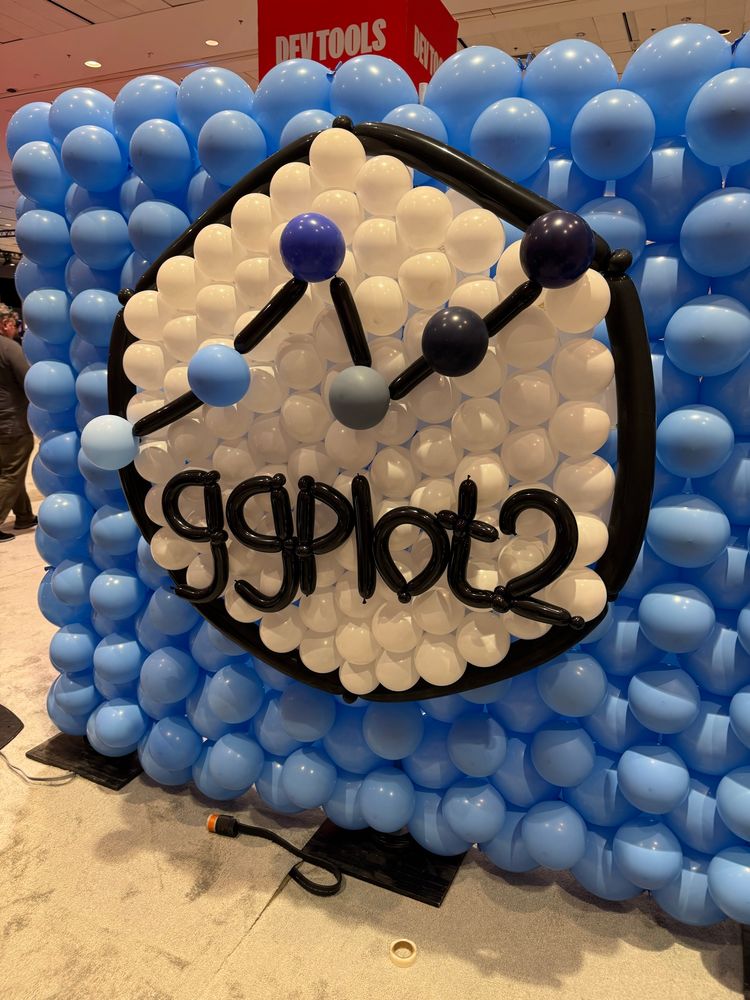
Balloon wall art inspired by the ggplot2 hex sticker. The display features a hexagonal frame made of black balloons, filled with white balloons inside and surrounded by a background of light and dark blue balloons. A line graph with black balloon segments and round coloured nodes runs across the centre, and the word “ggplot2” is spelled out in black balloon letters below the chart.
Happy 18th birthday ggplot2! #rstats
10.06.2025 23:56 — 👍 862 🔁 164 💬 16 📌 21
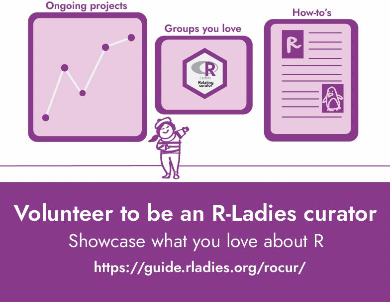
A chic lady (in a French outfit) shows off her gallery: a plot, a hex sticker of a group she loves, and a how to guide with an homage to the penguin dataset. It says "Volunteer to be an R-Ladies curator" with the subtitle "Showcase what you love about R" as well as the link to it! All in dashing purple.
We're looking for more curators for the second half of 2025! Want to share your voice or know someone who should?
📝 Sign up to curate: airtable.com/appjkZZgtF0i...
📖 Learn what curating involves: guide.rladies.org/rocur/guide/
💌 Nominate someone you admire: airtable.com/appFIBzsk2Ax...
12.06.2025 11:59 — 👍 19 🔁 20 💬 1 📌 3

Bar chart of daily #RStats posts. Amounts range from around 25 in September 2024 to peaking over 100 some days. Latest totals were 43 yesterday and 59 the day before.
Daily number of Bluesky posts with the #RStats hashtag (case insensitive) Sept. 1 - Mar 21, excluding the CRAN Package Updates bot.
Coded with the {bskyr} and {ggplot2} R packages.
[Posted via R script and weekly cron job. Tx for your patience if something went awry]
22.03.2025 14:06 — 👍 14 🔁 4 💬 1 📌 0
Posts – BG2
📢 New blog post available on The Bioarchaeologist's Guide!
Title: (To) Plotting Dental Inventory with ggplot2
bioarch.guide/posts/blog
#Rstats #dentalanth
02.01.2025 13:38 — 👍 1 🔁 1 💬 0 📌 0

regex101: build, test, and debug regex
Regular expression tester with syntax highlighting, explanation, cheat sheet for PHP/PCRE, Python, GO, JavaScript, Java, C#/.NET, Rust.
**potential spoiler warning**
Advent of code day 3 advice
Here's a useful tool to help solve day 3's puzzle
regex101.com/
03.12.2024 13:22 — 👍 0 🔁 0 💬 0 📌 0
Advent of Code 2024
🎄 #AdventOfCode is a great way to develop your programming skills, since it makes you think about problem-solving in a different way than you're used to (at least for me).
Any #Rchaeologists participating this year?
adventofcode.com
02.12.2024 08:25 — 👍 1 🔁 0 💬 0 📌 0

Map showing navigability of the Rhine in the Roman period, from https://www.researchgate.net/publication/384108657_Securing_transport_of_wood_over_water_on_the_Roman_Rhine
Happy #GISDay 🗺️
Spatial research is great with #opensource software such as @qgis.fosstodon.org.ap.brid.gy, but to make it #reproducible #rstats can be very helpful, for example in relation to transport of wood in the Roman period: www.researchgate.net/publication/..., code: doi.org/10.5281/zeno...
20.11.2024 15:12 — 👍 3 🔁 1 💬 0 📌 0
A good starter pack for #Rchaeologists
19.11.2024 06:37 — 👍 1 🔁 0 💬 0 📌 0
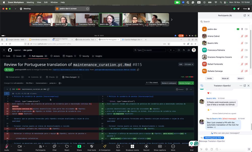
Zoom meeting with a GitHub review PR screen shared to the meeting.
Our @rOpenSci Traslaton started !!
@pedropark99 is explaining our review process
#RStats #RStatsPT
18.11.2024 13:23 — 👍 11 🔁 6 💬 1 📌 1
The community effort to translate our #RStats resources at @rOpenSci.hachyderm.io.ap.brid.gy to Spanish and now Portuguese is an inspiring confluence of community volunteerism, new technical tooling, and commitment to inclusion. Follow along with our translathon!
18.11.2024 14:03 — 👍 18 🔁 6 💬 0 📌 0
Developing the R package dendroNetwork for dendro-archaeology: lessons learned
The slides of my presentation at the JCM of CAA-NLFl and CAA-DE
are now available: ronaldvisser.github.io/dendroNetwor...
@rOpenSci.hachyderm.io.ap.brid.gy
25.10.2024 06:09 — 👍 0 🔁 1 💬 0 📌 0
Original post on hachyderm.io
1/6 🌎 It's International Open Access Week!
This week is held annually to inspire global momentum toward the open sharing of knowledge.
This year’s theme continues the call to put “Community over Commercialization” and prioritize approaches to open scholarship that serve the best interests of […]
25.10.2024 10:29 — 👍 9 🔁 6 💬 1 📌 0
Equating 'statistical significance' with real world significance
16.10.2024 17:21 — 👍 2 🔁 0 💬 0 📌 0

The patchwork logo next to a composition of a ggplot2 plot and a gt table. The Posit logo is in the corner.
Announcing patchwork 1.3.0! 🎉
patchwork makes simple and powerful plot compositions in #RStats.
@thomasp85.com shares the latest updates:
• Native support for gt objects
• More support for free-ing components
Learn more on the tidyverse blog: www.tidyverse.org/blog/2024/09...
26.09.2024 14:11 — 👍 42 🔁 12 💬 0 📌 1

patchwork 1.3.0 - Tidyverse
patchwork 1.3.0 has just been released bringing refinements to the `free()` function and full on support for gt tables
I'm excited to share the next version of patchwork with the world, available on CRAN now. First class support for gt tables and even more freedom with `free()` #rstats #ggplot2
16.09.2024 10:01 — 👍 74 🔁 32 💬 0 📌 2

tesselle: R Packages & Archaeology
This Wednesday, 2024-09-04, 5 pm CEST, Nicolas Frerebeau will present the tesselle project (www.tesselle.org), which is a cool suite of #Rstats packages developed for #archaeology.
Send us a DM for the link.
02.09.2024 17:50 — 👍 1 🔁 0 💬 0 📌 0

🌟 Reminder to all #OpenScience enthusiasts! 🌟
Want to publish your work openly and freely?
Simply put your preprint online and submit it for open peer-review on our platform!
🎉EASY, QUICK, OPEN, TRANSPARENT, FREE🎉
#OpenAccess #ScienceForAll 🏺🧪
28.05.2024 08:08 — 👍 3 🔁 3 💬 0 📌 0

A traditional column chart. The height of each rectangle encodes the share per group. However, as the percentages on the x-axis are aggregated in groups with irregular ranges, should we visualize the data in a different way?
In the made-up example shown, the groups on the x-axis are aggregated as <5%, 5-10%, >10-25%, >25-50%, and >50%. The groups >10-25% and >50% both have bars with a height indicating the same frequency of 27%.

A numeric x-axis. The height of each rectangle still encodes the share per group. But now, the width of each rectangle encodes the range used to aggregate the data.
As the area scales quadratically, the area of the last group is much larger than that of the third. But both have a 27 percent share.

Percentages encoded by area. To prevent rectangles with larger x-axis ranges from giving a false impression of greater importance than those with similar shares, we can map the share to the area instead of the height.
This might be correct, but how can we ensure that viewers understand and interpret it correctly?

A comparison of pros and cons when visualizing frequency by height (simplicity, conventional, comparability versus overemphasis of wider ranges) or area (accuracy, proportionality versus complexity, unconventional)
📊 Have you ever needed to create a bar chart when data is aggregated in groups of different ranges?
While researching the pros and cons, I couldn't find a consensus on what the "best" approach is. As often, "It depends" is the best recommendation I could find.
#dataviz #datavis #datavisualization
10.07.2024 09:27 — 👍 10 🔁 2 💬 0 📌 0
tesselle: R Packages & Archaeology
From CAA SSLA on mastodon:
Dear all, 📢 our next meeting takes place this Wednesday, 2024-06-05, as usual 5 pm CEST 📢 .
Please join us as Nicolas Frerebeau will present the tesselle project (www.tesselle.org), which is a cool suite of #Rstats packages developed for #archaeology.
Send DM for link.
03.06.2024 11:47 — 👍 1 🔁 1 💬 0 📌 0

GitHub - RonaldVisser/dendroNetwork: Package to create dendrochronological networks
Package to create dendrochronological networks. Contribute to RonaldVisser/dendroNetwork development by creating an account on GitHub.
I have submitted a #rstats package to #rOpenSci some time ago. The process of open review is wonderful as part of #OpenScience. Today I updated my package using the first review and this made it so much better! New version (0.5.2) released: github.com/RonaldVisser...
and doi/10.5281/zenodo.10636310
29.03.2024 19:53 — 👍 5 🔁 1 💬 1 📌 0
📣 Coming soon to PCI: articles submitted, evaluated and recommended will be presented to readers in multilingual versions. Title, abstract and keywords in 8 languages by default. Authors can add other languages
18.03.2024 13:12 — 👍 4 🔁 2 💬 0 📌 0
We'd like to organize some meet-ups for our community over the course of the year. In the past, we've done a mix of social and technical meetings (e.g. journal club, tutorials). What type of events would you want to attend? Reply and let us know 👇
14.03.2024 12:26 — 👍 0 🔁 1 💬 0 📌 0
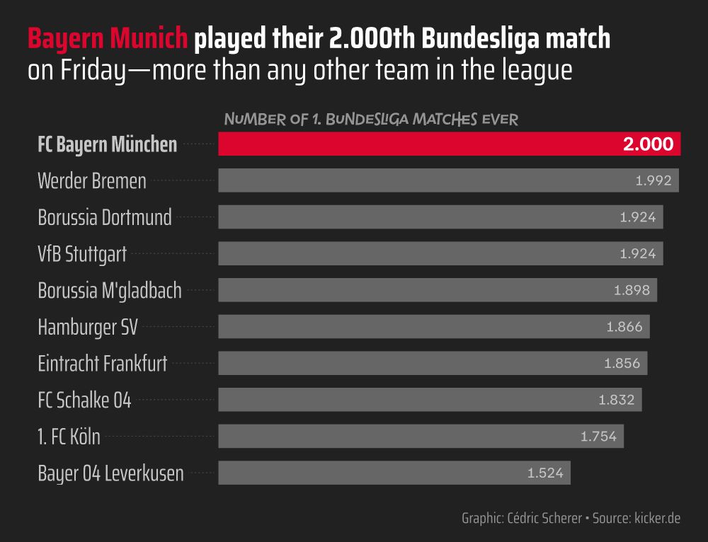
A simple bar chart for the ten teams that played the most Bundesliga matches. The top bar, encoding Bayern Munich's 2.000 matches, is colored in bayern-red while all other bars are grey.

The same bar chart of Bundesliga matches as a stacked version with green stacks indicating the number of matches won, grey stacks those ended with a tie, and yellow stacks indicating matches that have been lost.
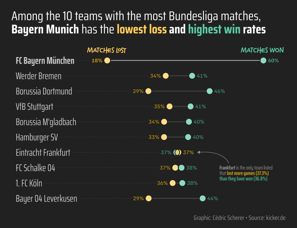
A horizontal dumbbell graph of share of matches won (green) and matches lost (yellow) for the 10 teams that have played the most Bundesliga matches ever. Bayern Munich has by a long shot the lowest loss and highest win shares among them.

A butterfly bar chart showing the number of matches Bayern Munich conceded and shot no, 1, 2, 3, 4, or 5+ goals, respectively. Conceded goals are encoded by red bars pointing to the left. Shot goals are encoded by blue bars pointing to the right. While the red bars peak for no and one goal, Bayern shots far more goals commonly.
⚽ Bayern Munich played their 2.000 Bundesliga match last weekend! 🎊
The stats are incredible: among the 10 teams with the most matches, they won the most and lost the fewest—in both absolute and relative numbers!
All #dataviz created in #rstats with #ggplot2 and the help of ggtext.
07.03.2024 19:08 — 👍 18 🔁 5 💬 3 📌 1

#psy6135 Class today: Introduction to ggplot2 #dataviz 📊
Slides available at friendly.github.io/6135/lecture...
08.03.2024 03:07 — 👍 5 🔁 1 💬 1 📌 0

Dear #Archaeology fellows, please remember for your next manuscript that you can have it peer-reviewed freely and transparently with @PCI_Archaeology ! #openaccess, #opendata, #openpeerreview, #opencode, #openscience. 🏺🧪
27.02.2024 14:17 — 👍 5 🔁 4 💬 1 📌 0
A community that connects, supports, and promotes LGBTQ+ people in the R community and spreads awareness of LGBTQ+ issues through data-driven activism.
https://rainbowr.org
Posts by @ellakaye.co.uk and @oberman.bsky.social.
Rotating Curator for the @rladies.org community💜
🔗 https://guide.rladies.org/rocur/
This week's curator: TBA
Promoting diversity in the #RStats community via meetups, mentorship and global collaboration! 200+ groups worldwide.
#RLadies
Digital rights are human rights. There's hardly anything as important as ensuring that our shared future has freedom of expression and creativity at its core. https://www.fightforthefuture.org
Open-source scientific and technical publishing system brought to you by posit.co.
github.com/quarto-dev/quarto-cli
Powerpoint by day, #ggplot2 by night. Here for dataviz and #rstats content and rants about football. 📊⚽️
Based in Cologne, Germany.
R, data, 🐕, 🍸, 🌈. He/him.
Dataviz designer, psychiatrist, PhD student
https://karaman.is
Associate Dean of Learning and Teaching @uofglasgow.bsky.social, PFHEA, psychologist, #rstats, learning & teaching in higher education, scholarship focused, in particular student and staff approaches to lecture recordings. 🏳️🌈
Website: https://stevenponce.netlify.app/
GitHub: http://github.com/poncest/
LinkedIn: http://linkedin.com/in/stevenponce/
Assoc Prof Computer Science and Communication Studies at Northwestern. Infovis, HCI. Author of tidybayes & ggdist R pkgs. he/him. 🏳️🌈 https://mjskay.com/
Co-director https://mucollective.northwestern.edu
Co-founder https://journalovi.org
#kakistographs
from Ancient Greek κάκιστος (kákistos, 'worst')
-Mapping the world- Dr. in Physical Geography | Environmental Health - bioclimatology - geography. RC Researcher from 🇩🇪 at @mbgcsic.bsky.social @csic.es in 🇪🇸 #rstats #dataviz
Secretary of the @aeclim.org
📍Galicia
ℹ️ https://dominicroye.github.io
Columnist and chief data reporter the Financial Times | Stories, stats & scatterplots | john.burn-murdoch@ft.com
📝 ft.com/jbm
Local historian, bike rider, and #RStats developer. Planner for Baltimore city. Poster at @elipousson@dads.cool
Senior Manager Data Science and Engineering at | Docker Captain 🐳| Time-series analysis & forecasting
My newsletters:
Weekly updates: https://ramikrispin.substack.com
AIOps: https://theaiops.substack.com
Forecasting: https://theforecaster.substack.com
i’m a linguist. he/him https://jofrhwld.github.io/
Social science and other distractions. Old posts get deleted pretty quick.
https://kieranhealy.org /
https://theordinalsociety.com
· Economist @univlorraine.bsky.social, en français and in English
· I use computers, network theory, and data to study how humans behave at work, in organizations and communities #Rstats
· He/Him 🏳️🌈
🌐 https://o.simardcasanova.net
📍 Nancy, Lorraine, France