Want to learn how to visualise and analyze spatial data in the social sciences and build your #GIS skills? LAST FEW PLACES for GIS courses are starting on Tuesday 24th Feb:
📍 Introduction to QGIS & Spatial Data
📍 Advanced GIS Spatial Analysis
nickbearman.com/training-cou... #GISchat
20.02.2026 20:40 — 👍 3 🔁 0 💬 0 📌 0

Students working on laptops creating maps.

A screenshot of a map created in R, showing Percentage population Ages 10 to 14 for Liverpool, UK.
Check out my #QGIS Intro and Advanced and R-RStudio GIS Intro and Advanced courses coming up over the next few months - QGIS starting next week! See nickbearman.com for more details on the courses and any questions, please ask #GISchat
16.02.2026 20:03 — 👍 2 🔁 0 💬 0 📌 0

A GEO100 sticker, saying GEO 100 Winner 2025 on top of two books - GIS: Research Methods and Using R as a GIS, both by Dr Nick Bearman
What a great letter to receive - the GEO100 stickers, as I wasn't able to make it to the celebration :-) Thanks to Alex Wrottesley and all the judges for all their work!
If you want to know more about GIS, checkout my books or my upcoming training courses - more details at www.nickbearman.com! 😊
12.02.2026 13:47 — 👍 2 🔁 0 💬 0 📌 0
Welcome! | Formbricks
Please complete this survey.
Starting with February 2026, @jsonsingh.com is planning on starting a monthly "London Geo Meetup" for anyone working or interested in geospatial. Looking at a mixed audience of students, professionals, academia and anyone in anything spatial.
Interested?:
app.formbricks.com/s/cmlb0thuk0...
10.02.2026 19:51 — 👍 3 🔁 2 💬 0 📌 1
“I love having a workbook to go through, it’s how I learn best. Also, perfect balance between presentation and practical work.”
Harriet Ann Patrick, PhD Researcher, University of Sheffield
10.02.2026 16:35 — 👍 1 🔁 0 💬 0 📌 0

Students working on laptops creating maps.
A screenshot of QGIS showing a world map in green.
Want to learn how to visualise and analyze spatial data in the social sciences? My #GIS courses are starting TWO WEEKS today:
Intro to QGIS & Spatial Data - No prior knowledge needed!
Advanced GIS Spatial Analysis - For those ready to dive deeper
nickbearman.com/training-cou...
10.02.2026 16:34 — 👍 1 🔁 0 💬 1 📌 0

Figure 12 showing visualization of contour matching results for experimental area 1 across three panels labeled b, c, and d. Each panel displays overlapping contour lines from Dataset1 (blue) and Dataset2 (orange), with cyan arrows indicating matching results identified by the proposed method. Panel b shows several circular enclosed contour features in the upper left. Panel c displays relatively parallel, wavy horizontal contours with some vertical variation. Panel d shows more complex contour patterns with enclosed shapes in the lower left and converging lines in the upper right. Each panel includes a north arrow and scale bar showing 0, 50, and 100 meters.
New article! Zhekun Huang, Haizhong Qian and colleagues explore and evaluate new ways of matching contours from multiple sources of terrain data using unsupervised learning doi.org/10.1080/1523... Data doi.org/10.6084/m9.f... Code gitee.com/zhekunhuang/... #GISchat
09.02.2026 17:10 — 👍 2 🔁 1 💬 0 📌 0

Figure 4b) showing Example 2 of headline-with-map versus headline-with-photo posts. Both posts have the headline 'Swiss glaciers lose 10% of volume in worst two years on record' with a user profile icon and reliability rating scale from 1 (Unreliable) to 4 (Fully Reliable). The left post displays a topographic map of Switzerland with colored circles indicating glacier volume changes, with a legend showing changes from 0.00 to -0.75 meters water equivalent and circle sizes representing glacier areas of 10, 50, and 200 square kilometers. The right post shows a photograph of a striped measurement pole on a snowy glacier with mountains in the background under a blue sky.
New article! Nianhua Liu, Yu Feng and colleagues look at Trust in Climate Change Communication, including the impact of having just a map or a photo included, or just a headline #GISchat #OpenAccess doi.org/10.1080/1523... Data at figshare.com/articles/dat...
03.02.2026 15:49 — 👍 2 🔁 1 💬 0 📌 0

Figure 1: A horizontal diagram displaying five colorful chevron-shaped steps of a collaborative framework. Step 1 (cyan): Preparatory design of the process by decision analysis and geographic information systems experts. Step 2 (lime green): Virtual workshop with small core group to discuss Web-Delphi design. Step 3 (orange): Web-Delphi process with larger panel of experts and policymakers to ideate relevant map-based geographic information elements for policymaking in pandemic contexts. Step 4 (coral pink): Web-Delphi analyses by decision analysis and geographic information experts, including statistical analyses of results. Step 5 (purple): Virtual workshop 2 with small core group to discuss Web-Delphi results and determine which elements are relevant for policymaking in pandemic contexts.
New article! Manuel Riberio and colleagues use Web-Delphi and workshops to help develop map-based dashboards to support pandemic response policy-making #GISchat doi.org/10.1080/1523...
02.02.2026 15:42 — 👍 2 🔁 1 💬 0 📌 0

Submit your own #freeandopensource #geospatial news story for inclusion in the OSGeo:UK newsletter using the form at this link: tinyurl.com/osgeouknews
We are also looking for short thought pieces, no more than a few hundred words, which can be about anything to do with open geospatial 🌏
20.01.2026 20:04 — 👍 3 🔁 2 💬 0 📌 0

Flowchart diagram titled 'Thick mapping workflow: from collaborative site assessment to immersive installation.' The workflow progresses through four numbered stages shown in circular vignettes: (1) Introductory training and orientation phase showing people using collaborative data collection platforms like Field Maps, Ushahidi, or Emapic for faster insights; (2) Collaborative on-site assessment through geospatial data collection, depicting groups gathering information in outdoor and indoor settings; (3) Information processing through co-production by micro-groups, showing varied site observations being transformed into qualitative and quantitative metrics through asynchronous teamwork; (4) Co-creation of thick maps and installation for visual representation, illustrating how thread colors represent distinct categories (spatial, natural, or historical layers) in both a vertical hanging installation and a horizontal table-based display with suspended elements.
New paper! Muhammet Ali Heyik & Francisco J. Abarca-Álvarez investigate implement thick mapping in spatial design studios, providing greater understanding of complex processes and spatial understanding in complex urban environments doi.org/10.1080/1523... #GISchat
12.01.2026 16:41 — 👍 3 🔁 2 💬 0 📌 0

Student working on a tablet computer making a map.
A screenshot of QGIS showing a world map in green.
Want to learn how to visualise and analyze spatial data in the social sciences? My #GIS courses are coming up in Feb-Mar 2026:
Intro to QGIS & Spatial Data - No prior knowledge needed!
Advanced GIS Spatial Analysis - For those ready to dive deeper
nickbearman.com/training-cou...
06.01.2026 17:41 — 👍 0 🔁 0 💬 0 📌 0

A comparison grid showing eight different map visualizations of the same geographic area featuring Silver Creek running diagonally from northwest to southeast and Interstate 65 highway running vertically to the east of the creek. The visualizations include: Label (simple map with creek and highway marked), Playground v2.5 (aerial photograph of a winding creek through green landscape), Stable diffusion 3.5 (map showing labeled creek and highway), Janus-Pro 7B (detailed street map with creek system), Map Diffusion (topographic-style map with terrain features), Flux.1-dev (minimalist map with I-65 label), GPT-4o (stylized map with creek and urban features), and MapGenerator (simplified map with creek and highway). The prompt at top describes the geographic layout with key spatial relationships highlighted in red and blue text."
The google map shows a section of a geographic area with **a creek** labeled **"Silver Creek"** running **diagonally** from the **northwest to the southeast**. To the **east** of the creek, there is a **major highway** labeled **"I-65"** running **vertically**. The background is a **light green color**, indicating land or a general area.
New article! Wenbo Zhang and colleagues employ a Parameter-Efficient Fine-Tuning (PEFT) strategy to improve automated map generating using AI: MapGenerator #GISchat doi.org/10.1080/1523...
05.01.2026 15:14 — 👍 2 🔁 1 💬 0 📌 0

A horizontal stacked bar chart showing the existence percentage of different harm types in GeoAI ethics cases. Five categories are displayed with icons on the left: eco (economy), phy (physical harm), pri (violation of privacy), psy (psychological harm), and equ (violation of equal rights). Each bar is divided into two segments: magenta representing 'Existence' and tan representing 'Non-existence'. The percentages are: eco shows 41.82% existence and 58.18% non-existence; phy shows 33.22% existence and 66.78% non-existence; pri shows 30.52% existence and 69.48% non-existence; psy shows 18.90% existence and 81.10% non-existence; and equ shows the lowest at 3.60% existence and 96.40% non-existence. A legend in the upper right indicates the color coding for existence (magenta) and non-existence (tan).
New article! Chaun Chen, Mengyi Wei and colleagues look at GeoAI ethics and present An infographic framework of GeoAI ethics based on news data #GISchat #OpenAccess doi.org/10.1080/1523...
19.12.2025 14:39 — 👍 3 🔁 1 💬 0 📌 0

Working on Arrow in Positron and PR comments are showing up inline! 😍 OK, I'd been a bit hesitant to move away from RStudio as I was used to it, but this is a game changer! I know this is a VS Code extension thing not a Positron thing, but VSCode was a bit meh for R, so rarely used it! #rstats
11.12.2025 18:51 — 👍 34 🔁 3 💬 1 📌 0

Three maps labeled a, b, and c showing different visualizations of the same geographic region. Map a) georeferenced map symbols, which are aggregated into proportional rectangular
map symbols, with frequencies indicated inside these shapes. Map b) displays the same region as a dot density map with hundreds of colored dots (appearing in shades of red, orange, yellow, and other colors) distributed across the area, with the highest concentration in the center. Map c) presents a heat map or kernel density visualization with colors ranging from blue (low density) through green and yellow to red (high density), showing smooth gradients of concentration with the most intense areas appearing as red hotspots in the center and upper portions of the map. All three maps include a legend, scale bar, and attribution to OpenStreetMap contributors.
New article! Tomasz Opach and colleagues explore using a digital map to facilitate the exploration of place names from literary, using place names mentioned in Norwegian literature 1814–1905 doi.org/10.1080/1523... #GISchat
18.12.2025 13:56 — 👍 4 🔁 1 💬 0 📌 0

A network graph showing the evolution of seven related studies from 2020 to 2024. The timeline runs horizontally along the x-axis, with seven study names listed vertically on the left: Kang et al., CT Replication, Illinois Reproduction, Chicago Reproduction, Class Projects, VT Pharmacy Extension, and Esri Extension. Each study has a small grid showing reproducibility criteria (indicated by black and white boxes). Circles connected by lines represent different versions of each study, with solid lines indicating direct forks or pulls and dashed lines showing references. Colored symbols within or near circles indicate the type of work: green squares for reproduction, blue circles for reanalysis, red triangles for replication, and purple inverted triangles for extension. The graph shows how these studies branched, referenced, and built upon each other over time, with a note indicating that the HEGSRR template was adopted in 2022. Updates in response to reproduction efforts are noted at the top. The network demonstrates how each study reproduced, reanalyzed, replicated, or extended the original Kang et al. (2020) study (indicated by colored polygons) in sequence, improving upon different aspects of the original work (shown by black boxes in the grids).
The final paper in our upcoming special issue on #Replicability and #Reproducibility, Joseph Holler and colleagues use open science practices to develop a GIScience study on access t oCOVID-19 healthcare in Illinois, US doi.org/10.1080/1523... #OpenAccess #GISchat
15.12.2025 16:19 — 👍 3 🔁 1 💬 0 📌 0

A flowchart diagram showing a two-step 'template-render' framework for map symbol generation. The process begins with a user input icon on the left. Step 1 (Template Generation) is shown in a light green box: user input and a knowledge-guided prompt flow into an LLM (represented by a robot icon), which produces a symbol description or 'template' (shown as a document icon). Step 2 (Visual Rendering) is shown in a light blue box: the symbol description flows into a T2I model (represented by a 3D cube icon), which synthesizes a visual symbol from the description and outputs a point symbol or 'render' (shown as a red map pin icon on a folded map). Arrows connect each component from left to right, illustrating the sequential workflow from user input to final rendered map symbol

A diagram illustrating point symbol concept generation using 'Zoo' as an example. On the left, a pink box shows user input: 'Zoo' or 'Design a map symbol for Zoo'. An arrow labeled 'LLM' points to a green box containing the symbol description: 'Symbol of the Zoo, abstract 2D style, white background, stylized image with animal silhouettes and tree elements, rounded rectangle shape with curved top, simple lines for texture.' An arrow labeled 'T2I model' points to the final point symbol on the right: a rounded square icon with dark green background showing silhouettes of two animals (appearing to be a lion and elephant) facing each other under a tree canopy, with a white border and rounded corners.
New article! How do we go about using AI to automate point symbol generation? Shuaiqing Wang, Li Shen and colleagues have a investigate, with the process and an example shown below doi.org/10.1080/1523... Data and code at doi.org/10.6084/m9.f... #GISchat
11.12.2025 16:25 — 👍 2 🔁 1 💬 0 📌 0

Students working on laptops creating maps.
A screenshot of QGIS showing a world map in green.
Want to learn how to visualise and analyze spatial data in the social sciences? My #GIS courses are coming up in Feb-Mar 2026:
Intro to QGIS & Spatial Data - No prior knoweldge needed!
Advanced GIS Spatial Analysis - For those ready to dive deeper
nickbearman.com/training-cou...
11.12.2025 15:24 — 👍 0 🔁 0 💬 0 📌 0
Deepfake geography: A new paper from Valentin Meo looking at how we can detect manipulated satellite images doi.org/10.1080/1523...
Also check out our interview on the paper with Valentin and
@nickbearman.bsky.social: youtu.be/DklnevrHR1c #GISchat #FreeAccess
10.12.2025 15:17 — 👍 2 🔁 1 💬 0 📌 0
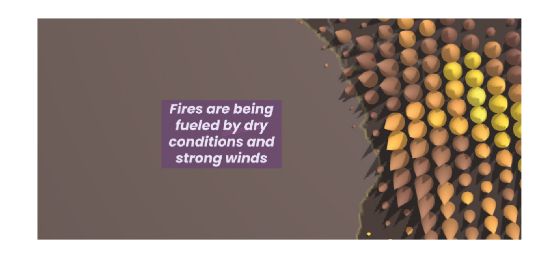
A screenshot from the app, showing a series of yellow and orange cones (each one representing fire intensity (colour) and fire frequency (width and height) along text saying "Fires are being fueled by dry conditions and strong winds".
New article! Using storytelling and guided interactions to help users understand large spatial and temporal data sets. Oana Candit et al. provide an example representing active fires of 2023 Paper: doi.org/10.1080/1523... App: www.animation.oanacanditmaps.ro/app/ #GISchat
08.12.2025 16:30 — 👍 3 🔁 2 💬 0 📌 0

Figure 2: A series of 6 maps, showing transition from proportional symbols (circles) for each area within the map to a choropleth map where the color shows the value. Labelled t=0 to t=1.
New article! Timofey Samsonov explores animated transitions proportional symbol and choropleth representations on thematic maps #GISchat #ICC2023 doi.org/10.1080/1523... Check out the supplementary videos of each transition at zenodo.org/records/1717... and see it in practice at observablehq.com
02.12.2025 11:57 — 👍 8 🔁 2 💬 0 📌 0

📣 Deadline Extended to Wednesday!
Good news — we’ve extended the application deadline for the Open Science Retreat 2026! 🎉
If you’ve been meaning to apply but needed a little more time, this is your chance.
✨ Don’t miss out — apply by Dec. 3 and be part of something special.
buff.ly/lFoKE2K
01.12.2025 10:15 — 👍 2 🔁 1 💬 0 📌 0

Three of the maps used in the evaluation, on the left a Google Maps style map (relatively plain colouring, with green for parks, blue for water and shades of grey and light brown for everywhere else), in the middle a Snazzy Maps - Hopper style map, with darker colors across the board, dark green for parks, dark blue for water, light green for gardens/ greenspace and grey for buildings, and on the right, the Place-aware Map, with much more vibrant colours.
We all know color in maps is important. Shangjing Jiang and colleagues used crowdsourced photographs to create place-aware colored maps which help create a sense of place doi.org/10.1080/1523... #GISchat Figure 1 below shows their comparisons: Google Maps, Snazzy Maps "Hopper" and place-aware maps
01.12.2025 11:51 — 👍 3 🔁 1 💬 0 📌 0

My hand holding a shortbread cookie in the shape of an airplane. There are red sprinkles in the pattern of the survivorship bias plane.

A plate of the same cookies.
Does anyone want a survivorship bias shortbread
29.11.2025 04:50 — 👍 15423 🔁 4179 💬 147 📌 106
At a festival with events happening over a week and over a whole city? Dilara Bozkurt explores temporal navigation for festival maps on mobile devices, working out how to incorporate space and time on a small screen like a mobile phone doi.org/10.1080/1523... #GISchat #OpenAccess Check out the GIF:
27.11.2025 15:02 — 👍 5 🔁 2 💬 0 📌 0
Terra Draw is one of the projects that has previously benefited from the GoFundGeo programme. See this quote from @jameslmilner.bsky.social on how the funding has helped support the project. Submissions are open until end of month.
26.11.2025 20:55 — 👍 3 🔁 1 💬 0 📌 0

A picture says that Open Science Retreat Global and Join us and send in your application now.
Final Call! OSR applications close 30 November!
If you’ve been planning to apply, this is the moment.
Join an international community of researchers & open science practitioners for a week of focus, creativity, collaboration, and connection in Machynlleth.
Apply: buff.ly/6z1PhfU
25.11.2025 12:45 — 👍 9 🔁 7 💬 0 📌 2

Get 25% off Using R as a GIS e-book from Locate Press using THANKS25, so it will only cost USD$26.25 instead of USD$35! Valid until 30th Nov
locatepress.com/book/rgis #GISchat
(only valid on the e-book unfortunately, not valid for print copies)
More details at nickbearman.com/rgis.html
25.11.2025 16:19 — 👍 4 🔁 0 💬 0 📌 0
Geographer. Happiness, climate change, human rights.
“What appears to be coming at you is really coming from you.”
MERV, not MIRV.
He/هو/any. Our views and typos aren’t even our own. Fuck cancer.
+ 2025 | Scientist - Fluvial Geomorphology | 🇦🇺
______
+ 2025 | PhD | Geospatial and Fluvial Geomorphology 🇦🇺
+ 2020 |Joint MSc | Water and Coastal Mgt. | 🇮🇹 🇪🇸 🇵🇹
+ 2015 | BSc (Hons) | Water Resources Mgt. | 🇳🇬
Teaching Prof - GeoAI Literacy, Intro to Geo Data Science, Cartography, Advanced Spatial Analysis, and have designed multiple courses for others (Intro to GI systems, AI & Machine Learning, Spatial Analytics, and Spatial Regression techniques.
pragmatic, progressive, multidisciplinary creative, data scientist & full stack dev. occasional avid beach goer. always learning.
🔗 https://marko.tech 🏠 https://startyparty.dev
M.Sc. Graduate, KNT University
Remote Sensing | Photogrammetry
---→ Environmental Monitoring, Forest Ecology, Wildfire, UAV Photogrammetry, Bundle Adjustment, Canopy Cover
#RemoteSensing #Photogrammetry #UAV #Drone #DeepLearning #GIS
Academic: Professor at RMIT University, GIScience, spatial algorithms, AI, and databases, ontologies http://gkl.rmit.melbourne
Author: GIS 3e http://gisacp.duckham.org
Me: gender equity, wheelchair user, food, new music
maps in fact do love you like i love you
Atlanta ♡ GIS / VIS
The background banner image is % cloud cover data.
Here to help you to publish and make an impact with your research.
🌍 Multilingual enthusiast navigating the realms of English and Esperanto!
🔬 Passionate about science, technology, FOSS and a11y.
💬 I love engaging in thoughtful discussions
Mastodon: @debby@hear-me.social
Join ⁂: https://hear-me.social/invite/rU3m4Hkc
PhD Student at Geospatial Systems CDT | Researching Cycle Networks, Low Traffic Zones and Geospatial Networks
We are the UK’s learned society and professional body for geography, supporting geography and geographers across the world.
🗺️ Maps for developers: Visual tools, global data, SDK & APIs for web, mobile, and enterprise applications.
Instats is a mission-driven organization devoted to improving research practices through expert-led training for PhD and post-PhD researchers across a broad range of fields, methods, and theoretical orientations across the globe.