Experts warn of ‘global crisis’ as number of women in prison nears one million
Number of women incarcerated around the world rising at nearly three times the rate of men, with female prisoners often subjected to sexual violence and forced labour
I've spent the last year looking into women in prison around the world, with help from so many people. We @theguardian.com are running a series on the topic. Here is the first piece revealing some of what women, many of whom are ignored and forgotten, face. www.theguardian.com/global-devel...
27.11.2025 11:18 — 👍 0 🔁 1 💬 1 📌 0

The distribution of the world's wild land mammal biomass
Our World in Data
Biomass is the total weight of each animal group. It's calculated by multiplying an estimate of the total number of individuals by their average mass. Shown is each group's share of global wild mammal biomass on land.
Rodents (16%)
Squirrels, mice, beavers
Even-hoofed mammals (49%)
Deer, boars, warthogs, camels, hippos and giraffes
Odd-hoofed mammals (1%)
Rhinos, zebras, wild horses
Bats (7%)
Elephants (8%)
Marsupials (7%)
Kangaroos, koalas, wombats
Rabbits and hares (1%)
Primates (4%)
Monkeys, apes
Carnivores (3%)
Lions, tigers, bears
Other (4%)
e.g. pangolins, hedgehogs, sloths
Note: Wild mammal biomass estimates come with substantial uncertainty; some groups have poor population records, and are therefore estimated based on modelling from factors such as the range size of particular animals, and extrapolations of densities from more localized studies.
Data source: Lior Greenspoon et al. (2023). The global biomass of wild mammals. PNAS.
OurWorldinData.org — Research and data to make progress against the world's largest problems. Licensed under CC-BY by the authors Hannah Ritchie and Fiona Spooner.
The bats are a surprise. 📊
By @ourworldindata.org
24.11.2025 19:07 — 👍 9 🔁 3 💬 1 📌 0

Deadly airstrikes and a military buildup: how the US ‘war on drugs’ has unfolded in the Caribbean
US has used claims of a drug route to justify its attacks, which have resulted in 83 deaths that the UN has called extrajudicial executions
A visual guide to the deadly airstrikes and military buildup: how the US ‘war on drugs’ has unfolded in the Caribbean
US has used claims of a drug route to justify its attacks, which have resulted in 83 deaths that the UN has called extrajudicial executions
www.theguardian.com/us-news/2025...
24.11.2025 13:46 — 👍 1 🔁 1 💬 0 📌 0

UK public service journalism heroes recognised at British Journalism Awards
Express, FT, Guardian, The i, Standard and Eastern Eye make public service shortlist.
Very happy to make the shortlist alongside brilliant colleagues @robevansgdn.bsky.social @rowenamason.bsky.social @michaelgoodier.bsky.social David Conn @anlugonz.bsky.social for this year's Public Service Journalism category at the British Journalism Awards for our project The Lords Debate.
20.11.2025 12:50 — 👍 6 🔁 3 💬 0 📌 0


#30DayMapChallenge Day 14-OpenStreetMap
Here is a 3D OpenStreetMap visualization of Osogbo, capturing the city’s building footprints and road network from an elevated perspective. The model highlights the density, structure, and spatial patterns that define the urban landscape.
14.11.2025 11:22 — 👍 4 🔁 1 💬 0 📌 0

#30DayMapChallenge day 8: Urban
Chae Won Lee uses the Overpass API to visualize current coffee shop density in New York with an interactive map. Here's a snippet.
14.11.2025 17:09 — 👍 10 🔁 1 💬 1 📌 0
This collection of stories around the photobooth is so uplifting www.theguardian.com/lifeandstyle... and it also reminds me of one of the most beautiful digital stories ever www.danielmeadows.co.uk/gallery/vide... - Polyfoto by Daniel Meadows. It will warm your heart. 📷
14.11.2025 10:24 — 👍 0 🔁 0 💬 0 📌 0

Who supports Reform and why? The charts that show who favours Farage’s party
Based on largest poll of supporters, these charts and maps show five distinct groups that could hand Reform a majority
This is a great article by @anlugonz.bsky.social and @ashleyjkirk.bsky.social analysing the Reform vote. Excellent use of visualisations to bring home the central point of just how disparate a bunch they are.
www.theguardian.com/politics/202...
13.11.2025 10:02 — 👍 3 🔁 1 💬 0 📌 0
#30DayMapChallenge Day 10: Air
🌪️ Animated mesh layers of #hurricane tracks resembling Vincent van Gogh’s Starry Night.
#HurricaneMelissa #Jamaica.
Made with #QGIS. Data from #Copernicus #ECMWF
10.11.2025 20:00 — 👍 14 🔁 6 💬 1 📌 0

Minimalist map of the world where each country is represented by a circle and the size of the circle represents the population size.
A minimal map of the world's population for day 11 of the #30DayMapChallenge!
#RStats #ggplot2 #DataViz
11.11.2025 10:02 — 👍 38 🔁 3 💬 3 📌 1
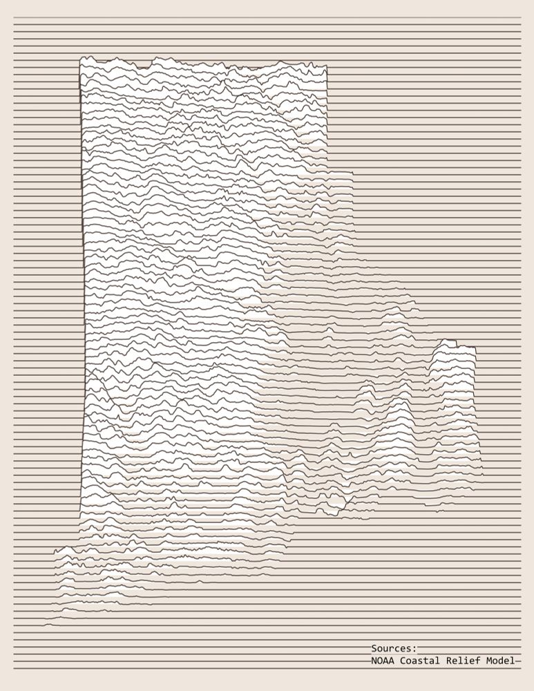
A map of Rhode Island elevation using horizontal lines running across the page, rising and falling relative to the surface elevation.
Day 11 - Minimal
Rhode Island Elevation Joy Plot Map
I made a Joy Plot map years ago in ArcPro, but I am using QGIS these days, so I figured this would be a great time to learn a new workflow. I will be posting the workflow on Day 23 - Process.
#30DayMapChallenge
11.11.2025 15:09 — 👍 24 🔁 2 💬 2 📌 0
#30DayMapChallenge - Minimal
✈️ A (very minimal) real-time flight-tracking map.
googlemapsmania.blogspot.com/2025/11/a-mi...
11.11.2025 16:39 — 👍 6 🔁 4 💬 2 📌 0

Aotearoa major cities
#30DayMapchallenge Day 8, Urban.
People don't realise what a big deal it is for acceptance of place names to change in such a short time without wars/dictators/invasion/etc. Just people, within a generation, deciding it is the right thing to do. mapdata::NZHires baseman + Affinity Publisher.
08.11.2025 00:52 — 👍 99 🔁 38 💬 7 📌 2

The Roman Britain Travel Map
Maps Mania is a blog dedicated to tracking the very best digital interactive maps on the internet and the tools used to create them.
#30DayMapChallenge - Accessibility
🏛How far could you travel in one day in Roman Britain?
My map shows roman roads, travel times in Roman Britain and the points of interest you could reach within 1,2,3,4 and 5 days.
googlemapsmania.blogspot.com/2025/11/the-...
07.11.2025 19:52 — 👍 5 🔁 3 💬 1 📌 0

#30DayMapChallenge Day 6: Dimensions
I used the dimension of time to map Sussex, NB (and area), over the seasons in 2024, using images from Copernicus Sentinel 2.
I used ArcGIS Pro with tools such as georeferencing, raster clip, and splitting polygon feature layers.
07.11.2025 02:18 — 👍 9 🔁 1 💬 1 📌 0

#30DayMapChallenge 7 Nov - Accessibility
This map shows the weather stations operated by the Spanish Met Service and regions where there is a lack of stations.
𝗧𝗵𝗲 𝗹𝗮𝗰𝗸 𝗼𝗳 𝘄𝗲𝗮𝘁𝗵𝗲𝗿 𝘀𝘁𝗮𝘁𝗶𝗼𝗻 𝗰𝗼𝘃𝗲𝗿𝗮𝗴𝗲 𝗹𝗶𝗺𝗶𝘁𝘀 𝘁𝗵𝗲 𝗮𝗯𝗶𝗹𝗶𝘁𝘆 𝘁𝗼 𝗱𝗲𝘁𝗲𝗰𝘁 𝗮𝗻𝗱 𝗮𝗻𝘁𝗶𝗰𝗶𝗽𝗮𝘁𝗲 𝗲𝘅𝘁𝗿𝗲𝗺𝗲 𝗲𝘃𝗲𝗻𝘁𝘀.
#aemet #geopandas #cartopy
07.11.2025 08:57 — 👍 18 🔁 4 💬 0 📌 0

Map of county-level kid population in 2020 for the US
My favorite maps are the ones that take like 3 applications to finish.
Kidding.
Here's my Day 6 ("dimensions") of #30DayMapChallenge: a joy or ridgeline plot of kids in the US in 2020. Thanks @ipums.bsky.social (NHGIS), QGIS, R, Adobe Illustrator, and especially @helenmakesmaps.bsky.social
06.11.2025 20:35 — 👍 35 🔁 5 💬 0 📌 1

A globe with shade relief centred on the Atlantic Ocean.
I took today's #30daymapchallenge literally and made a map of the Earth as a globe.
Software used: Natural Scene Designer, map data: naturalearthdata.
#30daymapchallenge day 5: earth #maps #cartography #earth #globe #shadedrelief
05.11.2025 14:56 — 👍 9 🔁 1 💬 0 📌 0
#30DayMapChallenge Day 4: My Data – The Illusion of Support ❤️💙
This map comments on political echo chambers using a red filter. National had the highest percentage party vote in 2023.
People tend to form relationships with others with similar views, which can make election results feel surprising.
04.11.2025 09:22 — 👍 7 🔁 1 💬 0 📌 0

#30DayMapChallenge Day 3: Polygons
I arranged the Japanese prefectures to look like a sight test! The largest polygon at the top is Hokkaido. It's roughly the size of Austria.
#map #Japan
04.11.2025 13:03 — 👍 33 🔁 6 💬 0 📌 0

#30DayMapChallenge Day 3: Polygons
Visualizing territorial claims in Antarctica.
03.11.2025 20:29 — 👍 11 🔁 1 💬 1 📌 0


#30DayMapChallenge | Day 1: Points (Miniature Globes Edition)
Happy first day of the #30DayMapChallenge! For today’s theme, “Points,” I created a miniature globe using NASA’s Black Marble dataset, which captures the glow of artificial light across Earth at night.
#gis #cartography #gischat
01.11.2025 17:39 — 👍 24 🔁 4 💬 1 📌 0
#30DayMapChallenge
Day 2: Lines – The Secret Life of Streams 💧
UV light reveals piped streams.
Early Wellington was shaped by streams flowing to the harbour. As the city grew, many were piped underground, hidden from sight but still running beneath our feet.
#Wellington #Flooding #cartography
02.11.2025 10:42 — 👍 24 🔁 9 💬 0 📌 1

Día 2 – Líneas #30DayMapChallenge, Distribución de Elevaciones Parque Nacional Pico Bonito Honduras. Herramientas: R con los paquetes sf, exactextractr, ggplot2, ggnewscale, ggtext, dplyr, terra, showtext, scales, patchwork, ggspatial, metR, rnaturalearth y rnaturalearthdata.
02.11.2025 14:03 — 👍 7 🔁 1 💬 1 📌 0
#30DayMapChallenge
Day 1: Points
Worked on this experimental dot density map using UK population data by age and sex. The points are generated and coloured in real-time as you explore the map.
onsdigital.github.io/dot-map-poc/
1/3
01.11.2025 08:50 — 👍 47 🔁 11 💬 2 📌 1
South America correspondent for the @Guardian | criador do projeto Querino, lançado também em livro: https://tinyurl.com/livro-querino
I make stuff. Currently Says Who and Rebel Spirit podcasts & writing at dansinker.com. Formerly Punk Planet (RIP), impeachment dot fyi, OpenNews, and much more. Always something new coming soon.
Senior Researcher at HOPE not hate: @hopenothate.org.uk
We use the law to resist hate and bring hope. Injustice is not inevitable.
Support us: https://goodlaw.social/donate-bsky
Contact us securely: https://goodlaw.social/got-a-tip-off-bsky
The UK’s leading campaign group against the far right | Promoted by Nick Lowles on behalf of HOPE not hate LTD at 167-169 Great Portland St, 5th Floor, W1W 5PF.
🔗 https://hopenothate.org.uk
Londoner in Norn Iron | Dad of girls | Data Communicator | Inclusive Education Activist | Glastonbury Pilgrim | Gödelian Strange Loop | Runner | ENTP | bit.ly/PfIE
Associate Prof. #ihedelft | Physical Geographer | Owner of QWAST-GIS | #OpenSource advocacy | board member @qgis.nl | #gisocw | #OSGeo Charter Member | #QGIS
Anarchist writer, translator, and educator. De vez en cuando, posteo en español.
Blog: https://fallingintoincandescence.com/
Mastodon: https://kolektiva.social/@susurros
Palestinian-American digital-internet pioneer. Non-profit, NGO founder. Scholar, analyst, consultant, lecturer. Humanist. MENA Peace and Reconciliation. Interdisciplinary Narrative Studies. Campari enthusiast. Dawg Mom. Yankees & Giants Fan.
Musician, researcher, peace activist. Affiliations: Guildhall School,
Keele University, iraqbodycount.org, elparnasohyspano.com
- but posting here in a personal capacity.
Lab at Yale School of Public Health researching and addressing humanitarian crises worldwide
Meteorologist & 53 WRS Air Force Reserve Hurricane Hunter. Alum of Naval Postgraduate School (M.S.) & NC State (B.S.) | Views do not represent those of the Air Force or DoD.
❤️📊 | 🗣️DE|EN|FR | #rstats | #econsky
Reporter covering AI for The Guardian. Senior Tarbell Fellow @ Tarbell Center for AI Journalism. SABEW award for international reporting, 2024.
Tracks the level of the piss tank on the International Space Station in real time.
Not affiliated with NASA.
Please don't follow me unless you want your feed filled with percentage changes. (It is not as fun as it sounds)
FAQ thread is pinned.
Conserving Life on Earth by Reconnecting Our Natural World
https://largelandscapes.org/
Cross-platform data visualization solutions • www.anychart.com
JavaScript library for interactive charts, maps, and dashboards • Qlik Sense extensions for visual analytics • And more to turn data into insight 📈
I’m that guy that looks just like this that did that tweet that made you laugh that one time. UK based.