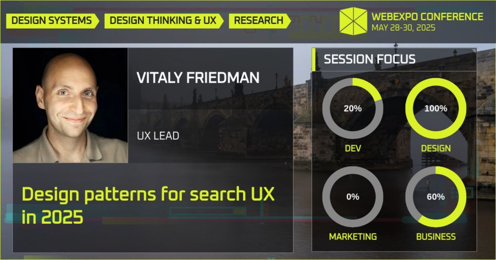
Design patterns for search UX in 2025
In many products, search is critical, yet too often it’s forgotten or overlooked.
🔍 What makes a great search experience in 2025?
Join @vitalyf.bsky.social, co-founder of @smashingmagazine.com, as he shares practical tips and real-life examples to design better autocomplete, filters, sorting, and more in his talk at WebExpo 2025.
✨ Don’t miss it!👇
27.11.2024 07:38 — 👍 8 🔁 1 💬 0 📌 0
✤ Recommended books:
– Design For Real Life, by Sara Wachter-Boettcher, Eric Meyer
– The End of Average, by Todd Rose
– Think Like a UX Researcher, by David Travis, Phil Hodgson
– Mismatch: How Inclusion Shapes Design, by Kat Holmes
26.11.2024 10:09 — 👍 7 🔁 1 💬 1 📌 0
Personally, I often start exploring errors and recovery flows early because they often leave users frustrated and disappointed. Looking into "broken" state helps you also figure out how you communicate to your users, your tone and voice, and hence the messaging.
26.11.2024 10:09 — 👍 0 🔁 0 💬 1 📌 0
Personally, I often start exploring errors and recovery flows early because they often leave users frustrated and disappointed. Looking into "broken" state helps you also figure out how you communicate to your users, your tone and voice, and hence the messaging.
26.11.2024 10:09 — 👍 0 🔁 0 💬 1 📌 0
Or optimistic actions where we assume access by default and hence reduce the perceived speed of uploading data. If it goes unexpectedly wrong, we flag an error and ask users for their input.
26.11.2024 10:09 — 👍 0 🔁 0 💬 1 📌 0
We need to avoid an entire page takeover, but rather lazy load content panes or use inline loading. Finally, we can improve the blank states by using skeleton screens where we show the structure and layout of the page early.
26.11.2024 10:09 — 👍 0 🔁 0 💬 1 📌 0
Our job here is to prevent people from getting discourage and giving up on our product. In the loading state, when users are waiting for an update to come through, we must avoid frustrating rage taps/clicks and allow users to set filters by being mindful on how we manage data fetching.
26.11.2024 10:09 — 👍 0 🔁 0 💬 1 📌 0
We start with the ideal state. It’s the zenith of your product's potential. We then explore the error state, when things go wrong, with unexpected problems, error messages and input validation UX. From there on, we move to the partial state — when the page is sparsely populated.
26.11.2024 10:09 — 👍 0 🔁 0 💬 1 📌 0
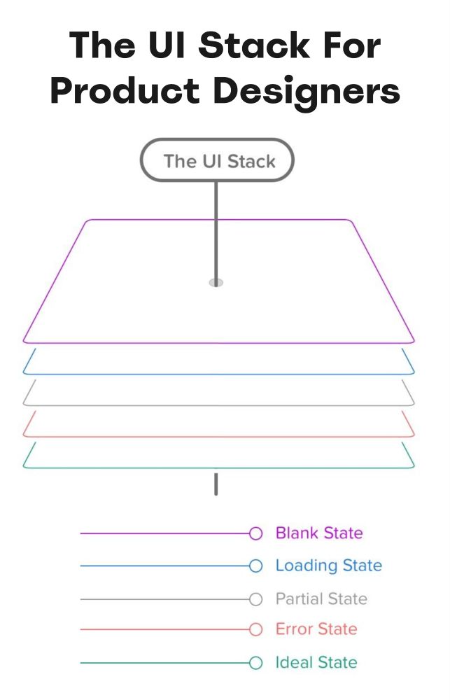
🥞 The UI Stack For Product Designers. Every screen you interact with has multiple personalities: blank state, loading state, partial state, error state and ideal state.
How To Fix a Bad User Interface, by Scott Hurff ↓
www.scotthurff.com/posts/why-yo...
26.11.2024 10:09 — 👍 16 🔁 1 💬 2 📌 0
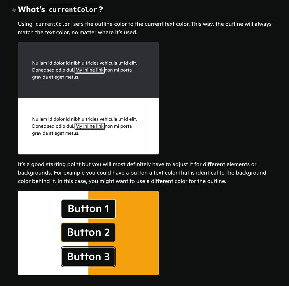
Screenshot of a part of the article showing an example of current color adapting a focus ring to light and dark theme
Beautiful focus outlines (10min) Thomas Günther explains how to use currentColor, :focus-visible, :focus outline-offset to create accessible custom focus indicators
medienbaecker.com/articles/foc...
26.11.2024 08:30 — 👍 37 🔁 13 💬 1 📌 0
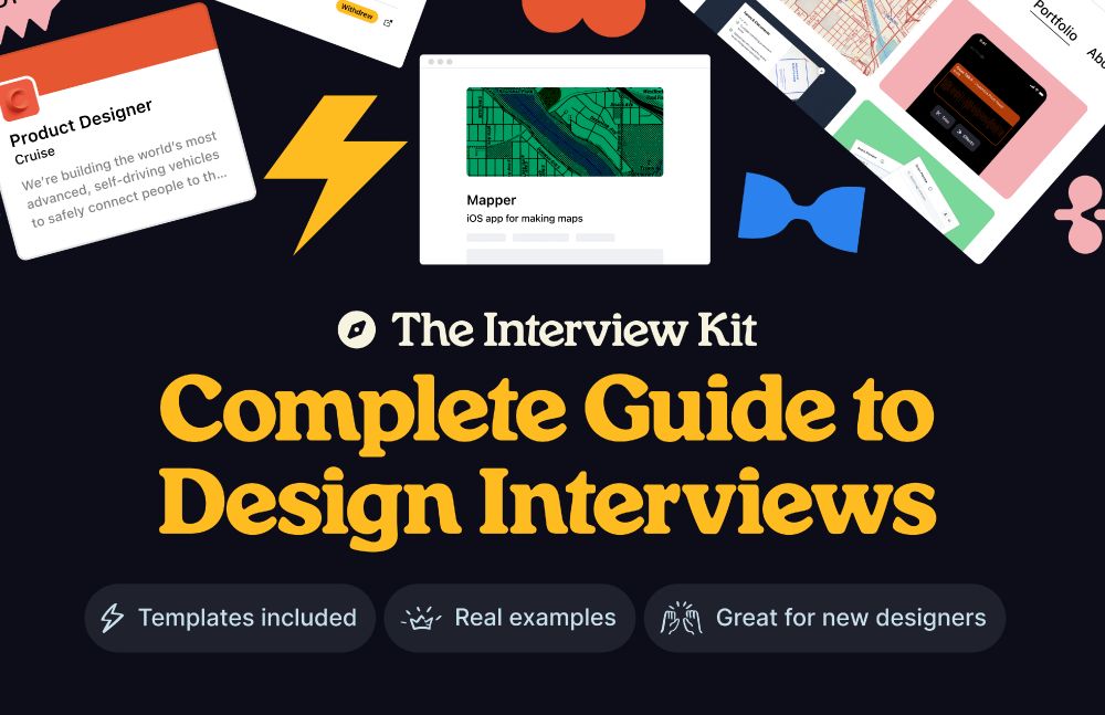
Complete Guide to Design Interview, with templates, real examples — great for seasoned and young designers
🌟 Free Interview Kit: A Complete Guide To Design Interviews (www.figma.com/community/fi...), a free guide to design interviews that covers how to craft case studies, solve design challenges, write cover letters, present your portfolio and negotiate your offer. Kindly shared by Oliver Engel.
25.11.2024 15:18 — 👍 5 🔁 0 💬 0 📌 0
✤ Useful resources:
Practical Guide To Content Testing, by Intuit
lnkd.in/ewZSVT3i
Testing Content With Users, by Kate Moran
lnkd.in/eVzyQmvD
Five Fun Ways To Test Words, by John Saito
lnkd.in/eJ6uk-U2
Highlighting: Simple Way To Evaluate Content, by Peter Gale
lnkd.in/eRt4mDQz
#ux #content
25.11.2024 08:50 — 👍 1 🔁 0 💬 0 📌 0
And: a great technique I use to test how well a design matches mental models is the 🍌 Banana test. Replace all key actions with “Banana”, then ask users to explain what each action might mean.
It will tell you if your key actions are in the right place, if your icons and interactive elements work.
25.11.2024 08:50 — 👍 2 🔁 0 💬 1 📌 0
How to choose the right way to test?
💭 Do users understand? ← interview, comprehension tests, Cloze test
💭 Do we match the mental model? ← Banana test, Cloze test
💭 What word works best? ← card sorting, A/B test, tree testing
💭 Why doesn’t it work? ← interviews, highlighting, walkthroughs
25.11.2024 08:50 — 👍 0 🔁 0 💬 1 📌 0
Too often, users would say that a page is clear and well-organized, but when asked specific questions, you notice that their understanding is vastly different from ours.
Such insights rarely surface in unmoderated sessions — it’s much more effective to observe behavior in-person or remote.
25.11.2024 08:50 — 👍 0 🔁 0 💬 1 📌 0
With content testing, our goal is to learn how users actually perceive the content that we present to them. It’s not only about being confused, or not finding the right answer on a page, but also if our content clearly articulates what we actually want to communicate.
25.11.2024 08:50 — 👍 0 🔁 0 💬 1 📌 0
✅ First, write up a plan with goals, customers, questions.
✅ Bring questions and wait silently — avoid speak-aloud.
✅ Ask users to highlight helpful and confusing words.
✅ Ask users to explain a product, flow, concepts to you.
🚫 Don’t ask people what they like, prefer, feel or think.
25.11.2024 08:50 — 👍 1 🔁 0 💬 1 📌 0
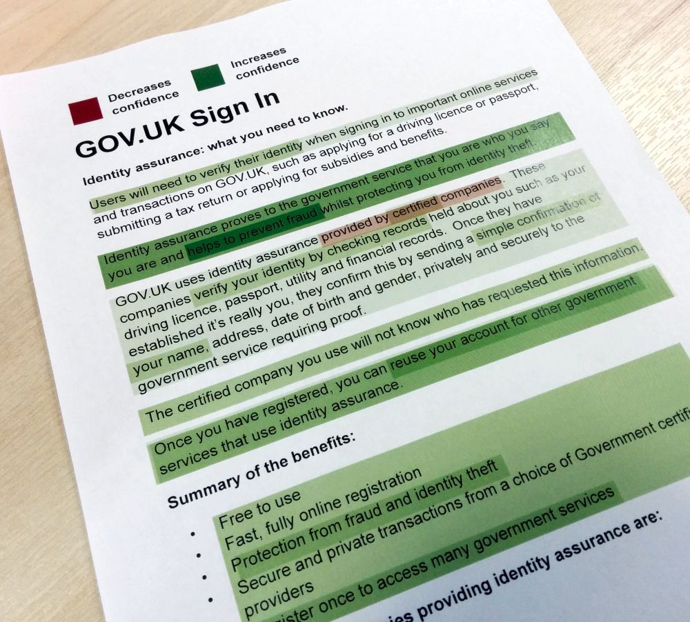
Highlghting is a simple technique to ask users to highlight most relevant and confusing bits in the content
🍌 Banana test ← replace key actions with Banana, ask to explain
🕳️ Cloze test ← remove words, ask users to fill in
🤔 Reaction cards ← write emotions on cards, ask to choose
🖍️ Highlighting ← ask users to highlight helpful/confusing words
🥊 Competitive testing ← ask users to explain competitor pages
25.11.2024 08:50 — 👍 0 🔁 0 💬 1 📌 0
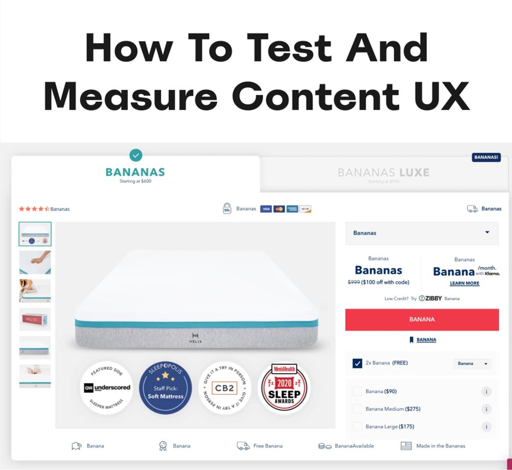
👩🏻🔬 How To Test And Measure Content In UX. With practical guidelines on how content is perceived and understood ↓
✅ Content testing is a way to test for clarity.
✅ It helps address questions, doubts, concerns.
✅ Before testing, know what you want to learn.
🚫 Don’t test words, revise concepts broadly.
25.11.2024 08:50 — 👍 10 🔁 1 💬 1 📌 0
📱 Designing For Gen Z: Expectations and UX Guidelines
With frequent myths and actual behavior patterns that go beyond heavy use of social media.
Gen Z has high expectations for accessibility, authenticity, and inclusivity in digital products. They are highly skeptical of brands and advertising, and rely on social circles, influencers, and peers for information.
Great article by @vitalyf.bsky.social
www.linkedin.com/pulse/design...
20.11.2024 19:11 — 👍 14 🔁 2 💬 0 📌 0
am: Staff Engineer & Web Lead @slack.engineering. International Speaker. Design Systems Advocate. Chaotic Good.
was: Hillary for America (1st dev hired). IBM Design.
always: 🖖🏾. Whovian. Beyoncé.
♿️ AuDHD. CPTSD. INFP. ABCDEFG.
👉🏾 https://mina.codes
Making and mending networks and knowledge. Working and thinking at wrecka.ge, building at Unbreaking.org.
Cofounded the Covid Tracking Project, previously OpenNews, old web nonsense.
Engineering Manager @ Spotify💚
Black Code Collective co-founder ✊🏾
Scuba Diver 🧜🏽♀️🤿
Whiskey expert — IG: womanwithwhiskey
Adventurer 🗺️
you have the ability to understand things
principal engineer, react person, super gay, still masking
web dev, design, LLMs, data viz, tools for thought
✨ Design @ SHV
🌸 wattenberger.com
Design engineer playing with AI and hacky prototypes @githubnext.com
Adores digital gardening, end-user development, and embodied cognition. Makes visual essays about design, programming, and anthropology.
📍 London
🌱 maggieappleton.com
Engineer • Designer • Speaker
a11y • design tokens • JS things
cat herder • costume wrangler
she/her
https://kathleenmcmahon.dev
A person who enjoys creating things with friends & does not enjoy fascism
🏳️⚧️ Queer art & code (& "ideology")
🕸️ Web dev/teaching @OddBird.dev
💅 CSS @ W3C Working Group
👩🏼🎤 Art @ TeacupGorilla.com & GrapefruitLab.com
MiriamSuzanne.com
Author of Designing Interface Animation 📕 Always likes dogs. Sometimes likes running. Principal Designer at Adobe. (Opinions mine.)
Front end developer. Extremely online since 1998! HTML, CSS & a touch of JS.
Into web accessibility and inclusivity in general. I'm a cis het elder millennial mum of 2, she/her.
♿✊🏿🏳️⚧️🏳️🌈
https://sarajoy.dev
(see also @sarajw.front-end.social.ap.brid.gy)
Content lead for Chrome Web Developer Relations. Opinions (and cats) my own.
Sr. Front-end Engineer, Accessibility. Aggressive keyboard navigation tester. Fighter of bright ideas. Hater of delight. MMO gamer. Brooklyn. she/her. Opinions are my own.
Masto: https://hachyderm.io/@hbuchel
Web: https://heather-buchel.com
Design Technologist at Atlassian. Previously GitHub.
www.katielangerman.com
Programmer, writer, mother. She/Her. Senior Software Engineer @ Mangomint. I enjoy talking about code, writing, photography, and life moments. Falo portugués. Married to @rmwardell.bsky.social
Host of @humansideof.dev
Creator of @clocktracker.app
She/her
Design systems and content design consultant. Reckless shitposter.
amyhupe.co.uk
wearefrankly.co
#DesignSystems #ContentDesign #WriteTheDocs
😻 Accessibility @ GitHub
🎮 HCI PhD candidate a11y + AI
💻 Recovering frontend dev
✨ Star Wars fan (obviously)
💁♀️ she/her
8 hours of sleep. 8 hours working as an unprofessional front-end developer. Then on my other 8 hours I poke my blog, take photos of my cat & try my best.
📧 hello@anarodrigu.es
Keen on IndieWeb, CSS, sustainability, plants, crafts she/her
ohhelloana.blog
Writing the React, fighting with the application state, designing the GraphQL APIs, cursing the TypeScript errors, learning Golang, migrating the databases, and admiring the amazing content at https://codepen.io.
https://rachsmith.com
Apple Evangelist on the Web Developer Experience team for Safari & Webkit. #PwME
🗺️ NL born, after 10 years in HK, finding a new place to live. Currently in Asia.
💕 Doing all things SmashingConf.
🌃 Dumpling eater and skyscraper admirer.
👩💻 Still building websites and loving it.
🧍♀️ Also love food, travel, games and Ferdi 🐈⬛