Relief visualization in perspective style showing elevation data from Malinau at coordinates 2.7148, 116.1959 with elevation range from 365m to 1282m.
//\ Relief #037
Location: Malinau, Kalimantan Utara, Indonesia
Coordinates: 2.7148, 116.1959
Elevation Range: 365m to 1282m
Terrain type: mountainous
#ReliefOfTheDay #DataViz #Geography
27.06.2025 10:16 — 👍 1 🔁 1 💬 0 📌 0

DOGE cancels lease of USGS Rice Lake water monitoring office • Wisconsin Examiner
The planned closure of a USGS water field office in Rice Lake is worrying experts on the future of water quality data in Wisconsin.
"The agency has been operating streamgages in the United States since the 1880s. One of the first 120 gages the agency installed was in Wisconsin in 1899 ... That longevity gives scientists an essential resource for tracking Wisconsin’s bodies of water."
via @wisconsinexaminer.com
30.05.2025 14:11 — 👍 14 🔁 11 💬 0 📌 1
Jazz up your ggplots!
Useful tricks to elevate your data viz via `ggplot` extension packages in R
Jazz up your ggplots!
‘Useful tricks to elevate your data viz via `ggplot` extension packages in R”
Custom themes, fonts, annotations, arrows & more
By the USGS
waterdata.usgs.gov/blog/ggplot-...
#RStats #ggplot2 #ggplot #Dataviz
09.04.2025 10:53 — 👍 31 🔁 9 💬 0 📌 1

Data that are "available upon request".
13.05.2025 02:53 — 👍 126 🔁 10 💬 3 📌 1
I've reached out to multiple authors this week to try and get data from their papers.
So far, all I've got is a collection of bounced emails.
13.05.2025 03:23 — 👍 3 🔁 2 💬 0 📌 0

Trump holding a board showing reciprocal tariffs next to an illustration labelled "Trump's 'liberation day'". A stock market graph is in the background
Thrilled to have played a part in this excellent story about the stock market during Trump's first 100 days
www.cnn.com/interactive/...
30.04.2025 07:29 — 👍 12 🔁 5 💬 1 📌 3
🚀🚀
15.04.2025 10:35 — 👍 59623 🔁 19115 💬 1616 📌 862

Join your local protest on April 19th. Spread the word.
14.04.2025 00:58 — 👍 6580 🔁 2375 💬 95 📌 90
Yesterday was incredible. The official count is in — 5.2 million people joined the #HandsOff protest nationwide. So many are asking: what’s next? Mark your calendars: 4/19 is the next nationwide day of protest.
06.04.2025 14:26 — 👍 18117 🔁 4863 💬 429 📌 490
As Governor, I will always stand with Minnesotans in the business of protecting fundamental rights.
03.03.2025 22:18 — 👍 25195 🔁 2215 💬 383 📌 60
Musk’s status as a “special government employee” limits him to 130 days in the executive branch. However, despite working daily—documented by his own X posts—they claim he only works one day a week, effectively stretching his limit to 130 weeks. This needs to be brought to Congress—please share.
02.03.2025 15:18 — 👍 18356 🔁 6972 💬 385 📌 323


Learn how to create stunning charts 📈 and maps 🌍 in this new lesson on Code Like a Journalist! We'll code #dataviz together using data from the 2023 Canadian wildfires.
I rewrote it a few times, so I’d love for you to check it out. 😅
Link in the comments! 👇
20.02.2025 13:46 — 👍 11 🔁 1 💬 1 📌 1
Every scientist, long before they were a scientist, was a little kid who stood in front of a fish tank or stared up at the stars or turned over a rock to look at the bugs underneath and said “wow”. On the best days, working in science still feels like that.
19.02.2025 02:08 — 👍 1878 🔁 413 💬 26 📌 34
Dear federal scientists: If you have been affected by the probationary firings and would be willing to speak with Science, please reach out to me by email (klangin@aaas.org) or on Signal. We can guarantee annonymity.
14.02.2025 20:05 — 👍 2478 🔁 1303 💬 24 📌 15
The making of last week's #TidyTuesday visualisation, recorded using {camcorder} in #RStats 📹
There was something weird going on with the interaction between {ggtext}/{marquee} and {ggpattern} for displaying images, so the hardest part ended up being arranging them with {patchwork}
12.02.2025 09:34 — 👍 44 🔁 8 💬 2 📌 1

#MakeOverMonday week 7 - Most Popular Valentine Day candy.
Tableau Public: public.tableau.com/app/profile/...
#dataviz #Tableau
12.02.2025 12:41 — 👍 9 🔁 1 💬 0 📌 0

Water availability in the U.S.
Do we have enough water? water.usgs.gov/vizlab/water... #dataviz #rstats #d3js 📊
30.01.2025 22:52 — 👍 5 🔁 1 💬 0 📌 0
It's #TidyTuesday y'all! Show us what you made on our Slack at https://dslc.io!
#RStats #PyData #JuliaLang #RustLang #DataViz #DataScience #DataAnalytics #data #tidyverse #DataBS
28.01.2025 12:59 — 👍 6 🔁 1 💬 0 📌 1
Logo for the #TidyTuesday Project. The words TidyTuesday, A weekly data project from the Data Science Learning Community (dslc.io) overlaying a black paint splash.
TidyTuesday is a weekly social data project. All are welcome to participate! Please remember to share the code used to generate your results!
TidyTuesday is organized by the Data Science Learning Community. Join our Slack for free online help with R and other data-related topics, or to participate in a data-related book club!
How to Participate
Data is posted to social media every Monday morning. Follow the instructions in the new post for how to download the data.
Explore the data, watching out for interesting relationships. We would like to emphasize that you should not draw conclusions about causation in the data.
Create a visualization, a model, a shiny app, or some other piece of data-science-related output, using R or another programming language.
Share your output and the code used to generate it on social media with the #TidyTuesday hashtag.

Three choropleth maps of the United States west of the Mississippi River, using 2022 U.S. Census Bureau Data, entitled Mapping water insecurity in R with tidycensus. The first choropleth is labeled Percent Hispanic, 2022, and shows the highest percentages of Hispanic people near the US-Mexico border, with scattered high percentages, such as in the state of Washington. The second choropleth is labeled Median gross rent, 2022, and shows the highest rents in California, Washington state, and Colorado. The third choropleth is labeled Average household size, 2022, and has scattered areas of large household size, with the highest averages in South Dakota, Utah, southern California, and southern Texas. The image also includes the hex logo of the tidycensus R package, with an indistinct choropleth map in shades of green.
Curator: @nnpereira
@dslc.io welcomes you to week 4 of #TidyTuesday! We're exploring Water Insecurity!
📁 https://tidytues.day/2025/2025-01-28
🗞️ https://waterdata.usgs.gov/blog/acs-maps/
#RStats #PyData #JuliaLang #DataViz #tidyverse #r4ds
27.01.2025 13:40 — 👍 21 🔁 5 💬 0 📌 2
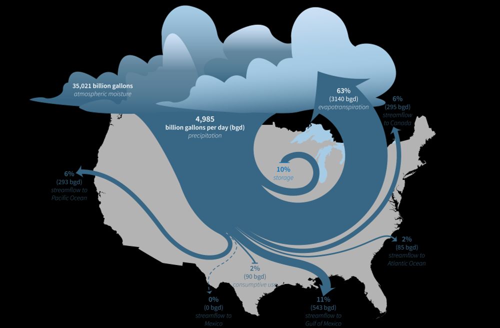
Stylized illustration of the water cycle of the lower 48 United States, showing the fate of water that enters through precipitation. Most of the water returns to the atmosphere through evapotranspiration, but much of the water ends up in the Atlantic and Pacific Oceans, in Canada, or in the Gulf of Mexico through streamflow.
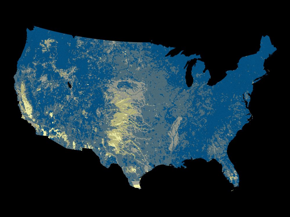
Map of water limitation in the lower 48 United States by watershed. Areas with relatively high water limitation are in the high plains, Texas, California, and the Mississippi Embayment hydrologic regions.
The U.S. Geological Survey (USGS) Vizlab has just released a new, interactive data visualization website about the USGS National Water Availability Assessment Report and Data Companion. Explore the data and the key findings of the assessment at water.usgs.gov/vizlab/water... #DataViz #rstats #USGS
16.01.2025 18:20 — 👍 22 🔁 10 💬 1 📌 2
NEW: Animation showing how the LA fires have spread over the past 7 days. Near hurricane-force winds are expected later today which firefighters fear could fan the devastating wildfires.
Read @grimeslikedimes.bsky.social and Myles McCormick's report
www.ft.com/content/1304...
#dataviz
13.01.2025 18:47 — 👍 193 🔁 73 💬 5 📌 8
This whole blog series is 🔥
16.01.2025 17:05 — 👍 1 🔁 0 💬 0 📌 0
Roaming independent creative developer, previously at @ cher-ami.tv | Former sweetpunk.com | Alumnus of gobelins.fr
☞ bastiencornier.com
Daily topographical relief visualizations of earth.
For requests: Reply on latest post with latitude,longitude coordinates like "48.85, 2.35" (land only).
🌍 Source code: https://github.com/Bastou/bot-bluesky-reliefs
👨💻 Made by @bastiencornier.bsky.social
Visualisation and graphics @posit.co
Classic Generative Art Weirdo using 🖤 and R: http://thomaslinpedersen.art and http://deca.art/thomasp85
he/him
Theoretical Scientist | Researcher & Philosopher
Head of Research Department, RO Educational Institute
https://www.researchgate.net/profile/Jalal-Khawaldeh
https://orcid.org/0009-0003-7872-1967
Data visualisation engineer in Australia.
Author of Practical UI Patterns for Design Systems.
Creator of Typey Type for Stenographers.
🔗 https://didoesdigital.com
Data & Graphics @ CNN. 📈👸
Priors: WSJ, ONS. Clearly a fan of acronyms. "Aggressive Door Opener".
Fair Warning newsletter: https://fairwarning.substack.com
Data, analysis, visualization, #CensusMapper, transportation cyclist.
📍Vancouver, BC
Freelance Concept Artist & Illustrator; of BAFTA winner ROLLERDROME fame || Once in games, now everywhere ||🥤💀
portfolio: https://kim-hu.com
📩 hello@kim-hu.com
patreon blog: https://patreon.com/kimhu
art/work-only account: @elbowrocket.bsky.social
On the faculty job market!
Presently PhD candidate on "toolmaking" @hcii.cmu.edu. Former: Adobe, Highsoft, Apple, Visa, etc.
I care a lot about accessible data interaction 📊 (:
Disabled, getting into trouble, & making a ttrpg.
He/him
www.frank.computer
At the intersection of technology, journalism and culture.
information design - creative coding - data visualization: https://giacomo.website/
Currently building: https://vantage.thometnanni.net
Otherwise at @airwars.bsky.social and @metaLABharvard
Scientist and software developer. Creator of tidyplots.org. Website jbengler.de.
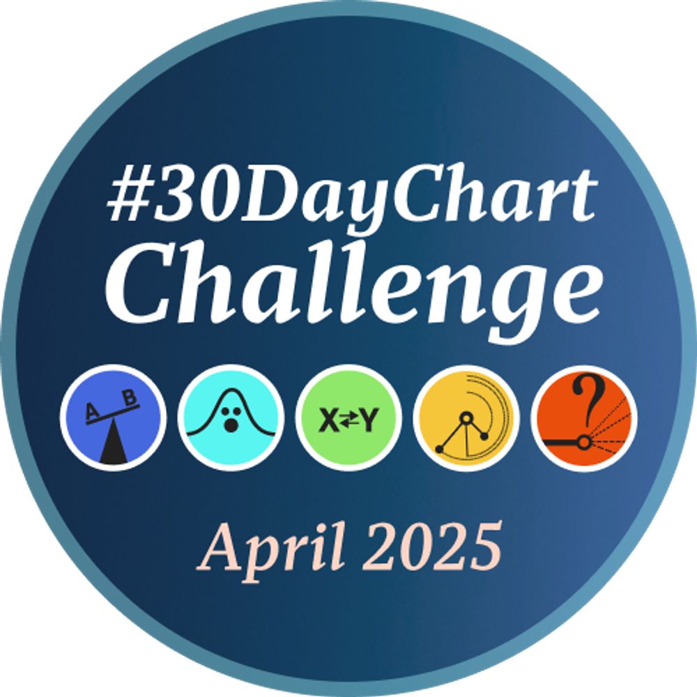
A #DataViz challenge 📊 by @cedricscherer.com and @drxeo.eu
Supported by @wendyshijia.bsky.social and @ansgarw.bsky.social
More info on Github: https://github.com/30DayChartChallenge/Edition2024
Coalition-building organization for the working class founded in 2023 by Senator Nina Turner. Boycott Target.
Visit WeAreSomebody.org
Hydrologist excited about water quality, water data, and aquatic ecology 💧 UW-Madison & Colorado State University alumna 📍PA (opinions and typos mine)
Climate, water, birds, bluegrass mandolin. Member US National Academy of Sciences, MacArthur Fellow, Carl Sagan Prize, author of The Three Ages of Water (2023). Also on Mastodon. @petergleick@fediscience.org. Email me at pgleick (at) gmail.
poetry | art | music | science | tech
nuclear physics | fountain pens | fishing
geology | photography | astronomy
philosophy | software development
cinema | free press | democracy
constitutional law | decency | reason
compassion | not, Speling grammar and
Hydrologist & developer 💧🌎💻 Tweets my own | she/her
Dad, husband, teacher, coach, veteran. Governor of Minnesota. Working to move our state forward as #OneMinnesota.
Public Access to Public Data is a Public Good. We want to ensure our data are not gone forever. Read more about our efforts: https://www.datarescueproject.org/press/
KD— 30 something year old mom, school committee member, who believes in democracy, is ready to punch nazis, and uninterested in misogynistic mind fuckery.