What are you building? 👀
10.01.2025 15:12 — 👍 0 🔁 0 💬 1 📌 0
Not @ariakitjs, but @ariakit.org of course
10.01.2025 10:27 — 👍 0 🔁 0 💬 0 📌 0
A nice new example from @ariakitjs: Command Menu with Tabs ❤️
It has it all — tabs, multi-column layout (grid), full keyboard navigation, solid API.
ariakit.org/examples/di...
10.01.2025 10:19 — 👍 9 🔁 2 💬 1 📌 0
… and let people follow the example 🔥
Any mentionable benefits you got from this strategy? How did it work in large orgs where you worked at?
30.12.2024 19:47 — 👍 0 🔁 0 💬 1 📌 0
So it’s for the content of the folder/folder items if I understand correctly
TreeFolderItems or TreeItems would maybe work better for me
I guess you want to avoid using prop? <TreeFolder items={children}>{item}</TreeFolder>
30.12.2024 19:43 — 👍 0 🔁 0 💬 0 📌 0
Design system teams should be actively refactoring the codebase to drive adoption—rather than only asking others to do it. Major benefits for the system come from it too.
What’s your take on this?
30.12.2024 19:34 — 👍 7 🔁 0 💬 1 📌 1
Looks solid, great that the virtualization is considered from initial API designs 👏
What’s not fully clear just from these examples — what is a difference between TreeFolder and TreeLevel?
27.12.2024 11:04 — 👍 3 🔁 0 💬 1 📌 0
Thank you also for the example with virtualization. Will there be also ComboboxRenderer, similarly as SelectRenderer?
Have you considered merging these 2 components together somehow? There are many similarities between them, and I see "searchable selects" more often now (especially in B2B patterns)
25.12.2024 13:26 — 👍 0 🔁 0 💬 1 📌 0
Thank you!
Tag looks awesome, and the example with integrated combobox is amazing — exactly what I was saying "it would be great to have it" 👏
I also welcome the change with the "integrated" combobox provider within Select component, which should make the last example a bit simpler too
25.12.2024 13:26 — 👍 0 🔁 0 💬 1 📌 0
Are the experimental features available somewhere already? 👀 Even if it's for testing still, happy to be part of that and provide feedback
Also curious about what changes are coming to Combobox API. Any chance there is public RFC/API design doc?
Thanks for any details you can already share
24.12.2024 22:37 — 👍 0 🔁 0 💬 1 📌 0
Tldr: From the first look, it appears very promising and as a good "base components companion" to my favorite Ariakit.
And not to forget that Base UI is still still in v1.0.0-alpha.
I really look forward to trying it out and seeing how Base UI will evolve in the future.
18.12.2024 16:11 — 👍 2 🔁 0 💬 0 📌 0

Base UI
After Radix’s useful (but polarizing?) asChild prop, I wondered how Base UI would approach it.
They kept it simple: a `render` prop that can accept either a component or a function. Clean, flexible—thoughts?
base-ui.com/react/handb...
18.12.2024 16:11 — 👍 4 🔁 0 💬 1 📌 0
Tooltip has also one interesting prop: `trackCursorAxis`. It gives some flexibility to design decisions.
Additionally, it has a `hoverable` property that you can use when you need the tooltip to be interacted with further (e.g., when it contains a link)
18.12.2024 16:11 — 👍 2 🔁 0 💬 1 📌 0

If you've been working with dialogs or popovers, you know the struggles with focus management.
Base UI provides props to manage focus when opening but also when closing a dialog.
This will save some headaches.
18.12.2024 16:11 — 👍 1 🔁 0 💬 1 📌 0
Expandable components like Accordion or Collapsible feature a useful prop called `hiddenUntilFound`.
What does it do? It simply expands the item when someone searches for it using the built-in browser search. Great attention to detail.
18.12.2024 16:11 — 👍 2 🔁 0 💬 1 📌 0
Radix is dead, long live the Rad... @base-ui.com! 🎉
Design system creators, this is a must-explore library of React UI components. There is a lot of built-in functionality and interesting API design choices.
A few examples in a thread 🧵
18.12.2024 16:11 — 👍 18 🔁 4 💬 4 📌 0
Did you try to update to the latest version? I think it appeared after, together with a changelog
17.12.2024 13:02 — 👍 1 🔁 0 💬 1 📌 0

A list of applications from Raycast Wrapped: including Figma, Cursor, PhpStorm, Github Desktop, or Linear.
Tell me you're a design engineer without telling me you're a design engineer 👾
Thanks for latest @raycast.com Wrapped!
17.12.2024 10:45 — 👍 5 🔁 1 💬 2 📌 0
Imagine a call with a prototype in hands
28.11.2024 17:09 — 👍 0 🔁 0 💬 1 📌 0

Setting up a screen reader testing environment on your computer
– The personal website of Sara Soueidan, inclusive design engineer
If you want a really good deep dive into testing with screen readers, I strongly advise reading this guide by @sarasoueidan.com
www.sarasoueidan.com/blog/testing...
#a11y #screenReaders #accessibility
23.11.2024 17:21 — 👍 87 🔁 26 💬 7 📌 3
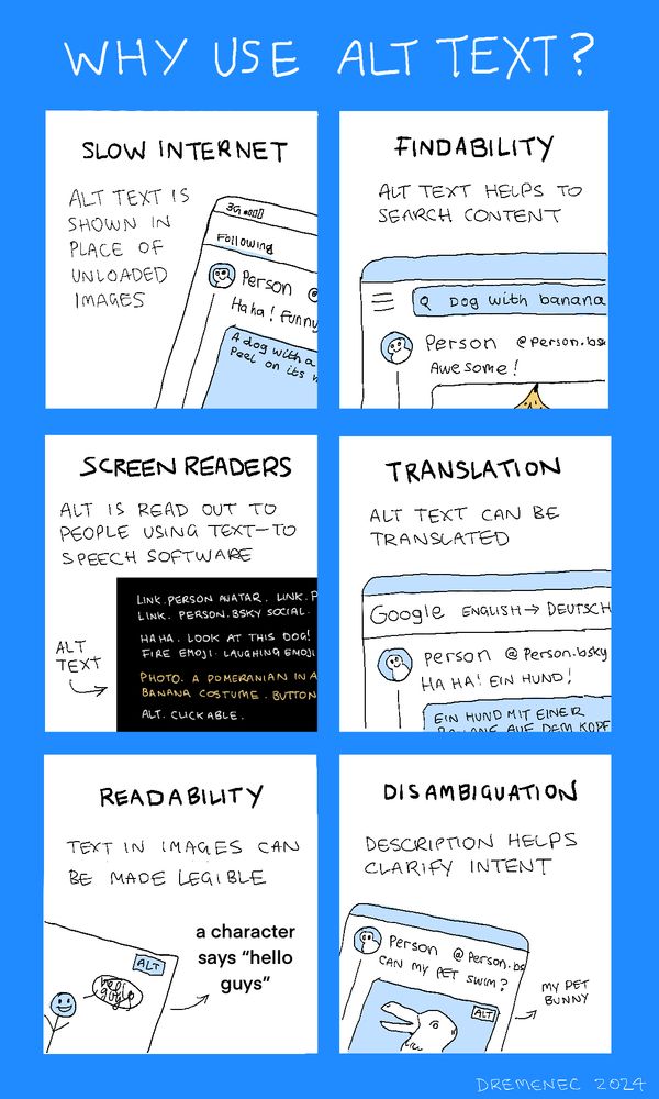
An infographic. There are six panels.
1. "Slow internet. Alt text is shown in place of unloaded images." a drawing shows a phone with poor signal, and alt text is visible where the image should have loaded.
2. "Findabillity. Alt text helps to search content." A drawing shows someone searching 'dog with banana' and a post is shown underneath without the words 'dog' or 'banana'. It is implied to be part of the alt text.
3. "Screen readers. Alt is read out to people using text-to-speech software". There is a drawing of the output a screen-reader would show when viewing an image with alt text on bluesky.
4. "Translation. Alt text can be translated". A drawing shows a post being translated. The alt text is also translated into german.
5. "Readability. Text in images can be made legible" There is a drawing of some truly awful handwriting inside a speech bubble. The alt text clarifies what the text is supposed to say.
6. "Disambiguation. Description helps clarify intent." There is a drawing of a post with a picture of a creature. This is styled after the famous optical illusion of a rabbit and a duck. The alt text clarifies that the animal is a rabbit. It definitely looks more like a duck.
Generally we think of alt-text as the domain of those with accessibility needs.
However alt-text is useful for many reasons, which benefit your viewers, as well as you, the creator!
28.10.2024 22:20 — 👍 10714 🔁 6630 💬 196 📌 696
👋
03.07.2023 19:56 — 👍 3 🔁 0 💬 1 📌 0

Goldman Sachs' design system has a page called "Design System Concepts" 💡
It's an effective way to show that their naming isn't random, but rather intentional, leading to a more coherent API and language 👏
https://design.gs.com/foundation/design-system-concepts
25.05.2023 04:26 — 👍 2 🔁 0 💬 0 📌 0
A new resource on @figma.com community — a blueprint for a button component 🎉
It's an example of how to build a well-usable component with some useful Figma tricks applied. Copy/paste it to your files and tweak it to your liking 🎨
https://www.figma.com/community/file/1242237541978933162
23.05.2023 02:40 — 👍 0 🔁 0 💬 0 📌 0
Passionate, positive-minded, Sr Front-end Engineer @ Preply (Design System) / Front-end advisor @ Plannix / ex Hasura (platform team), WorkWave (team leader) / Speaker / Instructor / Writer
Musings about Design & Product. Currently at Zillow, Design Tech & AI.
Design systems consultant at Directed Edges in Fairfax, VA USA. Figma Specs plugin creator. Blogger on @medium. Formerly EightShapes. Supports Arsenal, University of Chicago and Virginia Tech. From Ohio, originally.
Front-end developer | co-founded https://specifyapp.com | designtokens.org editor.
I also like ambient music and a nice côte de boeuf bien persillée.
Principal Design Technologist. Design Systems. Design tokens. AWS Amplify. Style dictionary. Cats. (He/him)
Design System Consultant. Design, Dev & Product. Prev zeroheight, Auto Trader, BBC
All about design systems, design tokens, product design and occasionally making music at @thesedeadmachines.bsky.social
Fullstack Dev ❯ JS⚛ CSS Node ❯ JavaScript30.com ❯ wesbos.com/courses ❯ 🔥 Tips ❯ Podcast @syntax.fm
Opinions my own.
https://sarah.dev
Sr Director of Engineering @ Google: Core Web, Android, iOS Infrastructure
Formerly Vue Core •
Frontend Masters teacher •
O'Reilly Author •
https://www.engmanagement.dev/
https://github.com/sdras
👋 Engineering Leader working with Design Systems & Accessibility
⏮️ ex-Spotify & BBC
🐝 Living in Manchester
🐶 I own a pug, he's old
Systems Designer at GitHub, CSS nerd, co-host of the Complementary podcast.
katielangerman.com
👋 currently looking for new client work
🖤 Design Systems Practitioner
🛠 Front-End Developer
📰 Curates Design Systems News
🏎️ Formula One Watcher
🧟♂ Horror Fan
🍖 BBQ’er
🖥️ www.alwaystwisted.com
📜 news.design.systems
#accessibility / #a11y advocate, post enjoyer.
🌐 https://ericwbailey.website/
✉️ https://ericwbailey.website/newsletter/
Web components at Microsoft. Co-host at ShopTalk. Previously Luro and Paravel. Blogger.
I love building Design Systems and tools to help teams ship faster.
https://www.tonyward.dev
https://www.github.com/ynotdraw
Design Systems. Web Components. Dad stuff. Music. Basketball.
The Whiteboard Guy @warp.dev
Software Engineer who loves building developer tools and cloud services. Now at Stripe.
Building githero.app on the side: a modern and delightful GitHub client.
📍Zaragoza, Spain
Everyone’s fave goth Mom.
Lead Accessibility Specialist at Just Eat. Design systems and associated nerdery. Be kind ❤️
gerireid.com
Content lead for Chrome Web Developer Relations. Opinions (and cats) my own.
#CSS ex-Google Chrome DevRel, CSSWG, co-host The CSS Podcast, host @ GUI Challenges, co-host Bad@CSS Podcast.
Creator of VisBug, open-props.style, gradient.style, transition.style & more
UI, UX, CSS, HTML, JS
https://nerdy.dev
– Author of @ariakit.org
– Previously Automattic, WordPress
– JavaScript, CSS, Accessibility
– Autistic, dad, he/him