📈 Can Belgium reach 80% employment by 2030?
We created an interactive visual storytelling piece showing how age, gender, and location shape job opportunities.
Take a look 👉 itinera-emploi80.s3-website-eu-west-1.amazonaws.com?lang=en
17.06.2025 07:47 — 👍 7 🔁 1 💬 0 📌 0
Pretty cool indeed 😉
21.05.2025 14:41 — 👍 0 🔁 0 💬 0 📌 0
Fil's maps don’t just show places, they tell powerful stories. Always inspiring to see his work and grateful for his contribution to the community. Give him a follow and read his interview:
24.02.2025 15:06 — 👍 4 🔁 0 💬 0 📌 0
Thanks for the addition 🙏
23.02.2025 15:45 — 👍 1 🔁 0 💬 0 📌 0
Thanks for this idea! They do have some graphical skills, so this could be a great way to quickly create an original design based on data and then explore their own ways to physicalize it using a variety of materials.
07.02.2025 11:17 — 👍 1 🔁 0 💬 1 📌 0
Hey #dataviz folks! I’m looking for fun, hands-on workshop ideas to introduce art students (no coding skills) to data visualization. Any favorite exercises that blend creativity & data in an engaging way? Open to all suggestions! 🎨📊
07.02.2025 07:54 — 👍 6 🔁 1 💬 1 📌 0
Another fantastic roundup of datavis! Thrilled to see my wild creations making an appearance! 👀
06.02.2025 14:02 — 👍 2 🔁 1 💬 0 📌 0
merci!
04.02.2025 22:35 — 👍 0 🔁 0 💬 0 📌 0
👀
04.02.2025 21:57 — 👍 0 🔁 0 💬 1 📌 0
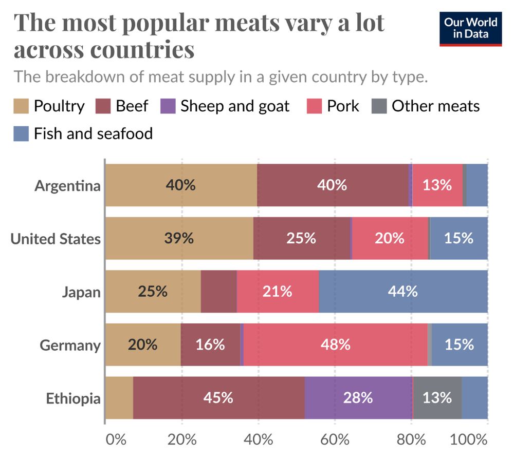
I recently revisited @ourworldindata.org after learning that @maxroser.bsky.social received honorary doctorates from KU Leuven & UC Louvain for his work in making global trends more accessible (Congrats for that!). This viz by @hannahritchie.bsky.social caught my eye—and inspired my own take on it!
02.02.2025 11:24 — 👍 8 🔁 0 💬 1 📌 0
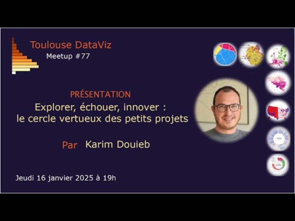
YouTube video by Toulouse DataViz
Explorer, échouer, innover : le cercle vertueux des petits projets
L'association @toulousedataviz.bsky.social a publié la vidéo du #meetup de @karimdouieb.bsky.social. Un partage d'experience très enrichissant avec des réalisations de #dataviz captivantes. A voir assurément ! youtu.be/2Zp3Vp4WHg8
20.01.2025 08:11 — 👍 2 🔁 2 💬 0 📌 0
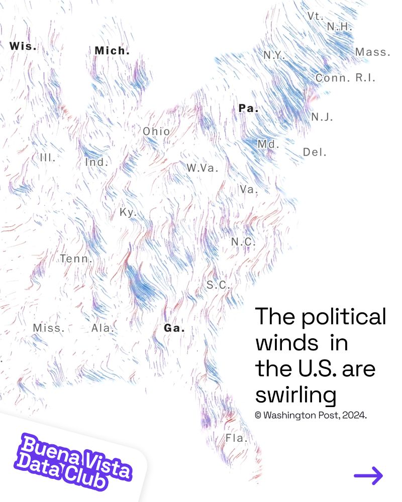
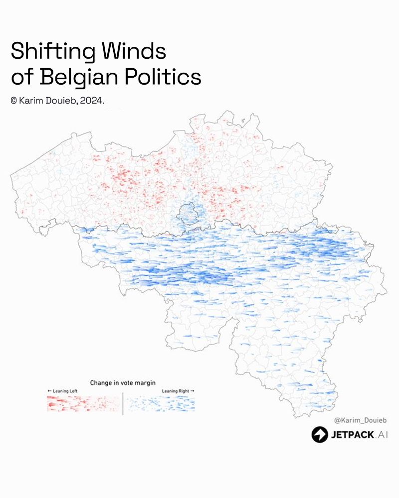
Learn why and how @karimdouieb.bsky.social (data scientist and co-founder of Jetpack.ai) used Observable to re-envision U.S. election maps using a dynamic cartogram, for a more intuitive, representative, and engaging view of election results: https://buff.ly/41P9vZg
30.12.2024 16:54 — 👍 5 🔁 1 💬 0 📌 0
Lovely idea 👌
25.12.2024 09:34 — 👍 1 🔁 0 💬 1 📌 0
Thanks Philip for including my little dataviz experiment in the latest edition of "How to read this chart" newsletter. 🙏 Subscribe for your weekly dose of data insights and creative visuals.
14.12.2024 22:20 — 👍 9 🔁 0 💬 0 📌 1
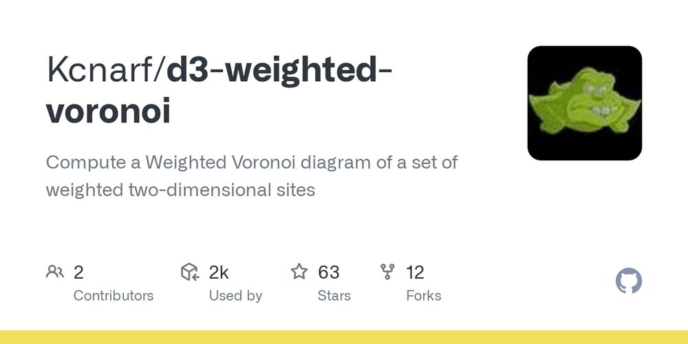
GitHub - Kcnarf/d3-weighted-voronoi: Compute a Weighted Voronoi diagram of a set of weighted two-dimensional sites
Compute a Weighted Voronoi diagram of a set of weighted two-dimensional sites - Kcnarf/d3-weighted-voronoi
I assume you are trying to achieve a weighted voronoi diagram... If that's the case I don't think d3 offers that out of the box. But they are js libs that implement it. Like the one from @franck-kcnarf.bsky.social github.com/Kcnarf/d3-we...
13.12.2024 23:39 — 👍 3 🔁 0 💬 1 📌 0
Oui pas de soucis pour l'utiliser dans ta presa et non je viens de voir la mention, merci pour l'info 😉
06.12.2024 19:22 — 👍 1 🔁 0 💬 0 📌 0
Animation in dataviz has been my secret recipe for years—not just to help people understand my charts but to make them fun, engaging, and impactful. It’s often overlooked, yet easy to do with D3 transitions and super powerful. Thrilled to see my U.S. election map featured in this must-read article!
05.12.2024 21:02 — 👍 8 🔁 0 💬 0 📌 0
Trop chouette de voir ma petite expérience visuelle mentionnée dans la dernière édition de la newsletter de @wedodata.bsky.social ! Un grand merci à eux pour cette belle mise en avant. 🙏 Abonnez-vous pour découvrir plein de projets inspirants. 🙌
05.12.2024 12:19 — 👍 4 🔁 2 💬 0 📌 1
They say every true ceramist must make a porcelain teapot to earn their stripes... So, does this count? 🫖
#porcelain #teapot #ceramics #pottery #projection #shadow
04.12.2024 22:21 — 👍 9 🔁 0 💬 0 📌 0
The name shaping trend thing by @karimdouieb.bsky.social is a fun treat baby-names.jetpack.ai
For the time series dataset that keeps on giving, get it on SSA: www.ssa.gov/oact/babynam...
04.12.2024 19:38 — 👍 11 🔁 3 💬 1 📌 0
Thanks Nathan for the shout-out! I’m really glad to hear you’re enjoying the app. 😊
04.12.2024 19:57 — 👍 1 🔁 0 💬 0 📌 0
Lovely to see my baby names little experiment being mentioned in the latest Data Vis Dispatch. Thanks @datawrapper.de
👉 baby-names.jetpack.ai
03.12.2024 20:49 — 👍 5 🔁 0 💬 0 📌 0
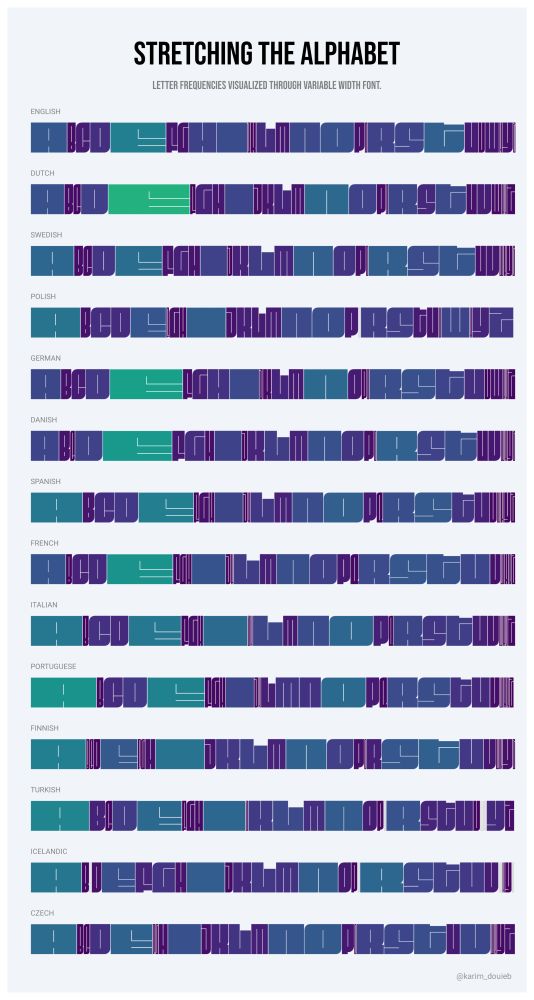
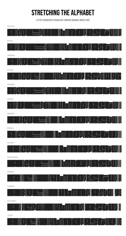
Here’s a new dataviz experiment: exploring letter frequencies in different languages using variable fonts. The width of each letter stretches with its usage frequency. Not sure how I feel about the result—kind of cool, kind of meh. 🤔 What do you think? #dataviz #experiments
01.12.2024 16:57 — 👍 10 🔁 1 💬 3 📌 0
Congratulations 👏
27.11.2024 07:27 — 👍 1 🔁 0 💬 0 📌 0
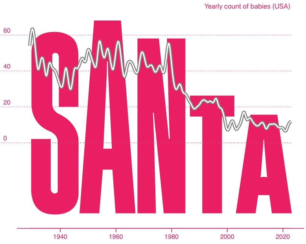
Popular Baby Names
Popular Baby Names
The data source I used has some limitation. It only provides the top 1000 names for every years. This represents about 71 percent of all names.
www.ssa.gov/oact/babynam...
26.11.2024 21:22 — 👍 2 🔁 0 💬 1 📌 0
Very true 😅
26.11.2024 18:44 — 👍 0 🔁 0 💬 0 📌 0
Thanks Paula 🙏
26.11.2024 18:20 — 👍 0 🔁 0 💬 0 📌 0
News and analysis with a global perspective. We’re here to help you understand the world around you. Subscribe here: https://econ.st/4fAeu4q
Data journalist for @economist.com. Europe + climate
Senior Visual Data Journalist at @zeit.de. Co-founder and former CTO of @datawrapper.de. Former @nytimes.com graphics editor #datajournalism #graphics #maps #cartography (he/him)
graphics editor @FT | prev @BBCNews @the_young_fdn | data viz @LCCLondon
https://www.ft.com/jana-tauschinski
dataviz designer @EU_ISS (twitter) . shapes, colors, and stories on security, foreign policy, and others . also on twitter.com/cd_trich
Dataviz at @civio.es · Passionate about #dataviz #maps #creativeCoding alwaysLearning · 👩🏻💻🏳️🌈 she/her
https://observablehq.com/user/@carmen-tm
Cartographer, data visualizer, beans on toast defender.
helenmakesmaps.com for tutorials
Former Washington Post columnist
Writing: pbump.net
Book: "The Aftermath"
Email: philip@pbump.com
Signal: pbump.11
cartographer, geographer, & field-checker for Benchmark Maps & Raven Maps
photographer & naturalist on my own
www.chaneyswiney.com
Maps, charts, illustrations, animations, 3d models, data analysis and fun little easter eggs from your favorite graphics team. https://www.reuters.com/graphics/
L'agence Dataviz 🇫🇷 / nous vous aidons à raconter vos données
// #data #viz & #dataviz
// Newsletter 💌 Buena Vista Data Club 💌 http://wedodata.fr/newsletter
language data science https://moebio.com/
Head of Data and Visualization @zeit (zeit.de/daten-und-visualisierung)
👩💻 Creative developer; Data visualisation for Reuters Graphics
🖌️ Posting about data viz + art, creative coding 🌸
👩🎨 Organising c3s - community for co-creating with code in London
🦉 All views my own
🐈🐈⬛ are my joy
📍 London, sometimes Tokyo
Nous concevons la carte comme un objet artisanal travaillé avec précision et savoir-faire pour répondre à un besoin unique. #LesArtisansCartographes #map
Independent health data visualization designer, speaker, and teacher | Data Viz Society Founding Board Member & Advisory Council, Exec Director 2021-2024
Journaliste - Enquête, traitement de données, analyse spatiale et cartographie - Nantes
(Datajournalism, geography & map design)
https://leplan.studio