ohhh, very nice!!
12.12.2025 13:15 — 👍 1 🔁 0 💬 0 📌 0

Chuffed to see my work on the internet accountability compass exposed at #idc25
The compass explores countries' performance across four cardinal directions and 12 indicators.
globalgovernanceprogramme.eui.eu/gifi/interne...
#informationdesign
@eui-eu.bsky.social
31.10.2025 09:26 — 👍 2 🔁 0 💬 0 📌 0
my latest scrollyteller #dataviz for the @euiss.bsky.social looks into the @eui-schuman.bsky.social Global Risks to the #EU survey. built with #d3js and @observablehq.com #plot
06.02.2025 14:33 — 👍 6 🔁 1 💬 0 📌 0
ohhh, would love to! thanks for letting me know.
08.01.2025 10:05 — 👍 1 🔁 0 💬 0 📌 0
i'm a dataviz designer at the @euiss.bsky.social (an EU agency dealing with foreign, security and defense policy). imet some of you at either Outlier, Info+ or 2CO in recent years.
i made this atlas of relations between the European Union and the African Union 👇
www.iss.europa.eu/content/afri...
03.12.2024 10:31 — 👍 24 🔁 7 💬 4 📌 1
Statistics expert and author of 'Sum of Us' (2025) and 'Bad Data' (2022). Research Affiliate at the Oxford Migration Observatory.
Formerly of the House of Commons Library. Now writing and podcasting on Substack https://georginasturge.substack.com/
The collaborative data canvas
Data visualization designer & data scientist
Co-founder of Jetpack.AI
L'agence Dataviz 🇫🇷 / nous vous aidons à raconter vos données
// #data #viz & #dataviz
// Newsletter 💌 Buena Vista Data Club 💌 http://wedodata.fr/newsletter
// S'inpirer 🤩 et se former 📚 en dataviz : https://dataviz-index.fr/
What’s a Map in the Wild? It’s a map in a real-life context, a sign, a poster, an object, perhaps quirky, perhaps unexpected. What it isn’t is a screen grab from a web site, the output from a GIS or similar.
Keeping Europeans up to date, all over the continent.
Join us by signing up for our daily newsletter: https://t.co/NHyIqg602P
Information designer at the Netherlands Environmental Assessment Agency: https://www.pbl.nl/en/publications/visualising-knowledge
Mastodon:
@filipdeblois@vis.social
LinkedIn:
https://www.linkedin.com/in/filipdeblois
Data Visualisation Manager at a health think tank 👩💻 Mostly talk about data, #dataviz, #opendata, #maps, #python and #data4good 📈 Into cycling, yoga, sourdough, puns and more. Views my own.
Also active on Mastodon + Linkedin
| Husband & dad^3
| head data & visualizations at @spiegel.de
| #Svelte and #D3
| biochemistry & computational biology PhD
| 🇸🇪🇩🇪🇪🇺
| https://spiegel.de/duv
| https://higsch.com
Hey, I'm a climate and energy writer / data analyst who focuses on corporate + govt accountability
Creator + curator of the Greensky feed: https://ketanjoshi.co/greensky/
Based in Oslo but write about US, Europe, Aus too - ketan.joshi85@gmail.com
Artist, writer, educator, birder & nudibranch enthusiast. Author of Living in Data (MCDxFSG).
Crafting data experiences at http://truth-and-beauty.net
Award-winning Data Visualization Designer & Data Artist | Founder of Visual Cinnamon | Graduated Astronomer ✨ | Author of "CHART" & "Data Sketches" | 🇳🇱
VisualCinnamon.com
Designer, journalist, and professor.
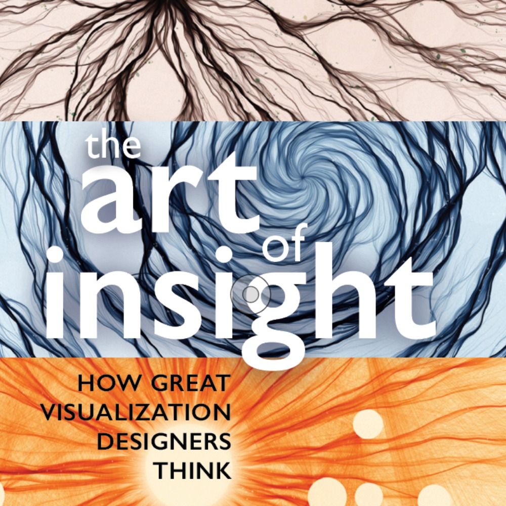
Author of 'The Art of Insight' (2023) 'How Charts Lie' (2019), 'The Truthful Art' (2016), and 'The Functional Art' (2012). NEW PROJECT: https://openvisualizationacademy.org/
Obsessed with data graphics. I design high‑stakes charts.
Founder, Visionary Press • CHARTOGRAPHY weekly
Talks • workshops • consulting → infowetrust.com
Designer | Visual & data storytelling @guardian. Previously @BBCNews @circleeconomy. I make stuff and sometimes break stuff
Head of visual and data journalism @guardian
Web developer playing at being a journalist in the Guardian's interactives team 🗞️
https://www.not-ship.com/
Explaining the world through data and design • Newsletter: Not-Ship • Formerly Washington Post, Quartz, the Guardian 🇨🇦 🏴
remote sensing, satellite imagery, visual journalism at bloomberg news
adjunct professor at the cooper union