Of personal interest; did you use a reference for the typographic ornament on the spine of the book just left of the cat? If there is a ref, I’d love if you shared it, it’s such a nice shape
18.04.2025 15:47 — 👍 2 🔁 0 💬 0 📌 0

A snail-shell-esque spiral carved into a stone with green tint.

two pencil sketches for a spiral on thin, chalky tracing paper that makes one wonder: Wouldn’t an eraser be difficult to use to correct the strokes on paper this flimsy and thin, a weird cross between baking paper and the vacuum of space, made for much looser pattern drawing for making clothes? And then conclude: Yes, yes it would.
Stone-carved a spiral with translation contrast (or broad pen contrast). Love working with chisels but I feel like I sharpen them wrong (same with knives).
Stone ← → some sketches
bit wonky but I still love 🌻
#stonecarving #typedesign #lettering #design #art (?) #calligraphy #masonry
18.04.2025 15:03 — 👍 1 🔁 0 💬 0 📌 0

Extremely detailed drawing of a Silcrow/Section sign. Jan van Krimpen

Precise drawing of a humanist sans-serif. Top down view on Œ, &, $, and £ signs. Jan van Krimpen
Handmade letters are really magical! They’re also great fun to make (especially with the brush) but the physical object made is worth the effort even if they weren’t. Last year I got the chance to look through and study Jan van Krimpen’s type drawings. I’ll add one or two below; they’re amazing.
18.04.2025 14:52 — 👍 1 🔁 0 💬 0 📌 0

Brush calligraphy with details corrected via black pen & white pen.
Made it as lettering for a book cover, but I didn’t like it in the end.
#typedesign #calligraphy #lettering
15.04.2025 14:06 — 👍 2 🔁 0 💬 1 📌 0
I like the sentence ‘The computer is not the thing; it’s the thing that gets us to the thing’.
03.01.2025 00:09 — 👍 1 🔁 0 💬 0 📌 0

Precise drawing of an italic sans-serif

A drawing of an ‘h’ mostly filled with black, brush pen filling the remaining space inside of thick outlines.
Always a good idea fill in #type drawings with black. Outlines can be used to judge shape but volume is needed to judge balance.
This drawing won’t be balanced exactly because I refused to use white ink.. oh well
#typography #lettering #art #drafting #typedesign #font
02.01.2025 21:31 — 👍 6 🔁 0 💬 0 📌 0
Oh! Enjoy the rabbit hole then! Gerrit Noodzij is very famous in the Dutch type design scene—this particular book is pretty rare, but there are available copies out there of the newer ‘The Stroke’, and it’s an extremely interesting read! Imo it’s the best short book on type out there, but I’m biased
01.01.2025 21:13 — 👍 1 🔁 0 💬 0 📌 0

Brown book with a large dark capital A and white text above it; ‘Gerrit Noodzij, The stroke of the pen’
This gave me such ‘what the heck’ flavour pause.
sometimes very specific literature intersects through an unspecific phrase and it’s so bizarre and surreal for a moment. also happens when two completely unrelated videos use the same music
01.01.2025 20:46 — 👍 1 🔁 0 💬 1 📌 0
Obsessed with how far the brown spine carries on to the blue cover. Not to mention the typographic ornaments
01.01.2025 20:41 — 👍 1 🔁 0 💬 0 📌 0

A top-down view on a sheet of hand-drawn letters in 3 lines, the descenders and ascenders sharing common space.
exploring variations
#typography #lettering
01.01.2025 12:14 — 👍 2 🔁 0 💬 0 📌 0

sheet of paper with guidelines and date at the top; says ‘1 I 2025’, with the ending of the two extending and curling down, forming the bottom of the five, and a small right angle is drawn above to complete the 5.
New yearly ligature; 25
Works only for book figures, which is how all figures should be written anyway
might need some workshopping yet
#typography #lettering
01.01.2025 12:12 — 👍 2 🔁 0 💬 0 📌 0
My secret loophole in the face of the saying is judging books by their dust-jackets
29.12.2024 19:48 — 👍 0 🔁 0 💬 0 📌 0
Well… I suppose a white rose is still a rose, right
29.12.2024 19:47 — 👍 1 🔁 0 💬 0 📌 0
To ban Handmaid’s Tale is hilarious yet pitiful, and to ban books like The Bluest Eye is downright criminal. Though I suppose all book bans are downright criminal. And extremely pathetic.
25.12.2024 10:59 — 👍 5 🔁 0 💬 0 📌 0

text “5 XII 2024” with the ending stroke of the 2 being extended into the horizontal of the 4
A cute version of the 24 ligature (that unfortunately will be leaving common use next month)
Just a timestamp I put on some new genmaicha to mark the opening date.
05.12.2024 17:26 — 👍 1 🔁 0 💬 0 📌 0
love the typography so much.. old type sometimes is so physical and direct. The riveted plate works so well with the physicality of the raised letters
01.12.2024 17:14 — 👍 1 🔁 0 💬 0 📌 0
Can confirm; definitely the octothorpe 1 reasons for unfair prejudice against fractions
29.11.2024 19:45 — 👍 0 🔁 0 💬 0 📌 0

Sloppy italic handwriting spanning the whole image, dark brown on beige. On the right side, the ink has separated forming swathes of gray with green hints around the letters, and pink-orange hues further way.
Spilled some olive oil on a note (written with my non-dominant hand)
The ink is one of my favourites; MB’s brown from the Around the World in 80 Days line.
#lettering #handwriting
27.11.2024 15:15 — 👍 1 🔁 0 💬 0 📌 0

A sandy-gray cat laying on dark gray carpet, with raked fur resembling a Japanese stone garden, with a zen garden rake and a small stone on top.
(photo taken by Sarah Holland-Batt)
27.11.2024 15:04 — 👍 0 🔁 0 💬 0 📌 0

Closeup on the bottom of the letter E, showing multiple strokes intersecting and covering one another

A picture of the letter O taken from above. A nearly perfect circle, with the inner white shape being an oval turned to the left.

A closeup on the letter O, showing how the two stroke intersect. The first stroke begins at the top of the letter but bottom of the contour with a 0° brush angle, and descends, rotating to 30° as it starts defining both inner and outer contours. The second stroke begins on the outer contour, slightly lower and to the left of the letter; at a 30° angle, it starts defining the outer contour and picks up from the other stroke as it reaches the top of the shape, then begins descending rightwards.
Each stroke requires control of pressure and rotation, and to some extent speed. In particular the O is the devil; Both strokes include subtle rotation, not to mention it’s basically drawing a perfect circle in two slow strokes.
Loosely based on The Origin of the Serif by Edward Catich
(2/2)
26.11.2024 16:37 — 👍 0 🔁 0 💬 0 📌 0

Letters ‘B R P L E R I H’ written in gold colour with a flatbrush on paper

Letters ‘D O C S A’ and loose strokes written in black and red with a flatbrush on paper.
The traditional method of understanding capitals is to sell your soul to the devil. And then you still don’t get it.
Some relatively clean brush caps written with a 13mm flatbrush
(1/2)
#calligraphy #type #typography #art (?) #lettering
26.11.2024 16:37 — 👍 3 🔁 0 💬 1 📌 0
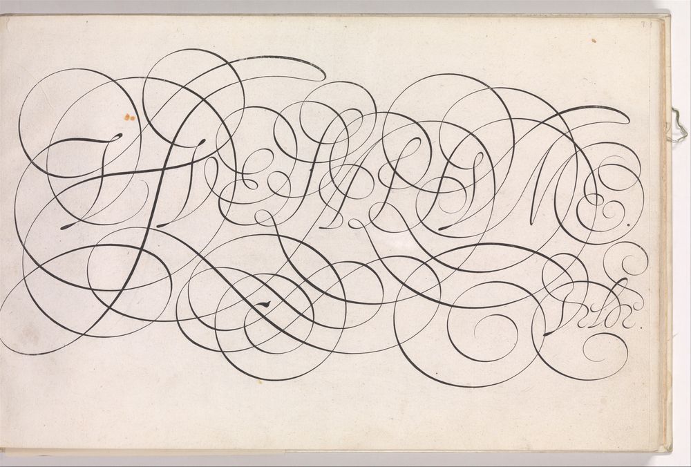
Highly flourished pointed pen calligraphy executed perfectly

A paragraph of (seemingly) broad-nib calligraphic text surrounded by dense, precise, circular ornamentation.
I sometimes think of the famous calligrapher Jan van de Velde, widely considered to be the GOAT. The things he would draw with his hands — insane. There are some unbelievable perfect circles he drew with a *pointed nib*, I must’ve lost that image somewhere. But this is related and also crazy.
26.11.2024 13:35 — 👍 1 🔁 0 💬 0 📌 0

The word ‘exam’ written with a broad-edge pen in basic roman and italic scripts. The letters ‘x’ in those scripts unfortunately look somewhat similar to swastikas, although orientated towards the left rather than the right.
You get a similar problem with a lot of calligraphy. Especially broad nib scripts like the foundational hand and some italic hands. At least it’s oriented the Buddhist way instead of the 20th century German way.. It’s a pity those shapes gained nasty connotations.
20.11.2024 23:01 — 👍 3 🔁 0 💬 0 📌 0
An issue in many parts; if you commit to narrow inner margins, you can salvage the book by using proper bookbinding glue (more flexible vs hot glue popular for print on demand) or thread binding (which isn’t that much more expensive). This is cost cutting away potential solutions one after another.
19.11.2024 17:13 — 👍 1 🔁 0 💬 1 📌 0

The same black brush-stroke written hundreds of times on large sheets of white paper
Practice from a few years ago. 13mm flatbrush
#flatbrush #calligraphy #lettering #type
19.11.2024 09:24 — 👍 1 🔁 0 💬 0 📌 0

“The written letter can be deeply contextual” written in highly cursive handwriting with many intersecting strokes, black on white, with a simple pen.

“Providing #lettering, #typography, & #typedesign of dubious quality since earlier this week” written black on white in a sloppy italic hand with a translucent, red-cap broad-nib pen which is placed under the text.
Left: left hand, pentel sign pen
Right: right hand, pilot #parallelpen 1.5mm
“The Written Letter can be deeply Contextual”
“Providing #lettering #typography & #typedesign of Dubious Quality since earlier this week” (an much needed ad for my new excellent bluesky account)
16.11.2024 18:23 — 👍 3 🔁 0 💬 0 📌 0

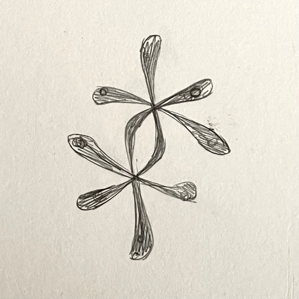
Hasty ballpoint pen drawings of various glyphs and dingbats on paper, including fleurons, asterisks, text ‘vox’ and ‘Lekker’, spirals, hiragana ‘na’.

Hasty ballpoint pen drawing of the dummy text ‘Agiat RXT’, signed ‘14 XI 2024 Loose Type Drawings’
Yesterday’s quick letter sketches. Ballpoint pen on thin paper for the no-takesie-backsie factor.
#lettering #typography #typedesign
15.11.2024 15:47 — 👍 3 🔁 0 💬 0 📌 0
these are so neat! They remind me of Turing patterns. they’d fit right in on a leopard
13.11.2024 09:33 — 👍 0 🔁 0 💬 0 📌 0

word ‘gohalics’ written in a loose italic by arranging rice grains on a cutting board

Sinograms for ‘rice writing’ arranged with rice on a wooden cutting board
Some sloppy rice writing from today — now the glyphs are cooking 🍚
#typography #lettering #type
12.11.2024 17:51 — 👍 7 🔁 1 💬 1 📌 0
TF, two letters that stand for Type Foundry and Typographie Française (French Typography).
https://www.205.tf/
a comedy streamer with all of your favorite shows
🧔♂️ Game Changer
📢 Make Some Noise
🎲 Dimension 20
🫂 Very Important People
🐷 Smartypants
dropout.tv
Former German Nazi concentration & extermination camp Auschwitz. Official account. We commemorate victims, educate about history & preserve the authentic site.
www.auschwitz.org | lesson.auschwitz.org | podcast.auschwitz.org
middling jokes/existential dread
all posts ⏬⏬ ig: @im_all_id
https://bsky.app/profile/did:plc:nhytley6vv7tq6k2at6kvl5b/feed/aaabgxg57gn7e
Author (The Fault in Our Stars, The Anthropocene Reviewed, etc.)
YouTuber (vlogbrothers, Crash Course, etc.)
Football Fan (co-owner of AFC Wimbledon, longtime Liverpool fan)
Opposed to Tuberculosis
what the heck do i put in my bio
www.pikat.io | art tag: #artpik
Toki Pona founder, art producer, book publisher, polyglot, and stuff you can't see yet.
mi mama Sonja: https://tokipona.org
Fediverse bridge: https://mastodon.social/@tokipona.org@bsky.brid.gy
America’s Finest News Source. A @globaltetrahedron.bsky.social subsidiary.
Get the paper delivered to your door: membership.theonion.com
Hand carved, often sweary, lettering on stone. Brace yourself.
Retired silversmith. Recovering geek. Nobody gets out of here alive.
www.poorfrankraw.co.uk/shop
Man of letters.
🔤 Hoefler&Co Founder & Director Emeritus
🎬 Netflix “Abstract,” S02 E06
jonathanhoefler.com
The Type Foundry & Design Studio of Matthijs Herzberg.
I'm that YouTuber who taught you how dishwashers work. Guess I'm tryin' out the whole Bluesky thing now.
he/him
https://www.youtube.com/technologyconnections
You know it when you see it•DMs open for submissions
Showcasing IRL typography (good and bad) from around the world.
Submissions and suggestions welcome through DM! 💜
Associated with the Glyphs and Alphabets Discord: https://discord.gg/glyphs-alphabets-850457945220841473
official Bluesky account (check username👆)
Bugs, feature requests, feedback: support@bsky.app