screenshot of my post
Big new blogpost!
My guide to data visualization, which includes a very long table of contents, tons of charts, and more.
--> Why data visualization matters and how to make charts more effective, clear, transparent, and sometimes, beautiful.
www.scientificdiscovery.dev/p/salonis-gu...
09.12.2025 20:28 —
👍 799
🔁 316
💬 22
📌 50

Hi #rstats friends! 👋🏽
Checkout our newest blog that displays how to create beautiful and reproducible river maps! 🗺
🔗: waterdata.usgs.gov/blog/nhd-viz...
#nhdplusTools #dataRetrieval #ggplot #dataviz
03.12.2025 17:47 —
👍 13
🔁 4
💬 0
📌 0
I really liked this idea of using a histogram as a legend in a choropleth map (since land isn't unemployed; people are), so I made a little guide to doing it with #rstats, {ggplot2}, and {patchwork}
www.andrewheiss.com/blog/2025/02...
19.02.2025 17:58 —
👍 865
🔁 192
💬 27
📌 23
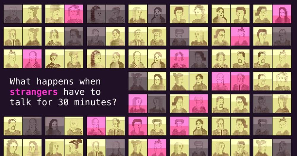
30 minutes with a stranger
Watch hundreds of strangers talk for 30 minutes, and track how their moods change
My latest piece for @puddingviz.bsky.social: 30 minutes with a stranger
13.06.2025 11:22 —
👍 62
🔁 23
💬 6
📌 7
Jazz up your ggplots!
Useful tricks to elevate your data viz via `ggplot` extension packages in R
Jazz up your ggplots!
‘Useful tricks to elevate your data viz via `ggplot` extension packages in R”
Custom themes, fonts, annotations, arrows & more
By the USGS
waterdata.usgs.gov/blog/ggplot-...
#RStats #ggplot2 #ggplot #Dataviz
09.04.2025 10:53 —
👍 31
🔁 8
💬 0
📌 1
#30DayChartChallenge | Day 30 - National Geographic Theme | Great Salt Lake 🛰️
#dataviz #remotesensing #GEE
30.04.2025 16:43 —
👍 5
🔁 1
💬 0
📌 0


Done! elmeraa-usgs.github.io/posts/2025-0...
25.03.2025 15:43 —
👍 0
🔁 0
💬 0
📌 0

100% - data just wasn't available in the package. After doing some digging, looks like this site does have some data, I can manually add later! Thanks for the reminder :) www.nwslsoccer.com/teams/196746...
25.03.2025 15:30 —
👍 1
🔁 0
💬 1
📌 0


Explored some pro women’s soccer data using the `nwslR` package this evening — check out some of these quick #rstats #dataviz using packages like #ggimage and #gtExtras for table making.
& Go SD Wave! 🌊 ⚽️ #nwsl
🔗: elmeraa-usgs.github.io/posts/2025-0...
25.03.2025 04:54 —
👍 8
🔁 1
💬 3
📌 0
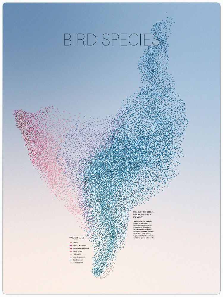
What appears to be a massive flock of birds in red, purple and blue colours in a pale blue sky. Each "bird" represents a bird species, and their colour represents their conservation status from the IUCN Red List. Around one third of species appear to be near threatened, endangered or extinct
This dataviz is absolutely amazing 😍 Global bird species' conservation status displayed as a massive flock!
By Andrea Garrec, longlisted for the 2024 Information Is Beautiful Awards
www.informationisbeautifulawards.com/showcase/731...
#dataviz 📊🌏🧪🐦🦉🦆🦅
19.03.2025 02:39 —
👍 199
🔁 60
💬 2
📌 2

A radial bar chart titled ‘Pixar Film Ratings’ displaying the average ratings of Pixar films based on Rotten Tomatoes, Metacritic, and Critics’ Choice Scores. Each bar represents a film, with lengths corresponding to the score. Bars are color-coded based on CinemaScore grades: gold for A+, green for A, orange for A-, and white for films with no CinemaScore data. The highest-rated film is Toy Story (1995) with 97.5, while the lowest is Cars 2 (2011) with 54.7. Data from {pixarfilms} R package.
Week 10 | #TidyTuesday | Pixar Film Ratings
🔗 github.com/elmeraa-usgs...
#rstats #dataviz #r4ds #ggplot
14.03.2025 22:35 —
👍 23
🔁 1
💬 0
📌 0
Thanks for the shoutout of "Mapping water insecurity in R with #tidycensus"
waterdata.usgs.gov/blog/acs-maps/
04.03.2025 18:15 —
👍 2
🔁 0
💬 0
📌 0

The Middle Ages
Follow hundreds of kids as they navigate their treacherous middle school years.
My latest for @puddingviz.bsky.social: The Middle Ages
Read: pudding.cool/2025/02/midd...
Watch: www.youtube.com/watch?v=b4zL...
03.03.2025 19:02 —
👍 15
🔁 5
💬 1
📌 1

GitHub - clauswilke/colorblindr: An R package to simulate colorblindness on R figures.
An R package to simulate colorblindness on R figures. - clauswilke/colorblindr
🎨✨ colorblindr: Ensuring Accessible #DataViz ✨🎨
Want to make your figs more accessible? colorblindr by Claire D. McWhite & Claus O. Wilke lets you simulate colorblindness in production-ready figures.
🔗 Repo: buff.ly/2UTiByV
🎨 Simulator: buff.ly/4khr0IS
More #Rstats resources, buff.ly/41cFyjY
25.02.2025 23:39 —
👍 91
🔁 38
💬 3
📌 2

Slope chart showing the percent of households lacking plumbing in California counties from 2022 to 2023. Humboldt County shows the highest increase, rising above 1.5%, followed by notable increases in Placer, Kings, Mendocino, and Lake counties. Gray lines in the background represent other counties in California. Data source: tidycensus.

Bubble map of the U.S. showing changes in the percentage of households lacking plumbing facilities by county from 2023–2022. Direction of change are represented by circles with green circles indicating a decrease and orange circles indicating an increase, with size reflecting magnitude. Generally, areas of the western U.S. display a decrease in percentage of households lacking plumbing facilities, while pockets of increases are observed across the eastern U.S. We provide arrows and callouts for McKinley County, NM (-0.93%) and Orange County, TX (+2.3%). Data source: tidycensus.
Week 4 | #TidyTuesday | Water Insecurity
🔗 github.com/rfordatascie...
#rstats #dataviz #r4ds #ggplot
10.02.2025 23:19 —
👍 16
🔁 2
💬 0
📌 0

spData logo
The shapefiles are gone! 🎉
The {spData} package has officially dropped all datasets in the shapefile format, moving toward modern and efficient geospatial data standards. 🚀🌍
Upgrade your workflows with {spData}: https://buff.ly/4htZ5D3
#rspatial #rstats #GIS #Geocompx
02.02.2025 15:00 —
👍 8
🔁 4
💬 1
📌 0
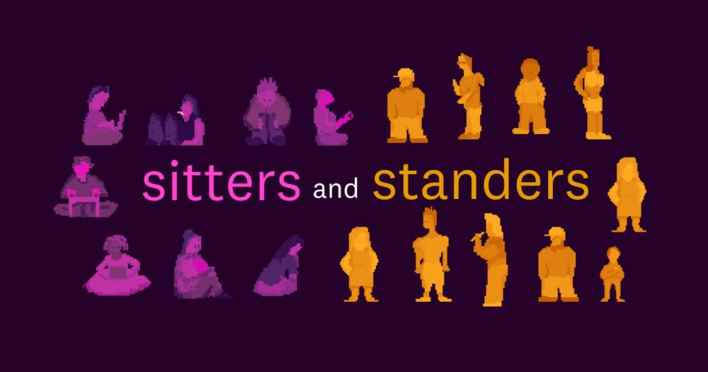
Sitters and Standers
The American worker divide: Those who sit, and those who stand
The US workforce can be divided into “sitters” (like programmers and lawyers) and “standers” (like servers and construction workers). In our newest piece, @alv9n.com looks at what we can learn from this labor split.
💻: pudding.cool/2024/11/sitt...
📺: www.youtube.com/watch?v=sE_E...
21.11.2024 15:58 —
👍 52
🔁 20
💬 1
📌 6

#TidyTuesday week 4: Water Insecurity 💧
Plumbing facilities are improving in 22 states, and it is getting worse in 28.
#Rstats #dataviz
01.02.2025 23:10 —
👍 10
🔁 1
💬 3
📌 0

#TidyTuesday - week 4 - Water Insecurity - and my first time sharing what I've made online. Plot was made using ggplot2, and I fine-tuned the graphics in Illustrator.
Might share my code on GitHub later (after I clean it up a bit) :D
#rstats #ggplot2
31.01.2025 10:17 —
👍 16
🔁 1
💬 0
📌 0

#TidyTuesday week 3 - Water Insecurity.
Created this tile map using #Tableau. Thanks to @nnpereira.bsky.social for this week's dataset.
#dataviz
29.01.2025 13:57 —
👍 19
🔁 2
💬 2
📌 0

Percentage of households lacking plumbing (2023). Four out of the five U.S. Counties with the highest percentage of households without complete indoor plumbing overlap with the boundaries of the Navajo Nation Reservation and Off-Land Trust Land. The maximum percentage among counties was 3.9%, while the maximum among American Indian/Alaska Native/Native Hawaiian Areas was 5%.
#TidyTuesday week 4 ✅
This week’s data is from the U.S. Census Bureau’s American Community Survey.
I took a look at how the data on lack of indoor plumbing among U.S Counties compares to other census provided geographies, specifically American Indian/Alaska Native/Native Hawaiian Areas.
#rstats
28.01.2025 17:40 —
👍 13
🔁 1
💬 1
📌 0

Bar chart showing changes in U.S. county-level water insecurity from 2022 to 2023. The chart reveals that 46% of counties saw increased water insecurity, with 35.5% experiencing a major increase (>50%). 27.6% saw a major decrease, while 16.4% had a moderate decrease, and 10.4% experienced a moderate increase. 10.1% of counties had stable conditions. Annotations highlight that 44% fewer counties were affected by major decreases and 46% more counties became vulnerable to water insecurity.
📊 #TidyTuesday – 2025 W04 | Water Insecurity
.
🔗: stevenponce.netlify.app/data_visuali...
.
#rstats | #r4ds | #dataviz | #ggplot2
25.01.2025 22:04 —
👍 21
🔁 2
💬 1
📌 0
Excited to check out all the #DataViz for this weeks #tidytuesday!
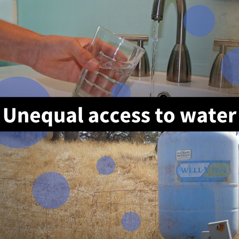
Check out our site to learn more about unequal access to water in the Western U.S: labs.waterdata.usgs.gov/visualizatio...
And our #tidycensus blog post: waterdata.usgs.gov/blog/acs-maps/
#DataViz #EJ #Water #rstats
27.01.2025 15:03 —
👍 9
🔁 1
💬 0
📌 0
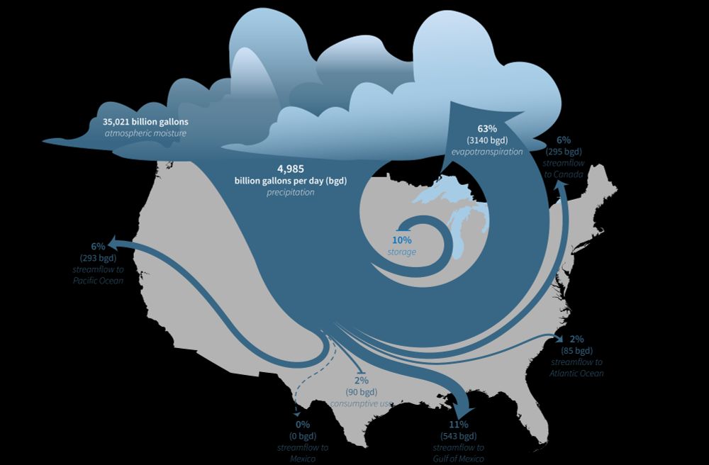
Stylized illustration of the water cycle of the lower 48 United States, showing the fate of water that enters through precipitation. Most of the water returns to the atmosphere through evapotranspiration, but much of the water ends up in the Atlantic and Pacific Oceans, in Canada, or in the Gulf of Mexico through streamflow.
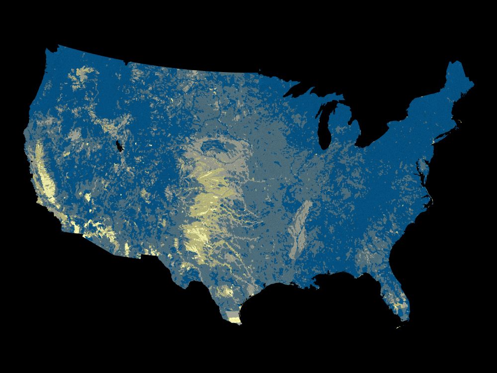
Map of water limitation in the lower 48 United States by watershed. Areas with relatively high water limitation are in the high plains, Texas, California, and the Mississippi Embayment hydrologic regions.
The U.S. Geological Survey (USGS) Vizlab has just released a new, interactive data visualization website about the USGS National Water Availability Assessment Report and Data Companion. Explore the data and the key findings of the assessment at water.usgs.gov/vizlab/water... #DataViz #rstats #USGS
16.01.2025 18:20 —
👍 22
🔁 10
💬 1
📌 2

Reproducible Data Science in R: Flexible functions using tidy evaluation. Improve your functions with helpful dataframe evaluation patterns! waterdata.usgs.gov/blog/rds-fun... #rstats
17.12.2024 16:38 —
👍 33
🔁 9
💬 0
📌 1
Vulnerability Indicators
Explore how social vulnerability indicators—such as income, household size, and education—contribute to water insecurity in the Western U.S.
🔗: labs.waterdata.usgs.gov/visualizatio...
09.12.2024 19:44 —
👍 1
🔁 1
💬 0
📌 0

Dumbbell plot showing changes in the percentage of households lacking complete plumbing facilities in Arizona counties between 2022 and 2023. Each county is listed on the y-axis, with dots representing data for 2022 (light purple) and 2023 (dark purple). The x-axis shows the percentage of households lacking plumbing, ranging from 0% to 4%. Counties like Apache and Navajo have higher percentages compared to others such as Maricopa and Pima.
Explore how to visualize change in incomplete plumbing facilities across counties for states of interest using #tidycensus
09.12.2024 19:44 —
👍 1
🔁 0
💬 1
📌 0