#30DayChartChallenge | April 2024 - Day 20 | correlation
A 📊 chart showing the relationship between 3PT attempts and FT attempts...as a casual NBA fan, seems intuitive that this might be negatively correlated.
code: github.com/curatedmess/...
#ggplot2 #rstats #dataviz
21.04.2024 00:04 — 👍 9 🔁 2 💬 0 📌 0

#30DayChartChallenge | April 2024 - Day 19 | dinosaurs
A 📊showing the timeline of albums released by the English rock band, T.Rex 🦖
code: github.com/curatedmess/...
#ggplot2 #rstats #dataviz
20.04.2024 00:14 — 👍 11 🔁 1 💬 0 📌 0

#30DayChartChallenge | April 2024 - Day 18 | Asian Development Bank (data day)
Playing catch up for yesterday....A📊showing financed amounts in South Asia for 2023.
code: github.com/curatedmess/...
#ggplot2 #rstats #dataviz
19.04.2024 12:09 — 👍 5 🔁 1 💬 0 📌 0
Thanks! If I had the time, it might be interesting to compare with other models to see if responses match.
19.04.2024 11:05 — 👍 1 🔁 0 💬 0 📌 0
Apparently, it’s self critical 😀
19.04.2024 10:59 — 👍 1 🔁 0 💬 0 📌 0
I ran a few times and the responses varied a little, but for the most part shuffled through the same options. I even tried 20 each which was better still, but didn’t have time to deal with the formatting challenges with that the larger numbers.
18.04.2024 16:06 — 👍 0 🔁 0 💬 0 📌 0

#30DayChartChallenge | April 2024 - Day 17 | networks
A 📊 showing word association with ChatGPT.
code: github.com/curatedmess/...
#ggplot2 #rstats #dataviz
17.04.2024 22:53 — 👍 10 🔁 2 💬 3 📌 0

#30DayChartChallenge | April 2024 - Day 16 | weather
A 📊 showing the 75 years of high/low temps in Charlotte for a random day, April 13.
code: github.com/curatedmess/...
#ggplot2 #rstats #dataviz
16.04.2024 18:37 — 👍 9 🔁 1 💬 0 📌 0

#30DayChartChallenge | April 2024 - Day 15 | historical
A 📊 showing a multi-generational family playing professional baseball in MLB for a combined 58 years
code: github.com/curatedmess/...
#ggplot2 #rstats #dataviz
15.04.2024 12:13 — 👍 8 🔁 1 💬 1 📌 0

#30DayChartChallenge | April 2024 - Day 14 | heat map
A 📊chart showing Google Trends , last 90 days for search term = "Brunch"
code: github.com/curatedmess/...
#ggplot2 #rstats #dataviz
14.04.2024 10:47 — 👍 7 🔁 1 💬 0 📌 0
Share away!
13.04.2024 10:57 — 👍 1 🔁 0 💬 0 📌 0

#30DayChartChallenge | April 2024 - Day 13 | Family
A 📊 chart showing the Lego brick colors for the Minecraft theme. Legos and Minecraft are big with my family. #TidyTuesday data set from week # 36, 2022.
code: github.com/curatedmess/...
#ggplot2 #rstats #dataviz
13.04.2024 10:43 — 👍 13 🔁 2 💬 0 📌 0
My two cents, stem and leaf plots probably helpful in exploring some patterns, not great in presenting to an audience interested in seeing multiple dimensions like model and year, in this case. Another chart type would probably be better.
12.04.2024 17:10 — 👍 1 🔁 0 💬 0 📌 0

Updated version with how to read note as stem and leaf plots aren't commonly seen in the wild (at least not by me)
12.04.2024 12:17 — 👍 2 🔁 0 💬 1 📌 0
I’m going to update later today with version that includes some instructions on how to read. It’s not intuitive unless you know this chart type. I’d not made before till now.
11.04.2024 16:16 — 👍 1 🔁 0 💬 0 📌 0
Thanks for sharing. Really fascinating.
11.04.2024 11:52 — 👍 2 🔁 0 💬 0 📌 0
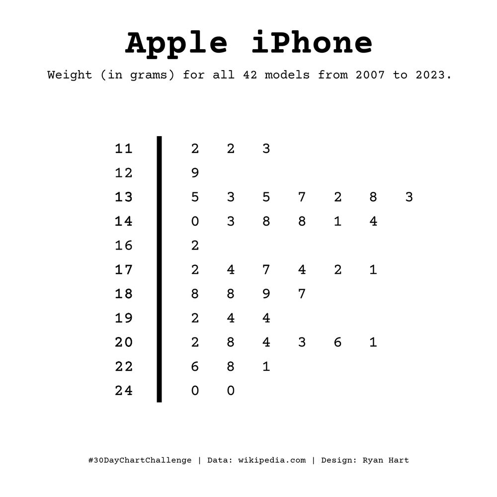
#30DayChartChallenge | April 2024 - Day 11 | Mobile Friendly
Distribution of the iPhone weights throughout it's evolution 📊 (iPhone Gen 1 to iPhone 15s)
code: github.com/curatedmess/...
#ggplot2 #rstats #dataviz
11.04.2024 10:29 — 👍 7 🔁 1 💬 2 📌 0
Very nice! Does this include all vehicles, including suvs and trucks? Seems like traditional cars have largely stayed similar and we’ve shifted to more larger suv and truck style vehicles.
10.04.2024 21:09 — 👍 0 🔁 0 💬 1 📌 0

Car widths over time, more than 60.000 data points. Shows distributions and a loess smoother
Day 10 | #30DayChartChallenge | Physical 📊
If you own a car, you may have noticed how parking spots and garages seem to only get narrower, but it's actually the cars that are getting wider. 99% #rstats, 1% illustrator.
Code: peder.quarto.pub/blog/posts/a...
#dataviz
10.04.2024 20:41 — 👍 20 🔁 9 💬 4 📌 4

#30DayChartChallenge | April 2024 - Day 10 | Physical
A 📊 distribution of Iron Mike's fight durations for his professional boxing career. I can't think anything more physical than stepping in a ring with Tyson.
code: github.com/curatedmess/...
#ggplot2 #rstats #dataviz
10.04.2024 13:53 — 👍 10 🔁 1 💬 0 📌 0

#30DayChartChallenge | April 2024 - Day 9 | Major/Minor
Messi goals 📊
"I am also aware that I went to a minor league, but a lot happens because of the way one faces it and competes." said Messi to Star+ about Miami.
code: github.com/curatedmess/...
#ggplot2 #rstats #dataviz
09.04.2024 10:35 — 👍 12 🔁 2 💬 0 📌 0

#30DayChartChallenge | April 2024 - Day 8 | Circular
A 📊 showing Caitlin Clark's career points as the all-time NCAA scoring leader from Iowa, utilizing a uniform distribution of random numbers to plot the basketballs.
code: github.com/curatedmess/...
#ggplot2 #rstats #dataviz
08.04.2024 10:38 — 👍 9 🔁 1 💬 0 📌 0

UPDATE. Fixed many errors (plot type and spelling).
07.04.2024 15:47 — 👍 1 🔁 0 💬 0 📌 0

#30DayChartChallenge | April 2024 - Day 7 | Hazards
A 📊 about lightening events in North Carolina, U.S.A using FEMA's National Risk Index data.
code: github.com/curatedmess/...
#ggplot2 #rstats #dataviz
07.04.2024 12:17 — 👍 7 🔁 2 💬 2 📌 0
Well, there’s the answer!!! Thanks Daniel.
06.04.2024 17:16 — 👍 1 🔁 0 💬 0 📌 0
Yeah, not sure. I don’t have a background in public health, so this one is odd to me. Maybe Covid started here earlier than typically credited? It’s such a noticeable jump…I even wondered if the data was bad (or error on my part).
06.04.2024 10:41 — 👍 2 🔁 0 💬 1 📌 0

#30DayChartChallenge | April 2024 - Day 6 | OECD
A 📊 at self-reported sick days. What's odd is that the US saw a significant increase in 2019 (+ 3.4 days) ending a declining trend.
code: github.com/curatedmess/...
#ggplot2 #rstats #dataviz
06.04.2024 09:18 — 👍 15 🔁 1 💬 1 📌 0

#30DayChartChallenge | April 2024 - Day 5 | Diverging
A 📊 Looking at the split of my runs from the last four years before or after 7 AM. Also, only ran six times after noon...I guess I'm more of a morning person.
code: github.com/curatedmess/...
#ggplot2 #rstats #dataviz
05.04.2024 10:28 — 👍 14 🔁 2 💬 0 📌 0

Image is a screenshot of the glitch page, showing the script.js file alongside the preview window.
#30DayChartChallenge | #Day4 | Waffle
This one went a bit over my 30 minute limit!
✨made 100 squares
✨distributed columns and rows
✨broke the loop into pre vs post threshold
glitch.com/edit/#!/04-o...
04.04.2024 13:04 — 👍 11 🔁 3 💬 0 📌 0

Waffle chart on a 10x10 grid with each square coloured based on percentage of uses in a Bob Ross painting.
For the "Waffle" prompt on Day 4 of the #30DayChartChallenge, I revisited a data set on Bob Ross painting colours - and made a waffle chart with a hand-drawn effect using {roughsf}! 📊 🧇
#RStats #DataViz
04.04.2024 12:58 — 👍 27 🔁 2 💬 2 📌 0
Graphext co-founder.
Data Stuff 📊 & Product 📦
graphext.com - @graphext.bsky.social
victoriano.me
twitter.com/victorianoi
Using data to tell better stories about sport at Plot the Ball
https://www.plottheball.com
ben@plottheball.com
Data journalist at Insurance Insider in my day job
https://www.insuranceinsider.com
ben.wylie@insuranceinsider.com
#kakistographs
from Ancient Greek κάκιστος (kákistos, 'worst')
Data Visualization & Biomedical Science. PhD in biology, trained in art, Associate Prof
Writes here: https://helenajamborwrites.netlify.app/
📊 data visualization engineer, 💊 healthcare analytics consultant, 🐶 dog mom, 🌱 vegan for the animals. Free Palestine 🇵🇸
https://nicolemark.heygrid.co/
Data Scientist, PhD in Cog Neuro
She/her. Not Danielle, Daniela, or Daniel. Kneader of words and curator of colours. Afraid for the future. Proud NL/UK dual national. Climate, politics, dataviz, editing, craft, birds. Omni 🏳️🌈 Views own. https://datayarns.wordpress.com/
Aquatic Invasive Species Extension Educator @ UMN Extension & MAISRC. Mostly posting about AIS, water, and nature with a little personal touch. Posting on my own behalf.
Dataviz designer, psychiatrist, PhD student
https://karaman.is
Mostly making maps about the United States.
#Cartography | #GIS | #Maps
https://antonioantoine.com/
-Mapping the world- Dr. in Physical Geography | Environmental Health - bioclimatology - geography. RC Researcher from 🇩🇪 at @mbgcsic.bsky.social @csic.es in 🇪🇸 #rstats #dataviz
Secretary of the @aeclim.org
📍Galicia
ℹ️ https://dominicroye.github.io
A #DataViz challenge 📊 by @cedricscherer.com and @drxeo.eu
Supported by @wendyshijia.bsky.social and @ansgarw.bsky.social
More info on Github: https://github.com/30DayChartChallenge/Edition2024
We are dedicated to fostering community for data visualization professionals.
Data analyst and data viz geek
#dataanalysis #rstats #dataviz
Senior Data Analyst, DTU Food
Views mine
www.gregdubrow.io
www.linkedin.com/in/dubrowg/
https://medium.com/the-polymaths-dilemma
Data Visualisation Manager at a health think tank 👩💻 Mostly talk about data, #dataviz, #opendata, #maps, #python and #data4good 📈 Into cycling, yoga, sourdough, puns and more. Views my own.
Also active on Mastodon + Linkedin
Looking for my #rstats friends on ALL the platforms...
Enrich your stories with charts, maps, and tables – interactive, responsive, and on brand. Questions? Write us: datawrapper.de/contact-us
🔔 Statistician 🫶 #Rstats 📈 #Dataviz 🏃♂️ Trail runner 🤘 Metalhead ❤️ Dad 🔥 #survivor 🌏 Canberran 🌿 Vego
Survivor Stats db: https://survivorstatsdb.com/
Ramblings: https://gradientdescending.com/