"It is time to stop pretending that we are just one more model away from magic. We are not. The magic trick is over. The rabbit is not coming out of the hat."
codemanship.wordpress.com/2025/08/08/t...

@spandl.ca.bsky.social
data visualization designer and founder of r42.ca #dataviz · #Observable · #d3js · #LookerStudio · #PowerBI · #measure – 🇨🇦 🇩🇪
"It is time to stop pretending that we are just one more model away from magic. We are not. The magic trick is over. The rabbit is not coming out of the hat."
codemanship.wordpress.com/2025/08/08/t...
"rapidly aging population" is a funny expression, a bit like, "time flies". In some countries faster than in others. 😅
11.07.2025 22:32 — 👍 1 🔁 0 💬 0 📌 0🤣 mcgyverying
07.07.2025 22:07 — 👍 1 🔁 0 💬 0 📌 0Tough question! 😀
It's made for marketing folks and gets now slowly adapted to more enterprise/BI usage.
I like that it is very simple to start with (kind of like low-code environments), but then you hit a lot of walls, which leads to quirky solutions. It has a niche, but needs better visuals.
👍🏼 I ever you want more input, feel free to ping me. I did a lot of experiments from Looker Studio (lots of frustration) over Observable Framework (great, but limited) to Svelte (awesome, but high complexity). And I am only concerned about the representation layer... There is lots of stuff to cover.
07.07.2025 21:47 — 👍 1 🔁 0 💬 1 📌 0You should definitely wrap up this very post. When using Power BI (or any other tool) and when creating a custom solution.
There are so many use cases, so many different skills required, so many layers (visual, data, cleaning, team, security, etc.) and each layer has an impact on the choice.
😂
It is actually surprising that there aren't any good visual tools out there that know how we use Git.
It works so well, until you hit VIM.
Here's the link. newsinteractives.cbc.ca/features/202...
26.06.2025 13:21 — 👍 4 🔁 3 💬 2 📌 1There is also the kind of people that need to write, but not using their first language.
I think there is a difference if you use AI to write the content or to use AI to shape your own content.
Haven't used it yet, but Sveltia is high on my list for the next time I need one:
jamstack.org/headless-cms...
Other than that, I have used Contentful, which is good, but it becomes complex rather quickly.
@reinhold.is it is still somewhat experimental, but I think this will be a much better development flow than what I have right now.
I was working hard with Claude to get there (Well, Claude was working hard 😀)
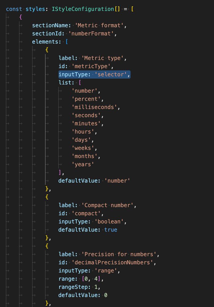
In a nutshell:
- I create (or wrap) data visuals
- Each visual has a JSON definition, that determines what style elements can be changed, including a strict definition of the controls.
- Each visual is a Svelte component (or JS/d3 only)
- The Story is dynamically created from the JSON
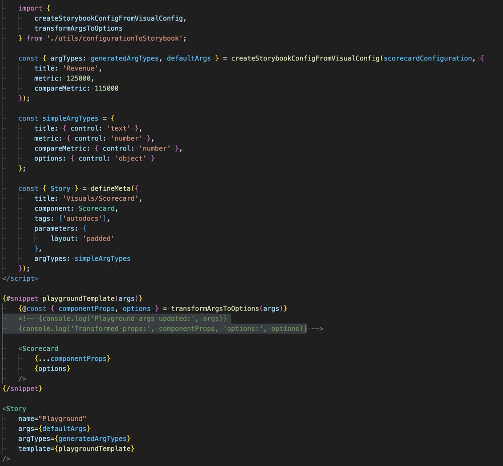
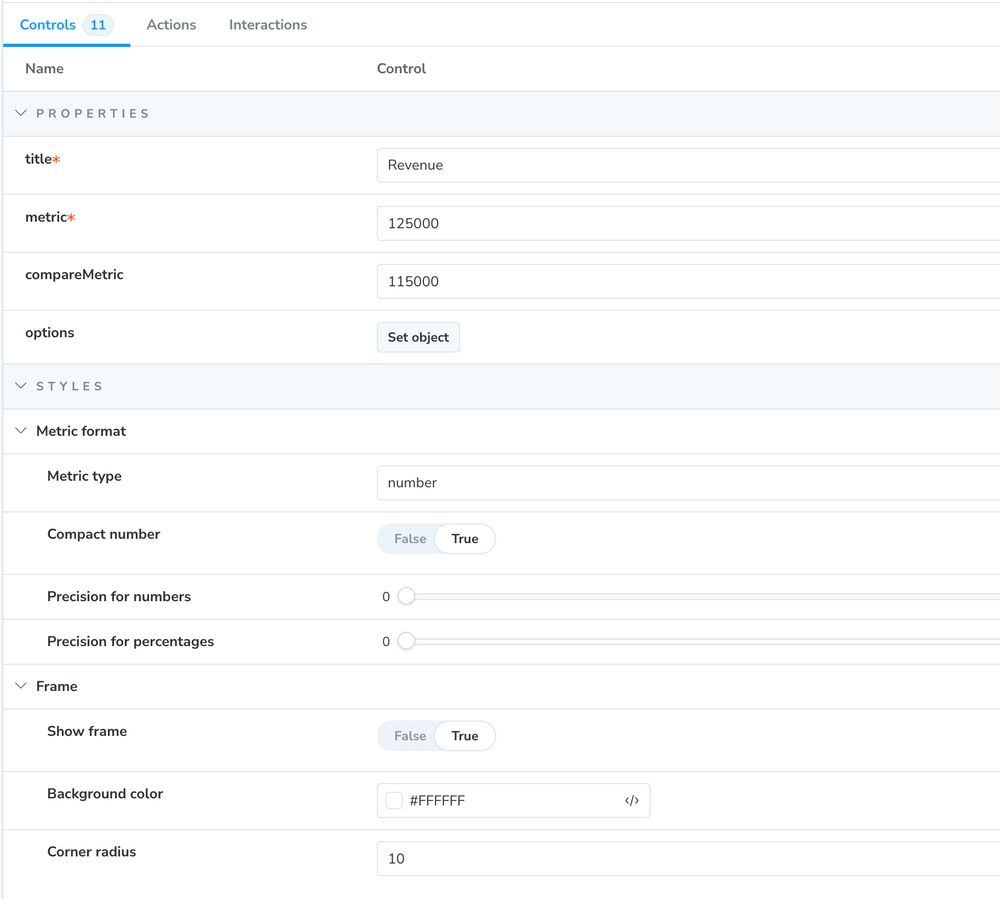
Pretty amazed, how well #storybook integrates with #svelte. Using configuration JSON files to create test controls / interactive playground: ✅ check.
Everything is super fast. Absolutely fantastic to develop visuals with many variables.

Voilà: is hiring a graphic designer for the first time in 4 years. Rare opportunity to join the team.
The job is in Montreal (no remote) and the ad is in French because we work in French and half our projects are in French.
Happy to answer questions!
Excellent example to showcase, that AI doesn't understand but just guesses the shit out of it.
05.06.2025 15:47 — 👍 2 🔁 1 💬 0 📌 0Wow, there is even a smoke forecast website now:
firesmoke.ca/forecasts/cu...
😅 - well, the visual effect is quite clear, that's what AQI 187 sort looks like. At least today.
04.06.2025 00:08 — 👍 2 🔁 0 💬 0 📌 0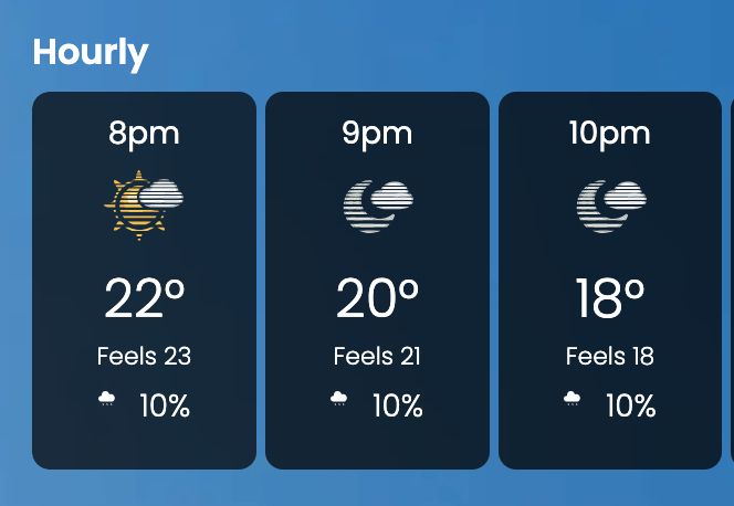
Looks like the Weather Network has now a new icon when the air is foggy from forest fires... #climatechange
03.06.2025 22:54 — 👍 2 🔁 1 💬 1 📌 1
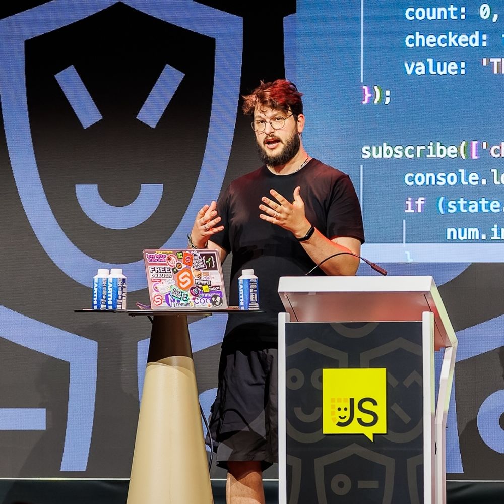
I think the @storybook.js.org team wins the best major announcement page ever price. Stunning. And good that it is like that, because they moved mountains with this release. Kudos to everyone involved!
03.06.2025 19:58 — 👍 45 🔁 6 💬 2 📌 0This was my personal favorite of the Svelte Summit.
If you are looking to combine #Svelte and #ObservablePlot for #dataviz projects, this is a must see.
According to the author not production ready yet, but something to keep an eye on.
I would have to think about that.
Maybe, what borders me is that there is so much attention drawn to the difference of summer and winter, that the actual message – temperature change from before to now – is too subtle.
But I couldn't propose anything better without playing around with it. 🤔
This was one of the best presentation of the Svelte Summit. I'm really looking forward to use Storybook 9 in my next project.
30.05.2025 13:25 — 👍 7 🔁 1 💬 0 📌 0Nice, just wondering why you would use a divergent color scheme for a linear scale. It implies that an average temperature of 14 C starts feeling cold.
30.05.2025 13:20 — 👍 1 🔁 0 💬 1 📌 0This is why I love @observablehq.com !
24.05.2025 00:36 — 👍 0 🔁 0 💬 0 📌 0I did buy a virtual ticket to the Svelte summit just to watch this presentation (free videos shall be released soon).
Amazing work.
I love Observable Plot, but it is very hard to get the marks animated.
I hope this one will survive!
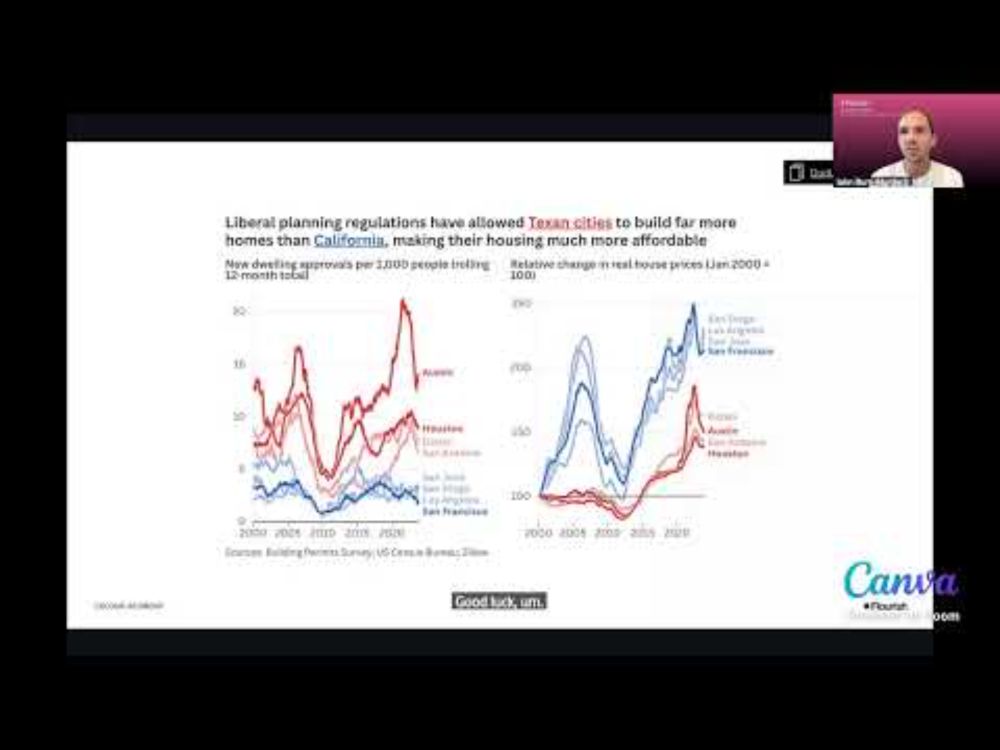
Always a pleasure to listen to @jburnmurdoch.ft.com that just gave another fantastic presentation about how to tell better data stories. Watch again here on YouTube:
www.youtube.com/watch?v=uRRO...
@erindataviz.bsky.social absolutely nailed the smart brevity #dataviz thing with this unconventional bar chart. Sometimes, rules are meant to be broken.
15.05.2025 14:05 — 👍 18 🔁 8 💬 0 📌 0Thread with some substance. Plot + Svelte = SveltePlot
13.05.2025 21:21 — 👍 3 🔁 0 💬 0 📌 0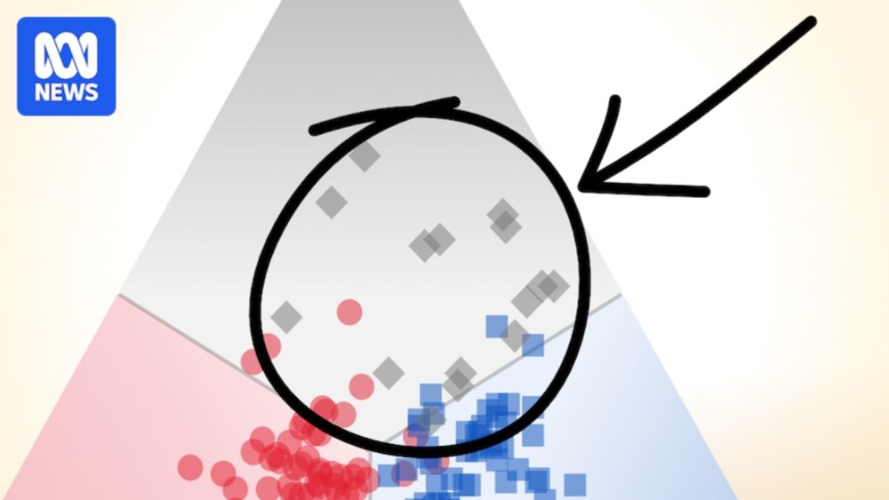
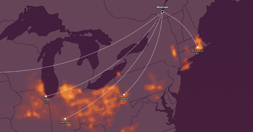
So much to love in the scrollytelling — the ternary plot, the depth of the data, the findings — but my favourite part is the explanation and the text in general. 📊
Remember, a chart doesn't have to be understood in 3 seconds. It should reward the effort you put into understanding it.
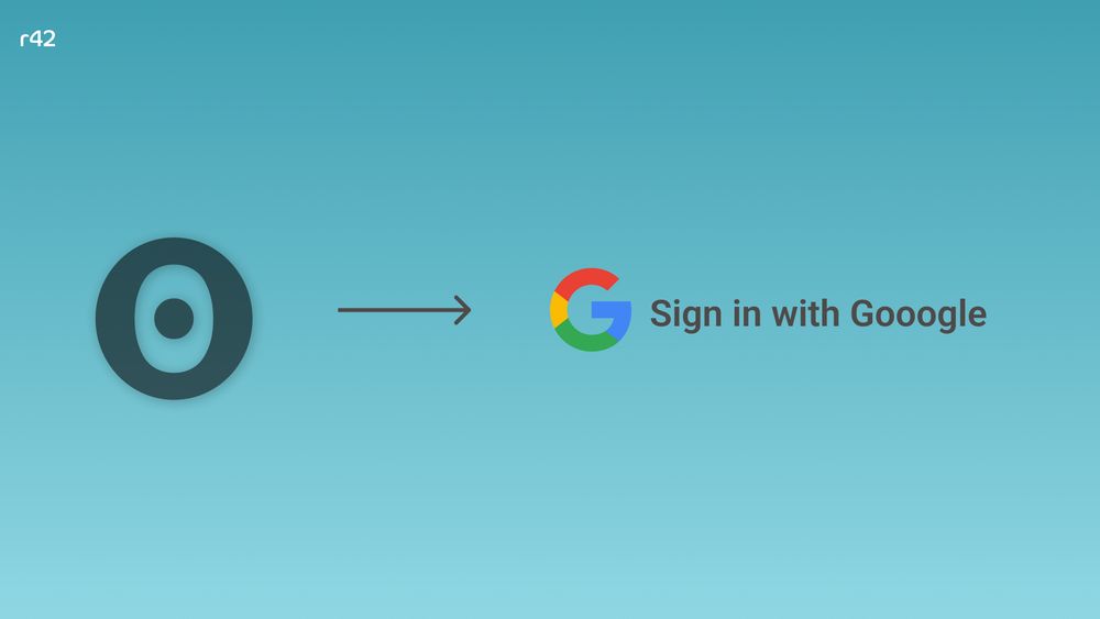
Observable logo with an arrow pointing to a Google logo with the words "Sign in with Google"
Last week, #Observable announced the deprecation of its Cloud service. This means developers of Observable Framework data apps loose their option to quickly deploy and protect their data apps. Here is a quick overview about alternatives.
www.linkedin.com/pulse/protec...