Does the link not work for you?
11.07.2025 21:17 — 👍 0 🔁 0 💬 1 📌 0
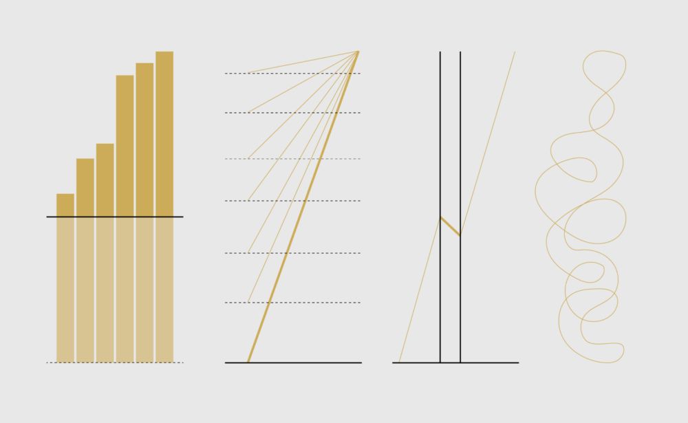
An alternative to plotting time: instead, use the horizontal axis to plot a second variable, and animate the chart to show changes over time (also used by the great Hans Rosling)
24.05.2025 14:39 — 👍 13 🔁 3 💬 1 📌 0


The European State of the Climate 2024 report is OUT!
A joint effort by @copernicusecmwf.bsky.social & @wmo-global.bsky.social
Read it & explore all additional resources which include a Graphics gallery, infographics, animations! Enjoy 😊 climate.copernicus.eu/esotc/2024
#dataviz #climate #ESOTC2024
15.04.2025 06:50 — 👍 73 🔁 22 💬 2 📌 3

Hello, Bluesky! 👋 I'm an HCI & data visualization researcher, currently exploring AI-driven climate communication. Looking to connect with folks in #HCI, #DataViz, #ClimateChange, and #Academia. Who else is here?
27.03.2025 20:09 — 👍 33 🔁 6 💬 0 📌 0

There are a few days left to apply for The Club of Rome Communication Fellowship, a remote, paid 7-month opportunity for early-career professionals interested in sustainability and systems change. Apply now ➡️ shorturl.at/rRMpw
#Communications #Fellowship
04.03.2025 10:00 — 👍 4 🔁 2 💬 1 📌 0
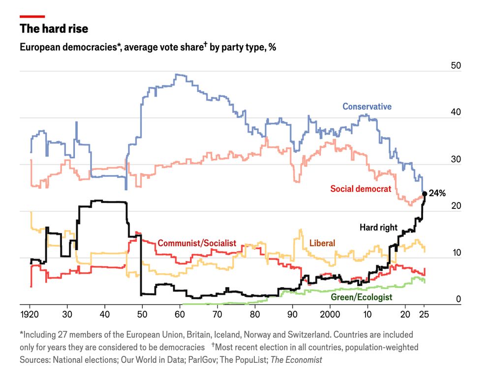
After the AfD's surge on Sunday, far right parties are the most voted-for of any grouping in Europe, for the first time in history: www.economist.com/graphic-deta...
28.02.2025 17:32 — 👍 649 🔁 286 💬 49 📌 73

poster for the event
Join us online on Thu 20 March 18:00–19:00 CET:
*Visualising climate science*
by Angela Morelli
Visualisation is a powerful tool for navigating the complexity of climate change. However, visualising climate science can confuse, misinform or polarise.
Register at: www.eventbrite.at/e/iiid-conve...
01.03.2025 08:45 — 👍 12 🔁 4 💬 0 📌 0
Defense Against Dishonest Charts
This is a guide to protect ourselves and to preserve what is good about turning data into visual things.
Dishonest charts are coming from all directions, and they're only going to hit harder. Unless we push back. So, an interactive guide: Defense Against Dishonest Charts flowingdata.com/projects/dis...
13.02.2025 21:44 — 👍 499 🔁 249 💬 33 📌 59

The great climate disconnect
New attempts to prolong the fossil fuel era have come at precisely the wrong time
“Never before has the danger of climate change been so evident and the response so cavalier.”
12.02.2025 07:30 — 👍 576 🔁 164 💬 20 📌 6
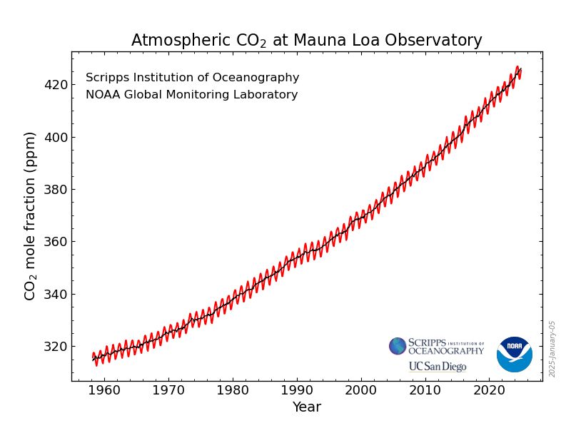
A line graph showing atmospheric CO2 levels at Mauna Loa Observatory from 1955 to 2025. The y-axis represents CO2 mole fraction in parts per million (ppm), ranging from 320 to 420 ppm, while the x-axis is years.
The most iconic figure in the environmental sciences is the Keeling Curve, the CO₂ record from Mauna Loa, Hawaii.
@noaa.gov had a wonderful site where you could visualize and download these data, and now it's just gone. These data belong to us and we should not let this happen!
05.02.2025 11:38 — 👍 3480 🔁 1328 💬 107 📌 142
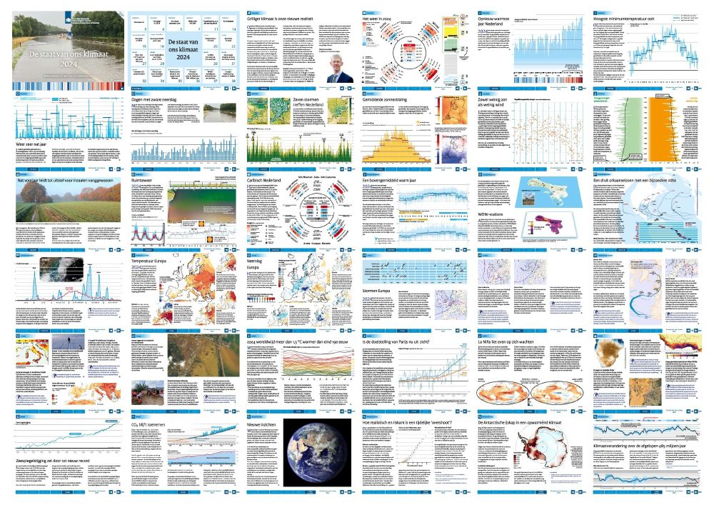
The Dutch @knmi.bsky.social Institute has just published ‘De Staat van het Klimaat 2024’, showing worrisome climate-related developments in very good visualizations.
You can flip through (and download) the full report here: cdn.knmi.nl/system/data_...
@maartenvanaalst.bsky.social @fruys.bsky.social
31.01.2025 20:49 — 👍 12 🔁 6 💬 0 📌 0
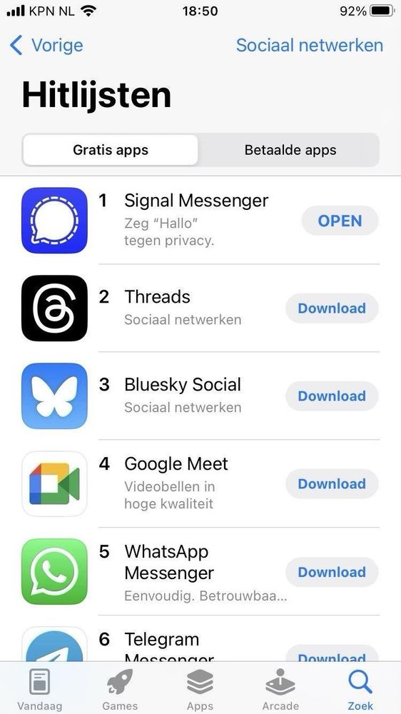
Screenshot showing the Dutch App store featuring Signal at #1 for social networking apps, above Threads, Bluesky, Google Meet, WhatsApp, and Telegram
Bedankt 🇳🇱!
22.01.2025 18:29 — 👍 367 🔁 54 💬 14 📌 4
Created by: @neilrkaye.bsky.social
27.01.2025 14:41 — 👍 1 🔁 0 💬 0 📌 0

🌡️ A record-breaking climate year in seven key charts. Discover the data from the Global Climate Highlights 2024 report: bit.ly/3DZs8jn
#C3S #CopernicusClimate
20.01.2025 11:42 — 👍 103 🔁 57 💬 5 📌 2
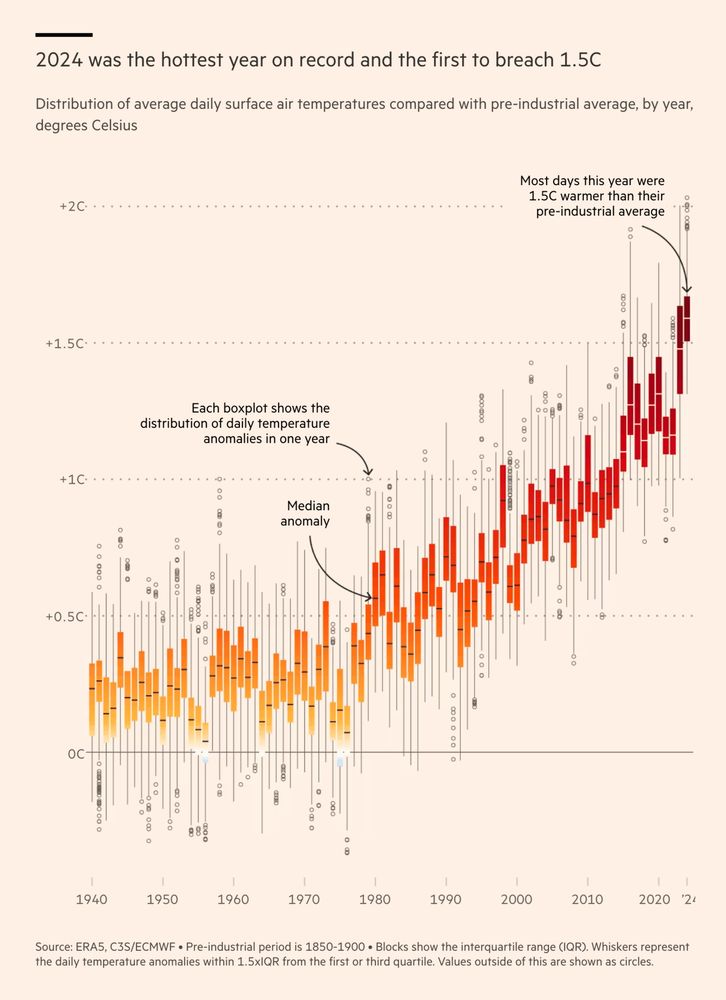
Remarkable chart by @data.ft.com
Many readers won't fully understand boxplots. At a quick glance, they don't add much information here. But then, look at the lower end of the 2024 whisker (or 2015 for the previous El Niño)!
Also: I just love the aesthetic 🤩 #dataviz
www.ft.com/content/fd91...
14.01.2025 21:07 — 👍 102 🔁 34 💬 3 📌 4
Here is a very similar version of this chart (but not identical): bsky.app/profile/yuri...
15.01.2025 10:33 — 👍 2 🔁 0 💬 1 📌 0
To visualize daily temperature anomalies since 1940, BBC News uses a ridgeline chart (yes, the Joy Division kind): www.bbc.com/news/article...
11.01.2025 20:53 — 👍 1 🔁 0 💬 0 📌 1

🤔
(cartoon by Marian Kamensky ooe.orf.at/stories/3206...)
16.12.2024 14:06 — 👍 2 🔁 3 💬 0 📌 0

The annual climate cycle presents a good opportunity to use a radial or polar chart, allowing us to visualize seasonal patterns. It's super interesting to see the geophysical differences between climate zones in the US. #rstats #dataviz
📖 dominicroye.github.io/en/2021/clim...
28.11.2024 08:58 — 👍 156 🔁 37 💬 7 📌 5

A small multiple bars chart showing C02 emissions of big tech companies up to 2030, with actual, projected, and target values. Published in Bloomberg.

A map of Valencia highlighting roads and transport infrastructure damaged by floods, with almost all lines affected. Published in Le Monde.

A stream graph showing delegates from the world at U.N climate summits (1995 to 2024), highlighting key peaks and growth. Published in New York Times.

A Sankey diagram visualizing export volumes and crude oil exports from Iraq, Libya, Saudi Arabia, Azerbaijan, and the UAE. Published in Der Spiegel.
It's been a while since the Data Vis Dispatch devoted some time to climate visualizations, so here we go: from AI emissions to snowfall to floods to climate conference attendees:
Find more topics here: https://blog.datawrapper.de/data-vis-dispatch-november-19-2024/
19.11.2024 17:09 — 👍 43 🔁 9 💬 1 📌 0

Atlas of Sustainable Development Goals 2023
The Atlas of Sustainable Development Goals 2023 presents interactive storytelling and data visualizations about the 17 Sustainable Development Goals. It highlights trends for selected targets within e...
Ok, time seems appropriate for a proper (re)introduction. Last week, I joined the Development Data Group of the World Bank as a data visualization consultant. I'll be mainly working on the next edition of the Sustainable Development Goals Atlas (2023 edition here: datatopics.worldbank.org/sdgatlas)
13.11.2024 14:54 — 👍 137 🔁 18 💬 16 📌 0

The majority of CO₂ emissions were emitted relatively recently. Our new interactive tool shows how much has been added in your lifetime alone.
www.zeit.de/wissen/umwel...
14.11.2024 14:04 — 👍 15 🔁 7 💬 0 📌 0
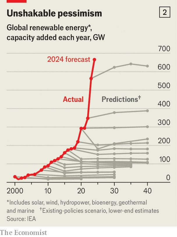
A beautiful chart from @gavinjackson.bsky.social's excellent Briefing on why the energy transition will be cheaper than you think
www.economist.com/briefing/
14.11.2024 15:17 — 👍 239 🔁 112 💬 10 📌 16
Hey Elon, do I have a hockey stick for you!
13.11.2024 15:19 — 👍 588 🔁 128 💬 24 📌 16
Assistant Professor at ASCoR, University of Amsterdam | Climate change communication, science communication, and polarization | 🌄🏞🌌🌇
Working for climate action in Edinburgh
https://data-4-climate-action-edinburgh.github.io/home/
Diseño producto en SCImago y enseño en la Universidad Internacional de la Rioja
https://www.yusef.es
Historian and DH | UTwente & RUG | #histSTM #nathist #colonialism #DH #AI | DB lead of the ‘digital Humanities - AI - Cultural heritage’ (HAICu) consortium | running
Independent data visualisation designer and scientific illustrator, LinkedIn instructor. Portfolio: ritagiordano.co.uk
Samen staan we sterker. Als sociale bewegingen slaan we de handen ineen om broodnodige verandering te forceren. Lees het manifest met alle eisen: debeweging.org
Op 24 mei gaan we massaal de straat op, sluit je aan! https://destraatop.nu
Design and Development Studio for Human Data Interaction.
(he/him) Climate expert (PhD). Telling climate stories, a.o. at Klimaatveranda.nl. Consultant at Weather Impact 🌊☀️⛈️
psycholoog, professor, auteur, spreker, idealist | mensen, dieren, natuur, duurzaamheid | je bent wat je doet | mijn ego heeft altijd gelijk | #FirstGen | http://roosvonkboeken.nl
Climate Scientist at @climatecentral.org | PhD | Passionate about improving science communication through data-driven stories | Harrisburg, PA | https://zacklabe.com/
Views, thoughts, and opinions expressed here are only my own.
Professor of English Language and Digital Humanities at the University of Helsinki. Interested in #multimodality, digital / computational humanities and linguistic landscapes. Mitglied bei @werder.de! 💚
🚨 Helping climate science break through to many more people - and unlock action. Brainchild of climate comms lab @utopiabureau.bsky.social and campaigner @nickoldridge.bsky.social https://www.climatesciencebreakthrough.com
Award-winning science communicator, bestselling author, TV personality & co-founder of Scientists for XR - making STEM fun, fighting misinformation & advocating for diversity.
AuDHD, she/her
2x TEDx speaker, 4x cat lover
www.emilygrossman.co.uk
Science Communicator and Visualization Specialist
✉ hello@joanaccarvalho.com
🔗 joanaccarvalho.com
Missie: versnellen & verbinden. Het NKP is de schakel tussen de praktijk van de energietransitie en het beleid vanuit de overheid. We adviseren het kabinet wat betreft kansen en knelpunten op de weg naar een duurzame toekomst. Meer op nkp.nl
Climate Data Visualiser @copernicusecmwf.bsky.social 🛰️ 📈🌍🌡️🎨 • @datavizsociety.bsky.social DVS mentor 2025 • Previously physicist @cambridgephysics.bsky.social 🔬 & senior data journalist @thetimes.com 🗞️ • 🇮🇹 + 🇬🇧 • Views mine
Associate Professor of Computer Science @University of Massachusetts Amherst | Co-Director of the HCI-VIS Lab. Former Harvard Radcliffe Fellow | Currently on sabbatical @Inria Saclay
Science graphics at NY Times
🦬🏔️ @cuboulder.info science prof
Vis / HCI - Designing data for the public.
📊❤️ PI @informationvisions.bsky.social
Previously: Bucknell CS prof, Tufts CS PhD
🔗 https://peck.phd/