Now also linked in the repository, together with a gallery image showcasing the featured examples and direct links to the codes.
02.08.2025 12:23 — 👍 3 🔁 0 💬 0 📌 0
Plot Twist
Yes, they are!
z3tt.github.io/ggiraph-user...
02.08.2025 11:49 — 👍 15 🔁 1 💬 3 📌 0
Slides are available, too - see my other comment :)
02.08.2025 11:37 — 👍 3 🔁 0 💬 1 📌 0
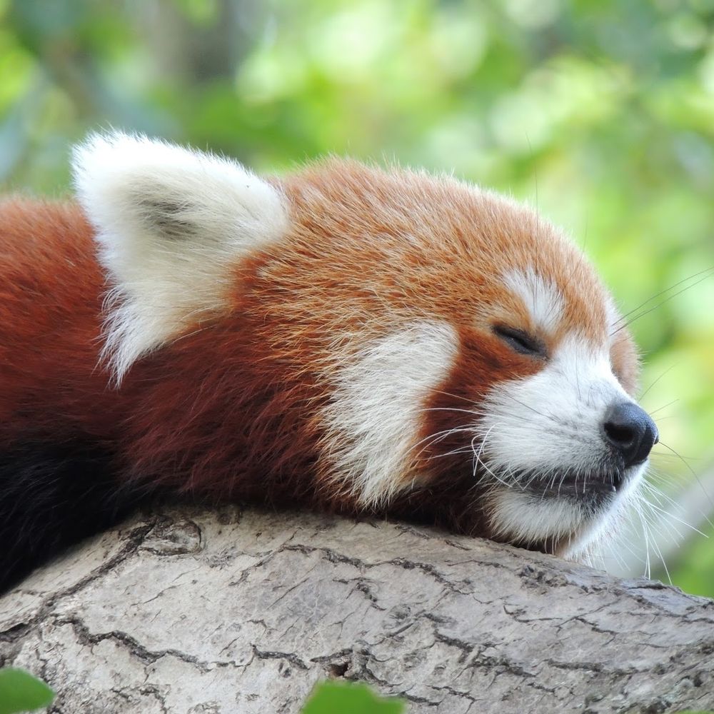
Did you know, that brown bears can make entire countries happier?
For statistical evidence of that fact, see the animation below
#rstats #ggplot #statistics #correlation #causation #Rprogramming #TidyTuesday #DataViz #RStudio
(this is of course meant to be humoristic)
🧵
08.07.2025 19:33 — 👍 7 🔁 3 💬 1 📌 2
🫶
01.08.2025 18:41 — 👍 1 🔁 0 💬 0 📌 0
Thanks Sharon! (and the GitHub is now public, too)
01.08.2025 17:47 — 👍 1 🔁 0 💬 0 📌 0
YouTube video by useR! Conference
Plot Twist: Adding Interactivity to the Elegance of ggplot2 with ggiraph
New presentation just posted at today's @user-conf.bsky.social virtual conference: Plot Twist: Adding Interactivity to the Elegance of ggplot2 with ggiraph
By @tanyashapiro.bsky.social & @cedricscherer.com
Video www.youtube.com/watch?v=GnDj...
#RStats #DataViz #ggplot2 #user2025
01.08.2025 16:33 — 👍 33 🔁 6 💬 2 📌 0
YouTube video by useR! Conference
Plot Twist: Adding Interactivity to the Elegance of ggplot2 with ggiraph
Already available on YouTube!
www.youtube.com/watch?v=GnDj...
01.08.2025 16:57 — 👍 7 🔁 1 💬 2 📌 0
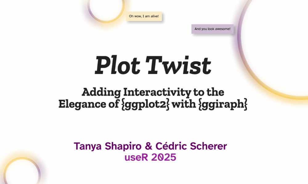
Title slide for our talk at useR entitled "Plot Tiwst:Adding interactivity to the elegance of ggplot2 with ggiraph"
The virtual #user2025 event takes place today — and our talk "Plot Twist: Adding Interactivity to the Elegance of ggplot2 with ggiraph" airs is lined up next! 🎥
#rstats #ggiraph #ggplot2 #dataviz
01.08.2025 15:49 — 👍 52 🔁 12 💬 3 📌 0
Urgh...*searching for soemthing else.
In any case the data is hard to spot in most all of these - and some lines are not straight (but most).
25.07.2025 18:35 — 👍 1 🔁 0 💬 0 📌 0
I don't know what the purpose is as I haven't read the report (was searciigj for something else). I guess "show the results" and ss there are multiple graphs like this (with the same y axes), comparison *might* be more important for each of the panel across figures. Or it's more about "trends".
25.07.2025 18:30 — 👍 4 🔁 0 💬 1 📌 0

The National's front page as Donald Trump set to arrive in Scotland
Today's front page is a nod towards the US president's upcoming visit to Scotland 👀👇
25.07.2025 10:52 — 👍 167 🔁 59 💬 7 📌 5
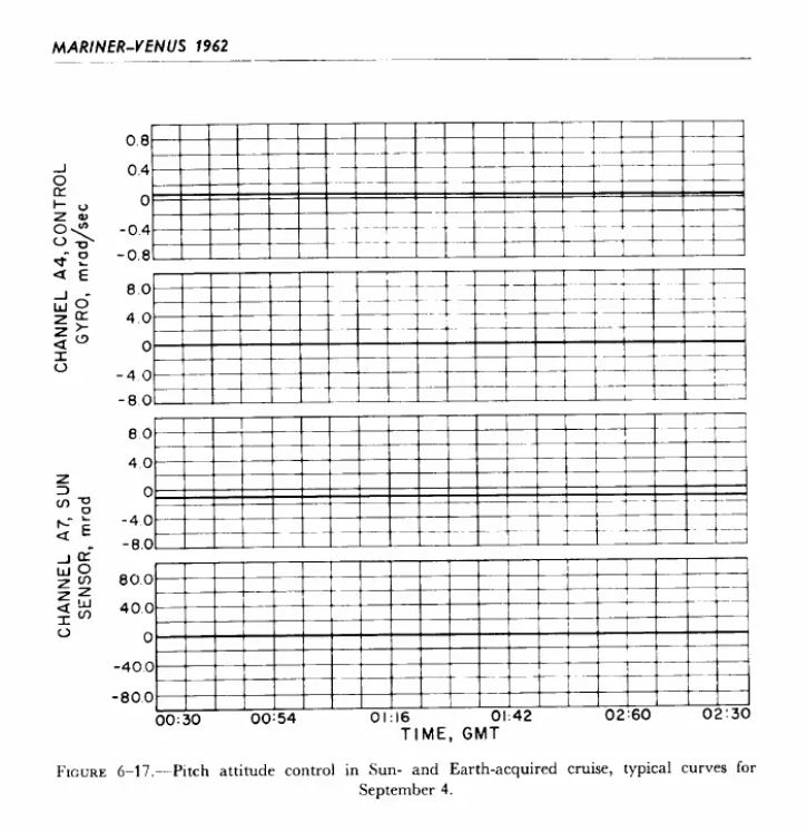
One of many line graphs in the NASA Mariner-Venus Report from 1962. Due to the rather black and bold and many grid lines, the straight lines that show the results (which are also black) are almost invisible.
Find the data 🧐🤓
#dataviz #datatoinkratio
25.07.2025 11:37 — 👍 17 🔁 3 💬 3 📌 0
Thank you Michael 👐
25.07.2025 07:20 — 👍 0 🔁 0 💬 0 📌 0
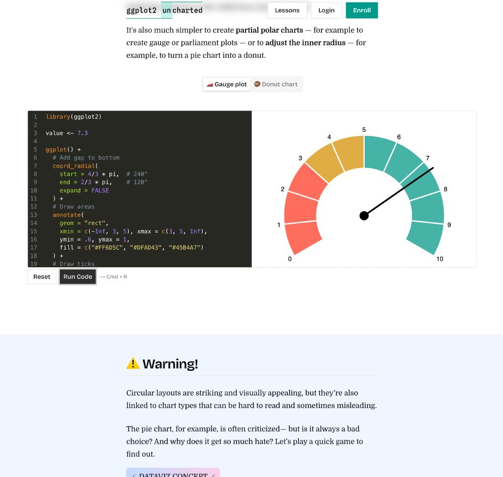
Screenshot of the gauge chart, along with the code in our interactive in-browser sandbox in the coordinate lesson of our course "ggplot2 uncharted".
The version in our online "ggplot2 [un]charted" workshop to illustrate how to create partial radial plots with #ggplot2 — part of the lesson "Coordinate Systems: Setting the Stage for Your Plot"
www.ggplot2-uncharted.com/module1/coor...
23.07.2025 15:48 — 👍 5 🔁 0 💬 1 📌 0
Last week, I crafted my first-ever gauge chart 🏎️ to showcase partial radial plots for our #ggplot2 [un]charted lesson on "coordinate systems"
Thanks to coord_radial(), partial circles like those are super easy now — and of course I couldn’t resist making a polished and animated version 💅📽️ #rstats
23.07.2025 15:43 — 👍 53 🔁 5 💬 3 📌 1
Thank you so much, both of you!! 💙
22.07.2025 19:04 — 👍 3 🔁 0 💬 0 📌 0
👐
22.07.2025 07:54 — 👍 4 🔁 0 💬 0 📌 0
ggplot + ggiraph in action ⚡
I teamed up with @cedricscherer.com to put together a fun ggiraph talk for useR conf this year. Of course I had to show an example inspired by him!
Stay tuned for behind the scenes how-tos, tricks, and code. Excited to share more info when the talk is live!
21.07.2025 19:09 — 👍 100 🔁 15 💬 6 📌 3
Oh, didn't know they changed the official English name in 2022! Thanks 😊
21.07.2025 06:07 — 👍 3 🔁 0 💬 1 📌 0
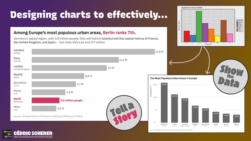
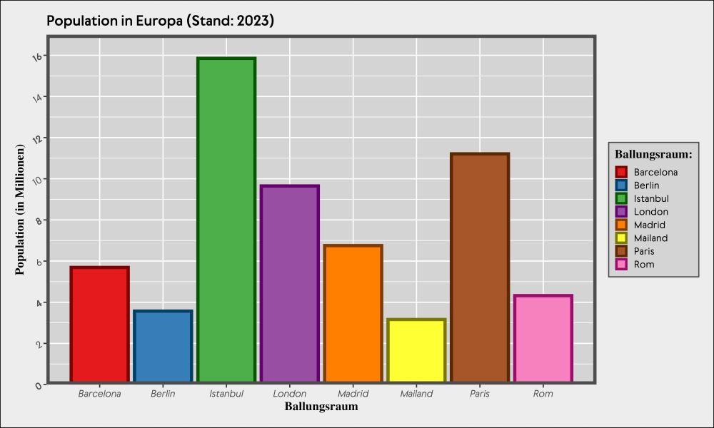
A collage of a decluttered, colorful bar chart and two reworked version — one with ranked vertical bars, all with the same weight, and a cleaner theme direct labels. and a more descriptive title, and the other with a key message highlighting the 7th ranked urban area Berlin in both the title, and the chart itself.
Two redesigns of the cluttered bar chart on Europe’s largest urban areas 📊
Two reworked variants — same data, different goals:
show the data vs. tell a story.
Decluttering, refocusing, adding context, and using visual emphasis can turn a chart into insight.
#dataviz #ggplot2 #rstats #tidyverse
18.07.2025 14:57 — 👍 31 🔁 6 💬 1 📌 0
A retro-vibe bar chart with many colors and a grey theme with too many labels, grid lines, and font styles, rotated labels, a superfluous legend and more.
It's always fun to create bad charts for workshops 🤪
#retro #dataviz #workshop #ggplot2 #rstats
17.07.2025 08:55 — 👍 21 🔁 2 💬 0 📌 0
A similar slide is featured in an upcoming talk with @tanyashapiro.bsky.social — stay tuned if you're curious!
14.07.2025 16:04 — 👍 5 🔁 0 💬 0 📌 0
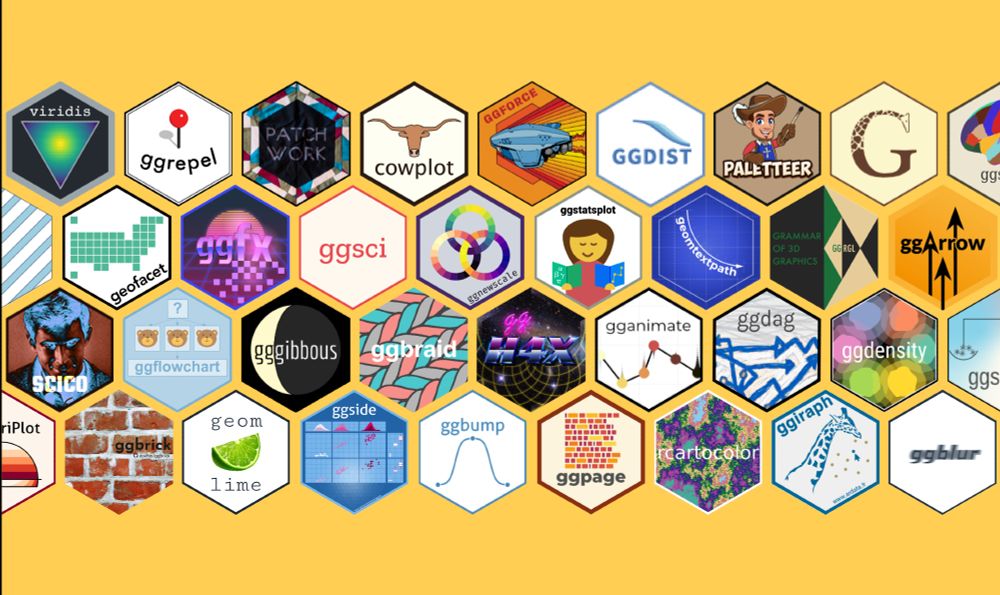
A collage of colorful hex logos from popular ggplot2 extension packages. Each hex represents an R package that expands ggplot2’s functionality. The overall layout celebrates the diversity and creativity of the ggplot2 ecosystem — while being able to just show a tiny sample from it.
Why do we 💙 #ggplot2?
Yes, it's for the Grammar!
But also for the passionate and supportive community — and their steady contributions to the ggplot2 universe: all the extension packages 🧩 that take its impressive flexibility even further, making it more powerful and beautiful 🙌
#rstats #tidyverse
14.07.2025 16:04 — 👍 72 🔁 11 💬 1 📌 0
I wasn't aware of other similar examples, so thanks for the nudge!
I guess you're referring to Smith & Van der Walt? (btw, the link in your list is broken) Unfortunately, the R package is often used as the primary reference 😟 (... good for me as I am listed as a contributor 😶🌫️)
11.07.2025 12:36 — 👍 1 🔁 0 💬 1 📌 0
Give it a try! It might be confusing in many cases but could work - as often, also depend on the data and their pattern.
11.07.2025 12:01 — 👍 3 🔁 0 💬 0 📌 0
Oh, just saw the comment that it might be for reasons of evaluation or comparison. Then that's a different story. Anyone else should be careful though.
11.07.2025 07:56 — 👍 1 🔁 0 💬 0 📌 0
#python, #rstats, #shiny, #datascience training and consultancy. We help organisations extract the most from their data.
Data Science Connects is a dynamic community committed to advancing the field of data science within the broader context of operational research. https://www.datascienceconnects.com/
A connected community of the Operational Research Society.
Geographer and dataviz creator
github.com/toebr
Putting R and Julia in production with 🤍 ricochet.rs #rstats #julialang
🤖 A collection of over 400 open-sourced, free #RStats books. This bot posts a random entry every few hours. Maintained by @oscarbaruffa.com
Chief Scientist for @berkeleyearth.org.
Physics PhD & data nerd. Usually focused on climate change, fossil fuels, & air quality issues.
data person, mostly #rstats and ⚽️
data specialist in the NHS, Scotland.
Experience with clinical audit, quality improvement, BI and public health.
Likes #RStats and #dataviz
Formerly HighlandR , still at
https://johnmackintosh.com
🦝 Writer/researcher, dataviz and information designer
Anarchist, hater of capital, the state-racial-cispatriarchal matrix of domination, and all borders
🏴 🏳️🌈 🏳️⚧️ 🏴☠️ 🍉
Otto Rühle: "Revolution is not a party affair"
Man Utd fan (against all reason!)
Journalist, New York Times Upshot
Bylines: nytimes.com/by/aatish-bhatia
Website: aatishb.com
Previously:
Freelance science writer
Associate director, Princeton
Physics Ph.D., Rutgers
Assistant Professor at the University of Massachusetts. I research and teach about environments, technologies, and racial capitalism
Book coming soon: DEMOLISHING DETROIT (Stanford UP, 2025). For more: nickcaverly.com
Union yes @MSP-MTA-NEA
Principal Engineer at Posit (fka RStudio), technical lead at quarto.org
Learning Brazilian Choro and the 7-string guitar
💼 Journalist @ WDR
💚 News, DDJ, data viz, Tech, Gaming, Sport
https://peder.quarto.pub/blog
Father x3. Rstats & data viz.
Currently looking for gut bacterial by-products that influence the cholestatic liver disease primary sclerosing cholangitis
Norwegian green party 🌱
🇳🇴 🇩🇪 🏴
Data analyst and data viz geek
Senior Editor of #Statistics and #datascience books at Chapman & Hall. www.routledge.com
Freelance data visualization designer and #D3js developer based in Mensk, Belarus. Open for hire worldwide #dataviz @ yanouski.com