Can you share a link of a recent full curation script so I have a logical template additionally to the documentation? Apart from curation, the review process seems very straightforward with the check boxes :)
15.08.2025 16:03 — 👍 1 🔁 0 💬 1 📌 0
What is the best entry level help one can assist you with? Reviewing datasets? I see no open PR at the moment but a lot of datasets as issues in the repo.
15.08.2025 15:25 — 👍 1 🔁 0 💬 1 📌 0
Hello #dataBS (& especially #TidyTuesday) fam! I'm trying to organize a thing to help me keep TidyTuesday running smoothly, but first I need to get a bit of a runway. Every week I curate a TT dataset, and it's wearing me down. Please see github.com/rfordatascie... for some ways you can help! #RStats
15.08.2025 11:23 — 👍 48 🔁 36 💬 7 📌 4
My tech stack cost breakdown:
Positron IDE: $0
R: $0
tidymodels: $0
DuckDB: $0
08.08.2025 17:35 — 👍 27 🔁 2 💬 2 📌 1
This week's #TidyTuesday data is about art in New York subway and train stations - thanks to @karaman.is for curating the data! I made an interactive chart about the sentiment of the descriptions!
💬 Sentiment analysis with {tidytext}
📊 Plot with #ggplot2
🦒 Tooltips with {ggiraph}
#RStats #DataViz
22.07.2025 14:12 — 👍 39 🔁 6 💬 2 📌 0
ggplot + ggiraph in action ⚡
I teamed up with @cedricscherer.com to put together a fun ggiraph talk for useR conf this year. Of course I had to show an example inspired by him!
Stay tuned for behind the scenes how-tos, tricks, and code. Excited to share more info when the talk is live!
21.07.2025 19:09 — 👍 102 🔁 14 💬 6 📌 3
For this #TidyTuesday week, I simply created a data animation with #Rstats #ggplot2 #gganimate.
Sometimes its fun to explore data in another way than a meaningful #datviz =P.
code: github.com/toebR/data_a...
14.07.2025 21:43 — 👍 12 🔁 0 💬 0 📌 0
Logo for the #TidyTuesday Project. The words TidyTuesday, A weekly data project from the Data Science Learning Community (dslc.io) overlaying a black paint splash.
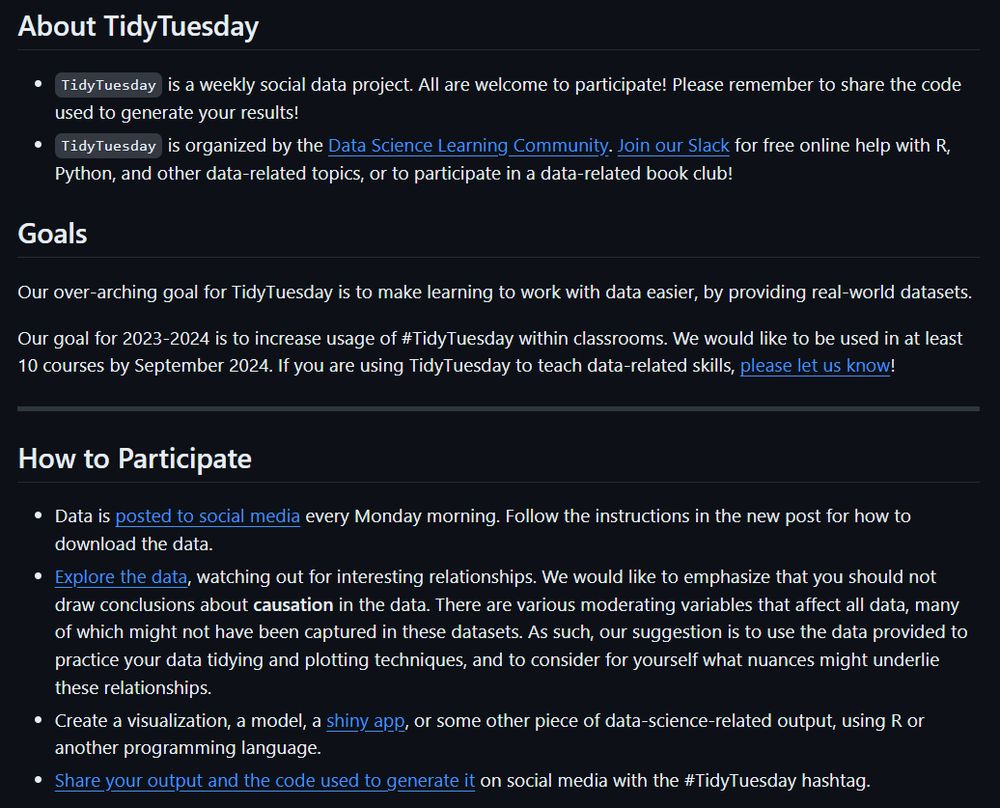
TidyTuesday is a weekly social data project. All are welcome to participate! Please remember to share the code used to generate your results!
TidyTuesday is organized by the Data Science Learning Community. Join our Slack for free online help with R and other data-related topics, or to participate in a data-related book club!
How to Participate
Data is posted to social media every Monday morning. Follow the instructions in the new post for how to download the data.
Explore the data, watching out for interesting relationships. We would like to emphasize that you should not draw conclusions about causation in the data.
Create a visualization, a model, a shiny app, or some other piece of data-science-related output, using R or another programming language.
Share your output and the code used to generate it on social media with the #TidyTuesday hashtag.
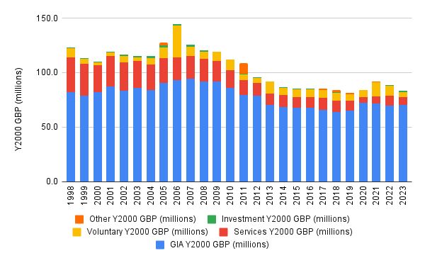
Stacked bar chart showing the British Library’s funding sources from 1998 to 2023, adjusted to Year 2000 GBP (millions). The chart breaks funding into five categories per year: "GIA (blue, dominant throughout), Services (red)," Voluntary (yellow), Investment (green), and Other (orange). Funding peaked in 2006 and declined gradually thereafter, stabilizing at a lower level from 2014 onward. GIA remains the largest component, with smaller and more variable contributions from other categories. The y-axis ranges from 0 to 150 million, and the x-axis lists years from 1998 to 2023. Original plot by Andy Jackson.
@dslc.io welcomes you to week 28 of #TidyTuesday! We're exploring British Library Funding!
📁 https://tidytues.day/2025/2025-07-15
📰 https://anjackson.net/2024/11/29/british-library-funding-breakdown-trends/#income-streams
#RStats #PyData #JuliaLang #DataViz #tidyverse #r4ds
14.07.2025 13:48 — 👍 11 🔁 2 💬 0 📌 1
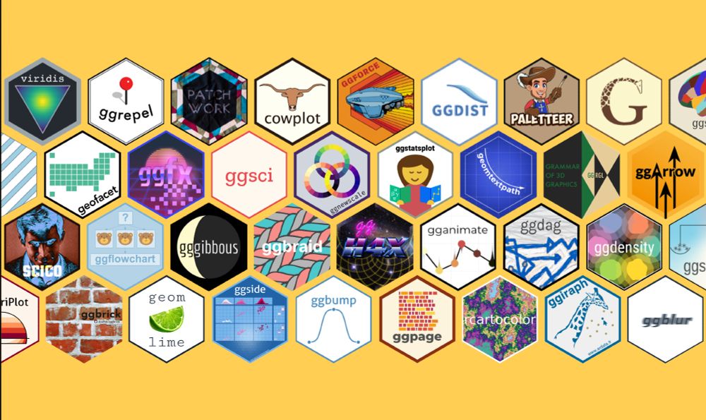
A collage of colorful hex logos from popular ggplot2 extension packages. Each hex represents an R package that expands ggplot2’s functionality. The overall layout celebrates the diversity and creativity of the ggplot2 ecosystem — while being able to just show a tiny sample from it.
Why do we 💙 #ggplot2?
Yes, it's for the Grammar!
But also for the passionate and supportive community — and their steady contributions to the ggplot2 universe: all the extension packages 🧩 that take its impressive flexibility even further, making it more powerful and beautiful 🙌
#rstats #tidyverse
14.07.2025 16:04 — 👍 70 🔁 10 💬 1 📌 0
Carnivore Ecologist 🐅🐆🦝🦨🦦🐾
Assistant Professor
Data scientist 👩🏻💻
Latina in STEM 🇬🇹
rstats, ecology, Bayesian stats.
gabspalomo.github.io
Posit DS Hangout host & data educator. Data Weasel. Community Builder. Teaches R+Python.
🔉 Heeren == "hair-en" ✨
LinkedIn: https://www.linkedin.com/in/libbyheeren
DS Hangout: https://pos.it/dsh
Building ChunkCity - an Infinite City Builder for PC & mobile 💻📱. No engine, built with #Kotlin and #libGDX
Make Games Faster!
https://opr.as/BS-GameMaker
#python, #rstats, #shiny, #datascience training and consultancy. We help organisations extract the most from their data.
❤️📊 | 🗣️DE|EN|FR | #rstats | #econsky
I teach people to use R @rfortherestofus.com
mediocre transsexual. sydneysider. former professor. credibly accused of crimes against statistics, mathematical psychology, and somehow pharmacometrics. occasionally makes low quality art. bitter malcontent. she/her, i suppose
Website: https://stevenponce.netlify.app/
GitHub: http://github.com/poncest/
LinkedIn: http://linkedin.com/in/stevenponce/
Swiss Hockey - nlicedata.com | https://bsky.app/profile/nlicedata.com
I ❤️ dataviz!
Author of
- data-to-viz.com
- the R, Python, d3 and React graph galleries
- dataviz-inspiration.com
Solopreneur @ IndieVisual
Data geek who loves problem solving
Rambles about fitness & random stuff too
https://indievisual.tech
🧙♂️✨📊
Independent Data Visualization Designer, Consultant & Instructor | available for projects and workshops
All things data & design with #rstats, #ggplot2, #Figma, #DataWrapper, #Flourish, and more
Co-Founder of the #30DayChartChallenge
Senior Manager Data Science and Engineering at | Docker Captain 🐳| Time-series analysis & forecasting
My newsletters:
Weekly updates: https://ramikrispin.substack.com
AIOps: https://theaiops.substack.com
Forecasting: https://theforecaster.substack.com
Creative data artist in the spatial industry.
📊 Data visualisation specialist.
💻 #RStats | #Python | #D3.
🎨 Generative artist.
🏃♀️ Runner.
Website: https://nrennie.rbind.io/
She/her. Views my own.
Dataviz designer, psychiatrist, PhD
https://karaman.is
Public Servant, #rstats coder