How does Andy Borowitz come up with this stuff, day after day?
Brilliant.
www.borowitzreport.com/p/trump-taps...

@datarevelations.com.bsky.social
Professional chart looker-atter. Author of "The Big Picture" and co-author of "The Big Book of Dashboards." James Jamerson disciple.
How does Andy Borowitz come up with this stuff, day after day?
Brilliant.
www.borowitzreport.com/p/trump-taps...
I had forgotten about this.
You continue to have what may be a perfect track record of nothing-but-really-useful posts (either your own or amplifying others).
Thank you for the kind words.
12.06.2025 01:08 — 👍 2 🔁 0 💬 0 📌 0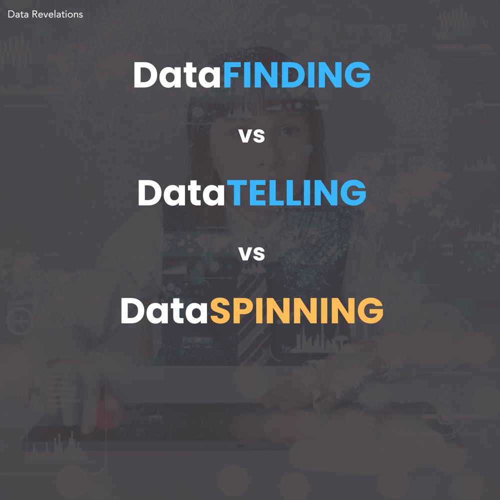
Hey dashboard designers:
This may be controversial, but I think a dashboard is a terrible place to *tell* a data story.
But a good dashboard can be an indispensable tool for helping you and your organization *find* data stories worth telling.
Learn more at buytickets.at/datarevelati...
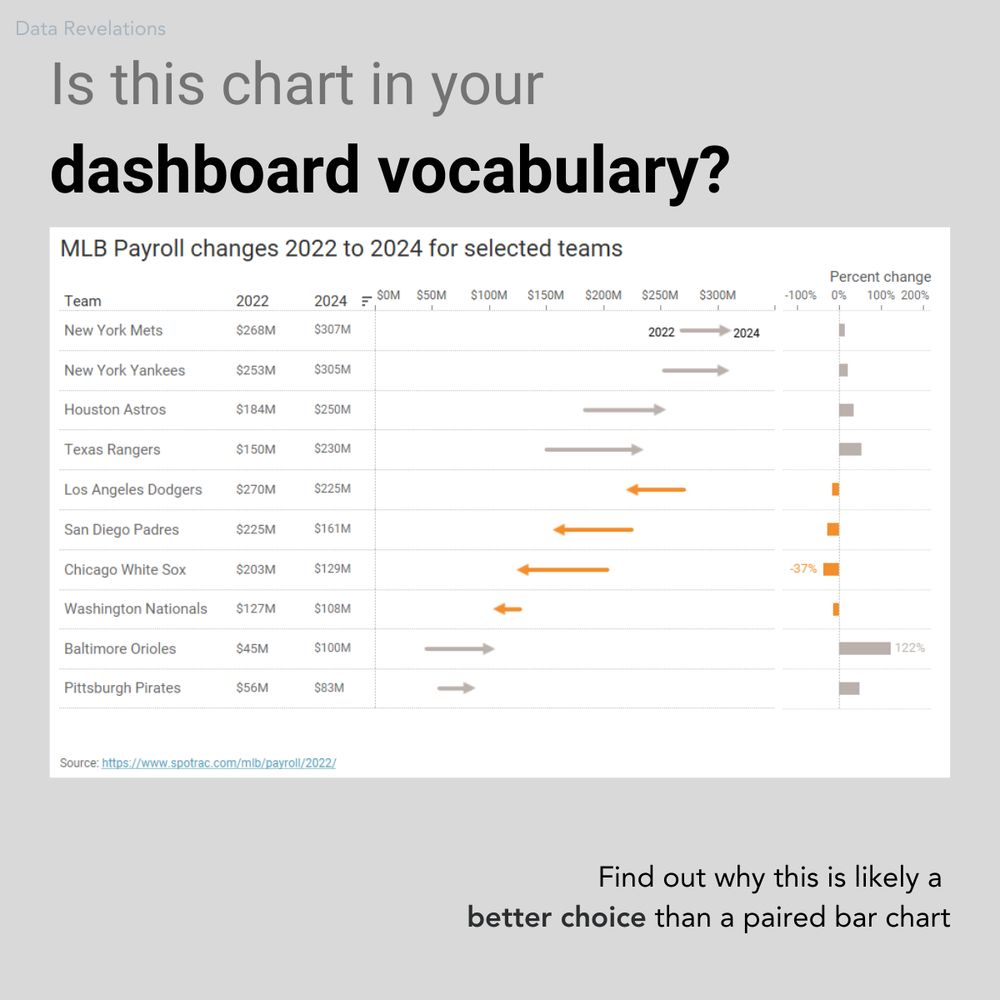
Hey, dashboard designers:
Is this chart in your chart vocabulary?
It's one of my favorite ways to show "now vs. then" along with percent change.
We'll examine this chart--and dozens--more in my upcoming dashboard design workshop May 27 and 29.
Learn more at buytickets.at/datarevelati...
These are all so good.
"Good" may not be the right word. I'd much prefer fewer choices here.
And please forward the link.
I'd like to get a few hundred responses by Friday.
FAVOR:
Please take this one-question survey. If my theory is correct, we'll have some interesting data to visualize.
www.surveymonkey.com/r/8BLVDW9
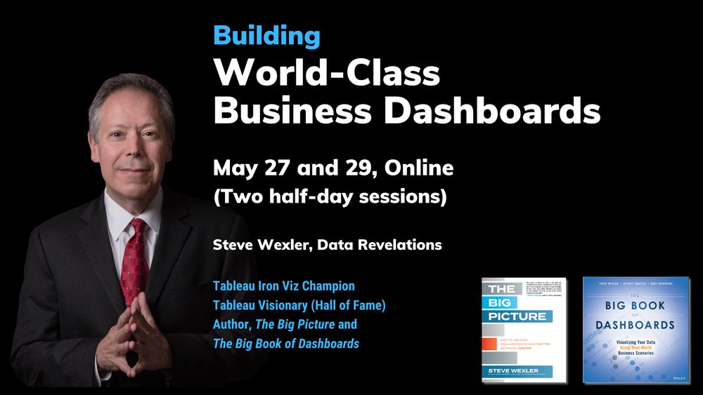

Not one but TWO dashboard design workshops coming up soon!
May 27 and 29 -- Online (two half-days).
June 5 -- In person as part of the Marketing Analytics Summit on Phoenix.
May: buytickets.at/datarevelati...
June: marketinganalyticssummit.com/workshop/bui...
What Andy said.
24.03.2025 11:14 — 👍 0 🔁 0 💬 0 📌 0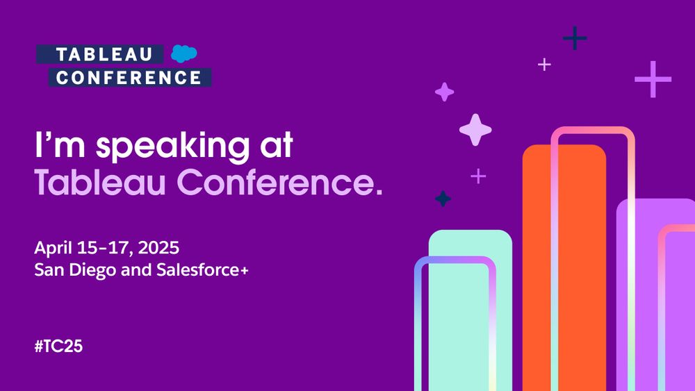
Tableau conference promotional slide for conference April 15-17.
2) **Chart Chat (In Person!)** A top-rated session three years in a row, I look forward to sparring with my fellow book authors Jeffrey Shaffer, @acotgreave.bsky.social , and @abmakulec.bsky.social. Lots of great sessions. See
reg.salesforce.com/flow/plus/tc...
Better link:
reg.salesforce.com/flow/plus/tc...
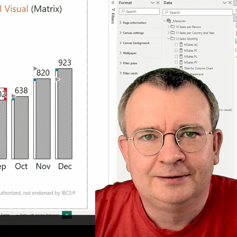
I'm delighted that I will be presenting twice at the upcoming Tableau Conference.
1) **Visualizing Survey Data with Tableau** After a multi-year hiatus I'll be sharing what's new, what's stood the test of time, and what you absolutely need to know in order to excel in your survey data efforts.
I encourage you to ask @acotgreave.bsky.social and Jeffrey Shaffer about this (particularly Jeff, who I don't think is on BlueSky).
In my limited experiences, you need to know what "good" looks like to get decent results.
That said, give it a data set and ask it to do EDA. It can be remarkable.
Oooh, this is gonna to be fun!
A deadly of dashboards? A deluge? An enigma? A collision?
I think "murder" is the best one yet, but the crows may have something to say about that.
I think the analog to a pie chart is a stacked bar chart. I call it a "cubist" pie chart.
30.01.2025 17:58 — 👍 2 🔁 0 💬 0 📌 0YIKES!
I'll be sharing an example of that in the book.
And you know how much I admire your integrity about these things. Asd for the person who gave you that advice...
The Climate Stripes is the other one I've been looking at.
27.01.2025 21:48 — 👍 0 🔁 0 💬 0 📌 0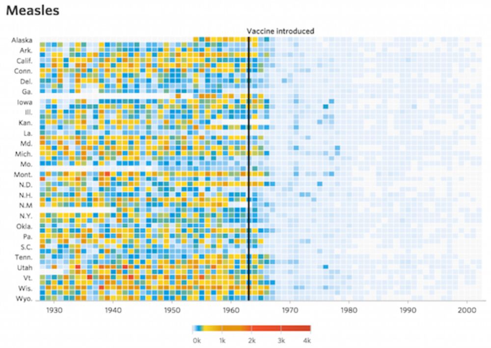
I'm agonizing over an essay I'm writing about storyFINDING vs. StoryTELLING vs StorySPINNING. I'm in the "it's easier to research than to write" phase. I came across this terrific post (and viewpoint) from @visualisingdata.com. See visualisingdata.com/2015/02/visu...
27.01.2025 18:13 — 👍 19 🔁 5 💬 2 📌 1What are your thoughts on WhatsApp? This is how I communicate with people outside of the US.
27.01.2025 16:26 — 👍 0 🔁 0 💬 1 📌 0
I'm a big fan of @borowitzreport.bsky.social. He's a brilliant satirist.
This article pushed me past the tipping point. I encourage to you to read it and share with friends.
www.borowitzreport.com/p/time-to-un...
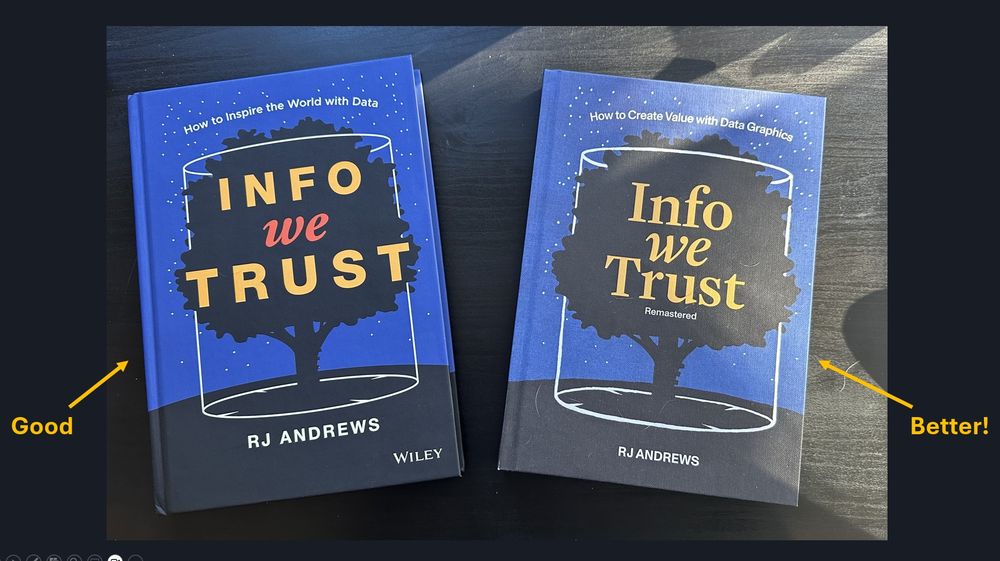
A copy of the first edition of RJ Andrews' book "Info Trust" and the updated and remastered version. The first one is labeled "good." The second is labeled "better."
@infowetrust.com I'm grateful for the good you bring into the world.
And now with the updated and remastered version, you've brought some "better" into the world.
I encourage people to visit infowetrust.com
I suspect George Santayana would be nodding his head in painful agreement.
20.01.2025 21:09 — 👍 2 🔁 0 💬 0 📌 0This just nails it.
19.01.2025 18:42 — 👍 7 🔁 0 💬 0 📌 0
In working with @abmakulec.bsky.social, Jeffrey Shaffer, and @acotgreave.bsky.social on our new book, I got to revisit this article from @elibryan.bsky.social .
He is seriously bad-ass.
Make sure to check out his other pieces for DVS Nightingale.
nightingaledvs.com/unfair-compa...
I expect to be at TC25, and you should try to get autographs from Andy and Jeff as well. I'm guess there are maybe 50 copies with all three signatures.
14.01.2025 21:16 — 👍 1 🔁 0 💬 0 📌 0
We need your help!
Please take this two-question survey about whether you think most dashboards fail. I'm working with Jeff Shaffer, @acotgreave.bsky.social and @abmakulec.bsky.social and with just a few more responses we'll be able to narrow the margin of error.
www.surveymonkey.com/r/K6YGR6Z
It comes with a Trump-signed Les Paul knock-off guitar. You've never seen such a good guitar and book combination. Believe me.
11.01.2025 17:11 — 👍 1 🔁 0 💬 0 📌 0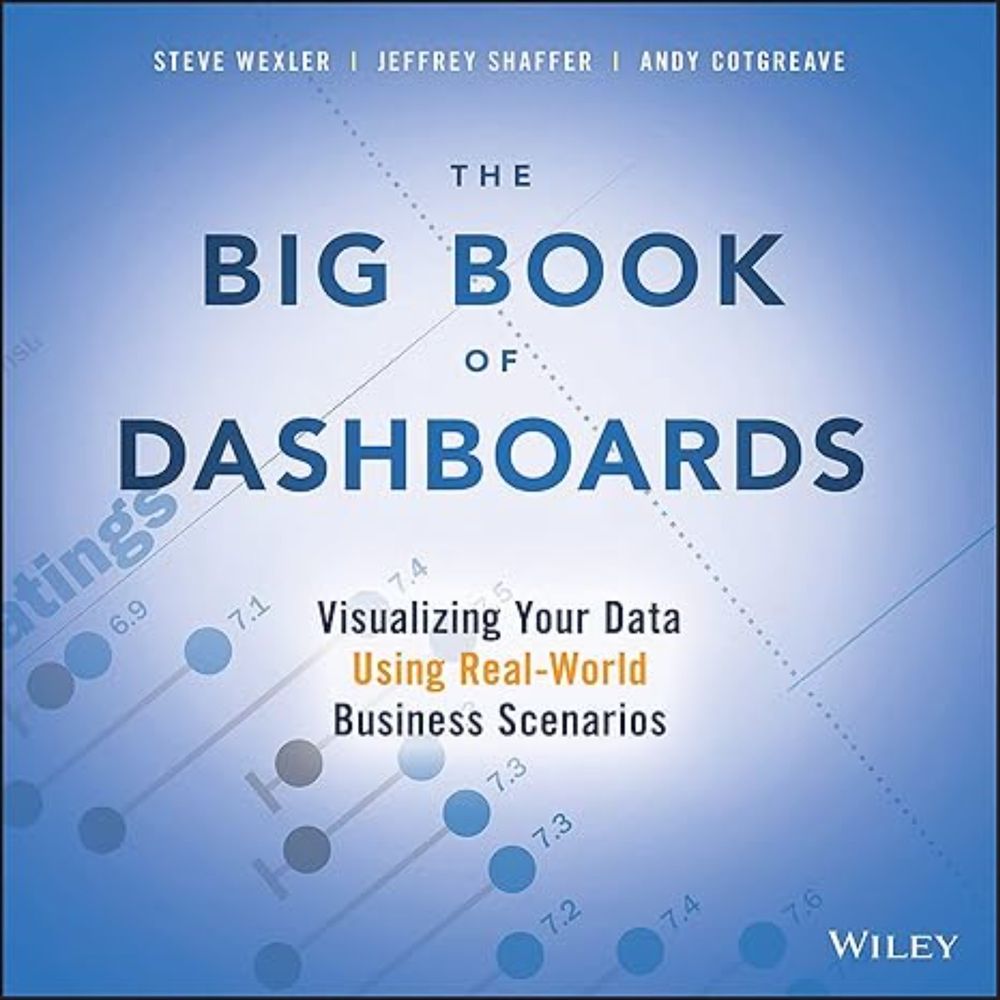
I have no idea how Amazon's algorithm works, but the price for The Big Book of Dashboards is the lowest it's ever been (at least in the US.) www.amazon.com/dp/1119282713 @acotgreave.bsky.social
10.01.2025 18:52 — 👍 12 🔁 3 💬 3 📌 1Who said it would be easy?
Maybe try this (which works for 3D pie charts, too):
"Let me show you a few ways to present the data. Which of these allow us to answer the questions we have more easily?"
It's rarely the dashboard with the multi-colored 3D pie chart.