We’re hiring a Developer Intern to kick off 2026 with us! ✨
At Revisual Labs, interns help us with internal tools, contribute to client projects, participate in talks and workshops, and more!

@schubert-da.bsky.social
Dataviz developer at Revisual Labs. Data visualisation, urban sketching, frontend and just about anything to do with dogs.
We’re hiring a Developer Intern to kick off 2026 with us! ✨
At Revisual Labs, interns help us with internal tools, contribute to client projects, participate in talks and workshops, and more!
In this post I break down the process of how I post-processed my #ggplot charts 📊 to look like they were embroidered into cloth. If you liked this effect, try it out on your own charts as well! Please let me know if something isn't clear. #rstats
aman.bh/blog/2025/cr...
From releasing zero personal projects the previous year to having my first math explainer win the Pudding Cup!
Just a reminder to put the work you love out there!

A test for Benford's Law where the author flips through a National Geographic Magazine and logs all the numbers to check the distribution of the leading digits to confirm whether they obey Benford's Law or not. Spoiler alert: they do - and surprisingly well at that!
In this visual explainer I explore how Benford's Law demonstrates the hidden patterns in real world datasets.
The same patterns which I later put to test by diving into dozens of @ourworldindata.org datasets, cataloging numbers in National Geographic magazines and more in the article!

A grid of bar charts with each showing the distribution of leading digits for their respective datasets. This grid demonstrates Benford's Law which says that when pulling the numbers from real world data, we often find that numbers with smaller leading digits are far more common.

Grid of Our World in Data datasets with their leading digits depicted as bar charts. This grid demonstrates Benford's Law showing that smaller leading digits are far more common.
The first side project I've seen to completion in a while: Benford's Law talks about how numbers in the real world, from finance to electoral and public data, aren't quite as random as they seem.
LINK: benfords-law-explainer.netlify.app
Still feel like I could improve the viz in the dropdown but right now I'm jut focusing on getting stuff "good enough" to share.
Funny how everything is like 80% of the way to what I want it to be but you wouldn't quite be able to tell by just looking at it...
Back from @vizchitra.bsky.social and admittedly been slow to share the progress on the personal site - but we now have a navbar! (and a tiny sneak peak of the WIP hero section + illustrations)
04.07.2025 05:03 — 👍 1 🔁 0 💬 1 📌 0Team RVL met at Bangalore to attend @vizchitra.bsky.social (India’s first dataviz conference) and to celebrate our studio’s 2-year birthday + IIB Awards win! We spent the weekend with our full-time team and almost every contractor who has worked with us over the years 🎂
02.07.2025 10:06 — 👍 4 🔁 3 💬 2 📌 0
Visual promotional poster for a QGIS mapping workshop at VizChitra 2025. The workshop is led by Pulaha Roy, senior data journalist at Down to Earth. The text highlights that the session will introduce participants to spatial data using the open-source tool QGIS. It mentions topics like vector and raster data formats, basic calculations, and map projections. The date is June 28, and the location is Underline Center, Bangalore. A registration link is provided.
"Maps deal with data about us and the space we inhabit, and they look wow!" says Pulaha Roy.
Join his #VizChitra2025 workshop to explore spatial data with QGIS, from vectors to projections.
🗓️ June 28 | Bangalore
🎟️ hasgeek.com/VizChitra/le...
#DataViz #QGIS

Website with a navbar designed to look like a stacked bar chart showing the amount of content in each section of the page.
On the personal site front - I've fleshed out the nav a bit!
It's meant to be a stacked bar showing the amount of content in each section. But on testing with friends this wasn't immediately apparent so maybe a minor redesign or helper text is in order (plus this doesn't translate well to mobile)
Been split between a couple projects this past week but a few things that did finally get done:
Just about done building VizChitra's team page. So if you wanna learn more about the folks volunteering to build India's first dataviz conference, head over to: vizchitra.com/meet-the-team
Our website has a new chart gallery! 📈📊📉
You can now browse through almost every chart from all our projects & filter them by chart function. Whether you’d like to draw inspiration, explore our projects, or just because you love charts. Stop by revisual.co/chart-gallery/ & look around! 👀
Had to rework things to play nice in Svelte 5, but finally we have a working footer!
For some reason I tried to force using $effect when a simple onMount worked fine. A bit of wrangling with a GSAP timeline and painful debugging sessions and here we are:
My bad, should have been more specific - it's mostly an issue with my code with just making the move to Svelte 5 and not fully understanding how the reactivity works just yet.
Not a bug with Svelte per se..

Site: vizchitra.com
For context, VizChitra (@vizchitra.bsky.social) is India's first dataviz conference happening later this month (27-28th June)
While progress on the personal site has grinded to a halt due a Svelte 5 reactivity bug that I can't quite figure out - I instead created these cards for the speaker line-up at VizChitra
Pretty pleased with the output considering it took a little under a day to design and build from scratch.
Just went through the entire process and the attention to detail both in recreating the piece and documenting it is just stunning!
The end results look amazing as well!
Screenshots of websites pages arranged in a collage
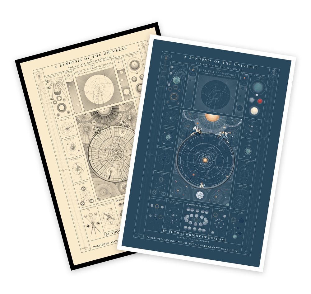
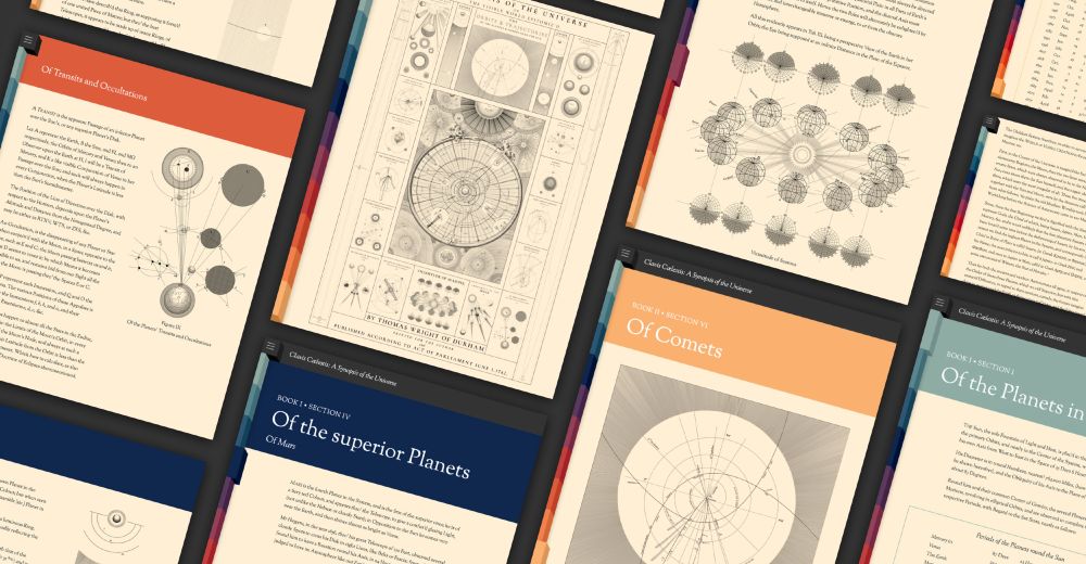
Antique and color posters

Closeup of antique poster

Closeup of color poster
New: I recreated Tomas Wright’s 1742 astronomical treatise, Clavis Cælestis, and its accompanying sheets titled A Synopsis of the Universe. New posters are available in antique style and modern colors.
Explore: www.c82.net/clavis-caele...
How it was made: www.c82.net/blog/?id=99
While it might seem like a LOT of work for a footer, this is mostly repurposed code and assets from another WIP explainer project that I never got around to completing.
This project uses a wave function collapse algorithm to generate a connected city grid from a few hand-drawn tiles.

Design of a footer for a website with a list of socials icons and a graphic of a grid of city tiles in the section below it. As the user spends more time on the web site, more tiles are added to the grid.
A bit of clean up and this what the footer for my personal site looks like.
The basic idea for the grid is to mimic an idle-style game running in the background as the user browses the site. As they spend more time on the page, more tiles are added to the grid (which is still to be completed).
My current project is my personal website which I've neglected updating since I actually started working in dataviz.
Today is a bit of progress in building out the base for the footer which I recorded over the course of an hour.
Only built out the visuals and now to actually make things work.
2/2
I always wanted to make an effort to work more in public, posting snippets of my progress on side projects and things I find interesting along the way.
Hopefully having things out in the open might help others pick and steal their favourite bits or spark some new ideas.
1/2
Still slowly working away at #30DayChartChallenge in my own time. So here's day 15 - Complicated which involves one of the more complex GSAP plugins - morphSVG to manipulate SVG shapes.
Made with Svelte + GSAP. Still super janky but here's the code: github.com/schubert-da/...

🚨Deadline Alert: The call for proposals for #VizChitra2025 closes tonight at 11:59 PM IST
⌛️There's still time. Not a lot, but enough to pull that idea out of drafts and pitch: hasgeek.com/VizChitra/20...
🧵Here's why you don't need to overthink it.
Oh wow nice catch! Must have messed something up just before I hit record :S
13.04.2025 10:04 — 👍 1 🔁 0 💬 0 📌 0
Thanks! Just got around to uploading the source code here: github.com/schubert-da/.... Probably not the best way to do things, but still figuring this stuff out
GSAP(gsap.com) is pretty neat too - really helps with setting up more complex animations which I'm trying to learn through this challenge
Thanks!
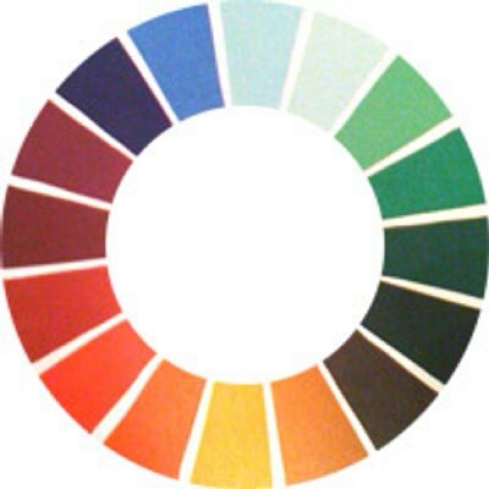
13.04.2025 06:16 — 👍 1 🔁 0 💬 0 📌 0#30DayChartChallenge Day 11 - Stripes.
Always wanted to figure out page transition animations so decided to build something similar for switching data in a bar chart. Made with Svelte + GSAP (and once again fake data!)
Also finally uploaded the source code: github.com/schubert-da/...
#30DayChartChallenge - Day 5: Ranking
Played around with my last viz to create a quick treemap loading animation with Svelte + GSAP.
Day 4 of #30DayChartChallenge - Big or Small has us comparing tiles of rather similar(ish) sizes in a treemap with a bit of interactivity using Svelte + GSAP (specifically the scrollTo plugin).
Data is from the definitely not made up geographical survey of Narnia.