🌍 Join the Board of Applied Epi!
We’re seeking new Board Members passionate about global health & Epidemiology.
Help guide a nonprofit that trains 1000s worldwide in data-driven public health response.
⏰ ~2 hrs/month | Apply by 31 Dec 2025
🔗 tinyurl.com/4yp5fu93
31.10.2025 08:29 — 👍 1 🔁 2 💬 0 📌 0
🌍 Join the Board of Applied Epi!
We’re seeking new Board Members passionate about global health & Epidemiology.
Help guide a nonprofit that trains 1000s worldwide in data-driven public health response.
⏰ ~2 hrs/month | Apply by 31 Dec 2025
🔗 tinyurl.com/4yp5fu93
31.10.2025 08:29 — 👍 1 🔁 2 💬 0 📌 0
join – Applied Epi
We're hiring!
Applied Epi is looking for a capable epidemiologist for a full-time 1-year remote contractor position.
Take a look at our website for more details on the role and how to apply: appliedepi.org/about/join.h...
Application deadline: July 31, 2025.
14.07.2025 12:43 — 👍 0 🔁 0 💬 0 📌 1
🚨 Rare opportunity! Our advanced R courses start end of July:
📈 Time series & outbreak detection in R
📊 Intro to Stats in R
🗺️ Intro to GIS in R
🖥️ Shiny in R
📝 Advanced R Markdown
Plus: Lots of Intro to R courses running all summer! 🌞
Taught live by experienced epidemiologists. 🌍
🔗 appliedepi.org
10.06.2025 17:26 — 👍 4 🔁 1 💬 0 📌 0

“I’ve taken several R trainings - this is the BEST!”
📢 New courses posted! Intro to R for public health
🗓️ 40 hours part-time, synchronous, with unlimited 1-on-1 coaching and options for ALL time zones.
✏️ Register: appliedepi.org/training/pub...
13.03.2025 09:52 — 👍 1 🔁 3 💬 0 📌 0

📢 Last week to apply for the Applied Epi scholarships!
Transition your team to R with free or discounted courses and services.
Why apply?
✔️ Full or partial scholarships
✔️ Focused on strengthening public health capacity
🗓️ Apply by Feb 10, 2025! 🌐 appliedepi.org/training/scholarships-ae
03.02.2025 20:51 — 👍 1 🔁 3 💬 0 📌 0
Applied Epi
📢 Ready to move your team to R? Applied Epi’s scholarships are OPEN!
✅ Funding available for teams in LMICs
✅ Even teams of 1 can apply with leadership support
✅ Deadline: Feb 10, 2025
Why team applications? Collaboration ensures a smooth transition to R! Apply today: 🌐 appliedepi.org
27.01.2025 15:55 — 👍 3 🔁 2 💬 0 📌 0
🚨 Applications are NOW OPEN for Applied Epi’s 2025 scholarships! 🚨
💡 For teams in low- & middle-income countries working in epidemiology, this is your chance to access funding for courses and support services that help transition to R.
🗓️ Deadline: Feb 10, 2025
🌐 Apply here: appliedepi.org
21.01.2025 01:22 — 👍 5 🔁 4 💬 0 📌 0

🎉 R scholarship applications open on January 20!
If your team (government or nonprofit) works in applied epidemiology in a low- or middle-income country, you could get access to our Intro to R course and Support Desk! Details: appliedepi.org/training/sch...
#Rstats #epitwitter
17.01.2025 17:04 — 👍 7 🔁 7 💬 0 📌 1
The main takeaways are:
1) Ggplot customization possibilities are pretty endless.
2) Merry Christmas and happy holidays to you all!
🎄🎄🎄
24.12.2024 20:57 — 👍 1 🔁 0 💬 0 📌 0
That code shows other cool things too, like how we added in a new font ("Grand Hotel") for the ggplot title.
We used the {showtext} package for this: font_add_google() loads the font from Google Fonts, and showtext_auto() ensures R applies the font to the plot.
24.12.2024 20:57 — 👍 1 🔁 0 💬 1 📌 0
Repeatedly rerunning the code is quite fun
24.12.2024 20:57 — 👍 1 🔁 0 💬 1 📌 0

And how did we get Santa's coordinates?
Since he didn't share his location, we created a function (get_random_night_coords()) to randomly generate coordinates of a location with a current local time between 11pm and 3am, assuming those are his working hours!
Close enough!
24.12.2024 20:57 — 👍 2 🔁 0 💬 1 📌 0

Both of these figures are created with ggplot2, and use a saved PNG file of Santa.
geom_image() from {ggimage} places the image at specified coordinates, reading from the file path.
Here's the ggplot code for the second figure:
24.12.2024 20:57 — 👍 2 🔁 0 💬 1 📌 0

And if you want his current location:
24.12.2024 20:57 — 👍 1 🔁 0 💬 1 📌 0
🎄 Merry Christmas Eve, everyone! 🎄
To wrap up this advent calendar, here’s our final tip:
Did you know you can use your own images in ggplot?
Check out this festive example with a cartoon of Santa —on his (surprisingly inefficient?) route tonight! 🎅✨
#DataViz #RStats
24.12.2024 20:57 — 👍 3 🔁 0 💬 1 📌 0
coalesce() is from the {dplyr} package. It returns the first non-missing value from a set of columns, based on the order you specify.
It’s not just for dates, but for any use-case where you need to pick one value from across columns!
23.12.2024 20:38 — 👍 0 🔁 0 💬 0 📌 0

Today's post is for anyone with bdays this time of the year. We see you!
This includes our Exec Director, an expert in "combo Xmas/bday" presents! Happy birthday Neale! 🎂
On that note, ever work with multiple date columns but need to pick one? Use coalesce() to easily prioritize a value!
#Rstats
23.12.2024 20:38 — 👍 19 🔁 2 💬 1 📌 0
Can you recommend any other holiday or Christmas-related R packages? We'd love to know!
22.12.2024 21:25 — 👍 0 🔁 0 💬 0 📌 0
Here's the code if you like the "minimalist" aesthetic.
That said, it does show the versality of ggplot!
22.12.2024 21:25 — 👍 1 🔁 0 💬 1 📌 0

P.s. Before finding the {christmas} package I was ready to make this the main event for this post:
22.12.2024 21:25 — 👍 0 🔁 0 💬 1 📌 0

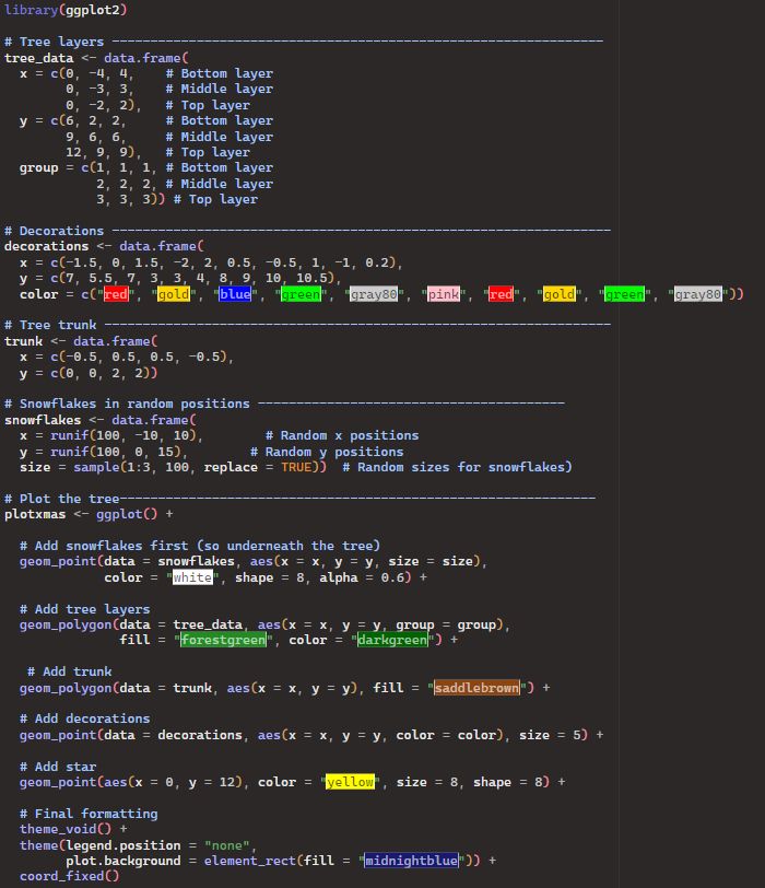
🎄Day 22: An R Christmas Tree 🎄
There's still time to write your Christmas cards!
And what better captures the yuletide spirit than...R...
Seriously though, check out the {christmas} package by Jose Barrera-Gomez.. Stunning!
22.12.2024 21:25 — 👍 1 🔁 0 💬 1 📌 0

Tidy eval helpers — tidyeval
This page lists the tidy eval tools reexported in this package from
rlang. To learn about using tidy eval in scripts and packages at a
high level, see the dplyr programming vignette
and the ggplot2 in...
You can make the function more complex, but don't overdo it - too many arguments could become hard to understand and edit!
It's all about balance and the best solution for your problem🤓
Learn more here:
epirhandbook.com/en/new_pages...
ggplot2.tidyverse.org/reference/ti...
22.12.2024 00:24 — 👍 3 🔁 1 💬 1 📌 0

Want to further customize colours? 🎨
The example above uses the same colour palette for each plot, with scale_fill_brewer().
For custom colours, you can also define a palette inside scale_fill_manual() - or as a separate object that you refer to (as discussed yesterday).
22.12.2024 00:24 — 👍 1 🔁 0 💬 2 📌 0
Why the squiggly brackets {{x}}? 🤔 They're for tidy evaluation!
{{ }} allows ggplot() to recognize the inputs for "xvalue" and "fillvalue" as column names from your data.
Without them, your function won’t know how to evaluate these column names properly!
22.12.2024 00:24 — 👍 0 🔁 1 💬 1 📌 0
The code defines a function for an epicurve with geom_histogram(), taking three inputs:
1️⃣dataset object name ("data"),
2️⃣column name for the x axis ("xvalue"),
3️⃣column name for the fill colour ("fillvalue").
So you can easily make epicurves with different breakdowns or date types!
22.12.2024 00:24 — 👍 0 🔁 0 💬 1 📌 0
See how short and readable the code for producing three epicurves becomes 🤩.
The function approach allows you to control data-related formatting (e.g. in the scale_* functions) AND non-data formatting (in theme()).
22.12.2024 00:24 — 👍 1 🔁 0 💬 1 📌 0
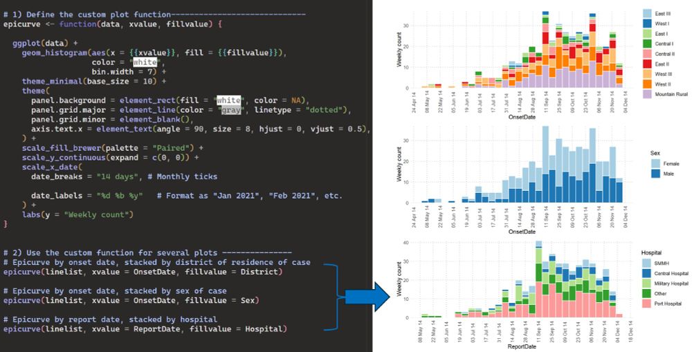
🎄Day 21: Ggplot efficiency part 3🎄
Need many plots with the same style/formatting but slightly different inputs?
💡Create a custom ggplot function!
Define your plot upfront in the function, with all the long formatting code. Then run the function for each new plot with different inputs.
22.12.2024 00:24 — 👍 110 🔁 11 💬 2 📌 2
This means:
1️⃣ Plots are easier to interpret (e.g. specific values always the same colours)
2️⃣ The actual ggplot code is shorter
3️⃣ You only need to edit the palette(s) in one location.
*chef's kiss*
Part 3 tomorrow!
#Dataviz #Ggplot #Epi
21.12.2024 03:31 — 👍 0 🔁 0 💬 0 📌 0
#1 Sunday Times bestselling author, because apparently that matters. New Statesman, New World, Oh God What Now, The Newsletter of (Not Quite) Everything, Paper Cuts (RIP). Londoner. *Not* an American.
R, data, 🐕, 🍸, 🌈. He/him.
Epidemiologist and data/IT nerd, working in infectious disease surveillance in the UK and abroad. Has a sort of blog here: https://prcleary.github.io/#. Understands R and Python, French and German. Interested in too many things.
Field epidemiologist at PHAC
Table generation packages for R and Python. Helping you make beautiful tables since 2018. Join our wonderful Discord at https://discord.gg/Ux7nrcXHVV
We make free, open-source software for data scientists like the RStudio IDE.
We're formerly known as RStudio. You can always download our open-source IDE here. https://posit.co/download/rstudio-desktop/
Epidemic Intelligence Service (EIS) officer @CDC, previously @ukhsa.bsky.social & @mrc-outbreak.bsky.social. Views are my own.
Infectious Disease Epidemiologist and Microbiologist.
Director of the Doctors without Borders (MSF) LuxOR Unit (Operational research and Epidemiology Support)
MSF Operational Centre Brussels
MSF Luxembourg
#episky
#medsky
Epidemiólogo y Médico de Salud Pública | MPSP
Investigador, Centro Nacional de Epidemiología ISCiii
Vigilancia, Enf Infecciosas, Determinantes Sociales, Pandemias
#OneHealth #ComplexSystems
Epidemiologist in a small country.
Head of Health Protection Intelligence, Systems, and Data @ UK Health Security Agency.
Infectious Disease Epidemiologist, Civil Servant, Global health person
https://www.linkedin.com/in/isaacflorence
CEO, UKHSA
Infectious diseases clinician and epidemiologist
Hon Consultant Infectious Diseases, Royal Free London
Hon Prof Infectious Diseases & Health Security, UCL
Co-founder at Applied Epi
Epidemiologist, Doctor
Fan of human rights, public education, libraries, local food systems, yarn and public health. I’m still learning.
Supporting research to transform life, health and wellbeing. We’re taking on three urgent health challenges: mental health, climate change & infectious disease.
@WHO.int Collaborating Centre for infectious disease modelling. Follow us for research on pandemic preparedness, global health analytics, vaccines, therapeutics and pathogen genomic epidemiology @imperialcollegeldn.bsky.social
We’re the European Centre for Disease Prevention and Control. We aim to strengthen EU’s defences vs infectious diseases. Here to promote public health.
We (The World Health Organization) are the United Nations’ health agency championing Health For All. Always check the latest posts for updated advice/information. We will remove misinformation, spam, and hate speech here.
Epidemiologist/mathematician. Professor at London School of Hygiene & Tropical Medicine. Author of The Rules of Contagion and The Perfect Bet. Views own.
New book Proof: The Uncertain Science of Certainty available now: proof.kucharski.io