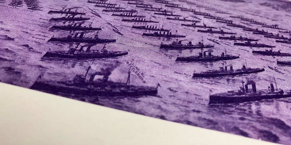

new NatGeo information graphics arrived in the mail
23.06.2025 23:39 — 👍 9 🔁 2 💬 0 📌 0
@krisztinaszucs.bsky.social
Data visualization designer krisztinaszucs.com
new NatGeo information graphics arrived in the mail
23.06.2025 23:39 — 👍 9 🔁 2 💬 0 📌 0
I just added lots of new content to my website! lisacharlottemuth.com
→ #dataviz projects & articles I've worked on at @datawrapper.de in the past years
→ a new "Events" page with information about the Data Vis Meetup, the Data Vis Book Club, and the Unwrapped conference
→ an updated About me page
Minimalistic mapping with isolines 😍 It shows Europe's average maximum temperature in July. The closer the lines are, the more complex the orography, with large temperature changes in small areas, such as mountain regions. Each step between two thermolines is 2ºC.
#dataviz #mapping #rstats
I love this
09.05.2025 02:47 — 👍 1 🔁 0 💬 0 📌 0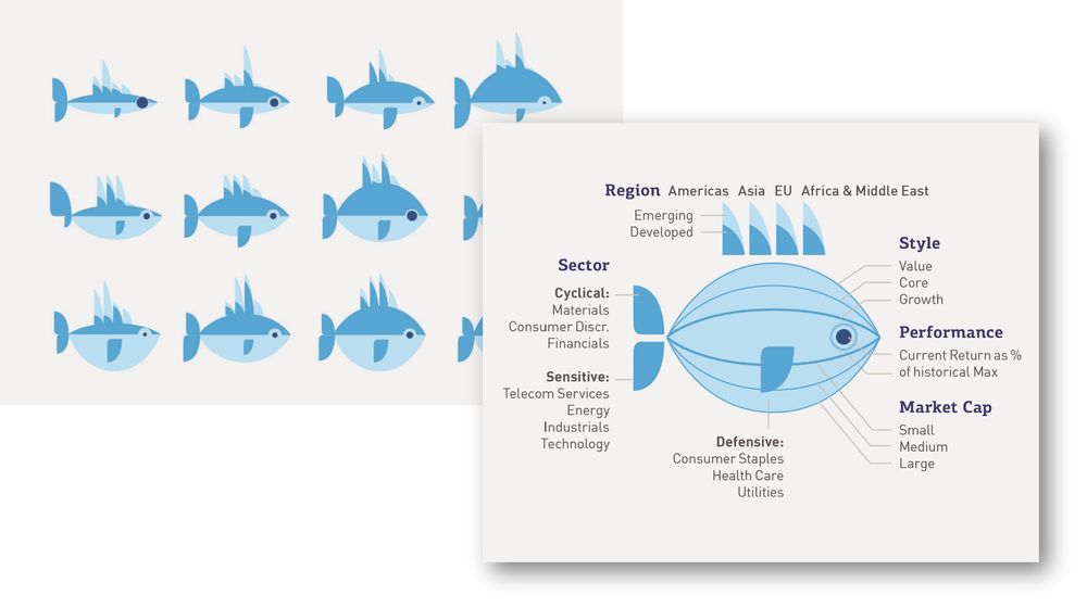
A stylized infographic features fish illustrations to visually represent different investment profiles. Each fish encodes multiple financial characteristics. The fins on its back indicate the region, distinguishing among the Americas, Asia, the European Union, and Africa & the Middle East, as well as whether the market is emerging or developed. The shape of the tail represents the company's market capitalization—small, medium, or large. The size of the fish's eye reflects its performance, defined as the current return as a percentage of its historical maximum. The contour of the fish's body conveys investment style, such as value, core, or growth. Finally, the shape and position of the fish's mouth and side fin signal the sector classification: cyclical (like materials and financials), sensitive (like energy and technology), or defensive (such as healthcare and utilities). A legend on the right explains the full visual grammar, mapping each fish attribute to its financial meaning.
🐟 This is one of the weirder charts in my collection of examples: a set of fish icons to compare funds.
I use it when I talk about visual variables. This chart uses SIZE as a visual variable in 15 different ways, to show 15 different aspects of a fund.
1/4
My colleagues at NYT came to my desk with cameras to make these videos. I'm so grateful to work in a place like this, doing what I love.
21.04.2025 20:19 — 👍 48 🔁 7 💬 4 📌 0the roads of DC, colored by the closest metro line!
using road/station data from Open Data DC and rendered with @threejs.org
#maps #washingtondc #threejs


random slides from my lecture yesterday, titled ‘Intuitive Thinking and Computational Space.’
10.04.2025 18:05 — 👍 9 🔁 1 💬 1 📌 0
The Catropolis metro. A subway system unlike any other: Every stop is a #cat breed, every line a separate family of felines. A unique and fun map to adorn your cat lover's home 😻 www.studiolegenda.com/produ... 🔹
06.04.2025 17:30 — 👍 3 🔁 1 💬 0 📌 0
Title image of the book "A Practical Guide for the Amateur Exonaturalist", featuring various fauna that resemble a dinosaur, a fanged dolphin, and a tiger like lizard with a long tongue
My love letter to the genre of speculative evolution, The Practical Guide for the Amateur Exonaturalist, is available now on DriveThruRPG! Envision alien biospheres and their incredible denizens through creative prompts and exercises.
www.drivethrurpg.com/en/product/5...
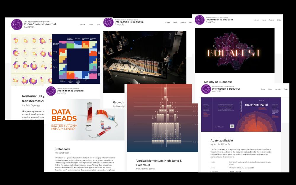
Many Hungarian works are longlisted for the Information is Beautiful Award this year. @krisztinaszucs.bsky.social @editgyenge.bsky.social Milán Janosov, Misi Minkó and Eszter Katona, Melinda Sipos and Mátyás Fusz. And my book. www.informationisbeautifulawards.com/showcase?aca...
11.03.2025 15:06 — 👍 9 🔁 2 💬 1 📌 0
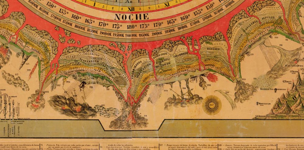

I defy you not to be entranced by this super awesome Mexican map centered around the COSMOGRAPHIC CLOCK!
www.davidrumsey.com/luna/servlet...

It's been a _very_ long time, but I finally wrote an extensive full dataviz design creation blog post again! 🙌
You can read about all the ups and downs, what worked, when it spectacularly failed, of trying to create the GitHub Top Contributor Network here: www.visualcinnamon.com/2025/01/gith...

A map of central Cincinnati showing surface area given to cars (roads, driveways, and parking lots) and to pedestrians (sidewalks, plazas, and parks). The car areas stand out more, especially because of large highways approaching and traversing downtown.
Blessings upon city and county GIS offices that make road and sidewalk polygons available, so that I can calculate just how much of a city has been sacrificed to the almighty automobile. (Looks like about 8% of Cincinnati.)
06.01.2025 19:08 — 👍 77 🔁 10 💬 4 📌 0NEW: The How We Made It part of our Climate Graphic: Explained weekly newsletter is now available online. Find out what goes into making the Climate Graphic of the Week
on.ft.com/41v6YD9

This is the sort of cartography modern tools cant *really* do well, simply because there is no antidote to a staggering amount of labor here:
26.02.2025 02:56 — 👍 32 🔁 7 💬 2 📌 0
A split map of Paris's primary urban cluster compares actual and potential walkability. One map shows an ideal distribution of neighborhood services, while the other shows the current reality; a slider allows the reader to uncover one view or the other. Central areas appear more walkable, in dark blue, while peripheral areas are more red, indicating longer walks to amenities. Published in The Economist.

Choropleth map of forest ownership in Sweden and Finland. In all provinces at least 28% of woodland is privately owned; in the more southern regions, that goes up to 86%. Published in Bloomberg.

Map of power lines connecting Russia and Belarus to the Baltic states of Estonia, Latvia and Lithuania. Small black crosses mark recent disconnections at the border line; the three Baltic states are severing their connections to the Russian-Belarussian power grid. Published in the Financial Times.

Two bracelets where colored beads are used to visualize data. One is showing the number of media prosecutions in Hungary between 2017 and 2023; the other shows climate stripes in Budapest, where colors range from blue (below the baseline) to dark red (above the baseline).
This new Data Vis Dispatch is full of maps – and we love maps. But it also includes annotated lyrics, multiple lines, bracelets (yes!), and complex interactive visualizations.
See them on our blog: https://blog.datawrapper.de/data-vis-dispatch-february-11-2025/

This is from 2013 youtu.be/QPKKQnijnsM?...
29.01.2025 19:19 — 👍 1 🔁 0 💬 1 📌 0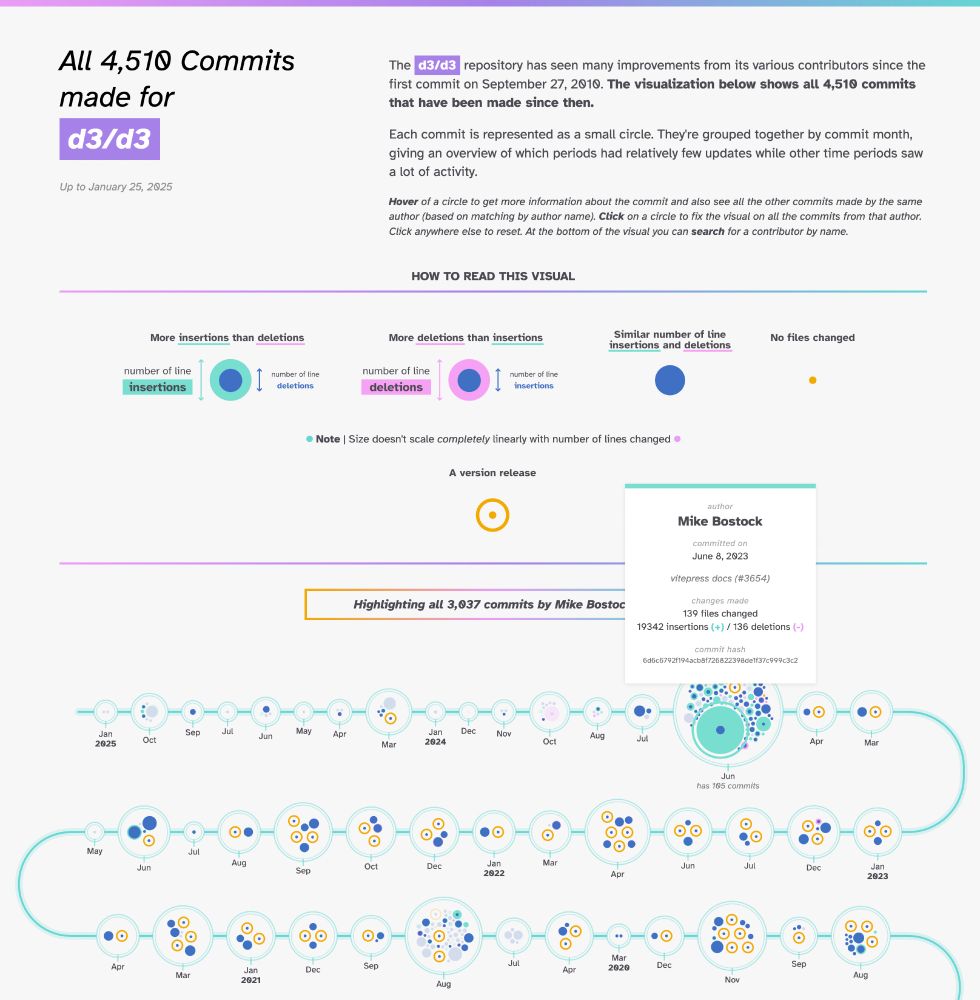
My latest project lets you explore the entire commit history of any GitHub repo ✨
Obviously, D3.js was one of the 1st repos I tested. You can clearly see the 3000+ commits made by its creator @ocks.org! But also @fil.rezo.net & many others.
nbremer.github.io/ORCA/commit-...

A graph showing interest rates since 2000 (in blue) and forecasts based on futures markets branching off in completely different directions from the blue line (in pink)
Nice looking graph from @financialtimes.com: “Never ever make predictions”
Implied rates forecasts over time, and what rates have actually done:

Feature image, a giant 2024 in a handwriting font in the foreground, three visualizations, one of which is The Pudding Cup in the background.
The glasses are clinking, the countdown is running, but you’re still thinking about data visualizations? We got you covered with our list of lists of 2024 data vis.
Check out personal favorites, portfolios, and award-winning vis from 2024 blog.datawrapper.de/data-vis-dispatch-december-31-2024/
Awwww, thank you, Sonja! You always say the nicest words❤️
31.12.2024 09:31 — 👍 3 🔁 0 💬 0 📌 0
My personal projects from 2024:
krisztinaszucs.com/blog/2024122...
#dataviz

How to create data visualization by making a few tweaks to a perfectly fine table:
krisztinaszucs.com/blog/2024121...
#dataviz


The Winter Solstice occurs today. This is the longest night and shortest day of the year.
If you're in Budapest, you can find my "How long are the nights" prints at Ajándék Terminál (in Mammut 2) until Dec 24.
Full project ➡ plotparade.com/gallery_sunr...
#WinterSolstice #dataviz
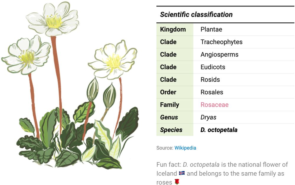
Table of the scientific classification of the flower Dryas octopetala annotated with a handmade illustration. Created by Eleni from the Datawrapper team.

Screenshot of I “Made a Graph of Wikipedia... This Is What I Found”. Shown is a network graph of all Wikipedia articles and the links between them, resulting in a colourful representation of the world's collective knowledge. Among the most interesting findings are so-called communities, groups of articles that are more closely linked to each other than the rest of the site, represented by the individual colours. Published on YouTube by adumb.
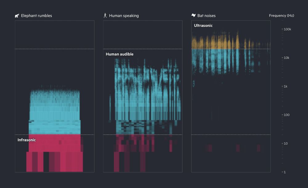
This image shows a spectrogram of three sound types: elephant rumbles (mostly infrasonic, red), human speaking (audible range, blue), and bat noises (ultrasonic, yellow and blue), with frequency increasing from bottom to top on a logarithmic scale. Published by Financial Times.
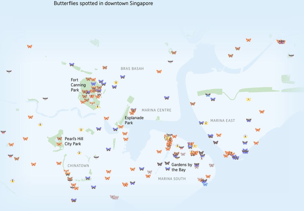
Map of downtown Singapore with little 3D butterflies added where butterflies have been spotted in the area. Different colored butterflies represent different species. Published in The Straits Times.
End of the year! ✨🎄🎇 So here we've got a special Data Vis Dispatch for you: it comes from the whole Datawrapper team. We're sharing our favorite visualizations of 2024. Take a look here 🎁 https://blog.datawrapper.de/data-vis-dispatch-december-17-2024/ and tell us: what were your favorites?
17.12.2024 16:33 — 👍 71 🔁 27 💬 2 📌 6
Fargo, Severance, Black Mirror, Atlanta, Master of None, Euphoria – they all left their fans waiting for three years or more between seasons. In fact, we're waiting longer than ever for TV shows to return, as @lisacmuth.bsky.social shows in her Weekly Chart: blog.datawrapper.de/waittime-for...
28.11.2024 14:50 — 👍 49 🔁 11 💬 2 📌 6
This I what a series of paths created by 800 unmanned bicycles being pushed until they fall over looks like. Science is beautiful. Obviously they used the same few bicycles for the data rather than 800 individual one. Source: buff.ly/3Cnb4PP
21.11.2024 12:05 — 👍 240 🔁 48 💬 7 📌 7