When it comes to #infographics, are we communicating #data or information? At what point can we say a visualization has done its job? Curious how others approach this.
17.02.2026 22:32 — 👍 0 🔁 0 💬 0 📌 0
YouTube video by storytelling with data
Use data series order to highlight what matters #excel
A useful tip for #Excel users from #StorytellingWithData.
youtube.com/shorts/Z8R7d...
13.02.2026 20:52 — 👍 1 🔁 0 💬 0 📌 0
We want to hear from you. If you’ve seen a chart or visual worth dissecting, drop it in the comments or share it below. Your #dataviz find could be featured in an upcoming episode.
12.02.2026 18:22 — 👍 0 🔁 0 💬 0 📌 0
YouTube video by Randy Krum
Bourbon and Sunburst Charts
📌: Checkout the full episode at youtu.be/q6g_s35-2xM?...
10.02.2026 19:39 — 👍 0 🔁 0 💬 0 📌 0
It’s a new era for #CoolInfographics. My new video series explores the art and science of #datavisualization. From viral charts to visualization fails.
10.02.2026 19:38 — 👍 0 🔁 0 💬 1 📌 0
DVS State of the Industry Survey - 2025
The 2025 State of the Industry Survey from @datavizsociety.bsky.social is open until January 30th 📈 Help out by completing the survey with your thoughts.
www.surveyhero.com/c/soti2025-n...
28.01.2026 17:51 — 👍 0 🔁 0 💬 0 📌 0

I'm so frustrated with Apple's dark patterns to trick people into upgrading iOS. 🤬 Tricked my 90+ year-old MIL into upgrading to iOS 26 on both her iPhone and iPad at the worst possible time! There's no obvious way to postpone the update to another day unless you figure out the trick.
23.01.2026 19:20 — 👍 0 🔁 0 💬 0 📌 0

Graphic design trends for 2025
Get the lowdown on the hottest graphic design trends predicted for 2025.
Taking a look back at #Adobe's graphic design trend predictions for 2025. Did they get it right? What are your predictions for 2026?
www.adobe.com/express/lear...
23.01.2026 19:04 — 👍 0 🔁 0 💬 0 📌 0

Broken Chart: discover 9 visualization alternatives
Researcher in climate science at MBG-CSIC
@drxeo.eu reminds us that chart choice should always be guided by the data type, the message, and the audience.
dominicroye.github.io/blog/broken-...
21.01.2026 22:46 — 👍 8 🔁 2 💬 0 📌 0
Create an infographic with the Microsoft 365 Copilot app - Microsoft Support
Design impactful infographics with Microsoft 365 Copilot. Use templates, brand kits, and design tips to turn complex data into stunning visual content.
@microsoft.com 365's Copilot is now advertising "infographics". Although I wouldn't call these #infographics, it does create text summaries fit for a presentation.
What are your thoughts? Can we really call these "infographics"?
support.microsoft.com/en-us/topic/...
09.01.2026 20:56 — 👍 0 🔁 0 💬 0 📌 0

Apple traditionally doesn't release any products during December, so all of my Apple Release Pattern #infographics are complete and up-to-date for 2025. Are you looking forward to any #Apple product updates in 2026?
infonewt.com/apple-releas...
12.12.2025 17:35 — 👍 2 🔁 0 💬 0 📌 0

The National Monuments Service has captured the history of Ireland's shoreline in one of Europe’s richest shipwreck databases — 3,554 documented wrecks, some dating back to the 1530s.This map transforms that legacy into a powerful visual story.
www.facebook.com/photo/?fbid=...
12.12.2025 15:02 — 👍 1 🔁 0 💬 0 📌 0

Infographic depicting the GlobPOP dataset - a comprehensive 33-year global gridded population generated through cluster analysis and statistical learning.
aditya-dahiya.github.io/projects_pre...
11.12.2025 15:00 — 👍 1 🔁 0 💬 0 📌 0

Fun infographic courtesy of Information is Beautiful. Data is based off of swipes from the dating app OkCupid.
vis.social/@infobeautif...
08.12.2025 15:00 — 👍 1 🔁 0 💬 0 📌 0

"Clarity is everything. Integrating legends directly into chart titles is a way to help your audience instantly understand what they’re seeing.
jschwabish.substack.com/p/integratin...
26.11.2025 17:27 — 👍 3 🔁 0 💬 0 📌 0

@ebertini.bsky.social delves into how line charts can inadvertently suggest causal relationships where none exist 🔗 filwd.substack.com/p/the-illusi...
24.11.2025 15:18 — 👍 4 🔁 0 💬 0 📌 0

A good reminder to pay attention to how your audience receives your visuals. Their response will show you what’s working and what needs to change.
www.storytellingwithdata.com/blog/the-aud...
05.11.2025 16:15 — 👍 0 🔁 0 💬 0 📌 0

I appreciate that the AMA is starting to use infographics to communicate to both patients and doctors, but these designs have a long way to go before they will effective.
www.ama-assn.org/press-center...
03.11.2025 15:24 — 👍 0 🔁 0 💬 0 📌 0

A compelling visual to make the case for extending enhanced premium tax credits.
www.aha.org/fact-sheets/...
16.10.2025 15:10 — 👍 0 🔁 0 💬 0 📌 0
-Mapping the world- Dr. in Physical Geography | environmental health - bioclimatology - geography. RC Researcher from 🇩🇪 at @mbgcsic.bsky.social @csic.es in 🇪🇸 #rstats #dataviz
Secretary of the @aeclim.org
📍Galicia
ℹ️ https://dominicroye.github.io
AI, Cloud, Productivity, Computing, Gaming & Apps ☀️
JasonForrestAgency.com, Data Vandals, Editor-in-chief of Nightingale, Electronic Musician, Ex-McKinsey. Contact & more: http://jasonforrestftw.com
America's loudest lounge singer, swankifying rock/rap hits since 2000! 🍸
More than 30 albums available on all music platforms. Vinyl LPs, CDs, merch, and FAQs at: http://www.richardcheese.com
https://www.youtube.com/RichardCheeseOfficial
The lighter side of science 🚀🧪🔭🧬 For more: https://sked.link/iflscience
Principal Solutions Architect at Chainguard.dev | 50-something dad || Comments/opinions are my own #BLM #StopGunViolence #SlavaUkraini
The Pudding is a digital publication that explains ideas debated in culture with visual essays. https://pudding.cool/
Email: sup@pudding.cool
Support us: http://patreon.com/thepudding
Designer, journalist, and professor.
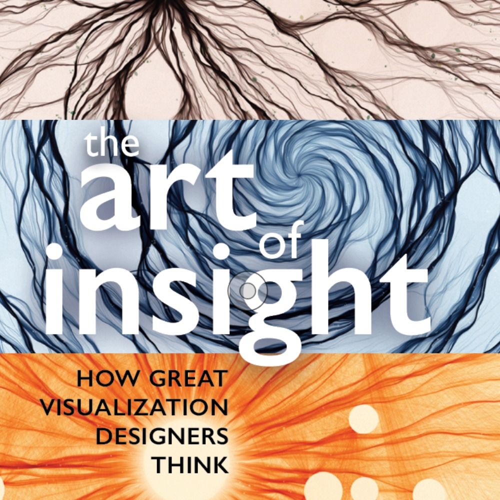
Author of 'The Art of Insight' (2023) 'How Charts Lie' (2019), 'The Truthful Art' (2016), and 'The Functional Art' (2012). NEW PROJECT: https://openvisualizationacademy.org/
Professional chart looker-atter. Author of "The Big Picture" and co-author of "The Big Book of Dashboards." James Jamerson disciple.
Providing detailed Apple video tutorials since 2005. Easy to follow guides on macOS, iOS, iPadOS, watchOS, tvOS and now visionOS! Come find us at https://screencastsonline.com or sign up for the newsletter at https://screencastsonline.com/newsletter
Your Jeopardy! pal. Author of THE COMPLETE KENNECTIONS (http://bit.ly/4qUcbhK) and a bunch of other stuff.
CEO of Bluesky, steward of AT Protocol.
dec/acc 🌱 🪴 🌳
Never Bullshit
I challenge any and every one who wants to kick my ass to a debate .
https://www.patreon.com/dril
https://www.instagram.com/dril
https://linktr.ee/drilreal
Dad, husband, CNN anchor, author, doorman to three dogs and a cat.
Bioacoustician & PhD candidate using sound to study baleen whale movement ecology 🐋 Wildlife photographer, birder, nature nerd 🪶
IG: instagram.com/avianinclination
Ko-fi: https://ko-fi.com/daryllmarie
forbes' 7.4 billion under 7.4 billion.
Food | travel columnist + features, Suffolk News + others
Food slot @ Suffolk Sounds Radio
Food events @ Bury St Eds Lit Fest
Newsletter: Tales From Topographic Kitchens
GFW online food writer '20, F&M cookery writer '22
https://linktr.ee/nicolamiller
he, him
old fart
seller of olive oil & salt
bean & cabbage lover
recovering food writer
Portland, Oregon
sign up for our newsletter at https://wellspentmarket.com/
@jamesedixon on IG
more recipes at https://www.wweek.com/food/