Attacks on healthcare facilities in #Gaza across 2024 (play gif).
“I’ve not seen anything like it... In my work on human rights and healthcare attacks over decades, I have not seen anything like the almost daily attacks on hospitals.”
More: buff.ly/u02hKUp (free to access)
04.11.2025 09:10 — 👍 1 🔁 3 💬 0 📌 0
We usually share the images with links written out on social platforms, mainly in case they get separated from the original post. But I like the idea of using QR codes instead. I'll talk with the team about it. Thanks!
12.05.2025 09:37 — 👍 1 🔁 0 💬 0 📌 0
Good call Erich. We do add them in print to guide people online, but would you also be interested in a QR code in this online version? I figure that the link is usually in the post on social platforms!
07.05.2025 11:15 — 👍 0 🔁 0 💬 1 📌 0
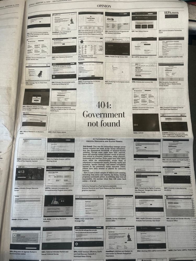
A page of 52 thumbnail images of government websites that are no longer available.
Effective and creative data visualization in the form of a full page piece in the WaPo today to show how Trump/Musk are dismantling government.
09.02.2025 16:42 — 👍 1708 🔁 599 💬 21 📌 36

Orange and Almond Muffins Visualicious Recipe 10 - Etsy
This Cookbooks item is sold by VisualiciousRecipes. Ships from United States. Listed on Dec 16, 2024
Feeling like a little post-Christmas baking? Try my new visual recipe for orange and almond muffins!
www.etsy.com/uk/listing/1...
Also this is my 10th recipe so you can now get a big discount on the full collection:
www.etsy.com/uk/listing/1...
27.12.2024 17:11 — 👍 0 🔁 0 💬 0 📌 0
Seeing the visuals of all the tracks playing at once really makes me appreciate the artistry involved in combining all these tracks. Love how they play through some of the originals before showing them mixed together. So clever!
06.12.2024 09:22 — 👍 0 🔁 0 💬 0 📌 0

The BMJ 2025: fortnightly in print, daily online
A landmark change in a rapidly changing world
The BMJ will be 185 years old in 2025. It is not a notable anniversary, but it will be a momentous one. We will cease to be a weekly publication in print...
The BMJ is moving from weekly to every 2 weeks. I think it's a good decision, and should allow us to make more graphics. Hopefully we will have at least one (full page) infographic every issue, as well as more online graphics. An editorial by Kamran Abbasi, our Editor-in-Chief, discusses the change.
05.12.2024 15:52 — 👍 1 🔁 0 💬 0 📌 0
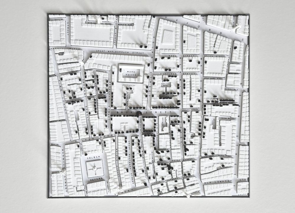
3D-printed map of Soho in 1854. Black marks on top of the buildings represent deaths from cholera caused by infected water from the Broad Street Pump (note the missing handle!). Top-down view.
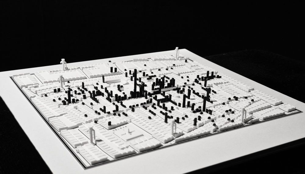
3D-printed map of Soho in 1854. Black marks on top of the buildings represent deaths from cholera caused by infected water from the Broad Street Pump (note the missing handle!). Side view.
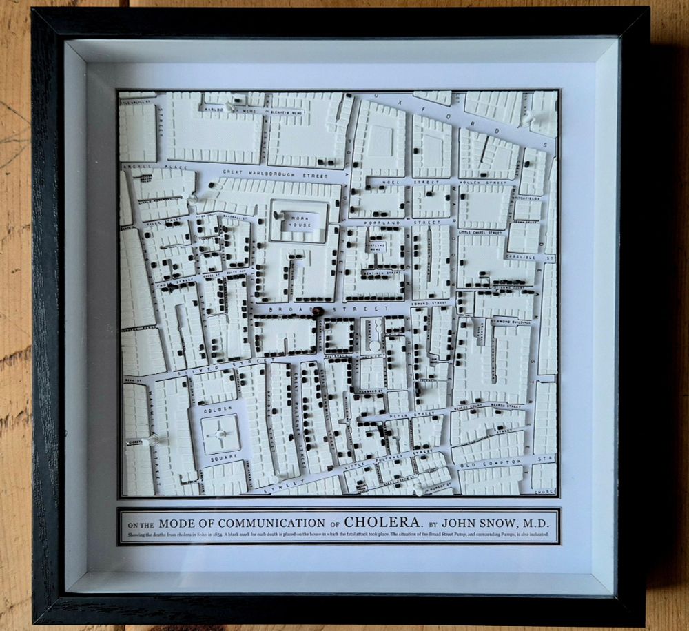
3D-printed map of Soho in 1854. Black marks on top of the buildings represent deaths from cholera caused by infected water from the Broad Street Pump (note the missing handle!). Framed, close-up.
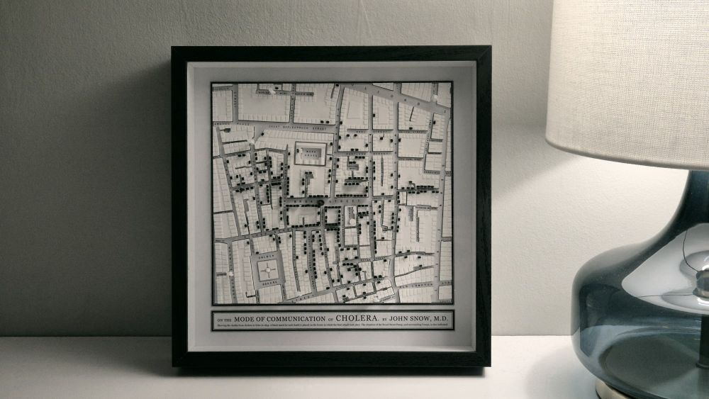
3D-printed map of Soho in 1854. Black marks on top of the buildings represent deaths from cholera caused by infected water from the Broad Street Pump (note the missing handle!). Frame, "artful" shot.
Day 18 #30DayMapChallenge
I 3D-printed John Snow's 1854 cholera map of Soho. It took ages.
18.11.2024 14:28 — 👍 708 🔁 151 💬 36 📌 36
Data visualizations & information graphics by David McCandless. Plus favourite finds & graphics from around the web. Making sense of the world - well, trying to - since 2009.
https://linktr.ee/infobeautiful
Founder of https://fathom.info, co-founder of https://processing.org, lecturer at https://mit.edu
Tableau evangelist + data communicator.
Newsletter: http://tabsoft.co/sweetspot
Book: http://bigbookofdashboards.com
LinkedIn: https://www.linkedin.com/in/acotgreave/
Climate scientist, University of Exeter and Met Office. Expert Adviser to the Adaptation Committee of the Climate Change Committee. Lead author IPCC AR4, AR5 & AR6. Live music lover, supporter of grassroots venues. Cycles a lot, rock climbs occasionally.
Professor of Design Research
Head of Visual and Data Journalism @financialtimes.com; Honorary Prof @UCL Social Data Institute. Views expressed are my own. Reposts are not necessarily endorsements.
Visualization toolmaker. Founder of Observable. Creator of D3. Former NYT Graphics. Pronounced BOSS-tock.
Professor of Evidence Synthesis. Interconnections between the environment and health. European Centre for Environment and Human Health at the University of Exeter,
Offering up gaming bars since 2010?! 14 years of independent existence, along with 100+ game themed cocktails for publishers & developers like Elderflower Scrolls Skyrum
Find us in Hackney (N160PH) Brighton (Seafront) & Peckham (SE155JT)
www.loading.bar
The Oxford Martin School at the University of Oxford is a centre of pioneering research that aims to find solutions to the world's most urgent challenges.
https://linktr.ee/oxmartinschool
Information Visualization 📊📉✍🏼 at University of Twente
Core project: The Languages of Visualization, with Clive Richards
Also at UT Climate Centre @utclimate.bsky.social
LinkedIn: https://linkedin.com/in/yuriengelhardt
Mastodon: https://vis.social/@yuri
Official UK Met Office account. Get the weather in your hand with our app: http://linktr.ee/MOContent
board game videos and podcasts with heart!
https://beacons.ai/shutupshow
Web developer, dataviz accessibility nerd.
Running a startup that makes the most accessible charts anywhere.
Fan of cats and metroidvanias.
Wellbeing, nature, disability, climate adaptation... and plenty of coffee and cake! She/her :-)
The BMJ is patient centred, evidence based, and independent. Help us improve the health of our world with the best science, journalism, education, and comment.
We're a membership body for statisticians and data professionals, promoting a world with data at the heart of understanding and decision-making.
Crafting data experiences at http://truth-and-beauty.net
Artist, Neurographer, AI Prompteur, Purveyor of Systems, Data Dumpster Diver, Information Recycler
Editor and reporter @bmj_latest
https://www.bmj.com/careers-articles
Email arimmer@bmj.com