A comic where a duck asks the WTP to cross the bridge
WTP #econsky
Credit: www.exocomics.com

@dallasnova.bsky.social
Behavioural Scientist, Thought-doer; Survey and Research Analyst @ College of New Caledonia. https://dallasnova.rbind.io/ Interested in competitive and cooperative consumption, using R and Open Science Opinions hopefully my own
A comic where a duck asks the WTP to cross the bridge
WTP #econsky
Credit: www.exocomics.com
They should be publicly available now - just take them with a grain of salt as they are still drafts for a Canadian context :)
14.10.2025 19:24 — 👍 1 🔁 0 💬 1 📌 0
Thanks for sharing, Crystal! In this same spirit - here's a draft sales and service blueprint I've been working on for my own research and strategy contracting docs.google.com/presentation...
14.10.2025 19:14 — 👍 2 🔁 0 💬 1 📌 0
Over the last 3 years I've been collecting resources to share with people interested in data freelancing. I've recently compiled those resources in a GitHub Repository.
If you are interested in data freelancing, these resources may help you navigate that transition.
github.com/Cghlewis/fre...

some side-by-side comparisons of Boxplot and other group comparion visualization methods: dallasnova.rbind.io/post/creatin...
10.10.2025 21:02 — 👍 1 🔁 0 💬 0 📌 0
It's been a while since I've reminded people that DMLSER has an entire chapter to help guide you in creating standardized rules for your team/projects in regards to file structures, file naming, variable naming and more! 📝
datamgmtinedresearch.com/style
1/
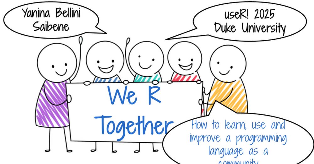
I had the honor of giving a keynote at #useR2025 🎉 at Duke University: “We R Together – How to learn, use, and improve a programming language as a community” 💜
Slides here 👉 docs.google.com/presentation...
Video here: www.youtube.com/live/CTTvTQ-...
#rstats #useR2025

I also have been drawn to raincloud plots - I've also done a bit of work trying to combine the boxplot with the violin geom - with the goal of presenting equivalent information with fewer plotted objects
dallasnova.rbind.io/post/efficie...

Always great to have collections of resources! If it's of any value for your list, I also have a few posts mostly on #DataViz in #RStats dallasnova.rbind.io/post/
12.08.2025 15:58 — 👍 3 🔁 1 💬 0 📌 0
Depending on your data type, use the right plot to tell the story.
A nice interactive app to determine what plots you need
www.data-to-viz.com/


"Does LED Street Lighting Reduce Crime? Evidence From a Staggered Large-Scale Retrofitting Program"
papers.ssrn.com/sol3/papers....
I'm back home with my dad and have thoughts about being an Indigenous scientist and academic. I'm writing this in real time so it might get disrupted and will have typos.
I am fairly successful by academic standards. I have a tenure track job, wrote papers, have grant funding, mentor students.
This is great! My current to-do is to get a workflow for making a good data dictionary from SPSS (.sav) files
11.07.2025 23:18 — 👍 1 🔁 0 💬 0 📌 0Do you clean data in R?
Stop renaming, reordering, or dropping variables manually. Automate the work with your data dictionary. #rstats
cghlewis.com/blog/dict_cl...

At Posit, we love @typst.app:
⚡ Make PDFs in milliseconds, not minutes
✨ The power of LaTeX with today's technologies
✍️ Modern typography (including emojis!)
🧠 Clear mental model
So I'm thrilled to announce that we're now supporting its development: posit.co/blog/posit-a...
#rstats

library(tidyplots) x <- c(2.3, 4.5, 6.3, 3.4, 7.8, 6.7) df <- data.frame( x = c(x, x + c(0.8, 0.75)), group = paste0("g", rep(c(1, 2), each = 6)), batch = paste0("b", c(1:6, 1:6)), shuffle = paste0("c", c(1:6, 6:1)) ) df |> tidyplot(group, x, color = group) |> add_boxplot() |> add_data_points() |> add_test_pvalue(paired_by = batch) |> add_line(group = batch, color = "black")
This is how you can do paired testing in #tidyplots 0.3.1 🍒
#rstats #dataviz #phd

I really enjoyed attending and speaking at R/Medicine this year! I learned a lot. Huge thanks to the organisers! My talk "Bootstrap inference made easy" is now available online: www.youtube.com/watch?v=EeAt...
#Rstats #Statsky

Tired of manually styling PDFs, HTML docs, and Shiny apps to fit your brand? Join Garrick Aden-Buie on R for the Rest of Us podcast to learn about brand.yml—a single YAML file for consistent styling.
🎧 Watch the episode and demo: buff.ly/Ybu6rF9
#rstats #DataViz
![Screenshot of a slide titled "Subgrouping" from a meta-analysis presentation. The slide displays a forest plot showing individual study risk ratios with 95% confidence intervals, grouped by whether the study used random allocation ("yes" or "no"). Each study is listed with author(s) and year in the leftmost column, followed by a "Random" column indicating randomization, and a "Risk Ratio [95% CI]" column with horizontal bars for each study. At the bottom, two pooled estimates are shown: one for non-random allocation (risk ratio = 0.62 [0.40, 0.95]) and one for random allocation (risk ratio = 0.38 [0.22, 0.65]), each with a corresponding 95% predictive distribution interval displayed as a shaded curve. A speaker (Wolfgang Viechtbauer) is visible in the upper right corner of the screenshot.](https://cdn.bsky.app/img/feed_thumbnail/plain/did:plc:jtlwlnekn5al2tqmudrtcapq/bafkreic3o32po36icfaw3k3qqogrl4tpml2ukb4ynpayjhziereda3w3bu@jpeg)
Screenshot of a slide titled "Subgrouping" from a meta-analysis presentation. The slide displays a forest plot showing individual study risk ratios with 95% confidence intervals, grouped by whether the study used random allocation ("yes" or "no"). Each study is listed with author(s) and year in the leftmost column, followed by a "Random" column indicating randomization, and a "Risk Ratio [95% CI]" column with horizontal bars for each study. At the bottom, two pooled estimates are shown: one for non-random allocation (risk ratio = 0.62 [0.40, 0.95]) and one for random allocation (risk ratio = 0.38 [0.22, 0.65]), each with a corresponding 95% predictive distribution interval displayed as a shaded curve. A speaker (Wolfgang Viechtbauer) is visible in the upper right corner of the screenshot.
From @wviechtb.bsky.social talk @ #ESMARConf2025 on showing heterogeneity in meta-analysis. Learned that 95% prediction interval can be visualized in a {metafor} forest plot using predictive distributions. I find it especially useful for illustrating subgroup differences! #RStats
11.06.2025 15:39 — 👍 5 🔁 2 💬 1 📌 0
A workflow diagram of how to make grilled cheese. Slice cheese and butter bread. Put them together, then heat. The end result is grilled cheese.
Here's the grilled cheese workflow diagram. It's just made in Google Slides because it needed to be quick. I use LucidChart frequently for work projects or Inkscape to make prettier ones.
17.04.2025 22:06 — 👍 10 🔁 2 💬 3 📌 0
plot of 2 regression lines where the middle 50% of the predictor vars is much thicker than the rest of lines. one line is labeled "vowels". it is flatter and higher up than the other line. the other line is labeled "consonants". there is an annotation that says "expected intelligibility for typical 4-year-old on typical item with other predictors fixed to means".
still trying to make regression boxplots a thing
06.06.2025 20:14 — 👍 41 🔁 8 💬 10 📌 1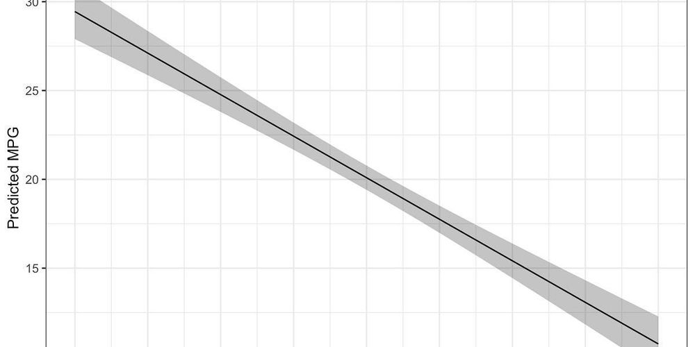
I used to wrap scale() in as.numeric() and call it a day. Now I know better: drop() preserves attributes and behaves cleanly.
Full walkthrough (with mtcars, lm, ggplot2): mattkmiecik.substack.com/p/scaling-va...
#rstats #DataViz #OpenScience

Here's a little piece on adding references to #quartopub documents & their bibfile directly from Zotero: vuorre.com/posts/zotero...
tl;dr: Install github.com/mvuorre/vsco..., insert citation, profit.

When exporting long char vars to .sav from R, the vars will be truncated at 255 chars and a new var will be created that contains the rest of the string. One solution that also maintains your labels is to export data to a .dta and import this file into SPSS!
Thank you, past me, for sharing a solution to this #rstats / SPSS issue. 🙏
21.05.2025 12:40 — 👍 19 🔁 1 💬 2 📌 0
datamethods.org is a place where methodologists meet subject matter experts for in-depth discussions + Q&A related to study design, measurement, data analysis, interpretation, and more. Now on a new server with the latest version of discourse software. Come join us there. #StatsSky
24.04.2025 14:42 — 👍 59 🔁 18 💬 0 📌 1👋 Join us for a hands-on session 🛠️ exploring how good Git practices can transform your workflow—whether you’re coding or writing with R. Bring your questions, share your tips, and let’s level up our version control together!
@maellesalmon.bsky.social @rladiesrome.bsky.social
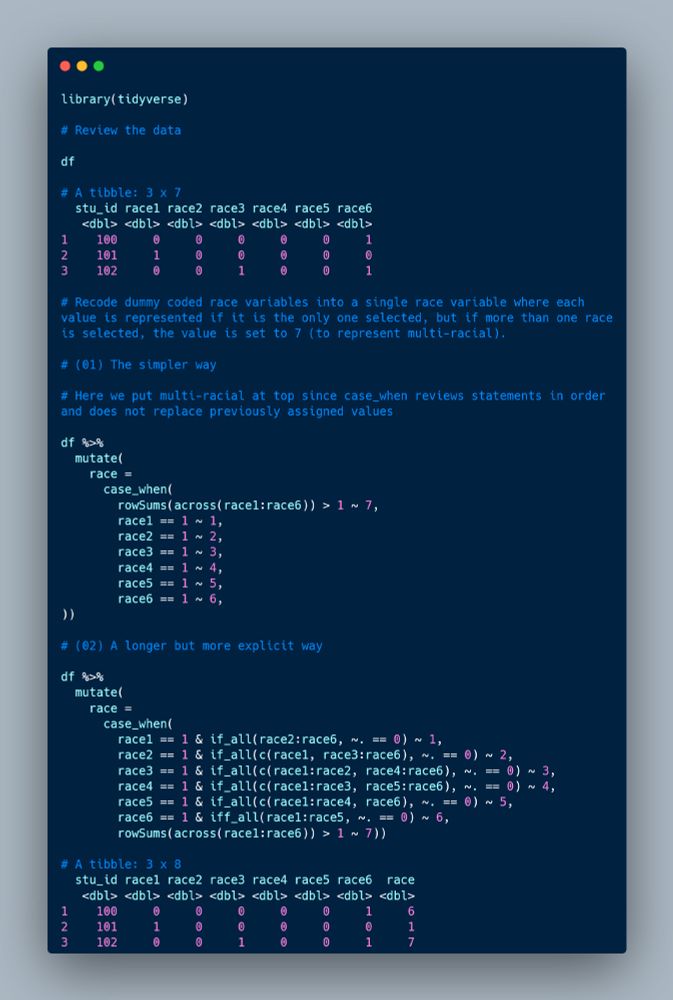
I'm often asked to recode multiple dummy coded race variables into a single variable so I thought I would share 2 different ways you might do this in #rstats. I'm sure there are many more ways. 😉
21.05.2025 02:28 — 👍 45 🔁 6 💬 1 📌 2