I suspected it would have that effect...
07.12.2025 20:01 — 👍 1 🔁 0 💬 0 📌 0

BR sick bag with a spindly version of the BR double arrow symbol in blue.
I'm slightly scared to show you this BR sick bag ... hopefully it wasn't post- Travellers-Fare quality
07.12.2025 18:01 — 👍 3 🔁 0 💬 0 📌 1
I went on a visit round St. P just as work on the great re-build started - and in the basement/old Gents was a pile of BR Maxpax & Lyons Fruit Pie cartons a mile high where they'd be shoved through a hole in the floor above. I should ahve kept an example!
07.12.2025 17:54 — 👍 0 🔁 0 💬 0 📌 0
Magnificent.
07.12.2025 17:52 — 👍 1 🔁 0 💬 0 📌 0
La Ina was/is a very dry sherry & one I still enjoy - Walnut Brown you'd almost need a spoon! I wonder what look I'd get if I ask for a sherry on my next LNER trip!
07.12.2025 17:51 — 👍 0 🔁 0 💬 0 📌 0

The catalogue, Issue Number 16, "Electrical Lighting Equipment" was a near 250 page book issued by the Tipton based Revo Electric Company Limited and although undated is believed to have been published in 1936. It shows thirteen sections of equipment and accessories that were also, I suspect, possibly issued individually. The company also issued other catalogues for their domestic and industrial electrical equipment as well as traffic and road signs and equipment. The company had its origins in the Cable Accessories Company Limited formed in 1907 by F.H.Reeves and the company prospered over the coming decades becoming the Revo Electric Company Limited in 1930. In 1956 Revo became part of Duport, originally known as Vono and with whom the Revo founder had links, and in the 1960s the company was effectively split up with the lighting business becoming Relite.
The catalogue includes some pages showing images of installations of the company's lighting equipment. These four photographs show; the new Peasholm Bridge in Scarborough in Yorkshire, with column lighting on the street and parapet, with the design 'complementing' the reinforced concrete construction; the Pavilion Gardens in Bournemouth, with 'monumental' columns and fittings, the new Marine Promenade in New Brighton, Cheshire, showing the very fancy columns and brackets along with lanterns; Marble Arch in Westminster with columns, brackets and lanterns. Revo supplied Westminster with equipment for many years.
The four photos are all framed in deep green with the Revo logo either side of the title text.
From the 1936 catalogue of the Tipton electrical manufacturing company of Revo. "Typical" street lighting installations inc. some v Thirties seaside stuff as well as the old Marble Arch layout in London. @simonbriercliffe.bsky.social @sabre-roads.org.uk @roads.org.uk @lccmunicipal.bsky.social
07.12.2025 16:03 — 👍 9 🔁 2 💬 0 📌 0
A rather classic "Access" card TV advert from 1989 with one of those annoying tunes you then cannot forget.
07.12.2025 15:59 — 👍 6 🔁 2 💬 2 📌 0
Classic! Mind you, I'll blame you when I'm humming that ruddy tune...
07.12.2025 15:58 — 👍 1 🔁 0 💬 0 📌 0
And "Luncheon Vouchers"!
07.12.2025 15:57 — 👍 1 🔁 0 💬 0 📌 0

One of a series of menu and drinks tariff cards inside a British Rail Travellers-Fare folder and dating from 1977; the Breakfast and Bill of Fare cards, dated June 1977, and showing the design for the 1977 Queen's Silver Jubilee are alongside the drinks menu from the same month and the Wine List from August 1977. The latter notes that the wines are from the "famous BTH cellars" these being the old British Transport Hotels and yes, the railway companies cellars were often regarded as having some decent plonk in them, alongside some run of the mill items, having been major buyers over the years for their hotels, station and train catering divisions.
The Travellers-Fare division of BTH was set up in 1973 and replaced the British Rail Catering brand. They were 'split' off from BTH in 1982 when the railway hotels were part of a privatisation disposal.
The main menu or "Bill of Fare" includes some main meals including Salmon, Roast Beef and Fricassé of Chicken, alongside a Cold Ham and Tongue salad or Sardines on Toast. It is Apple Tart and Ice Cream for sweet or cheeses. Alongside the Silver Jubilee symbol the card shows you could pay by cash, cheque or by 'Access" or Barclaycard or Luncheon Vouchers.

Breakfast menu : British Rail : Travellers-Fare : menu card and tariff : 1977. One of a series of menu and drinks tariff cards inside a British Rail Travellers-Fare folder and dating from 1977; the Breakfast and Bill of Fare cards, dated June 1977, and showing the design for the 1977 Queen's Silver Jubilee are alongside the drinks menu from the same month and the Wine List from August 1977. The latter notes that the wines are from the "famous BTH cellars" these being the old British Transport Hotels and yes, the railway companies cellars were often regarded as having some decent plonk in them, alongside some run of the mill items, having been major buyers over the years for their hotels, station and train catering divisions.
The Travellers-Fare division of BTH was set up in 1973 and replaced the British Rail Catering brand. They were 'split' off from BTH in 1982 when the railway hotels were part of a privatisation disposal.
The Breakfast menu shows the then famous BR Full Breakfast range, for £2.45, and a 'Continental' version at £1.05. You could pay in cash, cheque and by "Access" or Barclaycard credit card or Luncheon Vouchers.

Drinks : British Rail : Travellers-Fare : menu card and tariff : 1977. One of a series of menu and drinks tariff cards inside a British Rail Travellers-Fare folder and dating from 1977; the Breakfast and Bill of Fare cards, dated June 1977, and showing the design for the 1977 Queen's Silver Jubilee are alongside the drinks menu from the same month and the Wine List from August 1977. The latter notes that the wines are from the "famous BTH cellars" these being the old British Transport Hotels and yes, the railway companies cellars were often regarded as having some decent plonk in them, alongside some run of the mill items, having been major buyers over the years for their hotels, station and train catering divisions.
The Travellers-Fare division of BTH was set up in 1973 and replaced the British Rail Catering brand. They were 'split' off from BTH in 1982 when the railway hotels were part of a privatisation disposal.
The card includes the "Travellers-Fare is Quality" - a statement that by the late-70s was beginning to be questioned! The list here includes a wide range of sherries, including a La Ina, aperitifs such as Martini and Dubonnet, spirits, beers and soft drinks.

Wines : British Rail : Travellers-Fare : menu card and tariff : 1977. One of a series of menu and drinks tariff cards inside a British Rail Travellers-Fare folder and dating from 1977; the Breakfast and Bill of Fare cards, dated June 1977, and showing the design for the 1977 Queen's Silver Jubilee are alongside the drinks menu from the same month and the Wine List from August 1977. The latter notes that the wines are from the "famous BTH cellars" these being the old British Transport Hotels and yes, the railway companies cellars were often regarded as having some decent plonk in them, alongside some run of the mill items, having been major buyers over the years for their hotels, station and train catering divisions.
The Travellers-Fare division of BTH was set up in 1973 and replaced the British Rail Catering brand. They were 'split' off from BTH in 1982 when the railway hotels were part of a privatisation disposal.
This is the wines list showing prices for both table and bottles wines. The card includes the "Travellers-Fare is Quality" - a statement that by the late-70s was beginning to be questioned! Bottles ranged from £2.05 to £3.80 a bottle with some half and quarter bottles available.
British Rail & Travellers-Fare - what you could expect to eat & drink at station buffets and on trains in 1977. The "Travellers-Fare is quality" strapline came in for some stick in the late '70s. #railways #menu #food #drink
↘️ flic.kr/s/aHBqjCCXZ4
07.12.2025 15:18 — 👍 15 🔁 1 💬 2 📌 4

A colour plate that appears in the January 1919 issue of the noted German poster and advertising arts magazine, Das Plakat, in an article regarding the work of artist and designer Paul Scheurich (1883–1945). American born Scheurich trained in Berlin and alongside his poster work is widely considered to be amongst the finest designer in porcelain in the Twentieth Century. The poster was issued in 1911 by the Hamburg based Winterhuder Brauerei that was founded in 1881.
The poster shows a man, sitting with a long pipe and a tankard of beer on the table adjacent, dressed in 18/19th garb with a long black coat and hat. Outside the tavern window can be seen a quayside scene. The background colours are mostly bowns and muted, mustard yellows.
1911 poster-plakat for Hamburg's Winterhuder Bier by artist & designer Paul Scheurich seen in "Das Plakat" Jan. 1919. Scheurich is best remembered for his work as a porcelain designer. #poster #germany #graphicdesign
↘️ flic.kr/p/2rKjqZA
07.12.2025 08:36 — 👍 0 🔁 0 💬 0 📌 0

The first hints of sunrise. Dawn sky over Otley, West Yorkshire. as seen over the River Wharfe that is running a little high this morning. The dawn sky and streetlamps on th eopposite bank are reflected in the water. Abobe and through the bare trees the golden glow of the rising sun in a pale blue sky.
The first hints of sunrise. Dawn sky over Otley, West Yorkshire. #sunrise #yorkshire #landscape #photography
07.12.2025 07:40 — 👍 9 🔁 1 💬 0 📌 0

At £1 I was tempted if only for the cover but ... I daren't start collecting something else!
Leslie Wood's dust wrapper to Monica Dickens 1966 novel "The Room Upstairs". #books #graphicdesign @jlensink.bsky.social
06.12.2025 17:47 — 👍 5 🔁 0 💬 0 📌 0

The 'abridged' bound GEC catalogue of 1927-28 that itself runs to just short of one thousand pages and that covers 'everything electrical' from generating station equipment to domestic applainces, lamps, cables and many other items in the various sections. Section VI contains several styles of lanterns described as both 'waterproof' as well as specifically 'street lighting' lanterns; the former were also able to fulfill street lighting requirements. The company also advertised a relatively small range of columns, brackets and 'cradles' for street lighting purposes. The GEC 'range' of columns and brackets was never excessive and, in nearly all cases, were 'badged engineered' products of other foundries or tube makers.
By the 1930s, as electric street lighting grew in popularity and started to usurp gas lighting, the GEC range would, in common with other rivals such as Revo of Tipton, grow in both range and types becoming more 'scientific' as lighting technology developed. As well as the lanterns that were usually manufactured in their Birmingham works, the 'Osram' lamps themselves were made in London and in time the Wembley works became specialist in such products.
Many lanterns, and indeed columns, were 'named' after towns and cities that had specified or even effectively designed aspects of them alongside GEC engineers and that the GEC went on to produce. These were then available for wider sales. This is a good example as the streets of Wembley were well placed for in-situ trials of various lanterns and lamps developed in GEC Osram laboratories based in the Middlesex town. Various developments of this lantern, and others, carried the Wembley name for several decades this being the FC. 6046/7 series.

The 'abridged' bound GEC catalogue of 1927-28 that itself runs to just short of one thousand pages and that covers 'everything electrical' from generating station equipment to domestic applainces, lamps, cables and many other items in the various sections. Section VI contains several styles of lanterns described as both 'waterproof' as well as specifically 'street lighting' lanterns; the former were also able to fulfill street lighting requirements. The company also advertised a relatively small range of columns, brackets and 'cradles' for street lighting purposes. The GEC 'range' of columns and brackets was never excessive and, in nearly all cases, were 'badged engineered' products of other foundries or tube makers.
By the 1930s, as electric street lighting grew in popularity and started to usurp gas lighting, the GEC range would, in common with other rivals such as Revo of Tipton, grow in both range and types becoming more 'scientific' as lighting technology developed. As well as the lanterns that were usually manufactured in their Birmingham works, the 'Osram' lamps themselves were made in London and in time the Wembley works became specialist in such products.
Many lanterns, and indeed columns, were 'named' after towns and cities that had specified or even effectively designed aspects of them alongside GEC engineers and that the GEC went on to produce. These were then available for wider sales. Such an example were these, the Wembley Suburban lanterns (F.5171 and F.5173) designed to take 100/150W or 200W Osram lamps. Wembley's streets were very convieniently located for the GEC Osram laboratories to carry out in-situ tests.
Some Saturday street lighting nerdery for @lccmunicipal.bsky.social : pages from the 1927/28 GEC catalogue with the early versions of the Wembley lanterns. GEC Osram's labs were in the Middlesex borough & so their streets were useful for in-situ tests as electric lighting technology developed.
06.12.2025 17:41 — 👍 9 🔁 1 💬 0 📌 0
I must cheekily add; the infamous (in my world) re-tiling of Highgate station platform frieze where the 'kerning'/letter width v tile dimensions went a biy awry leading to H I GHGA TE. That didn't last long.
06.12.2025 14:48 — 👍 3 🔁 0 💬 0 📌 0
It was very dependent on the printers and yes, even then, it could be seen not to be perfect! You can see why, esp. in the mid-1930s, much work was done on things such as setting out timetables, tickets, etc. & avoiding its use for body text. Signs - well, that was the art of the draughtsman!
06.12.2025 14:45 — 👍 3 🔁 0 💬 0 📌 0

The advert from the Lancashire County Handbook of c.1936 uses a pictorial map that was commissioned during the 1930s from one of the great exponents of the art; MacDonald "Max" Gill, the brother of the now notorious Eric. Max Gill produced a large number of such maps for many concerns during the inter-war period and the original of this, in colour, apparently hung in the company's head office in Walkden but has apparently been subsequently lost. It has rather gained the reputation of being one of the 'Holy Grails' of its genre with the hope that the full colour version may one day reappear. In his trademark style it shows the "pits, wharves and distribution centres" of the Manchester Collieries super-imposed on the Manchester or South Lancashire coalfield to the west of the city set against an outline of the wider county.
One of the perceived 'Holy Grail's' of British pictorial maps; the 1930s map of the pits, mines & distribution centres of the Manchester Collieries Ltd. designed by the master of the art MacDonald 'Max' Gill & seen in a c.1936 advert. The colour original has long been missing.
↘️ flic.kr/p/2rKgjLd
06.12.2025 14:42 — 👍 3 🔁 0 💬 0 📌 0
A very British protest. No doubt there will now be an anguished debate about the recipe.
06.12.2025 13:50 — 👍 1 🔁 0 💬 0 📌 0

Oh dear - what a sorry saga - perhaps we shoudl lend them this! Station naming conventions are a v contentious subject - best, I suspect, to keep 'em simple & geographic along with strong line name/direction conventions. & yes we came close to "Battersea Power Station Station"!
06.12.2025 11:40 — 👍 0 🔁 0 💬 0 📌 0
There's you waving your baubles around - and in this weather...
06.12.2025 11:25 — 👍 2 🔁 0 💬 0 📌 0
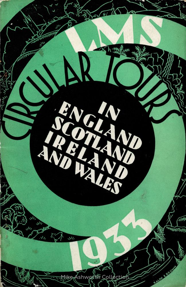
Suitably circular : the cover to the London Midland & Scottish Railway's 1933 Circular Tours booklet that gives details of many dozens of 'there & back" itineraries & fares for trips across the UK & Ireland. Cover by Ralph E Brown is in green and black, with white relief. A series of circles converge on the central lettering "In England Scotland Ireland and Wales" with LMS Circular Tours and 1933 wrapped around within the circle motif. On the black panels there are sketches of countryside, trees, churches and mountains.
Suitably circular : the cover to the London Midland & Scottish Railway's 1933 Circular Tours booklet that gives details of many dozens of 'there & back" itineraries & fares for trips across the UK & Ireland. Cover by Ralph E Brown. #railways #graphicdesign #lettering #travel
06.12.2025 11:24 — 👍 15 🔁 5 💬 0 📌 0
Is this to 'help' make up for First's dreadful inability to maintain & operate anything like a frequent & reliable bus service here in West Yorkshire I ask innocently ....
06.12.2025 05:27 — 👍 0 🔁 0 💬 0 📌 0
"Bal-Ham - Gateway to the South"
Showing my age now!
06.12.2025 05:22 — 👍 2 🔁 0 💬 0 📌 0

Boots the Chemist - Christmas Gifts envelope, c1950s (front). A lovely piece of ephemera - a small, almost tissue paper thin, paper envelope for Boots the Chemists and intended I'm sure for some sort of gift voucher. Probably dating from the 1950s, by the style and 'feel' of the winter snowscene illustrations, it is very "Christmassy". The red & green dressed figures, on almost cloud like mounds of snow are seen variously sking, sledging, skating and having a snowball fight. Amidst the varioys scenes and against the background of cold blue and falling snow are signs reading "Boots for Gifts" topped in snow and with a robin perched on the top of the sign.
It's day 6 in @arascot.bsky.social #ArchiveAdventCalendar so its a 1950s Boots the Chemist Christmas gift envelope with lots of #WinterSports
flic.kr/p/2kiHDSq
06.12.2025 04:58 — 👍 4 🔁 1 💬 0 📌 0

One of the best such holiday resort "official guides" I have seen in a while and the colourful covers, in a then popular spiral binding unusual for such a publication, were designed by Pool's Advertising Service Ltd. The book was edited by J.M. Scott, the Director of the Entertainments, Publicity and Trading Department of the Corporation and printed by C.H. Gee & Co. Ltd. of Leicester.
It gives details as to the many attractions of Southsea as a holiday resort as well as of the City of Portsmouth, especially its naval links and history. The cover shows part of the Promenade and one of the town's piers - with a splash of orange/red flowers lower right upon which the text in black is centred. Above - the greens of the formal gardens and flanking the blue sea the strip of promenade and beach. Across the top is a pier stretching out to sea.
One of the best '30s tourist guides I've seen in a while. The colourful covers to the Official Guide to Southsea & the City of Portsmouth issued by marvellously named Piers, Beach & Publicity Committee of Portsmouth Corporation. @seasideferry.bsky.social #portsmouth #holidays
↘️ flic.kr/p/2rK8GSQ
05.12.2025 16:53 — 👍 23 🔁 6 💬 0 📌 0

A lesser known station on the London Underground : Marspen. It's an early C20 matchbox label from Estonia. A red circle with a lined out horizontal box reading MARSPEN in the style of an early London Transport roundel or bullseye logo/symbol. Around the edge "impregnated safety matches" and Made in Esthonia.
A lesser known station on the London Underground : Marspen. It's an early C20 matchbox label from Estonia. #logo #symbol #london #graphicdesign
05.12.2025 16:26 — 👍 3 🔁 1 💬 0 📌 0

Hamburger Hauptbahnhof ; Großstadtbahnhof : Deutscher Reichsbahn Kalender 1927 ; 3, 4 & 5 Dezember 1927 : Deutsche Reichsbahn-Gesellschaft : Berlin : 1926 : This shows three days - 3 4 & 5 December in boxes with below a b/w photo of the station from the street and with text below describing the station. It is set in German Fraktur typeface.
5 December 1906 & one of the great European #railway stations was opened; Hamburg Hauptbahnhof. Designed by Reinhardt & Süßenguth it is seen here on the relevant page from the 1927 Deutscher Reichsbahn Kalender. Restored after WW2, still in use. #germany #hamburg #architecture
↘️ flic.kr/p/2oVaLci
05.12.2025 09:58 — 👍 3 🔁 0 💬 0 📌 0

An ambitious 'day' out from the Central belt of Scotland that involved a late evening departure, with travel overnight to arrive in Inverness by 0400 on the Saturday morning where you had a choice; on to Skye by train and ferry where you had around nine hours or to Wick where you had a day, with an optional bus excursion to John O' Groats before a return via the wee small hours to Inverness and a train south. This would land you back in Glasgow Buchanan Street station at 0832 on Sunday morning and Edinburgh Princes Street station at 0845 - blearie eyed but in time for Kirk. The long sections north to Wick, and returning south from Brora and Perth had restaurant cars and a limited number of Third Class sleeping berths were available.
Odd to think that in less than a month all this would be mostly impossible for six years.
The 'stock illustration of the steam locomotive is in scraperboard or Windsor Board and is by "M" - Reginald Mayes. It sometimes, to my tired eyes, does look to be going backwards at speed! It is all set in LMSR 'maroon' on newsprint paper.
Quite the 'day excursion'; an overnight expedition from Scotland's Central Belt for a day on Syke or at Wick before another overnighter back on the Sunday morning! London Midland & Scottish Railway publicity leaflet from 1939 with artwork by Reginald Mayes. #railways #scotland
↘️ flic.kr/p/2rK3Z54
05.12.2025 09:47 — 👍 7 🔁 0 💬 0 📌 0

Oldham Police Pillar
This photograph is captioned "New Oldham Police Pillar" and is from the collection of Oldham Borough Police. The police pillar – a freestanding post with a box that contained a telephone - was a regu...
From the historic Oldham Borough Police photo collections held by the Greater Manchester Police Museum - some one in the 1950s making use of a police call pillar, once common sights on town & city streets before widespread use of phones & radios. #history
flic.kr/p/2rK47d9
05.12.2025 09:42 — 👍 3 🔁 0 💬 0 📌 0

Rather jolly - frieze level British Rail signage at Euston station, London, screenshot from a 1972 BBC Archive "Man Alive" programme. Waiting room, Lounge bar, Grill Room, in white on black and below and illuminated panel "The Lancastrian Grill" features.
Rather jolly - frieze level British Rail signage at Euston station, London, screenshot from a 1972 BBC Archive "Man Alive" programme. The Lancastrian Grill features. @doublearrow64.bsky.social
04.12.2025 20:33 — 👍 10 🔁 1 💬 2 📌 0
Academic. Interested in various aspects of #tourism, place and coastal communities in particular. Interdisciplinary. Preston, Lancashire.
De Montfort University Special Collections, part of Library and Student Services. Explore our collections on our catalogue: http://specialcollections.catalogue.dmu.ac.uk
historian of mass housing (global + HK). New HK housing history: https://www.routledge.com/Hong-Kong-Public-Housing-An-Architectural-and-Policy-History/Glendinning/p/book/9781138680227. Global housing archive: https://datashare.ed.ac.uk/handle/10283/2927
I like Eurovision
(You may also know me as @anngav)
Keen interest in railways and buses. Frequent visitor to the East Lancs Railway.
An abandoned heritage asset amongst the jagged peace lines of North Belfast - support our #BackToLife efforts!
Intermittent illustrator and cat treat administrator. Sumptuously upholstered.
Angry People in Local Newspapers - Weird news - Bizarre headlines - Wild animals and ghosts which are actually cats - Bonkers billboards by @alistaircoleman.bsky.social. It’s a comedy account, so stop arguing. Avatar image by @tpneenan.bsky.social.
KGB spy, cosmonaut, inventor of the smell cancelling nosephones, extreme liar.
Call your own Ishmael!
Medieval historian interested in Wales, Somerset exile, inept cricketer, General Editor of the longest-running and largest local history project yet devised, the Victoria County History of England. Probably drinking tea.
Newspaper and magazine ads from the 1970s, 80s and 90s.
Also
@OldUKPrintAds.bsky.social - 1700s onwards
@OldUKPrintAdsXmas.bsky.social - Xmas ads, from Sept 16th
Print quality is very variable - remember this is mostly ancient newsprint, so VERY low-tech
Edinburgh-based architectural illustrator and 3D reconstruction artist. #Blender3D Pro. Member: Society of Architectural Illustrators, Scottish Castles Association, and the Caithness Broch Project. https://bobmarshall.co.uk
The YVBSG was formed in 1972 to study and record the traditional architecture of Yorkshire. We survey buildings; organise conferences, day schools and visits; and produce newsletters and an annual journal. https://www.yvbsg.org.uk
Railfan and Architect in training.
Hudson Valley, NY
He/Him
Theatre Lighting professional. Interested in the arts, growing, cooking and eating vegetarian food. Public transport user, serious about infra structure past and present. A Green, Leftie ,Yorkshireman , still proudly European.
The graphic joy of mid-century Eastern Bloc matchbox labels.
Prints available to buy online http://matchbloc.com
Northern correspondent, Financial Times
📍Manchester
Co-Founder of SwimmableCities.org, FutureLidos.org & ThamesBaths.com.
- ChrisRomerLee.com -
Formally of Studio Octopi.
Always at Serpentine Swimming Club.
Author of SEA POOLS & next DIVING BOARDS (batsfordbooks.com/book/sea-pools)
Berkeley professor, former Secretary of Labor. Co-founder of @inequalitymedia.bsky.social and @imcivicaction.bsky.social.
Substack: http://robertreich.substack.com
Buy my new book: https://sites.prh.com/reich
Visit my website: https://rbreich.com/
Official account for the Mayor of Greater Manchester. This account's not fully up and running yet (bear with us), so we may not see your comments. Give us a follow and we'll be here soon.