

Monotonizing data.
Classical PAV: monotone but step-flattened.
TPM: monotone and trend-faithful, maintaining readable dynamics such as endpoints, mass, slope continuity, inflection timing, and relative growth/decay patterns.
Monotonizing data.
Classical PAV: monotone but step-flattened.
TPM: monotone and trend-faithful, maintaining readable dynamics such as endpoints, mass, slope continuity, inflection timing, and relative growth/decay patterns.
Numbers and related fields are just a hobby for me, so hearing that any of my posts are helpful to people in dataviz is honestly very flattering.
21.06.2025 15:00 — 👍 1 🔁 0 💬 0 📌 0CSP is always useful for investigating relationships during the exploratory phase of data analysis. The reason it rarely works as an explanatory solution is that we can’t exactly say: "This hard-to-read graph shows there’s no clear relationship using this method..."
21.06.2025 14:19 — 👍 0 🔁 0 💬 0 📌 0Ha, glad to hear the method's been helpful. Measuring or even just describing relationships between variables has been always a tricky business.
21.06.2025 14:07 — 👍 0 🔁 0 💬 0 📌 0Ah, so that’s why my posts/remarks get nearly no traction...🤭
21.06.2025 13:58 — 👍 1 🔁 0 💬 1 📌 0
Are you aware of any data visualization designs that use optical illusions to enhance the intended message?
27.05.2025 10:55 — 👍 8 🔁 2 💬 3 📌 1While traditional beeswarms aim to reduce empty space through tight packing, my method focuses on frequency accuracy, with the space being used incidentally rather than as a packing objective.
06.05.2025 10:03 — 👍 2 🔁 0 💬 0 📌 0
Here is the result of my NEW frequency dot plot, an arrangement based on data density calculation using the dot size as resolution (granularity). This result actually validates the basic beeswarm packing for this dataset. Beeswarms are often poor density estimators due to their packing artifacts.
06.05.2025 09:50 — 👍 2 🔁 0 💬 1 📌 0
The Point Frequency Histogram (PFH) is a novel (??), simple, and highly effective visual method for accurately estimating the local density of data points.
www.linkedin.com/posts/daniel...
It was an exciting experience meeting so many statistical geeks in one place. Meeting @xangregg.bsky.social in person after more than a decade of social media debates was a particular delight. As he said, we could have talked forever.
15.03.2025 13:02 — 👍 1 🔁 0 💬 0 📌 0Not really a CSP. It is a multi line/dot chart. Time and ages are just shifted variables, no chess player trajectory will have curve twists.
01.03.2025 18:42 — 👍 1 🔁 0 💬 0 📌 0
When density continuity is a fact my method uses a different idea than KDE.
KDE uses a quite large bandwidth (constant or not) to calculate each value "contribution" to the density shape.
My method finds the smoothest density shape assuming each value was measured within a given tolerance.

My "best" guess is in the first image (truly, just a guess, no idea how good that is). Then I try to fit the dots as good as I consider is needed, starting from the optimal pack (hexagonal) to no errors at all. The final shape resemblances my "best" guess, an 0.2x error looking like this:
20.02.2025 16:13 — 👍 0 🔁 0 💬 0 📌 0
I think that the exploratory phase ends when we are confident enough that we found the density shape (iteratively challenging continuity, gaps, tails). Once we get there, we do our best to fit the available data by minimizing the error placement and/or overlapping, depending on the method.
20.02.2025 16:06 — 👍 1 🔁 0 💬 2 📌 0Using the distribution word in a statistical sense for a few discrete values as those from a Likert scale is a challenge. Can you share the data?
20.02.2025 13:06 — 👍 0 🔁 0 💬 1 📌 0Any chance you can share the data?
20.02.2025 12:30 — 👍 0 🔁 0 💬 1 📌 0Not sure how relevant is the rate. No idea how the system works there, but I doubt they can accommodate as many as they want. I would rather encode how many more applicants than the available places are (assuming all taken) with the following title: More and more people are interested in education.
20.02.2025 12:24 — 👍 1 🔁 0 💬 0 📌 0it looks like your display has a few bugs
15.02.2025 11:47 — 👍 1 🔁 0 💬 0 📌 0Cant really follow these graphs, but I am not familiar with data either. I cant see an explicit functional model to study a relationship from the dots.
09.12.2024 16:44 — 👍 0 🔁 0 💬 0 📌 0I think this example would be a fantastic exercise for people with different backgrounds, but with a bit of functional math and statistical knowledge. I am not sure how a two variable relationship dissertation would look to make it accessible to a broader audience, though.
09.12.2024 10:23 — 👍 0 🔁 0 💬 0 📌 0As you said, I kept staring at it. I love math and the logic behind PCA, but I dont see how it would improve the practical insights for a general audience. PCA might simplify mathematical analysis by removing the correlation, yet it doesnt mean it also simplifies human sensemaking.
09.12.2024 05:46 — 👍 0 🔁 0 💬 2 📌 0What I would conclude: 1. The concentric elliptical isolines might be the representation of a bivariate normal distribution. 2. The nearly constant orientation of the ellipses indicates also a linear relationship where values matter the most, in areas with high density.
08.12.2024 19:44 — 👍 0 🔁 0 💬 1 📌 0It wasn't the case here, because of the orientation, but I didn't know how the isolines shapes look. The ellipsis clearly have an angle. The "rotation" spreads the variance across both axes, so rescaling any axis will not convert the ellipse into a circle.
08.12.2024 19:34 — 👍 1 🔁 0 💬 1 📌 0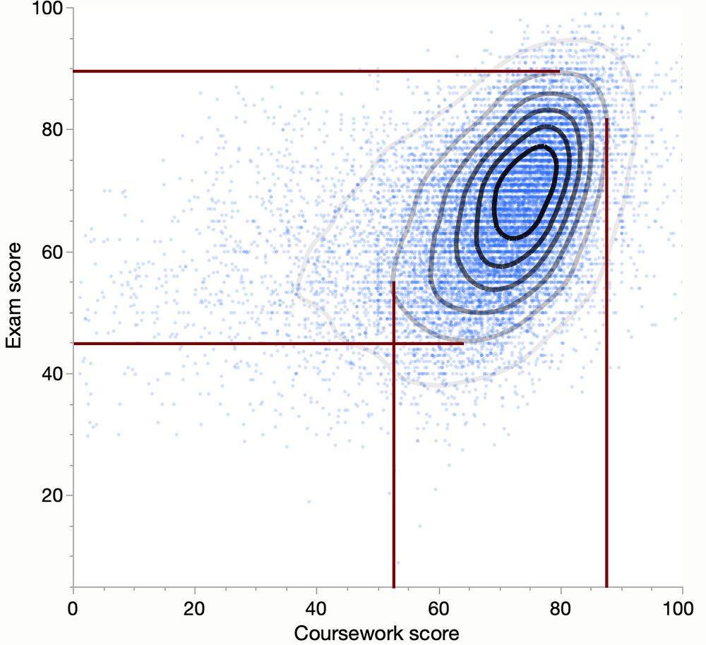
In a scatterplot, the visual shape of the distribution (ellipse or circle) is influenced by the scaling of the axes. Adjusting the scales can transform a 0 or 90deg oriented ellipse into a circle. This means the elongation might be a plotting artifact rather than a true feature of the data.
08.12.2024 19:18 — 👍 2 🔁 0 💬 1 📌 0I would love to see some isodensity or probability contours on this dataset with adjusted scales based on that. I would not filter out anything, I would just rescale the axis based on the ratio of, say, 90% probability ranges.
08.12.2024 11:58 — 👍 1 🔁 0 💬 1 📌 0
I can't really see a functional relationship (not really predictable).
However, the visible ellipse rather shows (kind of) a statistical dependency, but only if the range calculated scales dont foul us (if that would be a circle it would be no dependency).
Irrelevant reply:
"I am not sure if all need to be data encoding projects.
If not: recreate a logo. Describe how much fun you had getting there.
Else: recreate a masterpiece. Don't bother admiring too much the original. Convince your audience that your perspective is valid."
... an obvious insensitivity to local variations (if two years in a row health investments were reduced didn't automatically reflect into life expectancy, not those years, nor 10 years later). When such lag and obvious slow data responsiveness occur, CSP is hardly a solution.
🤷♂️
Thing is that CSP has often a serious drawback inherited from SP, but rarely mentioned.
In the famous CSP showing Life Expectancy vs Health Expenditure a "little" detail was left out.
That was the obvious cause-effect lag. For this dataset we can easily guess not only a decade gap, but also ->
To be honest this sort of debate resemblances quite well the survival bias, focusing or counting what is well known ignoring the rest just because they didnt occur too often in practice.
Everything I wrote about CSP strengths is legit. It just happens they are not too often reasons for CSP design.