Para celebrar el #DiaMundialDeLaEstadistica, se expandió el mapa interactivo de colonias con información censal a todas las localidades urbanas de #Sonora.
sonora-en-datos.github.io/ColoniasSono...
www.sonoraendatos.com
#WorldStatisticsDay #WSD2025 #StatsDay #Rstats #rstatsenespañol
20.10.2025 14:51 — 👍 1 🔁 1 💬 0 📌 0
Seguimos probando {mapgl}
Poderosa herramienta desarrollada por @kylewalker.bsky.social para usar Mapbox y MapLibre en #rstats
12.10.2025 23:18 — 👍 1 🔁 1 💬 0 📌 0

En 2024, 14.1% de los sonorenses carecían de acceso a una alimentación nutritiva y de calidad, 5.4 puntos porcentuales por debajo del registro de 2022 (19.6%).
Resultados de carencias sociales en #Sonora según #Pobreza2024 de @INEGI_INFORMA
#SonoraenDatos #rstats #ggplot
14.08.2025 15:33 — 👍 2 🔁 1 💬 0 📌 0
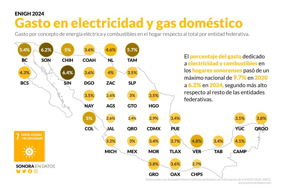
En 2024, los hogares de #Sonora dedicaron 6.2% de su gasto al pago de electricidad y combustibles domésticos, el segundo registro más alto entre las entidades federativas. En 2020 fue el más alto con 9.7%.
Mas información en: sonoraendatos.com
#ENIGH2024 #ODS7 #ggplot #rstats
01.08.2025 02:12 — 👍 2 🔁 2 💬 0 📌 0

Los resultados de la encuesta pueden ser consultados en la página de
@INEGI_INFORMA
en inegi.org.mx/programas/en...
Los gráficos y el análisis de este hilo en: sonoraendatos.com
02.08.2025 20:47 — 👍 0 🔁 1 💬 0 📌 0

En cuanto a los gastos de los hogares sonorenses, según la #ENIGH2024, en promedio gastan 32% de sus recursos en alimentación y 22% en transporte.
El decil de mayores ingresos dedica en promedio 13% a educación y esparcimiento, mientras el decil de menores ingresos 3 por ciento.
02.08.2025 20:47 — 👍 0 🔁 1 💬 1 📌 0

Mediante los resultados de la #ENIGH se puede calcular el Coeficiente de Gini, el cual es un indicador de concentración del ingreso.
En el caso de #Sonora se observa una constante disminución en el valor del coeficiente, es decir, la desigualdad de ingresos ha disminuido en el Estado.
02.08.2025 20:47 — 👍 0 🔁 1 💬 1 📌 0

En este sentido, al tomar la estructura porcentual se puede dar cuenta que una quinta parte de los hogares en #Sonora concentra 44.6% de los ingresos totales, por debajo de los valores de 2022 y 2022, donde concentraban 45.9% y 48.7% respectivamente.
02.08.2025 20:47 — 👍 0 🔁 1 💬 1 📌 0
Respecto a 2022, en 2024 todos los deciles de ingresos presentan una mejoría en sus percepciones. 2Los hogares del primer decil presentan un aumento en sus ingresos de 16.8%, mientras que los del décimo decil 8.5%.
02.08.2025 20:47 — 👍 0 🔁 1 💬 1 📌 0
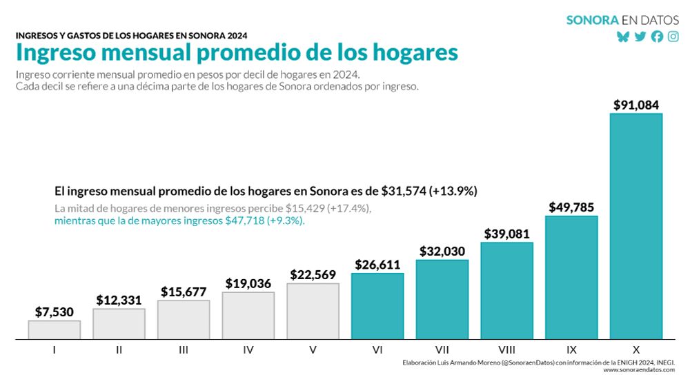
Algunos resultados de la #ENIGH2024 de #INEGI para #Sonora:
El ingreso corriente mensual promedio de los hogares sonorenses en 2024 fue de $31,574, un aumento de 13.9% respecto a 2022.
#rstats #ggplot2 #dataviz
02.08.2025 20:47 — 👍 3 🔁 1 💬 1 📌 0
a.k.a. boB Rudis • 🇺🇦 Pampa • Don't look at me…I do what he does—just slower. #rstats #js #duckdb #goavuncular•👨🍳•✝️• 💤• Varaforseti í Gögn Vísindi @ GreyNoise • 47-watch.com • https://stormwatch.ing • https://dailydrop.hrbrmstr.dev • Maine🦞
📊 Data visualisation specialist.
💻 #RStats | #Python | #D3.
🎨 Generative artist.
🏃♀️ Runner.
Website: https://nrennie.rbind.io/
She/her. Views my own.
Assistant professor at Georgia State University, formerly at BYU. 6 kids. Study NGOs, human rights, #PublicPolicy, #Nonprofits, #Dataviz, #CausalInference.
#rstats forever.
andrewheiss.com
Signal: andrewheiss.01
Powerpoint by day, #ggplot2 by night. Here for dataviz and #rstats content and rants about football. 📊⚽️
Based in Cologne, Germany.
I paint the world with #rstats and teach you how to unleash your inner #map artist. Join my map adventures and tutorials now:
https://youtube.com/@milos-makes-maps
🧙♂️✨📊
Independent Data Visualization Designer, Consultant & Instructor | available for projects and workshops
All things data & design with #rstats, #ggplot2, #Figma, #DataWrapper, #Flourish, and more
Co-Founder of the #30DayChartChallenge
The FT’s team of reporters, statisticians, illustrators, cartographers, designers, and developers work with colleagues across our newsrooms, using graphics and data to find, investigate and explain stories.
https://www.ft.com/visual-and-data-journalism
Designer, journalist, and professor.
Author of 'The Art of Insight' (2023) 'How Charts Lie' (2019), 'The Truthful Art' (2016), and 'The Functional Art' (2012). NEW PROJECT: https://openvisualizationacademy.org/
i write the data-driven politics newsletter Strength In Numbers: gelliottmorris.com/subscribe
wrote a book by the same name wwnorton.com/books/Strength-in-Numbers
polling averages at @fiftyplusone.news
formerly @ 538 & The Economist. email, don't DM, me
Visualisation and graphics @posit.co
Classic Generative Art Weirdo using 🖤 and R: http://thomaslinpedersen.art and http://deca.art/thomasp85
he/him
— Founder of Our World in Data
— Professor at the University of Oxford
Data to understand global problems and research to make progress against them.
Data and visual journalist, New York Times climate team
https://www.nytimes.com/by/mira-rojanasakul
Data visualizations & information graphics by David McCandless. Plus favourite finds & graphics from around the web. Making sense of the world - well, trying to - since 2009.
https://linktr.ee/infobeautiful
Hacker Mama/Artist/Designer/Coder/Writer/She/Ella Assoc Prof of Urban Science @MITdusp, Director, Data + Feminism Lab, Co-author #DataFeminism, hablo castellano
Institute Professor, MIT Economics. Co-Director of @mitshapingwork.bsky.social. Author of Why Nations Fail, The Narrow Corridor, and Power & Progress.
aka @soyserg.io
tu comunidad para aprender del análisis, la visualización, ciencia e ingeniería de datos
tacosdedatos.com