Have you tried our @penpot.app plugin to create charts 📊 directly in your designs? penpot.app/penpothub/pl...
This this is the first version and we’d love to keep improving it if people find it useful!

@graphicmethod.bsky.social
We are a data visualization design studio, based in Madrid, and we love to make complex matters intelligible through data, technology & design. http://graphicmethod.studio/
Have you tried our @penpot.app plugin to create charts 📊 directly in your designs? penpot.app/penpothub/pl...
This this is the first version and we’d love to keep improving it if people find it useful!
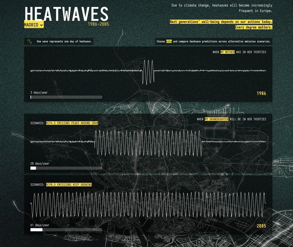
Website Screenshot displaying a data visualization made up by different waves
We had just experienced the first heatwave of the "summer" in Spain. More will come.
Last year, we built this experiment to compare the amount of heatwaves in the past with the ones expected in the future 📊
heatwaves-littlepictures.netlify.app
Too much flashy stuff... but we wanted to play!
También es importante comunicar el esfuerzo que supone tener estos datos. No son medidas directas, no es como salir a la calle y poner un termómetro. Hay un esfuerzo de mucha gente y un proceso bastante complejo detras que hemos querido narrar aquí datosaodlocal.femp.es/datos
20.03.2025 09:17 — 👍 0 🔁 0 💬 0 📌 0Hemos añadido algunas funcionalidades para dar más utilidad a las gráficas que tenemos. Como ejemplo, ademas de las descargar individuales, generamos un poster en formato svg: datosaodlocal.femp.es/municipios_p...
20.03.2025 09:17 — 👍 0 🔁 0 💬 1 📌 0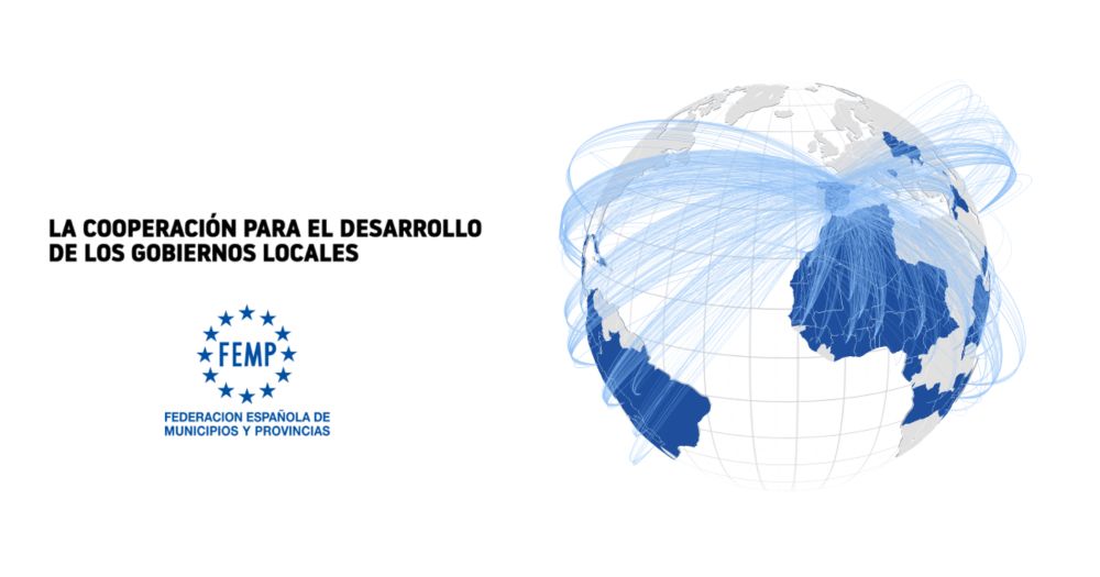
Hace unas semanas sacamos la nueva actualización de datosaodlocal.femp.es la herramienta (solo desktop) para explorar los presupuestos de ayuda al desarrollo de entidades locales. Hace un par de años hicimos un proceso de diseño abierto y poco a poco vamos incorporando lo que salió de ahí
20.03.2025 09:17 — 👍 3 🔁 1 💬 1 📌 0
#TodayinHistory #OTD 📊
🎂Mar 5, 1830 Etienne-Jules Marey born in Beaune, France 🇫🇷
In 1878, Marey made the first attempt to survey, describe, and illustrate available graphic methods for experimental data
& pioneered the study of animal motion.
He was a giant of #dataviz
The book: bit.ly/41AfMEK
The chart represents the budget (€) that Spanish councils donate to different countries each year. In a quick view, you can see variability (how spread the bubbles are) and evolution (thanks to bubble size). We see this as a nice complement to other charts. datosaodlocal.femp.es/mundo
06.03.2025 09:37 — 👍 0 🔁 0 💬 0 📌 0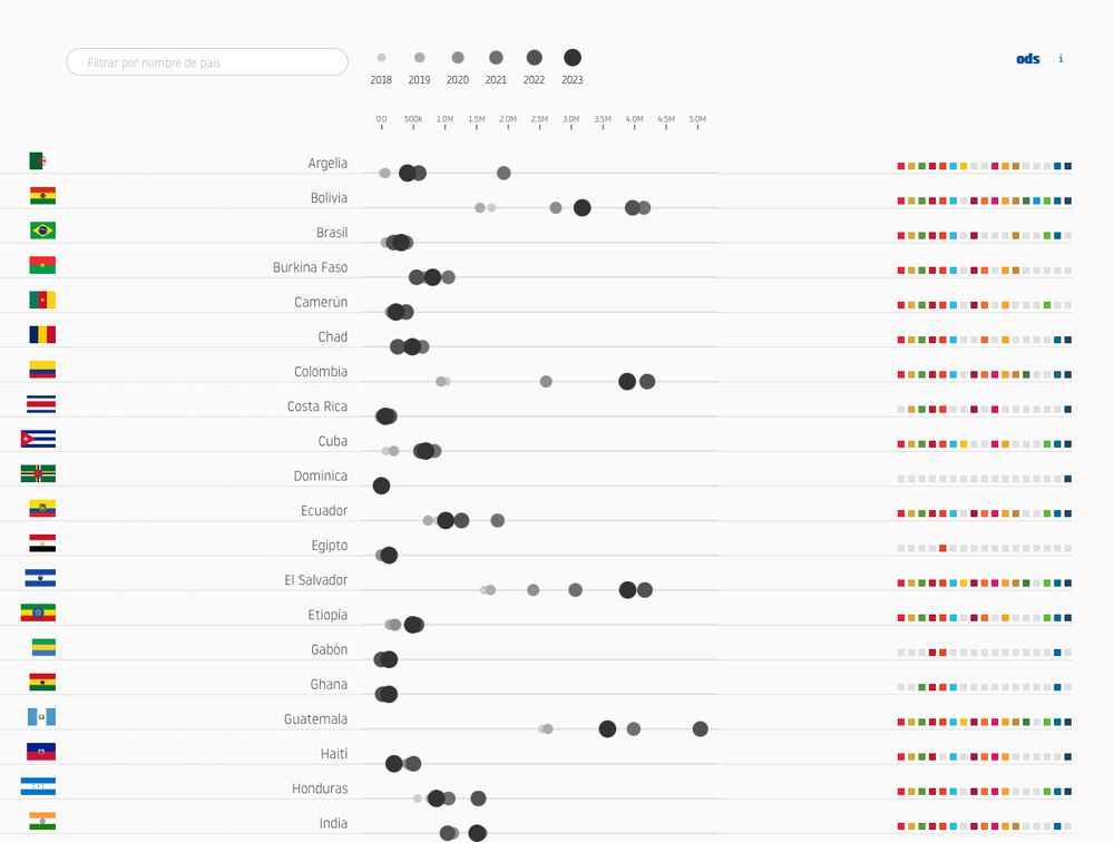
On this chart 📊 bubble size is not encoding quantity, but "time". When @alfredo-tgm.bsky.social proposed it, I found it "not so easy" to understand, but now I kind of like it...
06.03.2025 09:37 — 👍 1 🔁 0 💬 1 📌 0
The code to download charts as SVG or PNG always takes us some time to get it right. We usually rely on the svg-export library, but it is somehow outdated. So we have created our custom version, ready to be imported as a module. We also include text-to-path integration www.npmjs.com/package/svg-...
26.02.2025 13:38 — 👍 0 🔁 0 💬 0 📌 1Yes, I think it is only for trees with a single root node.
17.01.2024 13:54 — 👍 1 🔁 0 💬 1 📌 0I don't think it has all those features but take a look at jsoncrack.com/editor I've used their extension for vsCode in the past and was quite useful.
17.01.2024 13:39 — 👍 1 🔁 0 💬 1 📌 0Desde el INE llevan tiempo publicando proyectos muy curiosos en su sección de estadística experimental: ine.es/experimental... Hoy hemos visto este proyecto del ministerio de transportes donde ya no sólo publican datos sino que hace una narrativa movilidadbigdata.es/esqui Es guay ver esta evolución
17.01.2024 13:31 — 👍 0 🔁 0 💬 0 📌 0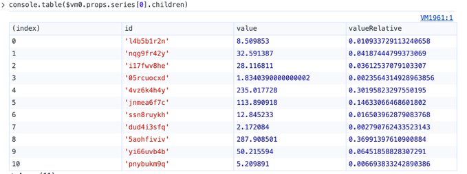
What age were you when you first discovered that you could print nicely formatted data with `console.table()` instead of the old `console.log()` ? #dataviztips
17.12.2023 14:37 — 👍 0 🔁 0 💬 0 📌 0...Another universally acknowledged fact is that handling CSV with Excel or Numbers can be a nightmare. It introduces weird formats and errors. So ever since we discovered vdt-labs.com/easy-csv-edi... our life with data is much easier. Hail to the "Easy Csv Editor"!
05.12.2023 10:43 — 👍 0 🔁 0 💬 0 📌 0We'll be sharing some of our #dataviz #tips from time to time. Let's kick it off with an app: One thing known to everyone working on "data visualization" is that "data visualization" is just an inflated name. We actually spend most of the time preparing and transforming data files:
05.12.2023 10:42 — 👍 0 🔁 0 💬 1 📌 0We love to see the BlueSky above us. Let's contribute to building a space for meaningful connections and conversations. Sharing knowledge, projects, and experiences. Promoting care and respect for our entire community.
01.12.2023 11:03 — 👍 3 🔁 0 💬 0 📌 0