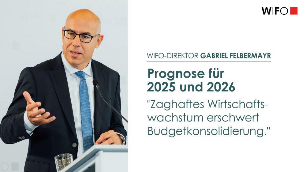
#BreakingNews: "Österreichs Wirtschaft sieht Licht am Ende des Tunnels. 2025 wächst das BIP um 0,5%. 2026 sollten es 1,2% und 2027 1,4% werden." @gfelbermayr.bsky.social 1/12 www.wifo.ac.at/news/oester...
18.12.2025 09:00 — 👍 16 🔁 11 💬 3 📌 1
@schmoigl.bsky.social
Data Scientist at the Austrian Institute of Economic Research | Lecturer at the Vienna University of Economics and Business https://appetizingdata.com | https://observablehq.com/@schmoigl | https://www.wifo.ac.at/person/lukas-schmoigl/
#BreakingNews: "Österreichs Wirtschaft sieht Licht am Ende des Tunnels. 2025 wächst das BIP um 0,5%. 2026 sollten es 1,2% und 2027 1,4% werden." @gfelbermayr.bsky.social 1/12 www.wifo.ac.at/news/oester...
18.12.2025 09:00 — 👍 16 🔁 11 💬 3 📌 1
Capital employed in 1882 in France, UK and US, portrayed by trains whose length is ~ to the number

Pictograms displaying Steam power (top) and horsepower per 1000 inhabitants by wheels whose diameter is proportional to the number represented, committing a graphical sin

Photo of Michael Mulhall looking to his right and wearing a long beard
#TodayinHistory #dataviz #Onthisday #OTD 📊
💀Dec 13, 1900 Michael George Mulhall died in Dublin, Ireland 🇮🇪
1884: 1st? use of a pictogram, to represent data by icons proportional to a number
The train one is accurate; the wheel one commits the area illusion, using diameter to represent the number

@attilabatorfy.bsky.social delights #dataviz with:
Pie chart frenzy from Brazil
open.substack.com/pub/attilaba...

A scatter plot titled "Fair and square? Russian federal elections, 2000-21" which visualizes the results of Russian federal elections. The x-axis represents voter turnout in percentage, ranging from 0 to 100%. The y-axis represents the percentage of votes for Putin, Medvedev, or the United Russia party, also ranging from 0 to 100%. Each dot on the plot represents a polling station. A cluster of dots appears in the upper right corner, indicating high voter turnout and a high percentage of votes for the specified candidates. A dashed rectangle highlights a grid-like pattern of dots at numbers ending in zero and five, with an annotation suggesting this pattern indicates potential foul play. The source is cited as Kobak and Shpilkin (2021).
Now this is how you detect whether an election was stolen. Humans choose rounder numbers.
by @TheEconomist

🚨 Wir schreiben den 1. Marie Neurath Preis für Datenvisualisierung aus!
Alle Infos hier: wien.arbeiterkammer.at/neurath
Prämiert werden 3 Visualisierungen mit Fokus auf Verteilungsfragen.
Wir freuen uns auf viele Einreichungen!
My #IEEEVIS 2025 paper explorer is live! 🎉
👉 johnguerra.co/viz/ieeevis2... 👈
An interactive #dataviz to explore 300+ papers by similarity. Perfect for:
✨ Discovering papers related to your interests
✨ Planning which sessions to attend
✨ Creating your own paper list (new!)
Pls help me distribute it

Excellent data journalism on housing rents in Vienna and other major European cities. Includes great interactive visualizations (in German): wien.orf.at/stories/3327...
28.10.2025 08:10 — 👍 5 🔁 1 💬 0 📌 0

Some beautiful Datawrapper hacks from our article on the MSCI World. And yes, technically those are custom choropleth maps 😀 #dataviz
www.spiegel.de/wirtschaft/s...

A playful scatterplot (using dog silhouettes instead of dots) depicts the best dog, according to data. On the vertical axis is a measure of public popularity. On the horizontal is an indexed score of several metrics to consider when owning a dog (cost, temperament, no. of genetic ailments etc). Each dog is coloured by category (sport, toy, hound etc) and sized (S, M, L). If a dog is facing left, it's kind of a dumb dog. If it's facing right, it's an intelligent dog.
It's fun to learn how to create impactful #infographics & data-visuals like this.
2 x virtual half days:
15th & 16th Oct 🇺🇸 USA timezone
11th & 12th Nov 🇬🇧 UK/EU/AUS
In-person Mon 13th Oct London 🇬🇧
Details geni.us/WAB2024
Reviews geni.us/WABreviews

For today's chartle I had to reconsult one of my older maps:
observablehq.com/@schmoigl/wi...
chartle.cc
#chartle #eurostat-map

A new daily puzzle game that asks you to guess what country the chart line represents - super fun for all my #dataviz peeps out there. (h/t @wwb099.bsky.social) chartle.cc
22.09.2025 14:50 — 👍 12 🔁 3 💬 0 📌 0
#BreakingNews: Nach zwei Jahren der Rezession (jeweils -1,0%) wird das BIP laut #WIFO-Prognose 2025 stagnieren und erst 2026 zulegen (+1,2%). @gfelbermayr.bsky.social
Mehr: www.wifo.ac.at/news/oester... 1/13

https://drought.emergency.copernicus.eu/tumbo/edo/map/
Ojeh - das sieht heuer nicht gut aus.
Zu wenige Niederschläge 🌧️ in großen Teilen der 🇪🇺.
drought.emergency.co...
Interessanterweise sind die Preiserwartungen noch moderat (preise.agrarforschun...)
Wo lebt es sich in 🇦🇹 am besten? Natürlich zu Hause. Wo sonst.
Wie sind die materiellen Lebensbedingungen dort? Das beantwortet der @wifo.bsky.social -Lebenssituationsindex.
Von @schmoigl.bsky.social perfekt in Szene gesetzt.
Tipp: scrolle nach unten für alle Details
➡️ data-science.wifo.ac...
with the usual interactive shenanigans:
19.03.2025 09:33 — 👍 0 🔁 0 💬 0 📌 0A bit late to the Closerread party but here you go:
🔗 data-science.wifo.ac.at/Lebenssituat...

#WIFO-Lebenssituationsindex von @franzsinabell.bsky.social & Julia Bock-Schappelwein gibt Einblick in materielle Lebensumstände & lässt damit Rückschlüsse auf Lebenssituation in 2.115 Wohngemeinden in 🇦🇹 zu. www.wifo.ac.at/news/so-leb...
Interaktive Geschichte im 🧵 lesen @schmoigl.bsky.social 1/9
Find the full study here:
www.europarl.europa.eu/RegData/etud...
as usual with interactive graphics:
17.03.2025 10:17 — 👍 0 🔁 0 💬 1 📌 0
The EU Revenue Galaxy 🪐 Where does the EU budget come from? My contribution to the Other Revenue project for the EU Parliament, exploring the different sources of EU funding.
🔗 data-science.wifo.ac.at/other-revenu...
 12.01.2025 10:55 — 👍 20 🔁 4 💬 0 📌 0
My year in #dataviz part VI 👵🏻 Visualizing the gender pension gap in Austria ↓
31.12.2024 10:57 — 👍 4 🔁 1 💬 0 📌 0Danke. Das hört man gerne!
30.12.2024 10:00 — 👍 0 🔁 0 💬 0 📌 0were*
30.12.2024 09:59 — 👍 0 🔁 0 💬 0 📌 0
My year in #dataviz part V 🌊 The 2024 flood in Austria. What where the damages? Flash estimates based on the affected area.
www.wifo.ac.at/en/institute...
#BreakingNews: "Die wirtschaftspolitische Unsicherheit in Österreich ist hoch. Im Prognosezeitraum ist mit erheblichen Einsparungen in den öffentlichen Haushalten zu rechnen, deren Auswirkungen derzeit nicht abschätzbar sind", so @gfelbermayr.bsky.social. 1/13 ow.ly/YMJw50UtZsk
20.12.2024 09:00 — 👍 21 🔁 14 💬 3 📌 0Heute jährt sich zum 74. Mal der Todestag des #Mathematikers und #Statistikers Abraham Wald. Der „Wald-Test“ ist zentraler Bestandteil jeder #Statistiksoftware. Er arbeitete von 1933-1938 am Österreichischen Konjunkturforschungsinstitut (heute #WIFO), 1938 musste er fliehen.
13.12.2024 06:11 — 👍 16 🔁 4 💬 2 📌 0With selectable exporter and importers:
16.12.2024 16:15 — 👍 0 🔁 0 💬 0 📌 0
My year in #dataviz part IV 🔃 Visualizing the trade flows of EU member states:
www.wifo.ac.at/en/research/...

Photo portrait of John Snow sitting in a chair, with an inlaid image of his iconic map of cholera in the upper left corner
#TodayinHistory #dataviz #Onthisday #OTD 📊
📅Dec 12, 1854 John Snow reports on the cholera outbreak that occurred in London in 1854 to the Cholera Inquiry Committee [Gilbert:1958; Snow:1855]